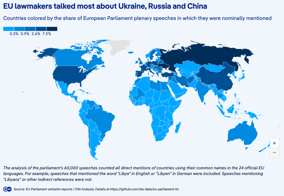
DW chose a choropleth map to compare countries by their mentions – this is probably a less effective method than a bar chart.

DW chose a choropleth map to compare countries by their mentions – this is probably a less effective method than a bar chart.
