
Reuters’ Graphics Team is renowned for creating a myriad of innovative news stories under tight deadlines, from Covid-19 coverage to mapping the movement of shifting smoke from California wildfires. In a guest post for OJB, Hanna Duggal speaks to the team’s Simon Scarr and Marco Hernandez about pushing the boundaries of visual storytelling in the newsroom and the relationship between data and design.
In a world that has become increasingly data-prolific and hardwired towards visual content, visualisation provides the newsroom with both a way to communicate complex data effectively and to engage audiences.
Data graphics have become more immersive, compelling and revealing, — and for Reuters, an integral part of how stories are told.
“I’m incredibly proud of our breaking news work,” says Simon Scarr, Reuters’ Deputy Head of Graphics.
“The level of detail we’ve been able to present to readers under deadline has really excelled in the past couple of years. Much of this coverage looks at natural disasters, for example Typhoon Hagibis, the Palu quake, and Australia bushfires.”
Most of the projects that Reuters’ graphics team publishes are collaborations. “Make sure you check out the bylines,” says Simon. “Collaboration is one of our greatest strengths that allows us to create some great work.”
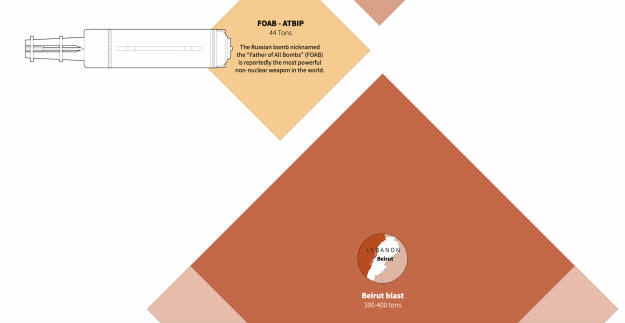
The right kind of visualisation: measuring the explosion in Beirut
Meticulous data visualisations such as the ones Reuters produces can be quite intimidating to recreate. However, not every data story demands an elaborate visual blueprint: some of the most effective are those that are simplest.
A good example is their work on the size of the Beirut port blast earlier this year. The warehouse explosion sent a crippling blast wave across Beirut, considered one of the strongest non-nuclear explosions recorded.
“The figure was interesting but we were still left wondering what that actually meant. If we were asking ourselves the question then it means others would be too,” says Data Visualisation Designer Marco Hernandez.
Using information from experts on the ground doing calculations on the blast yield, Simon and Marco drew up comparisons with munitions and earlier historical explosions.
Marco explains: “The construction of the main graphic was quite simple in reality: one long Illustrator ai2html artboard with scaled squares.
“Ultimately the strength of the graphic lies in its simplicity and the message it delivers.”
Trial and error: refining ideas on visualisation
One of the most exciting aspects of data journalism is how to visually represent a story. It’s also one of the most demanding parts: there’s a mark I, mark II and sometimes many more modified versions of a data narrative. Marco blogs about #infofails on his website: “beta graphics versions of stories that never go public”.
“Actually, there is no such thing as ‘fails’,” he says. “It’s all part of the journey when creating a project.
“For many of the pieces we produce, there is a bit of trial and error. Some of our best ideas ended up being average ones and good ideas have been refined into great ideas. Design is a conversation.”
Part of being a data journalist is learning what works and what doesn’t, in a very literal sense, and also in appreciating what an audience will be receptive to.
For Simon and Marco clarity is a top priority when it comes to making large complex data comprehensible for readers.
“When tackling something that’s proving particularly difficult to nail down, we usually joke that until we get to version 20 we are not close to publishing,” says Marco.
Visuals and words: finding the balance
Negotiating the balance between data visuals and the written elements of a news story isn’t always a linear task. The balance, according to Simon and Marco, lies in not forcing either.
“If a story does not benefit from a graphic then we don’t make one.”
However, there are many examples of stories which have strong visuals without words being a necessary element such as their graphic on the scale of Australia’s bushfires.
Three lessons for working on data in the newsroom
Working for one of the biggest media organisations in the world also means knowing a thing or two on how to navigate through the newsroom. For Simon and Marco, it comes down to three things.
The first is all about exclusivity and uniqueness — finding new angles for breaking news.
“We often hit breaking news stories with interesting follow-up angles as the story develops. Just because you have covered a topic doesn’t mean you should stop thinking about it.”
The second is the importance of prioritising workload: “Spend time on the things that need time spent on them,” says Marco.
“There are more stories and opportunities than bandwidth to cover them.”
The third is accuracy and sourcing: the foundation of any visualisation is in fact-checking and sourcing information coming in. Marco says:
“There can be no compromise here and a newsroom will be quick to let you know if you forget that.”
The future of visualisation: what next?
With more media organisations now investing in data teams the future of the newsroom points to more innovation.
“I can imagine graphics teams taking centre stage in many newsrooms as we move forward,” says Simon. “And not just because of the production and presentation side of things. I’m seeing more and more stories conceptualised and reported from graphics teams these days,”
Reuters’ coverage of the Hong Kong protests is a prime example of innovative approaches to reporting and production.
The story integrates hard-hitting special reports, breaking news, Pulitzer-winning photography and immersive presentations.
“One interesting swathe of visual coverage came from the graphics desk, and most of it from a reporting trip to a major rally on July 1,” explains Simon.
By reporting and collecting information on location, the team were able to calculate and publish estimated crowd sizes, document tactics used by protesters and show readers the entirety of the march through a continuous time lapse.
Visualisation techniques are also empowering different forms of journalism to come together in one place — and Simon feels that as technology continues to develop augmented and virtual reality will become commonplace as news consumers interact with the news in more interactive and immersive ways.
“The production and presentation of data-driven stories are definitely becoming more ambitious.”
Hanna Duggal is a student on the PGCert in Data Journalism at Birmingham City University.
