Tag Archives: Guardian

How data journalism is done on TikTok: six key takeaways from watching 50 videos

In a guest post for OJB, James Hickman pulls together a set of basic best-practice guidelines for creating data journalism videos on TikTok, from length and location to animation and style.

6 best practice guidelines for video data shorts:
1. Keep your data shorts under 90 seconds
2. Maintain a human connection
3. Locations reinforce authority
4. Show don't tell
5. Animate your graphs
6. Don't be afraid to innovate and adapt

Short-form vertical video is quickly becoming a key format for telling all types of news stories — and data journalism is no exception.

As a data journalist, I wanted to know how these outlets use this new and evolving digital video format to create “data shorts”: short-form social media videos in a vertical, reel-style format, that analyses or reports on specific datasets or newly released data.

I analysed 50 data shorts from the TikTok accounts of five major UK news publications — the BBC, ITV News, Guardian, Times and Financial Times — to examine how these digital news outlets approach the format. I looked at the genre of story they covered, the angles they focused on, their length, and their use of animation, to help inform my guidelines.

Continue reading
Words as data: how data journalists tell stories about documents and text

Documents and other collections of text can be goldmines for data journalism — if you know how to approach them as data. Here are some techniques and inspiration for your next data project.

From stories about political speech and song lyrics, to street names and social media chatter, data journalists now have a wide range of examples of text-as-data to draw inspiration and guidance from, while tools such as Pinpoint and NotebookLM are making text analysis easier than ever.

I compiled a list of over 200 pieces of data journalism where text or documents were used as sources. Quantification techniques ranged from counting the frequency of a single word and using Google’s ngram viewer, to machine learning and topic modelling.

Looking at those articles it’s clear that, once quantified, journalists tell the same stories about text as any other piece of data: using the seven most common angles.

But how those angles are used — and how often — is where it gets interesting…

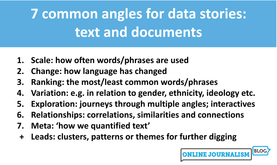
7 common angles for data stories: text and documents 
Scale: how often words/phrases are used
Change: how language has changed
Ranking: the most/least common words/phrases
Variation: e.g. in relation to gender, ethnicity, ideology etc.
Exploration: journeys through multiple angles; interactives
Relationships: correlations, similarities and connections
Meta: ‘how we quantified text’
Leads: clusters, patterns or themes for further digging
Continue reading

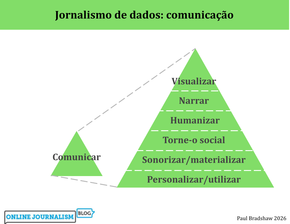
6 formas de comunicar jornalismo de dados (a Pirâmide Invertida do Jornalismo de Dados – parte 2)

etapas de comunicação (visualizar, narrar, humanizar, personalizar, sonorizar/materializar, utilizar).

A pirâmide invertida do jornalismo de dados mapeia o processo de utilização de dados na reportagem, desde a geração de ideias, passando pela limpeza, contextualização e combinação, até à comunicação. A fase final — a comunicação — apresenta uma série de opções: desde a visualização e sonificação até à personalização e ferramentas. Mas quais são as melhores práticas para cada uma?

(Também disponível em inglês, alemão e espanhol, russo e ucraniano).

1. Visualização

A visualização é normalmente a forma mais rápida de comunicar os resultados do jornalismo de dados: ferramentas gratuitas como Datawrapper e Flourish muitas vezes exigem apenas que você carregue os seus dados e escolha entre várias opções de visualização.

Continue reading

How to (not) write about numbers

Image by Andy Maguire | CC BY 2.0

If you’ve been working on a story involving data, the temptation can be to throw all the figures you’ve found into the resulting report — but the same rules of good writing apply to numbers too. Here are some tips to make sure you’re putting the story first.

Continue reading

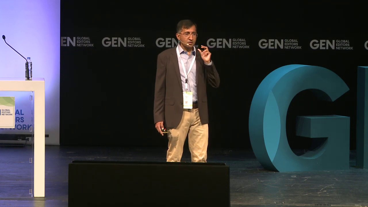
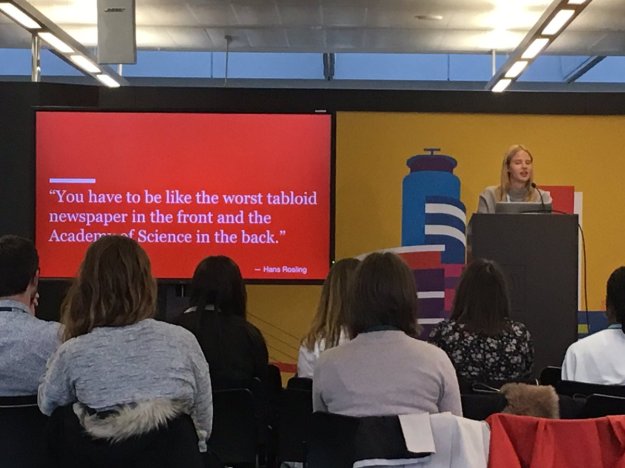
GEN 2019 round-up: 4 videos to watch on the potential of data and AI

Krishna Bharat

This year’s Global Editor’s Network (GEN) Summit, in Athens, Greece, had a big focus on the use of verification and automation. BBC News data scientist and PGCert Data Journalism student Alison Benjamin went along to see what was being said about artificial intelligence (AI), data and technology in the news industry. Here are her highlights…
Continue reading

From making data physical to giving journalists confidence (and a few other things too): Data Journalism UK 2019

marie segger at data journalsm uk 19

Last week saw the third Data Journalism UK conference, an opportunity for the country’s data journalists to gather, take stock of the state of the industry and look at what’s ahead.

The BBC Shared Data Unit’s Pete Sherlock kicked off the event, looking back at the first 18 months of the unit’s existence. In that period the unit has trained 15 secondees and helped generate over 600 stories across more than 250 titles in the regional press.

Sherlock highlighted two stories in particular to demonstrate how the data unit had helped equip regional reporters in holding power to account: the Eastern Daily Press’s Dominic Gilbert‘s story on legal aid deserts, and JPI Media’s Aimee Stanton‘s report on electric car charging points.

Both stories resulted in strong pushback – from the Ministry of Justice and the electric car industry respectively – but their new data journalism skills gave them the confidence to persist with the story. Continue reading

Whatever happened to the audio slideshow?

Remember the audio slideshow? Once one of the most compelling editorial formats – and a truly web-native one at that – it is now rare to see them on a news website. And a whole wave of audio slideshow work is starting to disappear from the web.

The page for BBC’s Jazz junctions – riding New York’s A Train now lacks the audio slideshow it once held, while The Guardian is awash with pages showing gaps where a slideshow should be – like After the riots and Timbuktu’s ancient manuscripts (both from 2007), error messages about Flash (from 2010 and 2011) – or no pages at all in the case of Shrimp fishing in the Wash or Somalia’s refugee camps.

audio-slideshows-chart new-york-times

A search on the New York Times Chronicle tool shows a spike in mentions of audio slideshows at the end of the last decade. After 2010 they aren’t mentioned at all.

2012 seems to have been the last time audio slideshows were part of the fabric in the UK: most of the work on the Guardian’s Audio Slideshows section is from that year, while it represents the peak of production at the BBC. Here’s just a selection: Continue reading

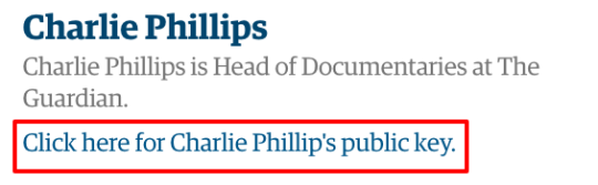
Guardian profiles routinely link to PGP keys – why aren’t other news orgs doing this?

guardian-profile

What a pleasant surprise to visit a profile page on The Guardian website and see a big, prominent link to the member of staff’s public key. Is this routine? It seems it is: an advanced search for profile pages mentioning “public key” brings up over 1000 results. Continue reading

Cartogram or election map? The Guardian vs The New York Times

guardian referendum map

A cartogram represents geography diagrammatically. Note above for example that London takes up more space than parts of Wales because it has much denser population

The New York Times didn’t use a cartogram for its EU referendum map, Gregor Aisch explained last week, because they are “too confusing for readers unfamiliar with the geography”.

https://twitter.com/driven_by_data/status/746381743507275776

The Guardian, on the other hand, did use a cartogram. In a series of tweets their visuals editor Xaquin Gonzalez explained why

Continue reading

The Guardian and VR: how psychologists helped create a solitary experience

GuardianPoster6x9_TRI_SUN (2)

Is virtual reality the next step for video journalism? Catalina George looks at The Guardian’s forthcoming VR project about solitary confinement: 6×9.

The Guardian’s new media project 6×9 aims to give users an experience of solitary confinement through the use of virtual reality technology. Due to launch in April, Francesca Panetta, multimedia special projects editor, explains the project:

“6×9” is an immersive experience of solitary confinement in US prisons, which places viewers in a virtual segregation cell which they can explore and interact with. It aims to tell a story of the psychological damage that can ensue from isolation.

Continue reading