Monthly Archives: November 2015

Respond by Monday: inquiry into cyber security and protection of personal data

data-breaches-datavis

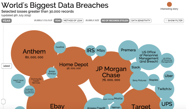
The World’s Biggest Data Breaches visualised by David McCandless. Click to see interactive and updated version

At the same time as one arm of the UK Government is proposing to force internet and telecomms service providers to store data on the internet and phone activity of every citizen, another part is holding an inquiry into lax security by one ISP which led to details being hacked.

It’s a rare opportunity to have your say on the clear personal security issues that the Investigatory Powers Bill raises – but the deadline is Monday.

Have your say here.


A simple hyperlocal experiment which shows how publishers can engage with different audiences

liveblog engagement

Civic engagement? Most readers spent more than 30 minutes on the liveblog

On Monday I was involved in a fascinating experiment in civic engagement: 10 hyperlocal blogs all agreed to embed a liveblog of a hustings which would give inhabitants of the largest local authority in Europe an insight into the next council leader.

The liveblog itself was to be maintained by student contributors to the Birmingham Eastside news site. The decision to offer it out to hyperlocal sites across the city seemed obvious – so why aren’t publishers doing this regularly? Continue reading

“It’s black and white to colour”: Ben Fry on data visualisation’s past and future

Ben-Fry-visualization

Ben Fry published his book Visualizing Data in 2007, before the term ‘data journalism’ had entered the professional vocabulary. Since then, Fry has been developing Processing, an open source “language for learning how to code within the context of the visual arts”, and he is a principal at Fathom, a Boston design and software consultancy which has created visualisation projects for National Geographic; Bill, Hillary & Chelsea Clinton Foundation and Bill & Melinda Gates Foundation

Catalina George asked him a few questions about his current work and his advice to aspiring data journalists.

Visualisation, a reinvented tool

World-eats-visualization-Fathom

For a better view of the world calories consumption, the user can see how much this differs from China to the UK @Fathom

One of your Fathom projects was a data visualisation for National Geographic’s What the World Eats”. The graphic part can play a great role to enrich our perception and understanding of reality. But what does the development of visualisation mean for journalism?

I think what’s called “visualisation” has been around a long time for journalism. Otto Neurath was doing this in the 1920s. I think it’s been receiving more attention in recent years because we have the means to more easily distribute interactive works, which is a boon for more sophisticated takes on data. Continue reading

Come help dig into data on football agents – and eat pizza

Pizza

Pizzas and footballs are both round. That’s enough justification for us. Image: Adam Kuban

Next Friday (November 13) I’ll be holding a day full of activities in Birmingham for anyone interested in digging into the world of football agents.

You won’t need any special skills – you can take part by doing basic internet searches, or you can bring your data journalism mojo and play with the data we’ve already gathered.

And we’ll also have people on hand to show you a range of useful techniques if you’re interested.

The special hackday is part of an investigation I’m doing, and we’re also working with OpenCorporates as part of their #FlashHacks series to build open data on football agents, identifying the biggest operators and their ownership structures.

If you can’t make it for the whole day feel free to drop in for part of it. Oh, and there’ll be pizza, stickers and t-shirts.

You can sign up and find more details about location and timings here.