Monthly Archives: August 2012

How to teach a journalist programming

Cross-posted from Data Driven Journalism.

Earlier this year I set out to tackle a problem that was bothering me: journalists who had started to learn programming were giving up.

They were hitting a wall. In trying to learn the more advanced programming techniques – particularly those involved in scraping – they seemed to fall into one of two camps:

  • People who learned programming, but were taking far too long to apply it, and so losing momentum – the generalists
  • People who learned how to write one scraper, but could not extend it to others, and so becoming frustrated – the specialists

Continue reading

Local Council Announcements via Newspapers, and Maybe Hyperlocal Blogs, Too…?

In a post on local council declarations of designated public place, I remarked on the following clause in The Local Authorities (Alcohol Consumption in Designated Public Places) Regulations 2007:

“5. Before making an order, a local authority shall cause to be published in a newspaper circulating in its area a notice— (a)identifying specifically or by description the place proposed to be identified;“

and idly wondered: how is a “newspaper circulating in its area” defined?

In Statutory Instrument 2012 No. 2089, The Local Authorities (Executive Arrangements) (Meetings and Access to Information) (England) Regulations 2012, which comes into force on September 10th, 2012, there is the following note on interpretations to be used within the regulations:

“newspaper” includes—
(a) a news agency which systematically carries on the business of selling and supplying reports or information to the newspapers; and
(b) any organisation which is systematically engaged in collecting news—
(i) for sound or television broadcasts;
(ii) for inclusion in programmes to be included in any programme service within the meaning of the Broadcasting Act 1990(6) other than a sound or television broadcasting service within the meaning of Part 3 or Part 1 of that Act respectively; or
(iii) for use in electronic or any other format to provide news to the public by means of the internet; [my emphasis]

So, for the purposes of those regulations, a newspaper includes any organisation which is systematically engaged in collecting news for use in electronic or any other format to provide news to the public by means of the internet. (The 2007 regs interpretation section don’t clarify the meaning of “newspapers”.)

This presumably means, for example, that under regulation 14(2), my local hyperlocal blog, Ventnorblog, could request as a newspaper a copy of any of the documents available for public inspection following payment to the Isle of Wight Council of “postage, copying or other necessary charge for transmission”. Assuming Ventnorblog passes the test of (a) being an organisation, that (b) is systematically engaged in collecting news, and for backwards compatibility with other regulations can be show to be (c) circulating in the local council area.

If this interpretation of newspapers applies more widely, (for example, if this interpretation is now applied across outstanding Local Government regulations), it also suggests that whereas councils would traditionally have had to place an advert in their local (print) newspaper, now they can do it via a hyperlocal blog?

So this might also include announcements about Licensing of public entertainments [1(4)], or adult shops [2(2)], tattoo shops [13(6)], temporary markets [37(1)], traffic orders [17(2a)], etc etc

PS Hmm, I wonder, is there a single list somewhere detailing all the legislation that requires local councils to “publish in a newspaper circulating in the area”…?

PPS via @robandale, this Local Government Information Unit initiative on Reforming Statutory Notices. It links to a survey for local councils relating to “how many notices are produced, how much they cost, how effective you believe they are etc.” to try to get a baseline on current practice.

A quick peek at the Isle of Wight Council Armchair Auditor (as run by Ventnorblog and updated from Adrian Short’s original version) gives us an idea of how much the Isle of Wight Council spends on “Advertising and Publicity” in areas such as “Traffic Management” (so presumably statutory notices relating to roadworks, road closures etc?) with the local rag, the Isle of Wight County Press.

Presumably a search on OpenlyLocal’s council spending dashboard would turn up similar spending categories for other councils? (It could be quite interesting to try exploring that… I’m not sure if data on the OpenlyLocal spending dashboard has been updated lately, though? I think OpenSpending take their data from OpenlyLocal, so that isn’t much additional help. And the DCLG opendatacommunities.org site only has budget related finance data at the moment?)

Hmm..thinks.. you could get an idea of how much external spending burden different bits of legislation impose on councils from their spending data, couldn’t you?

How to get started as a multimedia journalist

I’ve now covered almost all of the 5 roles in an investigations team I posted about earlier this year – apart from the multimedia journalist role. So here’s how to get started in that role.

Multimedia journalism is a pretty nebulous term. As a result, in my experience, when students try to adopt the role two main problems recur: 1) having a narrow assumption of what multimedia means (i.e. video) and 2) not being able to see the multimedia possibilities of your work.

Multimedia journalism is a very different beast to broadcast journalism. In broadcast journalism your role was comparatively simple: you had one medium to use, and a well-worn format to employ.

Put another way: in broadcast journalism the medium was imposed on the story; in multimedia journalism, the story imposes the medium.

Multimedia also has to deal with the style challenge I’ve written about previously:

“Not only must they be able to adapt their style for different types of reporting; not only must they be able to adapt for different brands; not only must they be able to adapt their style within different brands across multiple media; but they must also be able to adapt their style within a single medium, across multiple platforms: Twitter, Facebook, blogs, Flickr, YouTube, or anywhere else that their audiences gather.”

With that in mind, then, here are 4 steps to get started in multimedia journalism:

Step 1: Look for multimedia opportunities in your journalism

The style challenge outlined above means starting from a position of having to decide what medium to use – and the type of multimedia which is produced in this role will depend largely on the nature of the stories and investigations being pursued. Here are some typical examples of where multimedia can bring an extra dimension to a story:

  • Case studies: video or audio interviews with someone at the heart of the story: affected by the issue or working at the coalface
  • Reaction: video or audio interview with the person responsible: capturing their attempts to explain their role
  • Clarity: charts, maps or infographic turning data into something that users can understand more quickly. Tools useful here include Google Charts and Gadgets (in Google Docs), Many Eyes and Tableau for charts; Tagxedo, Wordle or Many Eyes for word clouds; Google Maps and BatchGeo for maps; and Infogr.am for infographics.
  • Explanation: taking something complex and making it accessible to a wider audience – this might be done through a graphic, or through a video or audio interview with an expert who can explain it clearly – including a member of the team
  • Conflict and chemistry: staging a podcast discussion to flesh out the key themes in the issue being explored. This can be done in an entertaining way if your presenters have chemistry, or it can be done in an engaging way if you have two camps in conflict (make sure you can add clarity and expertise into the noise)
  • Interactivity: producing something that users can interact with. Freedive is a useful tool for doing this with spreadsheets. There are also timeline tools like Dipity and Meograph, and charts and maps can be interactive too.
  • Curation: bringing together multimedia content by users in a way that adds value

The multimedia journalist needs to be able to spot those opportunities for multimedia to play a role – and develop the skills to see them through. Here are some questions to ask:

  • Does the story involve complex concepts that might be better illustrated through visual or aural means?
  • Does the story require a response from someone, or a description of an event, where non-verbal cues such as their tone of voice or facial expression may be key?
  • Are there different positions which would suit a discussion to flesh them out?
  • Is there so much information involved that users might want to explore it themselves to pull out the bits directly relevant to them?
  • Does the story involve figures or data that work better visually than in text?
  • Is there user generated content related to the issue – online or in offline archives, or individuals’ possession – which could be brought together and highlighted?

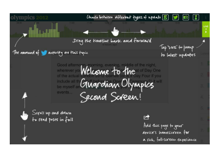
Looking at plenty of examples of online multimedia is very important here. For the reasons explained above, broadcast journalism is not always the best example to follow. Look at David McCandless’s visualisation work or the discussions about best practice on Flowing Data. Look at the video work of Travis Fox and Michael Rosenblum’s students. Watch The Guardian’s video and the documentary channel on Vimeo. Listen to the most popular podcasts and micropodcasts; soak in audio slideshows – and ask yourself what makes them so effective.

The technical quality – and I know people will disagree with this – can wait.

Step 2: Plan and practise

The reason that I place technical skills second here is this: if you don’t have a story to tell, you are going to have neither the means nor the motive to develop your technical skills.

Furthermore, because there are now so many technical options available to the journalist, learning them all before going out to report is not the most efficient option.

So: story first, technicalities second.

Once you have a story, you have to decide how best to tell it. If it’s video, you will need to learn that. If maps, then look at that.

Don’t wait for someone to show you how: there are thousands of resources online to get you started, from Vimeo’s Video School and YouTube’s Playbook to the BBC College’s resources andMindy McAdams’s collection on audio and video production.

YouTube has tons of tutorials on pretty much any skill you might want to tackle, but there are also text resources such as The Society of Professional Journalists’ Digital Media Handbook Part 1 (PDF) and Part 2 which cover mapping and data visualisation, among other useful techniques, and the Knight Digital Media Center’s extensive tutorials.

For photography there’s this free book on DSLR Cinematography, while videographers can choose between this ebook (PDF) by Adam Westbrook on multimedia production and ImageJunkies’s free ebook on news and documentary filmmaking.

If you’re struggling for a reason to use multimedia, liveblogging is a particularly good opportunity to practise your skills: when there’s lots going on, what are the multimedia opportunities:

  • Do you need to be in position for when something visually or aurally striking happens?
  • Or do you need to interview the people taking part, for colour?
  • Do you capture the atmosphere somehow?
  • Do you map it?
  • Do you attempt to flesh out rumours with some actuality?

Every choice counts – be prepared to make a lot of wrong ones, or at least to accept that part of the journalist’s job is deciding what to leave out.

Your first attempts will be crude and frustrating – but they will point you to the key issues, and provide the motivation for learning the techniques.

For example, your video may have poor audio, or be too shaky. There may be too much of you in it. Your map may have too little information. Your audio drones on for too long, then sputters out.

Largely this is about planning: checking out the location and picking a place where background audio isn’t too loud. Briefing the interviewee and getting in close. Researching your subject and knowing the right questions to ask – and when not to accept an answer.

So practise. Learn how to edit your work, just as you would edit your words. Learn how to film closely, or with a microphone, or both to get clearer sound. Learn how to kick off and wrap up audio succinctly. Practise.

Step 3: Improve the technical side with an understanding of principles

An understanding of key principles is just as important as technical ability: you need to understand what works well in a chosen medium: being able to hold a camera is worthless if you point it at something dull. Being able to edit audio isn’t going to help if you don’t ask the right questions in the interview. As countless examples of citizen journalism have proved: people will forgive poor technical quality if the newsworthiness of the content is strong enough. Here are some key principles that come to mind – I’d welcome others:

  • Narrative: how to start, maintain interest, and end well.
  • Interviewing: what questions to ask, when and how.
  • Editing and composition: how to combine elements for maximum clarity and effect. Being ruthless in taking things out.
  • Visual design: how to compose an image for impact, or what is most effective in a chart

Just as the story provides a focus for the development of technical skills, so these core principles should refine those further. In particular, they should help you make choices quickly, including the difficult ones. What to start with and what to end with. When and what to cut away. How to be confident in what you’re doing, and push for the right result.

Step 4: Start simple, and go from there

With those three steps established, there may be a temptation to try something with multiple angles, cuts, sections, or layers. So the final step is to step back, and start simple.

Mobile video is a good discipline here: it prevents you from using cutaways and other techniques to disguise your content – and forces you to focus on core qualities: clear audio, good questions, and an engaging subject.

Maps and charts should focus on a few key data points, and link to the rest.

A short podcast, tightly edited, will develop your production skills much better than a flabby multi-section programme which pulls you in too many different directions.

If you’re already good at photography, an audio slideshow will stretch you a little further. Master one part, and then build on that.

Comments especially welcome

How to get started as a multimedia journalist

Investigations team flowchart

I’ve now covered almost all of the 5 roles in an investigations team I posted about earlier this year – apart from the multimedia journalist role. So here’s how to get started in that role.

Multimedia journalism is a pretty nebulous term. As a result, in my experience, when students try to adopt the role two main problems recur: 1) having a narrow assumption of what multimedia means (i.e. video) and 2) not being able to see the multimedia possibilities of your work.

Multimedia journalism is a very different beast to broadcast journalism. In broadcast journalism your role was comparatively simple: you had one medium to use, and a well-worn format to employ.

Put another way: in broadcast journalism the medium was imposed on the story; in multimedia journalism, the story imposes the medium.

Continue reading

Has the increase in data changed your newsroom?

I’m currently researching if newsrooms have been changed by the increase in availability of data – from FOI and data.gov sites to open data and APIs. Specifically I’m interesting in the watchdog role of journalism, but any other uses are relevant too.

If you work in this area I’d really appreciate it if you can complete the survey below – and share it with others you know can contribute. Here it is.

Hyperlocal Voices: Matt Brown, Londonist

The fifth in our new series of Hyperlocal Voices explores the work done by the team behind the Londonist. Despite having a large geographic footprint – Londonist covers the whole of Greater London – the site is full of ultra-local content, as well as featuring stories and themes which span the whole of the capital.

Run by two members of staff and a raft of volunteers, Editor Matt Brown gave Damian Radcliffe an insight into the breadth and depth of the site. Continue reading

Two reasons why every journalist should know about scraping (cross-posted)

This was originally published on Journalism.co.uk – cross-posted here for convenience.

Journalists rely on two sources of competitive advantage: being able to work faster than others, and being able to get more information than others. For both of these reasons, I  love scraping: it is both a great time-saver, and a great source of stories no one else has. Continue reading

How do you navigate a liveblog? The Guardian’s Second Screen solution

I’ve been using The Guardian’s clever Second Screen webpage-slash-app during much of the Olympics. It is, frankly, a little too clever for its own good, requiring a certain learning curve to understand its full functionality.

But one particular element has really caught my eye: the Twitter activity histogram.

In the diagram below – presented to users before they use Second Screen – this histogram is highlighted in the upper left corner.

Guardian's Second Screen Olympics interactive

What the histogram provides is an instant visual cue to help in hunting down key events.

Continue reading

Olympics Swimming Lap Charts from the New York Times

Part of the promise of sports data journalism is the ability to use data from an event to enrich the reporting of that event. One of the widely used graphical devices used in motor racing is the lap chart, which shows the relative positions of each car at the end of each lap:

Another, more complex chart, and one that can be quite hard to read when you first come across it, is the race history chart, which shows the laptime of each car relative to the average laptime (calculated over the whole of the race) of the race winner:

(Great examples of how to read a race history charts can be found on the IntelligentF1 blog. For the general case, see The IntelligentF1 model.)

Both of these charts can be used to illustrate the progression of a race, and even in some cases to identify stories that might otherwise have been missed (particularly races amongst back markers, for example). For Olympics events particularly, where reporting is often at a local level (national and local press reporting on the progression of their athletes, as well as the winning athletes), timing data may be one of the few sources available for finding out what actually happened to a particular competitor who didn’t feature in coverage that typically focusses on the head of the race.

I’ve also experimented with some other views, including a race summary chart that captures the start position, end of first lap position, final position and range of positions held at the end of each lap by each driver:

One of the ways of using this chart is as a quick summary of the race position chart, as well as a tool for highlighting possible “driver of the day” candidates.

A rich lap chart might also be used to convey information about the distance between cars as well as their relative positions. Here’s one experiment I tried (using Gephi to visualise the data) in which node size is proportional to time to car in front and colour is related to time to car behind (red is hot – car behind is close):

(You might also be able to imagine a variant of this chart where we fix the y-value so each row shows data relating to one particular driver. Looking along a row then allows us to see how exciting a race they had.)

All of these charts can be calculated from lap time data. Some of them can be calculated from data describing the position held by each competitor at the end of each lap. But whatever the case, the data is what drives the visualisation.

A little bit of me had been hoping that laptime data for Olympics track, swimming and cycling events might be available somewhere, but if it is, I haven’t found a reliable source yet. What I did find encouraging, though, was that the New York Times, (in many ways one of the organisations that is seeing the value of using visualised data-driven storytelling in its daily activities) did make some split time data available – and was putting it to work – in the swimming events:

Here, the NYT have given split data showing the times achieved in each leg by the relay team members, along with a lap chart that has a higher level of detail, showing the position of each team at the end of each 50m length (I think?!). The progression of each of the medal winners is highlighted using an appropriate colour theme.

[Here’s an insight from @kevinQ about how the New York Times dataviz team put this graphic together: Shifts in rankings. Apparently, they’d done similar views in previous years using a Flash component, but the current iteration uses d3.js]

The chart provides an illustration that can be used to help a reporter identify different stories about how the race progressed, whether or not it is included in the final piece. The graphic can also be used as a sidebar illustration of a race report.

Lap charts also lend themselves to interactive views, or highlighted customisations that can be used to illustrate competition between selected individuals – here’s another F1 example, this time from the f1fanatic blog:

(I have to admit, I prefer this sort of chart with greyed options for the unhighlighted drivers because it gives a better sense of the position churn that is happening elsewhere in the race.)

Of course, without the data, it can be difficult trying to generate these charts…

…which is to say: if you know where lap data can be found for any of the Olympics events, please post a link to the source in the comments below:-)

PS for an example of the lapcharting style used to track the hole by hole scoring across a multi-round golf tournament, see Andy Cotgreave’s Golf Analytics.