
I’ve been using The Guardian’s clever Second Screen webpage-slash-app during much of the Olympics. It is, frankly, a little too clever for its own good, requiring a certain learning curve to understand its full functionality.
But one particular element has really caught my eye: the Twitter activity histogram.
In the diagram below – presented to users before they use Second Screen – this histogram is highlighted in the upper left corner.
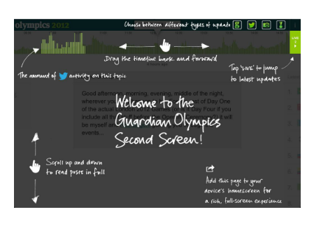
What the histogram provides is an instant visual cue to help in hunting down key events.
