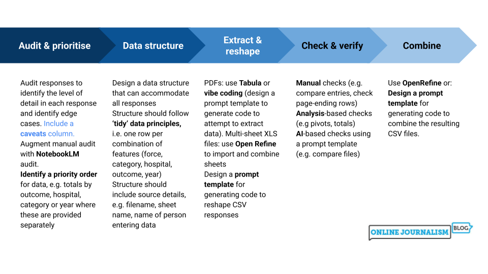
I was recently invited to speak to students at Tampere University in Finland, and had the opportunity — with the help of Esa Sirkkunen — to translate the ‘Inverted pyramid of data journalism‘ into Finnish. I’m sharing it here for anyone else who might find it useful.
If you’re working with data as a journalist it won’t be long before you come across the phrases “dirty data” or “cleaning data“. The phrases cover a wide range of problems, and a variety of techniques for tackling them, so in this post I’m going to break down exactly what it is that makes data “dirty”, and the different cleaning strategies that a journalist might adopt in tackling them.
Four categories of dirty data problem
Look around for definitions of dirty data and the same three words will crop up: inaccurate, incomplete, or inconsistent.
Inaccurate data includes duplicate or misentered information, or data which is stored as the wrong data type.
Incomplete data might only cover particular periods of time, specific areas, or categories — or be lacking categorisation entirely.
Inconsistent data might name the same entities in different ways or mix different types of data together.
To those three common terms I would also add a fourth: data that is simply incompatible with the questions or visualisation that we want to perform with it. One of the most common cleaning tasks in data journalism, for example, is ‘reshaping‘ data from long to wide, or vice versa, so that we can aggregate or filter along particular dimensions. (More on this later).
Python is an extremely powerful language for journalists who want to scrape information from online sources. This series of videos, made for students on the MA in Data Journalism at Birmingham City University, explains some core concepts to get started in Python, how to use Colab notebooks within Google Drive, and introduces some code to get started with scraping.
A couple of years ago I mapped out eight common angles for identifying stories in data. It turns out that the same framework is useful for finding stories in company accounts, too — but not only that: the angles also map neatly onto three broad techniques.
In this post I’ll go through each of the three techniques — looking at cash flow statements; compiling data from multiple accounts; and tracing people and connections — and explain how they can be used to get stories, with examples of articles that have used those techniques successfully.
🔦 9 способов найти историю в финансовых отчётах компаний@paulbradshaw вместе со своими студентами собрал примеры, в которых чтение нужной страницы отчёта помогло быстро подготовить действительно интересный расследовательский материал👇 https://t.co/YKwvdkJxzh
— GIJN – Глобальная сеть журналистов-расследователей (@gijnRu) February 1, 2023
🧵 It’s time for another roller-coaster thread digging into how one journalist has used company accounts* to get a great story. This time it's a front page story by @Robert_Boothhttps://t.co/yFi4qH5IBJ *Featuring: other useful open sources
In the summer of last year ProPublica published a major investigation into air pollution in Florida, and its connection to the sugar industry. The story itself, Black Snow, is an inspiring example of scrollytelling — but equally instructive is the methodology article which accompanies it, responding to criticisms from the sugar industry.
Not only does it demonstrate how to respond when large organisations attack a piece of journalism — it also provides a great lesson on the tactics that are adopted by organisations when attacking data-driven stories.
In this post I want to break down the three most common attack tactics, how ProPublica deal with two of those, and how to use the same tactics during planning to ensure your project design isn’t flawed.
The article explains what APIs are and how they differ from other data sources; the basic principles of how they work and how they can be used for stories; some of the jargon to expect — and where to find them. Read the article here.
Pinpoint creates a ranking of people, organisations, and locations with the number of times they are mentioned on your uploaded documents.
MA Data Journalism student Tony Jarne spent eight months investigating exempt accommodation, collecting hundreds of documents, audio and video recordings along the way. To manage all this information, he turned to Google’s free tool Pinpoint. In a special guest post for OJB, he explains how it should be an essential part of any journalist’s toolkit.
The use of exempt accommodation — a type of housing for vulnerable people — has rocketed in recent years.
At the end of December, a select committee was set up in Parliament to look into the issue. The select committee opened a deadline, and anyone who wished to do so could submit written evidence.
Organisations, local authorities and citizens submitted more than 125 pieces of written evidence to be taken into account by the committee. Some are only one page — others are 25 pages long.
In addition to the written evidence, I had various reports, news articles, Land Registry titles an company accounts downloaded from Companies House.
I needed a tool to organise all the documentation. I needed Pinpoint.