Tag Archives: apis

I’ve updated the Inverted Pyramid of Data Journalism — and brought together resources for every stage

Inverted pyramid of data journalism: conceive, compile, clean, context, combine (with 'question' throughout). Communicate: vis, narrate, humanise, personalise, socialise, utilise

It’s over a decade since I published the Inverted Pyramid of Data Journalism. The model has been translated into multiple languages, taught all over the world, and included in a number of books and research papers. But in that time the model has also developed and changed through discussion and teaching, so here’s a round up of everything I’ve written or recommended on the different stages — along with a revised model in English (shown above; versions have been published before in German, Russian and Ukrainian!).

The most basic change to the Inverted Pyramid of Data Journalism is the recognition of a stage that precedes all others — idea generation — labelled ‘Conceive’ in the diagram above.

This is often a major stumbling block to people starting out with data journalism, and I’ve written a lot about it in recent years (see below for a full list).

The second major change is to make questioning more explicit as a process that (should) take place through all stages — not just in data analysis but in the way we question our sources, our ideas, and the reliability of the data itself.

Alongside the updated pyramid I’ve been using for the past few years I also wanted to round up links to a number of resources that relate to each stage. Here they are…

Continue reading

What Data Journalists Need to Know About Application Programming Interfaces (APIs)

A list of APIs on the Parliament website
The UK Parliament publishes a series of APIs for political data

I’ve written a post for the Global Investigative Journalism Network about how APIs can be useful sources of data for journalists. The article is based on an earlier video post.

The article explains what APIs are and how they differ from other data sources; the basic principles of how they work and how they can be used for stories; some of the jargon to expect — and where to find them. Read the article here.

Here are some great examples of how to use AI and satellite imagery in journalism

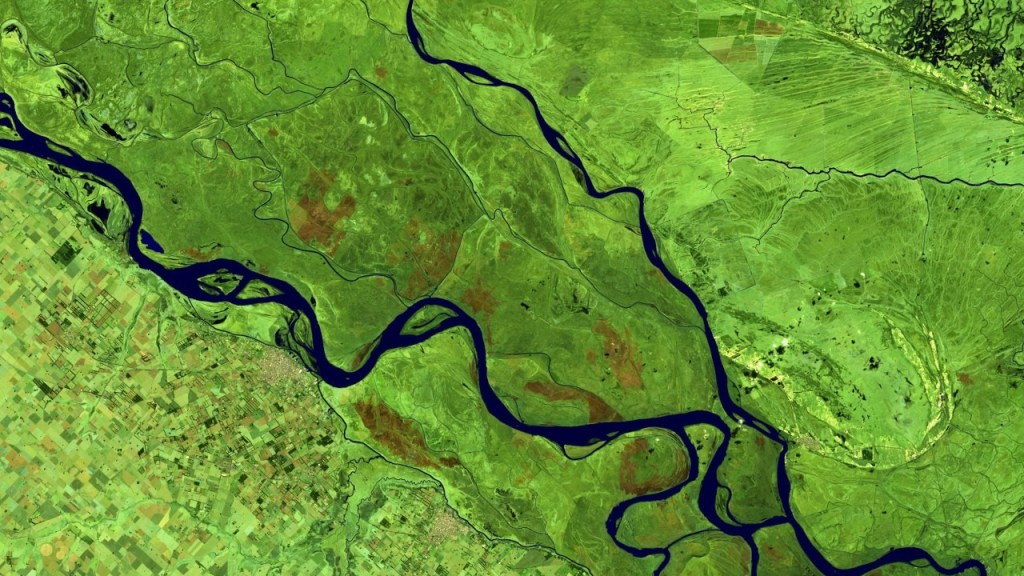
False colour image of the Paraná River near its mouth at the Rio de La Plata, Argentina
False colour image of the Paraná River near its mouth at the Rio de La Plata, Argentina. Image: Copernicus Sentinel data [2022] processed by Sentinel Hub.

In a guest post for OJB, first published on ML Satellites, MA Data Journalism student Federico Acosta Rainis explains what can be learned from some examples of the format.

Satellite imagery is increasingly a key asset for journalists. Looking from above often allows us to put a story into context, take a more interesting perspective or show what some power prefers to keep hidden.

But with hundreds of satellites taking thousands of images of the Earth every day, it is difficult to separate the wheat from the chaff. How can we find relevant stories in this ocean of data?

Continue reading

VIDEO: How to use R to fetch data from a postcodes API

All this week I have been publishing videos about APIs, from how data journalists use APIs and the jargon involved, to understanding the data formats they return. In this final video — first made for students on the MA in Data Journalism at Birmingham City University — I explain how to use an R notebook to fetch data from one particular API, postcodes.io.

You can find the notebook with all the code on GitHub here.

VIDEO: Understanding JSON and XML (when using APIs)

In two previous videos this week I introduced APIs for data journalists, and explained some of the jargon involved. In a short third video — first made for students on the MA in Data Journalism at Birmingham City University and shared as part of a series of video posts — I explain how to understand the data formats you’re likely to come across: JSON and XML.

One useful tool to install in your browser to help with this process is JSONView.

Links mentioned in the video:

VIDEO: Understanding API jargon for data journalists

Yesterday I shared a video introducing APIs for data journalists. In this video — first made for students on the MA in Data Journalism at Birmingham City University and shared as part of a series of video posts — I explain some of the jargon you’re likely to come across when using an API.

That includes ‘functions’ and ‘methods’ that allow you to request certain types of data; ‘arguments’ that allow you to specify what you want data about, or what format; and API ‘keys’ that act as passwords to access the data.

Links mentioned in the video:

VIDEO: What are APIs — and how are they used in data journalism?

APIs can be very useful sources of data for data journalists. In this video — first made for students on the MA in Data Journalism at Birmingham City University and shared as part of a series of video posts — I explain what an API is and how they have been used in a variety of data-driven stories.

Links mentioned in the video:

The visual challenges of big data: how The Economist turned Spotify data into a story about language

Early Visualisation from Off the Charts

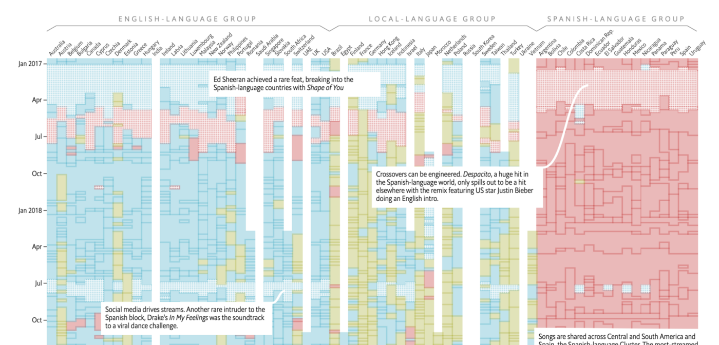
In an interview with Kirstin Bunce for OJB, interactive journalist Olivia Vane explains the production process behind ‘Singing in tongues. What Spotify data show about the decline of English.

Earlier this year The Economist team published an interactive analysis delving into 5 years of Spotify’s data in 70 countries. It was a large data project that started with a scraper — by data journalist Dolly Setton, who was interested in the role of language on the platform — but getting the data was just the beginning.

“I thought it was an interesting experience at the beginning, exploring and figuring out together what was the heart of the piece,” says Olivia. “We didn’t realise what the story was going to be until sort of midway through.”

Continue reading

Report: Social Media and News

Report: Social Media and NewsLast year I was commissioned to write a report on ‘Social Media and News’ for the Open Society Media Program, as part of the ‘Mapping Digital Media’ series. The report is now available here (PDF).

As I say in the introduction, I focused on “the areas that are most strongly contested and hold the most importance for the development of news reporting”, namely:

  • competition over copyright between individuals, news organisations, and social media platforms;
  • the move to hyperlocal and international-scope publishing;
  • the tensions between privacy and freedom of speech; and
  • attempts by governments and corporations to control what happens online.

These and other developments (such as the growth of APIs which “connect the information that we consume with the information we increasingly embody”) are then explored with specific reference to issues of editorial independence, public interest and public service, pluralism and diversity, accountability, and freedom of expression.

That’s quite a lot to cover in 4,000 words. So for those who want to explore some of the issues or cases in more detail – or follow recent updates (and a lot has happened even since finishing the report) – I’ve been collecting related links at this Delicious ‘stack’, and on an ongoing basis at this tag.

Data journalism pt5: Mashing data (comments wanted)

This is a draft from a book chapter on data journalism (part 1 looks at finding data; part 2 at interrogating datapart 3 at visualisation, and 4 at visualisation tools). I’d really appreciate any additions or comments you can make – particularly around tips and tools.

UPDATE: It has now been published in The Online Journalism Handbook.

Mashing data

Wikipedia defines a mashup particularly succinctly, as “a web page or application that uses or combines data or functionality from two or many more external sources to create a new service.” Those sources may be online spreadsheets or tables; maps; RSS feeds (which could be anything from Twitter tweets, blog posts or news articles to images, video, audio or search results); or anything else which is structured enough to ‘match’ against another source.

This ‘match’ is typically what makes a mashup. It might be matching a city mentioned in a news article against the same city in a map; or it may be matching the name of an author with that same name in the tags of a photo; or matching the search results for ‘earthquake’ from a number of different sources. The results can be useful to you as a journalist, to the user, or both.

Why make a mashup?

Mashups can be particularly useful in providing live coverage of a particular event or ongoing issue – mashing images from a protest march, for example, against a map. Creating a mashup online is not too dissimilar from how, in broadcast journalism, you might set up cameras at key points around a physical location in anticipation of an event from which you will later ‘pull’ live feeds: in a mashup you are effectively doing exactly the same thing – only in a virtual space rather than a physical one. So, instead of setting up a feed at the corner of an important junction, you might decide to pull a feed from Flickr of any images that are tagged with the words ‘protest’ and ‘anti-fascist’. Continue reading