Monthly Archives: August 2015

When to use shape maps in data visualisation: part 2 of a great big guide

maps xkcd

xkcd’s take on mapping, via Duarte Romero

In a previous post I explained some of the considerations in deciding to use a map in data visualisation, and went into detail about mapping points and heatmaps. In this second part, taken from the MA in Online Journalism at Birmingham City University, I’m going to look at other types of maps: shape-based maps and image maps.

Mapping shapes

A more ambitious alternative to mapping points is to map shapes: in other words, instead of each data point being placed on a specific point on a map, instead different areas on that map are drawn and coloured/labelled according to the relevant data. Continue reading

When to use maps in data visualisation: a great big guide

Zombie map

Matt Bierbaum’s zombie map allows you to simulate outbreaks

When it comes to data visualisation, everyone loves a map. More exciting than a chart, easier than an infographic, it’s generally the first thing that journalists and journalism students alike ask: “How can we create a map?”

But just because you have some geographical data doesn’t mean you should map it.

Here’s why: maps, like all methods of visualisation, are designed for a purpose. They tell particular types of stories well – but not all of them.

There is also more than one type of map. You can map points, shapes, or routes. You can create heat maps and choropleth maps.

I’ll tackle those different types of maps first – and then the sorts of stories you might tell with each. But the key rule running throughout is this: make sure you are clear what story you are trying to tell, or the story that users will try to find. The test is whether a map does that job best. Continue reading

VIDEO: Jornalismo de Dados – “Dados no contexto digital”

Inês Rodrigues interviewed me and a bunch of other people for a Portuguese video project about data journalism. The results can be seen in the video above, while you can also watch longer versions of the individual interviews with experts including Alberto Cairo, Simon Rogers and Raquel Albuquerque, and separate videos on subjects such as open access (in Portuguese). I’ve embedded these below. Continue reading

How one journalist found hidden code in a Google report and turned it into a story

right to be forgotten analysis

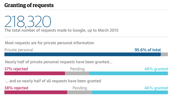
The story found that most requests were made by private individuals, not politicians or criminals. Image: The Guardian

Sylvia Tippmann wasn’t looking for a story. In fact, she was working on a way that Google could improve the way that it handled ‘right to be forgotten‘ processes, when she stumbled across some information that she suspected the search giant hadn’t intended to make public.

Two weeks ago The Guardian in the UK and Correct!v in Germany published the story of the leaked data, which was then widely picked up by the business and technology press: Google had accidentally revealed details on hundreds of thousands of ‘right to be forgotten’ requests, providing a rare insight into the controversial law and raising concerns over the corporation’s role in judging requests.

But it was the way that Tippmann stumbled across the story that fascinated me: a combination of tech savvy, a desire to speed up work processes, and a strong nose for news that often characterise data journalists’ reporting. So I wanted to tell it here. Continue reading