Monthly Archives: November 2017

Information is Beautiful Awards 2017: “Visualisation without story is nothing”

david mccandless

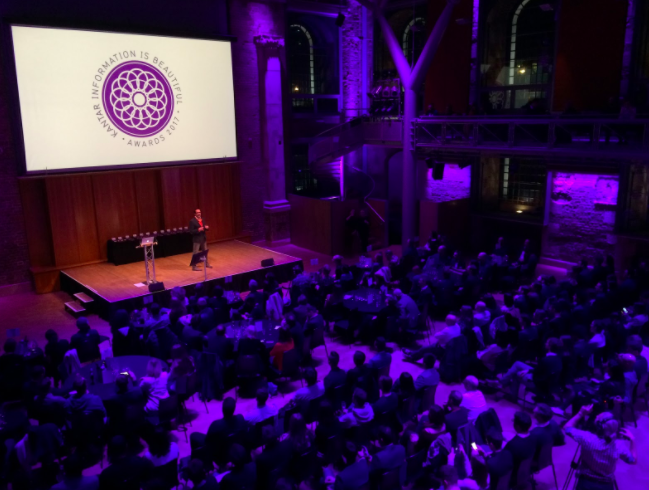
David McCandless, founder of the IiB awards, hosted the ceremony

MA Data Journalism students Carmen Aguilar Garcia and Victoria Oliveres attended the Information is Beautiful awards this week and spoke to some of the nominees and winners. In a guest post for OJB they give a rundown of the highlights, plus insights from data visualisation pioneers Nadieh Bremer, Duncan Clark and Alessandro Zotta.

Nadieh Bremer was one of the major winners at this year’s Information is Beautiful Awards 2017 — winning in both the Science & Technology and Unusual categories for Why Are so Many Babies Born around 8:00 A.M.? (with Zan Armstrong and Jennifer Christiansen) and Data Sketches in Twelve Installments (with Shirley Wu).

Why Are so Many Babies Born around 8am

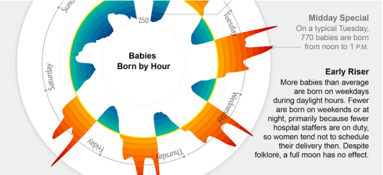
Silver, Science & technology category – Why Are so Many Babies Born around 8:00 A.M.? by Nadieh Bremer, Zan Armstrong & Jennifer Christiansen. The prize was shared with Zan Armstrong, Scientific American.

Gold in Unusual category for Data Sketches in Twelve Installments by Nadieh Bremer, Shirley Wu Unusual

Gold, Unusual category: Data Sketches in Twelve Installments by Nadieh Bremer, Shirley Wu

Bremer graduated as an Astronomer in 2011, but a couple of years working as an Analytic Consultant were enough for her to understand that her passion was data visualisation. For the past year she has been exploring this world by herself. Continue reading

How one Norwegian data team keeps track of their data journalism projects

In a special guest post Anders Eriksen from the #bord4 editorial development and data journalism team at Norwegian news website Bergens Tidende talks about how they manage large data projects.

Do you really know how you ended up with those results after analyzing the data from Public Source?

Well, often we did not. This is what we knew:

  • We had downloaded some data in Excel format.
  • We did some magic cleaning of the data in Excel.
  • We did some manual alterations of wrong or wrongly formatted data.
  • We sorted, grouped, pivoted, and eureka! We had a story!

Then we got a new and updated batch of the same data. Or the editor wanted to check how we ended up with those numbers, that story.

…And so the problems start to appear.

How could we do the exact same analysis over and over again on different batches of data?

And how could we explain to curious readers and editors exactly how we ended up with those numbers or that graph?

We needed a way to structure our data analysis and make it traceable, reusable and documented. This post will show you how. We will not teach you how to code, but maybe inspire you to learn that in the process. Continue reading

I’m delivering a 3 day workshop on scraping for journalists in January

Person looking at map

From January 23-25 I’ll be delivering a 3 day workshop on scraping in London at The Centre for Investigative Journalism. You don’t need any knowledge of scraping (automatically collecting information from multiple webpages or documents) or programming to take part.

Scraping has been used to report stories ranging from hard news items like “Half of GP surgeries open for under eight hours a day” to lighter stories in arts and culture such as “Movie Trilogies Get Worse with Each Film. Book Trilogies Get Better“.

By the end of the workshop you will be able to use scraping tools (without programming) and have the basis of the skills needed to write your own, more advanced and powerful, scrapers. You will also be able to communicate with programmers on relevant projects and think about editorial ideas for using scrapers.

A full outline of the course can be found on the Centre for Investigative Journalism website, where bookings can also be made, including discounts for freelancers and students.

“Data matters — but people are still the best sources of stories”  —  insights from investigative journalist Peter Geoghegan

Peter Geoghegan

Peter Geoghegan

In a guest post Jane Haynes speaks to investigative journalist Peter Geoghegan of the award-winning news site The Ferret about data, contacts and “nosing up the trousers of power”.

When the Scottish Government announced last month that it was banning fracking, it was a moment to savour for a group of journalists from an independent news site in the heart of the country.

The team from investigative cooperative The Ferret had been the first news organisation to reveal plans by nine energy companies to bid for licences to extract shale gas from central Scotland.

Using a combination of contact-led information and FOI requests, they uncovered the extent of the ambitions to dig deep into Scottish soil.

Firms target more of central Scotland for fracking

It was part of a steady flow of fracking stories from the Ferret team, ensuring those involved in making decisions were in no doubt of their responsibilities and recognised that every step would be scrutinised. Continue reading

Data storytelling done right: 8 easy tips to avoid bad visualisation

tesselationIn a guest post for OJB, Steve Carufel interviews Dutch data journalist Thomas de Beus about visualisation, storytelling — and useful new tools for data journalists.

Data journalism is, among other things, the art of resisting the temptation to show spectacular visualisations that fail to highlight the data behind a story.

Insights and relevant statistics can get lost in visual translation, so Thomas de BeusColourful Facts is a great place to start thinking more about clarity and your audience — and less about spectacular graphic design (although you do not want to forego attractiveness entirely). Continue reading

A potted history of the last 6 years? How the Online Journalism Handbook changed between 2011 and 2017

A few weeks ago the second edition of the Online Journalism Handbook was published. Two years in the making, it was more than just an update of the first edition — it was an almost complete rewrite (and 50% longer). The changes since that first edition in 2011 highlight just how the industry has changed in those six years — here are just a few of the things that I noticed when I looked back…

Blogging: “If you strike me down, I shall become more powerful than you can possibly imagine”

In the first edition of the Online Journalism Handbook a whole chapter was devoted to blogging. In the new edition the chapter is gone. Does that mean that blogging is dead? No. It means that ‘blogging’ is now so ubiquitous it has become almost invisible. Continue reading