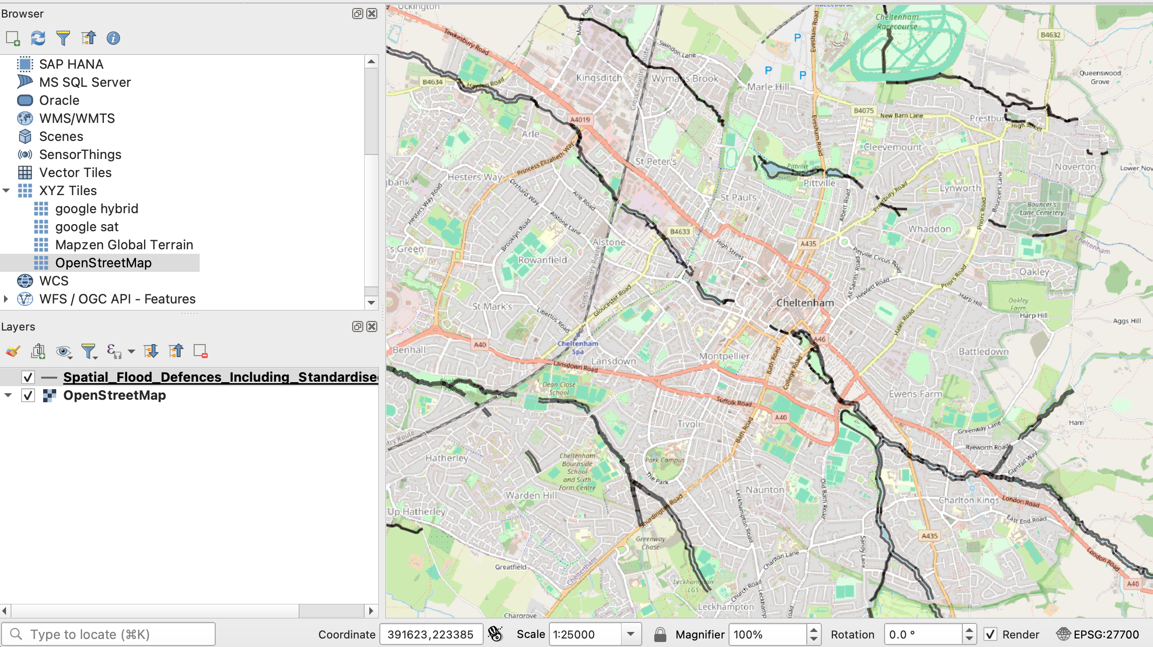
Tag Archives: mapping

VIDEO: Mapping for data journalists

If you’re using maps as a data journalist it’s important to be aware of the editorial choices you are making — and how they can skew your reporting.

In this video — first made for students on the MA in Data Journalism at Birmingham City University and shared as part of a series of video posts — I introduce critical cartography, the different types of maps you might choose to use to tell a story, and the different types of stories that they can tell.

I also give some examples of geography-based stories that might be better told with other charts, and list some tools and tips that can be used to tell geographical stories.

Links mentioned in the video include Theo Kindynis’s research on critical cartography; and Stories Behind A Line. And there are two related videos I refer to which are embedded below. First, a West Wing clip on mapping (more on that here):

Continue reading

How to: get started with SQL in Carto and create filtered maps

map carto

Today I will be introducing my MA Data Journalism students to SQL (Structured Query Language), a language used widely in data journalism to query databases, datasets and APIs.

I’ll be partly using the mapping tool Carto as a way to get started with SQL, and thought I would share my tutorial here (especially as since its recent redesign the SQL tool is no longer easy to find).

So, here’s how you can get started using SQL in Carto — and where to find that pesky SQL option. Continue reading

When to use shape maps in data visualisation: part 2 of a great big guide

maps xkcd

xkcd’s take on mapping, via Duarte Romero

In a previous post I explained some of the considerations in deciding to use a map in data visualisation, and went into detail about mapping points and heatmaps. In this second part, taken from the MA in Online Journalism at Birmingham City University, I’m going to look at other types of maps: shape-based maps and image maps.

Mapping shapes

A more ambitious alternative to mapping points is to map shapes: in other words, instead of each data point being placed on a specific point on a map, instead different areas on that map are drawn and coloured/labelled according to the relevant data. Continue reading

When to use maps in data visualisation: a great big guide

Zombie map

Matt Bierbaum’s zombie map allows you to simulate outbreaks

When it comes to data visualisation, everyone loves a map. More exciting than a chart, easier than an infographic, it’s generally the first thing that journalists and journalism students alike ask: “How can we create a map?”

But just because you have some geographical data doesn’t mean you should map it.

Here’s why: maps, like all methods of visualisation, are designed for a purpose. They tell particular types of stories well – but not all of them.

There is also more than one type of map. You can map points, shapes, or routes. You can create heat maps and choropleth maps.

I’ll tackle those different types of maps first – and then the sorts of stories you might tell with each. But the key rule running throughout is this: make sure you are clear what story you are trying to tell, or the story that users will try to find. The test is whether a map does that job best. Continue reading

Is there a ‘canon’ of data journalism? Comment call!

Looking across the comments in the first discussion of the EJC’s data journalism MOOC it struck me that some pieces of work in the field come up again and again. I thought I’d pull those together quickly here and ask: is this the beginnings of a ‘canon’ in data journalism? And what should such a canon include? Stick with me past the first obvious examples…

Early data vis

These examples of early data visualisation are so well-known now that one book proposal I recently saw specified that it would not talk about them. I’m talking of course about… Continue reading

2 how-tos: researching people and mapping planning applications

Mapping planning applications

Sid Ryan’s planning applications map

Sid Ryan wanted to see if planning applications near planning committee members were more or less likely to be accepted. In two guest posts on Help Me Investigate he shows how to research people online (in this case the councillors), and how to map planning applications to identify potential relationships.

The posts take in a range of techniques including:

  • Scraping using Scraperwiki and the Google Drive spreadsheet function importXML
  • Mapping in Google Fusion Tables
  • Registers of interests
  • Using advanced search techniques
  • Using Land Registry enquiries
  • Using Companies House and Duedil
  • Other ways to find information on individuals, such as Hansard, LinkedIn, 192.com, Lexis Nexis, whois and FriendsReunited

If you find it useful, please let me know – and if you can add anything… please do.

Data visualisation training

If you’re interested in data visualisation I’m delivering a training course on November 7 with the excellent Caroline Beavon. Here’s what we’re covering:

  • Pick the right chart for your story – against a deadline
  • Mapping tricks and techniques: using Fusion Tables and other tools to map Olympic torchbearers
  • Picking the right data to visualise
  • Visualisation tips for free chart tools
  • Avoiding common visualisation mistakes
  • Create an infographic with Tableau and Illustrator
  • Making data interactive

More details here. Places can be booked here.

Create a council ward map with Scraperwiki

Mapping council wards

With local elections looming this is a great 20-30 minute project for any journalist wanting to create an interactive Google map of council ward boundaries.

For this you will need:

Maps “in the public interest” now exempt from Google Maps API charge

If you thought you couldn’t use the Google Maps API any more as a journalist, this update to the Google Geo Developers Blog should make you reconsider. From Nieman Journalism Lab:

“Certain web apps will be given blanket exemptions from charging. Here’s Google: “Maps API applications developed by non-profit organisations, applications deemed by Google to be in the public interest, and applications based in countries where we do not support Google Checkout transactions or offer Maps API Premier are exempt from these usage limits.” So nonprofit news orgs look to be in the clear, and Google could declare other news org maps apps to be “in the public interest” and free to run. (It also notes that nonprofits could be eligible for a free Maps API Premier license, which comes with extra goodies around advertising and more.)”

Should you ‘brand’ a hashtag?

Faisal Islam: Sure that all the brilliant BBC reporters realise that #BBCBudget goes against the entire point of SOCIAL media. It will be abandoned.

Two experiments by news organisations with Twitter hashtags during today’s UK budget have raised an issue around ‘branding’ and how appropriate it is to social media.

The BBC, it seems, is encouraging users to adopt the #BBCBudget hashtag to flag their tweets as part of the ‘national conversation’. Channel 4’s Faisal Islam, above, feels it’s a waste of 3 characters.

But Channel 4 itself is trying something not too dissimilar: #C4cuts aims to crowdsource details of UK spending cuts. Ed Fraser, online editor for Channel 4 News, is quoted by Journalism.co.uk as saying the channel wants to “harness the power of social media and the wisdom of the crowd”. Continue reading