Tag Archives: data visualisation

The most-read posts on Online Journalism Blog — and on Medium — in 2016

2016

Rounding up the best posts of the year is a good habit to get into, but one that I’ve failed to acquire. In 2014 – the ten year anniversary of this site – I rounded up the year’s best performing posts, which does give you a flavour of what was happening that year — but I forgot to repeat it for 2015.

Here, then, are some reflections on the 10 pieces which did best in 2016 (there were 100 posts across the year), plus the older posts which keep on giving, and a comparison of some pieces which did far better on Medium than on OJB. Continue reading

Vine is gone. Here are 5 great ways it was used for datavis

After Vine’s announcement to discontinue the mobile app in the coming months, Maria Crosas Batista pulled together 5 good stories on data visualisation (first published on her site Dinfografia).

1.Legal vs illegal weapons in the US

2. The evolution of global warming

Continue reading

5 data visualisation tips from Andy Kirk and Cole Nussbaumer Knaflic

Data visualisation experts Andy Kirk and Cole Nussbaumer Knaflic – judges in this year’s Kantar Information is Beautiful Awards 2016 – have given OJB 5 tips to help those who want to sharpen up their own data science skills. Here they are:

1. Trust is paramount

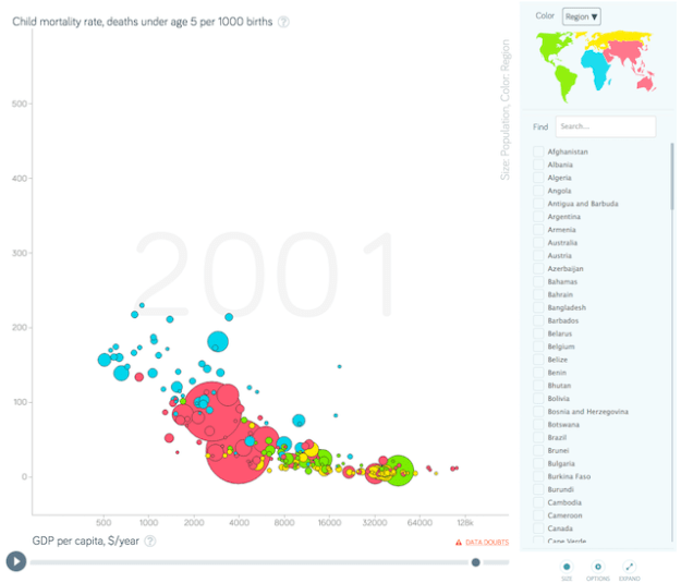
gapminder

Andy Kirk: Trust is hard to earn but easy to lose so ensuring your work is trustworthy is of paramount importance. Truthfulness and accuracy should be an obligation. Continue reading

If the Daily Mail ‘steals’ your visualisation, they’re giving you publishing permission on their site

Nathan Yau has written about the Daily Mail using his data visualisation without permission. It’s not the first time this has happened, nor even the second.

One of my former Telegraph trainees Raziye Akkoc had the same experience when her world map of immigration was embedded in a Daily Mail article.

Continue reading

5 great data visualisation pieces from outside the newsroom

Some of the most interesting examples of journalistic data visualisation come not from newsrooms, but from creative agencies or companies. In a post first published on her datavis blog Dinfografia, Maria Crosas Batista outlines 5 of the best examples:

1. The Refugee Project

The Refugee Project GIF

Interactive map designed by Hyperakt & Ekene Ijeoma about refugees’ migrations since 1975. It includes historical explanations of some large movements and events to contextualise them. Continue reading

This simple piece of visualisation will have you rethinking what you know about impact and mobile

deadworkers

It’s not often I encounter a piece of data journalism which solves a common problem in the field – and it’s even rarer to find a piece of work which tackles two.

But that’s just what lean data journalism Ampp3d did last week when it published a piece of visualisation on the deaths of construction workers in Qatar.

The two problems? Creating impact on mobile – and making big numbers meaningful. Continue reading

Data visualisation training

If you’re interested in data visualisation I’m delivering a training course on November 7 with the excellent Caroline Beavon. Here’s what we’re covering:

  • Pick the right chart for your story – against a deadline
  • Mapping tricks and techniques: using Fusion Tables and other tools to map Olympic torchbearers
  • Picking the right data to visualise
  • Visualisation tips for free chart tools
  • Avoiding common visualisation mistakes
  • Create an infographic with Tableau and Illustrator
  • Making data interactive

More details here. Places can be booked here.