
Data visualisation experts Andy Kirk and Cole Nussbaumer Knaflic – judges in this year’s Kantar Information is Beautiful Awards 2016 – have given OJB 5 tips to help those who want to sharpen up their own data science skills. Here they are:
1. Trust is paramount
Andy Kirk: Trust is hard to earn but easy to lose so ensuring your work is trustworthy is of paramount importance. Truthfulness and accuracy should be an obligation.
Trustworthiness is about being transparent: giving readers all the information they need in order to feel confident about what they’re reading and what interpretations are legitimate. This example demonstrates a visualisation that goes out of its way to acknowledge and highlight legitimate doubts that might exist with the data
2. Keep your audience in mind
https://twitter.com/albertocairo/status/789154939163607040
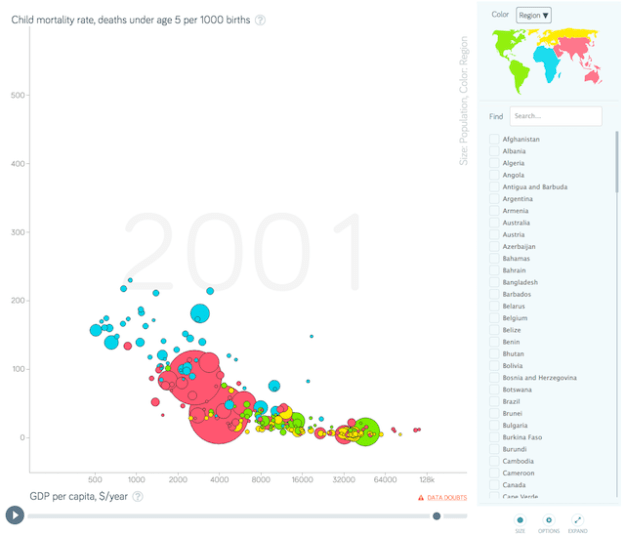
Cole Nussbaumer Knaflic: You are creating a data visualization because you want to communicate something to someone; keep that someone at the top of your mind throughout the design process.
Use visual cues (size, color, placement on page) to help direct your audience’s eye and provide signals on what to pay attention to.
An easy test is to show your visual to a colleague who has limited context and let them tell you how they process the information (where they focus, what observations they make). This is a good proxy for your audience, so if they aren’t paying attention to the right things, revisit the design.
3. Make reasonable demands of users

Andy Kirk: Accessible visualisation design is about making sure that the efforts you ask of your readers is proportional to the task you set them to make sense of the visualisation.
Some visualisations need to be quick and simple, for others it may be reasonable to offer a more prolonged task to make sense of a more complex subject or display.
The key is to provide readers with the most efficient pathway to the thing you want them to find. In this example, the rise of right wing parties across European elections is the main editorial component of interest and so the visualisation is designed – through the emphasis in red of these parties – to enable this point to come to the surface as efficiently as possible
4. Use colour strategically
Cole Nussbaumer Knaflic: The use of colour should always be an explicit decision. Use colour sparingly and strategically to highlight the important parts of your visual: colour is a strong visual cue to help your audience understand where they should focus their attention.
In general, aim to use a colour palette of shades of grey with pointed use of color. Around 10% of people are colorblind, which typically means difficulty distinguishing between shades of red and shades of green, so keep this in mind in your design.
5. Aim for elegance
Andy Kirk: Elegance is a hard thing to describe and articulate: you notice when it is missing perhaps more than when it is present – but it is certainly a key endeavour in visualisation design. It is a quality that you can find with design features that feel seamless: uninterrupted, avoiding unnecessary obstacles.
There is something elegant in this piece (shown above) in the way that the explanation features – that would normally be partitioned in a legend box – are seamlessly integrated into the introduction text allowing the brain to learn about the meaning of these visual attributes just as they are reading about the background to the project.
You can see the winning entries in the 2016 Information is Beautiful awards here.

Reblogged this on Matthews' Blog.
Pingback: The most-read posts on Online Journalism Blog — and on Medium — in 2016 | Online Journalism Blog
Pingback: Learn How To Blog Site Smarter With These Tips – Rank Greater In Your Organisation