Monthly Archives: January 2012

Twitter’s ‘censorship’ is nothing new – but it is different

Over the weekend thousands of Twitter users boycotted the service in protest at the announcement that the service will begin withholding tweets based on the demands of local governments and law enforcement.

Protesting against censorship is laudable, but it is worth pointing out that most online services already do the same, whether it’s Google’s Orkut; Apple removing apps from its store; or Facebook disabling protest groups.

Evgeny Morozov’s book The Net Delusion provides a good indicative list of examples:

“In the run-up to the Olympic torch relay passing through Hong Kong in 2008, [Facebook] shut down several groups, while many pro-Tibetan activists had their accounts deactivated for “persistent misuse of the site … Twitter has been accused of silencing online tribute to the 2008 Gaza War. Apple has been bashed for blocking Dalai Lama–related iPhone apps from its App Store for China … Google, which owns Orkut, a social network that is surprisingly popular in India, has been accused of being too zealous in removing potentially controversial content that may be interpreted as calling for religious and ethnic violence against both Hindus and Muslims.”

What’s notable about the Twitter announcement is that it suggests that censorship will be local rather than global, and transparent rather than secret. Techdirt have noted this, and Mireille Raad explains the distinction particularly well:

  • “Censorship is not silent and will not go un-noticed like most other censoring systems
  • The official twitter help center article includes the way to bypass it – simply – all you have to do is change your location to another country and overwrite the IP detection.
    Yes, that is all, and it is included in the help center
  • Quantity – can you imagine a govt trying to censor on a tweet by tweet basis a trending topic like Occupy or Egypt or Revolution – the amount of tweets can bring up the fail whale despite the genius twitter architecture , so imagine what is gonna happen to a paper work based system.
  • Speed – twitter, probably one of the fastest updating systems online –  and legislative bodies move at glaringly different speeds – It is impossible for a govt to be able to issue enough approval for a trending topic or anything with enough tweets/interest on.
  • Curiosity kills the cat  and with such an one-click-bypass process, most people will become interested in checking out that “blocked” content. People are willing to sit through endless hours of tech training and use shady services to access blocked content – so this is like doing them a service.”

I’m also reminded of Ethan Zuckerman’s ‘Cute Cats Theory’ of censorship and revolution, as explained by Cory Doctorow:

“When YouTube is taken off your nation’s internet, everyone notices, not just dissidents. So if a state shuts down a site dedicated to exposing official brutality, only the people who care about that sort of thing already are likely to notice.

“But when YouTube goes dark, all the people who want to look at cute cats discover that their favourite site is gone, and they start to ask their neighbours why, and they come to learn that there exists video evidence of official brutality so heinous and awful that the government has shut out all of YouTube in case the people see it.”

What Twitter have announced (and since clarified) perhaps makes this all-or-nothing censorship less likely, but it also adds to the ‘Don’t look at that!’ effect. The very act of censorship, online, can create a signal that is counter-productive. As journalists we should be more attuned to spotting those signals.

A lesson in UGC, copyright, and the law (again)

Terence Eden filmed the above video demonstrating O2’s phone security flaw. He put it on YouTube with the standard copyright licence. And someone at Sky News ignored that when they used it without permission. But what’s interesting about Terence’s blog post about the experience is the legal position that Sky then negotiated from – an experience that journalism students, journalists and hyperlocal bloggers can learn from.

Here is what Sky came back with after negotiations stalled when Eden invoked copyright law in asking for £1500 for using his video (“£300 for the broadcast of the video [based on NUJ rates …] £400 for them failing to ask permission, another £400 for them infringing my copyright, and then £400 for them violating my moral rights.”):

“After consulting with our Sky lawyers our position is that we believe a £300 settlement is a fair and appropriate sum.
“Our position is:

  • The £300 is in respect of what you describes as “infringement of copyright” rather than any “union rate”;
  • Contrary to what you claim, we did not act as if you had assigned us all rights. Specifically, we did not claim ownership nor seek to profit from it by licensing to others;
  • Criminal liability will not attach in relation to an inadvertent use of footage;
  • English law does not recognise violation of moral rights;
  • There is no authority that an infringement in these circumstances attracts four times the usual licence fee. To the contrary, the usual measure is what the reasonable cost of licensing would have been.”

This sounds largely believable – particularly as Sky were “very quick” to take the infringing content down. That would be a factor in any subsequent legal case.

Notably, the Daily Mail example he quotes – where the newspaper reportedly paid £2000 for 2 images – included an email exchange where the photographer explicitly refuses the website permission to reproduce his photographs, and a period of time when the images remained online after he had complained.

These are all factors to consider whichever side of the situation you end up in.

PS: Part of Eden’s reason for pursuing Sky over their use of his video was the company’s position in pursuing “a copyright maximalist agenda” which Eden believes is damaging to the creative industries. He points out that:

“The Digital Economy Act doesn’t allow me to sue Sky News for distributing my content for free without my permission. An individual can lose their Internet access for sharing a movie, however there don’t seem to be any sanctions against a large company for sharing my copyrighted work without permission.”

An interesting point.

The £10,000 question: who benefits most from a tax threshold change?

UPDATE [Feb 14 2012]: Full Fact picked up the challenge and dug into the data:

“The crucial difference is in methodology – while the TPA used individuals as its basis, the IFS used households as provided by the Government data.

“This led to substantially different conclusions. The IFS note that using household income as a measure demonstrates increased gains for households with two or more earners. As they state:

“”families with two taxpayers would gain more than families with one taxpayer, who tend to be worse off. Thus, overall, better-off families (although not the very richest) would tend to gain most in cash terms from this reform…””

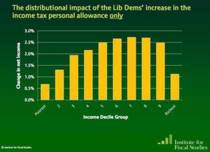
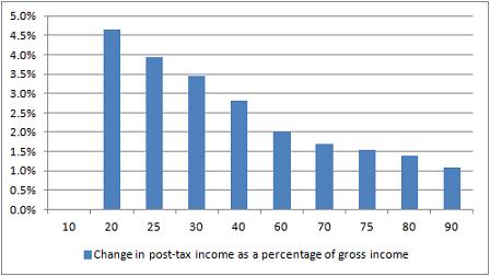
Here’s a great test for eagle-eyed journalists, tweeted by Guardian’s James Ball. It’s a tale of two charts that claim to show the impact of a change in the income tax threshold to £10,000. Here’s the first:

Change in post-tax income as a percentage of gross income

And here’s the second:

Net impact of income tax threshold change on incomes - IFS

So: same change, very different stories. In one story (Institute for Fiscal Studies) it is the the wealthiest that appear to benefit the most; but in the other (Taxpayers’ Alliance via Guido Fawkes) it’s the poorest who are benefiting.

Did you spot the difference? The different y axis is a slight clue – the first chart covers a wider range of change – but it’s the legend that gives the biggest hint: one is measuring change as a percentage of gross income (before, well, taxes); the other as a change in net income (after tax).

James’s colleague Mary Hamilton put it like this: “4.5% of very little is of course much less than 1% of loads.” Or, more specifically: 4.6% of £10,853 (the second decile mentioned in Fawkes’ post) is £499.24; 1.1% of £47,000 (the 9th decile according to the same ONS figures) is £517. (Without raw data, it’s hard to judge what figures are being used – if you include earnings over that £47k marker then it changes things, for example, and there’s no link to the net earnings).

In a nutshell, like James, I’m not entirely sure why they differ so strikingly. So, further statistical analysis welcome.

UPDATE: Seems a bit of a Twitter fight erupted between Guido Fawkes and James Ball over the source of the IFS data. James links to this pre-election document containing the chart and this one on ‘Budget 2011’. Guido says the chart’s “projections were based on policy forecasts that didn’t pan out”. I’ve not had the chance to properly scrutinise the claims of either James or Guido. I’ve also yet to see a direct link to the Taxpayers’ Alliance data, so that is equally in need of unpicking.

In this post, however, my point isn’t to do with the specific issue (or who is ‘right’) but rather how it can be presented in different ways, and the importance of having access to the raw data to ‘unspin’ it.

A new Scottish datablog (and a treemap in Liverpool)

The Scotsman has a newish data blog, set up (I’m rather proud to say) by one of my former PA/Telegraph trainees: Jennifer O’Mahony. This is particularly important as so much data covered in the ‘national’ press tends to be English-only due to devolution.

The Department of Education, for example, only publishes English education data. If you want Scottish education data you need to go to the Scottish Government website or Education ScotlandOfsted inspects schools in England; for Scottish schools reports you need to visit HM Inspectorate of Education. (Meanwhile, the National Statistics site, publishes data from England, Scotland, Wales and Northern Ireland).

So if there’s any Scottish data – or that of Wales or Northern Ireland – that you want me to help with, let me or Jennifer know. By way of illustrating the process, here’s a post over on Help Me Investigate: Education on how I helped Jennifer collect data on free school meals in Scotland.

A treemap in Liverpool

On the same note of non-national data journalism, here’s a particularly nice bit of data visualisation at the Liverpool Post. It’s not often you see treemaps on a local newspaper website – this one was designed by Ilan Sheady based on data gathered by City Editor David Bartlett after a day’s data journalism training.

Infographic showing the huge scale of the £5.5bn Liverpool Waters scheme


Word cloud or bar chart?

Bar charts preferred over word clouds

One of the easiest ways to get someone started on data visualisation is to introduce them to word clouds (it also demonstrates neatly how not all data is numerical).

Using tools like Wordle and Tagxedo, you can paste in a major speech and see it visualised within a minute or so.

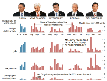
But is a word cloud the best way of visualising speeches? The New York Times appear to think otherwise. Their visualisation (above) comparing President Obama’s State of the Union address and speeches by Republican presidential candidates chooses to use something far less fashionable: the bar chart.

Why did they choose a bar chart? The key is the purpose of the chart: comparison. If your objective is to capture the spirit of a speech, or its key themes, then a word cloud can still work well, if you clean the data (see this interactive example that appeared on the New York Times in 2009).

But if you want to compare it to speeches of others – and particularly if you want to compare on specific issues such as employment or tax – then bar charts are a better choice. Compare, for example, ReadWriteWeb’s comparison of inaugural speeches, and how effective that is compared to the bar charts.

In short, don’t always reach for the obvious chart type – and be clear what you’re trying to communicate.

UPDATE: More criticism of word clouds by New York Times software architect here (via Harriet Bailey)

Obama inaugural speech word cloud by ReadWriteWeb

Obama inaugural speech word cloud by ReadWriteWeb

via Flowing Data

Report: Social Media and News

Report: Social Media and NewsLast year I was commissioned to write a report on ‘Social Media and News’ for the Open Society Media Program, as part of the ‘Mapping Digital Media’ series. The report is now available here (PDF).

As I say in the introduction, I focused on “the areas that are most strongly contested and hold the most importance for the development of news reporting”, namely:

  • competition over copyright between individuals, news organisations, and social media platforms;
  • the move to hyperlocal and international-scope publishing;
  • the tensions between privacy and freedom of speech; and
  • attempts by governments and corporations to control what happens online.

These and other developments (such as the growth of APIs which “connect the information that we consume with the information we increasingly embody”) are then explored with specific reference to issues of editorial independence, public interest and public service, pluralism and diversity, accountability, and freedom of expression.

That’s quite a lot to cover in 4,000 words. So for those who want to explore some of the issues or cases in more detail – or follow recent updates (and a lot has happened even since finishing the report) – I’ve been collecting related links at this Delicious ‘stack’, and on an ongoing basis at this tag.

Data journalism awards

Yesterday saw the launch of the first (surprisingly) international data journalism awards, backed by the European Journalism Centre*, Google, and the Global Editors Network.

There are 6 awards – 3 categories, each split into national/international and local/regional subcategories: investigative journalism; visualisation; and apps.

Each comes with prize money of 7,500 euros.

The closing date for entries is April 10. It’s particularly good to see a jury and pre-jury that isn’t dominated by Anglo-American traditional media, so if your work is unconventionally innovative it stands a decent chance of making it through. There’s also no specification on where your work is published, so students and independent journalists can enter.

The one thing I’d like to see in future years is the ‘visualisation and storytelling’ category expanded to include non-visual storytelling – there’s a tendency to reach for visualisation as a way to communicate data when other methods could be just as, or more, engaging.

*Declaration of interest: I am on the editorial board for the EJC’s Data Driven Journalism project.

Comment call: Objectivity and impartiality – a newsroom policy for student projects

I’ve been updating a newsroom policy guide for a project some of my students will be working on, with a particular section on objectivity and impartiality. As this has coincided with the debate on fact-checking stirred by the New York Times public editor Arthur Brisbane, I thought I would reproduce the guidelines here, and invite comments on whether you think it hits the right note:

Objectivity and impartiality: newsroom policy

Objectivity is a method, not an element of style. In other words:

  • Do not write stories that give equal weight to each ‘side’ of an argument if the evidence behind each side of the argument is not equal. Doing so misrepresents the balance of opinions or facts. Your obligation is to those facts, not to the different camps whose claims may be false.
  • Do not simply report the assertions of different camps. As a journalist your responsibility is to check those assertions. If someone misrepresents the facts, do not simply say someone else disagrees, make a statement along the lines of “However, the actual wording of the report…” or “The official statistics do not support her argument” or “Research into X contradict this.” And of course, link to that evidence and keep a copy for yourself (which is where transparency comes in).

Lazy reporting of assertions without evidence is called the ‘View From Nowhere’ – you can read Jay Rosen’s Q&A or the Wikipedia entry, which includes this useful explanation:

“A journalist who strives for objectivity may fail to exclude popular and/or widespread untrue claims and beliefs from the set of true facts. A journalist who has done this has taken The View From Nowhere. This harms the audience by allowing them to draw conclusions from a set of data that includes untrue possiblities. It can create confusion where none would otherwise exist.”

Impartiality is dependent on objectivity. It is not (as subjects of your stories may argue) giving equal coverage to all sides, but rather promising to tell the story based on objective evidence rather than based on your own bias or prejudice. All journalists will have opinions and preconceived ideas of what a story might be, but an impartial journalist is prepared to change those opinions, and change the angle of the story. In the process they might challenge strongly-held biases of the society they report on – but that’s your job.

The concept of objectivity comes from the sciences, and this provides a useful guideline: scientists don’t sit between two camps and repeat assertions without evaluating them. They identify a claim (hypothesis) and gather the evidence behind it – both primary and secondary.

Claims may, however, already be in the public domain and attracting a lot of attention and support. In those situations reporting should be open about the information the journalist does not have. For example:

  • “His office, however, were unable to direct us to the evidence quoted”, or
  • “As the report is yet to be published, it is not possible to evaluate the accuracy of these claims”, or
  • “When pushed, X could not provide any documentation to back up her claims”.

Thoughts?

Sockpuppetry and Wikipedia – a PR transparency project

Wikipedia image by Octavio Rojas

Wikipedia image by Octavio Rojas

Last month you may have read the story of lobbyists editing Wikipedia entries to remove criticism of their clients and smear critics. The story was a follow-up to an undercover report by the Bureau of Investigative Journalism and The Independent on claims of political access by Bell Pottinger, written as a result of investigations by SEO expert Tim Ireland.

Ireland was particularly interested in reported boasts by executives that they could “manipulate Google results to ‘drown out’ negative coverage of human rights violations and child labour”. His subsequent digging resulted in the identification of a number of Wikipedia edits made by accounts that he was able to connect with Bell Pottinger, an investigation by Wikipedia itself, and the removal of edits made by suspect accounts (also discussed on Wikipedia itself here).

This month the story reverted to an old-fashioned he-said-she-said report on conflict between Wikipedia and the PR industry as Jimmy Wales spoke to Bell Pottinger employees and was criticised by co-founder Tim (Lord) Bell.

More insightfully, Bell’s lack of remorse has led Tim Ireland to launch a campaign to change the way the PR industry uses Wikipedia, by demonstrating directly to Lord Bell the dangers of trying to covertly shape public perception:

“Mr Bell needs to learn that the age of secret lobbying is over, and while it may be difficult to change the mind of someone as obstinate as he, I think we have a jolly good shot at changing the landscape that surrounds him in the attempt.

“I invite you to join an informal lobbying group with one simple demand; that PR companies/professionals declare any profile(s) they use to edit Wikipedia, name and link to them plainly in the ‘About Us’ section of their website, and link back to that same website from their Wikipedia profile(s).”

The lobbying group will be drawing attention to Bell Pottinger’s techniques by displacing some of the current top ten search results for ‘Tim Bell’ (“absurd puff pieces”) with “factually accurate and highly relevant material that Tim Bell would much rather faded into the distance” – specifically, the contents of an unauthorised biography of Bell, currently “largely invisible” to Google.

Ireland writes that:

“I am hoping that the prospect of dealing with an unknown number of anonymous account holders based in several different countries will help him to better appreciate his own position, if only to the extent of having him revise his policy on covert lobbying.”

…and from there to the rest of the PR industry.

It’s a fascinating campaign (Ireland’s been here before, using Google techniques to demonstrate factual inaccuracies to a Daily Mail journalist) and one that we should be watching closely. The PR industry is closely tied to the media industry, and sockpuppetry in all its forms is something journalists should do more than merely complain about.

It also highlights again how distribution has become a role of the journalist: if a particular piece of public interest reporting is largely invisible to Google, we should care about it.

UPDATE: See the comments for further exploration of the issues raised by this, in particular: if you thought someone had edited a Wikipedia entry to promote a particular cause or point of view, would you seek to correct it? Is that what Tim Ireland is doing here, but on the level of search results?

SFTW: Scraping data with Google Refine

For the first Something For The Weekend of 2012 I want to tackle a common problem when you’re trying to scrape a collection of webpage: they have some sort of structure in their URL like this, where part of the URL refers to the name or code of an entity:

  1. http://www.ltscotland.org.uk/scottishschoolsonline/schools/freemealentitlement.asp?iSchoolID=5237521
  2. http://www.ltscotland.org.uk/scottishschoolsonline/schools/freemealentitlement.asp?iSchoolID=5237629
  3. http://www.ltscotland.org.uk/scottishschoolsonline/schools/freemealentitlement.asp?iSchoolID=5237823

In this instance, you can see that the URL is identical apart from a 7 digit code at the end: the ID of the school the data refers to.

There are a number of ways you could scrape this data. You could use Google Docs and the =importXML formula, but Google Docs will only let you use this 50 times on any one spreadsheet (you could copy the results and select Edit > Paste Special > Values Only and then use the formula a further 50 times if it’s not too many – here’s one I prepared earlier).

And you could use Scraperwiki to write a powerful scraper – but you need to understand enough coding to do so quickly (here’s a demo I prepared earlier).

A middle option is to use Google Refine, and here’s how you do it.

Assembling the ingredients

With the basic URL structure identified, we already have half of our ingredients. What we need  next is a list of the ID codes that we’re going to use to complete each URL.

An advanced search for “list seed number scottish schools filetype:xls” brings up a link to this spreadsheet (XLS) which gives us just that.

The spreadsheet will need editing: remove any rows you don’t need. This will reduce the time that the scraper will take in going through them. For example, if you’re only interested in one local authority, or one type of school, sort your spreadsheet so that you can delete those above or below them.

Now to combine  the ID codes with the base URL.

Bringing your data into Google Refine

Open Google Refine and create a new project with the edited spreadsheet containing the school IDs.

At the top of the school ID column click on the drop-down menu and select Edit column > Add column based on this column…

In the New column name box at the top call this ‘URL’.

In the Expression box type the following piece of GREL (Google Refine Expression Language):

http://www.ltscotland.org.uk/scottishschoolsonline/schools/freemealentitlement.asp?iSchoolID=”+value

(Type in the quotation marks yourself – if you’re copying them from a webpage you may have problems)

The ‘value’ bit means the value of each cell in the column you just selected. The plus sign adds it to the end of the URL in quotes.

In the Preview window you should see the results – you can even copy one of the resulting URLs and paste it into a browser to check it works. (On one occasion Google Refine added .0 to the end of the ID number, ruining the URL. You can solve this by changing ‘value’ to value.substring(0,7) – this extracts the first 7 characters of the ID number, omitting the ‘.0’) UPDATE: in the comment Thad suggests “perhaps, upon import of your spreadsheet of IDs, you forgot to uncheck the importer option to Parse as numbers?”

Click OK if you’re happy, and you should have a new column with a URL for each school ID.

Grabbing the HTML for each page

Now click on the top of this new URL column and select Edit column > Add column by fetching URLs…

In the New column name box at the top call this ‘HTML’.

All you need in the Expression window is ‘value’, so leave that as it is.

Click OK.

Google Refine will now go to each of those URLs and fetch the HTML contents. As we have a couple thousand rows here, this will take a long time – hours, depending on the speed of your computer and internet connection (it may not work at all if either isn’t very fast). So leave it running and come back to it later.

Extracting data from the raw HTML with parseHTML

When it’s finished you’ll have another column where each cell is a bunch of HTML. You’ll need to create a new column to extract what you need from that, and you’ll also need some GREL expressions explained here.

First you need to identify what data you want, and where it is in the HTML. To find it, right-click on one of the webpages containing the data, and search for a key phrase or figure that you want to extract. Around that data you want to find a HTML tag like <table class=”destinations”> or <div id=”statistics”>. Keep that open in another window while you tweak the expression we come onto below…

Back in Google Refine, at the top of the HTML column click on the drop-down menu and select Edit column > Add column based on this column…

In the New column name box at the top give it a name describing the data you’re going to pull out.

In the Expression box type the following piece of GREL (Google Refine Expression Language):

value.parseHtml().select(“table.destinations”)[0].select(“tr”).toString()

(Again, type the quotation marks yourself rather than copying them from here or you may have problems)

I’ll break down what this is doing:

value.parseHtml()

parse the HTML in each cell (value)

.select(“table.destinations”)

find a table with a class (.) of “destinations” (in the source HTML this reads <table class=”destinations”>. If it was <div id=”statistics”> then you would write .select(“div#statistics”) – the hash sign representing an ‘id’ and the full stop representing a ‘class’.

[0]

This zero in square brackets tells Refine to only grab the first table – a number 1 would indicate the second, and so on. This is because numbering (“indexing”) generally begins with zero in programming.

.select(“tr”)

Now, within that table, find anything within the tag <tr>

.toString()

And convert the results into a string of text.

The results of that expression in the Preview window should look something like this:

<tr> <th></th> <th>Abbotswell School</th> <th>Aberdeen City</th> <th>Scotland</th> </tr> <tr> <th>Percentage of pupils</th> <td>25.5%</td> <td>16.3%</td> <td>22.6%</td> </tr>

This is still HTML, but a much smaller and manageable chunk. You could, if you chose, now export it as a spreadsheet file and use various techniques to get rid of the tags (Find and Replace, for example) and split the data into separate columns (the =SPLIT formula, for example).

Or you could further tweak your GREL code in Refine to drill further into your data, like so:

value.parseHtml().select(“table.destinations”)[0].select(“td”)[0].toString()

Which would give you this:

<td>25.5%</td>

Or you can add the .substring function to strip out the HTML like so (assuming that the data you want is always 5 characters long):

value.parseHtml().select(“table.destinations”)[0].select(“td”)[0].toString().substring(5,10)

When you’re happy, click OK and you should have a new column for that data. You can repeat this for every piece of data you want to extract into a new column.

Then click Export in the upper right corner and save as a CSV or Excel file.

More on how this data was used on Help Me Investigate Education.