Tag Archives: bar charts

Word cloud or bar chart?

Bar charts preferred over word clouds

One of the easiest ways to get someone started on data visualisation is to introduce them to word clouds (it also demonstrates neatly how not all data is numerical).

Using tools like Wordle and Tagxedo, you can paste in a major speech and see it visualised within a minute or so.

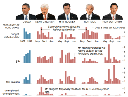
But is a word cloud the best way of visualising speeches? The New York Times appear to think otherwise. Their visualisation (above) comparing President Obama’s State of the Union address and speeches by Republican presidential candidates chooses to use something far less fashionable: the bar chart.

Why did they choose a bar chart? The key is the purpose of the chart: comparison. If your objective is to capture the spirit of a speech, or its key themes, then a word cloud can still work well, if you clean the data (see this interactive example that appeared on the New York Times in 2009).

But if you want to compare it to speeches of others – and particularly if you want to compare on specific issues such as employment or tax – then bar charts are a better choice. Compare, for example, ReadWriteWeb’s comparison of inaugural speeches, and how effective that is compared to the bar charts.

In short, don’t always reach for the obvious chart type – and be clear what you’re trying to communicate.

UPDATE: More criticism of word clouds by New York Times software architect here (via Harriet Bailey)

Obama inaugural speech word cloud by ReadWriteWeb

Obama inaugural speech word cloud by ReadWriteWeb

via Flowing Data

Data journalism pt3: visualising data – charts and graphs (comments wanted)

This is a draft from a book chapter on data journalism (the first, on gathering data, is here; the section on interrogating data is here). I’d really appreciate any additions or comments you can make – particularly around considerations in visualisation. A further section on visualisation tools, can be found here.

UPDATE: It has now been published in The Online Journalism Handbook.

“At their best, graphics are instruments for reasoning about quantitative information. Often the most effective way to describe, explore, and summarize a set of numbers – even a very large set – is to look at pictures of those numbers.” (Edward Tufte, The Visual Display of Quantitative Information, 2001)

Visualisation is the process of giving a graphic form to information which is often otherwise dry or impenetrable. Classic examples of visualisation include turning a table into a bar chart, or a series of percentage values into a pie chart – but the increasing power of both computer analysis and graphic design software have seen the craft of visualisation develop with increasing sophistication. In larger organisations the data journalist may work with a graphic artist to produce an infographic that visualises their story – but in smaller teams, in the initial stages of a story, or when speed is of the essence they are likely to need to use visualisation tools to give form to their data.

Broadly speaking there are two typical reasons for visualising data: to find a story; or to tell one. Quite often, it is both. Continue reading