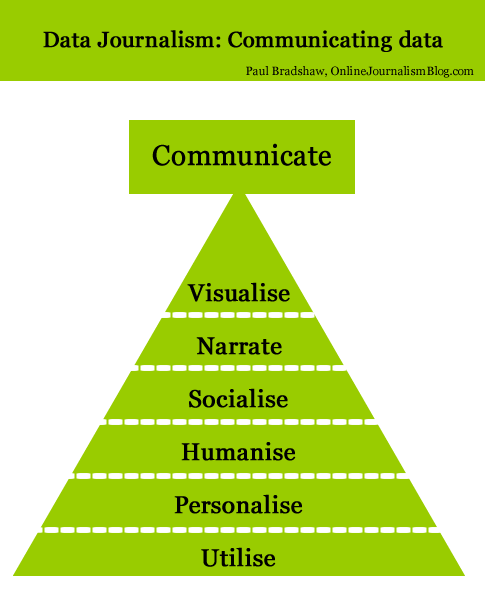
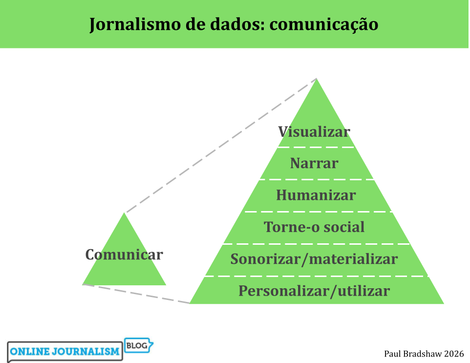
Tag Archives: personalisation

FAQ: Big data and journalism

The latest in the series of Frequently Asked Questions comes from a UK student, who has questions about big data.

How can data journalists make sense of such quantities of data and filter out what’s meaningful?

In the same way they always have. Journalists’ role has always been to make choices about which information to prioritise, what extra information they need, and what information to include in the story they communicate. Continue reading

Reduced Relevance – the downside of social, mobile news

Facebook Activity Plugin

News moves so quickly that your Facebook ‘friends’ just can’t keep up.

In a guest post for OJB, Neil Thurman highlights a new research report that suggests the increased availability of news on mobile platforms, and its harnessing of social networks—like Facebook—to power recommendations, comes at a price: stories that are less relevant to readers’ interests than those recommended by editors and found on news providers’ traditional websites.

Continue reading

6 ways of communicating data journalism (The inverted pyramid of data journalism part 2)

Last week I published an inverted pyramid of data journalism which attempted to map processes from initial compilation of data through cleaning, contextualising, and combining that. The final stage – communication – needed a post of its own, so here it is.

UPDATE: Now in Spanish too.

Below is a diagram illustrating 6 different types of communication in data journalism. (I may have overlooked others, so please let me know if that’s the case.)

Communicate: visualised, narrate, socialise, humanise, personalise, utilise

Modern data journalism has grown up alongside an enormous growth in visualisation, and this can sometimes lead us to overlook different ways of telling stories involving big numbers. The intention of the following is to act as a primer for ensuring all options are considered.
Continue reading

Mapping global events in a local way: BBC Dimensions

BBC Dimensions

This is one of the best BBC projects I’ve seen in a while: Dimensions maps key events, places and things such as the Pakistan floods, the Gulf oil spill and the Afghanistan-Pakistan border – over your postcode.

It’s a simple idea, but hugely effective.

The prototype comes not from the corporation’s News arm – it was commissioned by History. Commissioning Executive for the Multi-Platform Team Max Gadney writes:

“Our challenge was to make it relevant to audiences.

“This is a common desire. Commissioning editors often want stuff ‘made relevant’ – TV producers might translate this as putting a celebrity in it – one we can relate to (Who Do You Think You Are does this very well). How does digital media make something relevant?”

Currently this is a prototype, so feedback is welcomed. I hope that News will be rubbing their hands at the potential applications and making their own suggestions for improvements on those lines.

For once we may be able to stop comparing things to the size of Wales. Unless, of course, you have a Welsh postcode.

Data journalism pt3: visualising data – charts and graphs (comments wanted)

This is a draft from a book chapter on data journalism (the first, on gathering data, is here; the section on interrogating data is here). I’d really appreciate any additions or comments you can make – particularly around considerations in visualisation. A further section on visualisation tools, can be found here.

UPDATE: It has now been published in The Online Journalism Handbook.

“At their best, graphics are instruments for reasoning about quantitative information. Often the most effective way to describe, explore, and summarize a set of numbers – even a very large set – is to look at pictures of those numbers.” (Edward Tufte, The Visual Display of Quantitative Information, 2001)

Visualisation is the process of giving a graphic form to information which is often otherwise dry or impenetrable. Classic examples of visualisation include turning a table into a bar chart, or a series of percentage values into a pie chart – but the increasing power of both computer analysis and graphic design software have seen the craft of visualisation develop with increasing sophistication. In larger organisations the data journalist may work with a graphic artist to produce an infographic that visualises their story – but in smaller teams, in the initial stages of a story, or when speed is of the essence they are likely to need to use visualisation tools to give form to their data.

Broadly speaking there are two typical reasons for visualising data: to find a story; or to tell one. Quite often, it is both. Continue reading

US election coverage – who’s making the most of the web?

Elections bring out the best in online journalism. News organisations have plenty of time to plan, there’s a global audience up for grabs, and the material lends itself to interactive treatment (voter opinions; candidates’ stances on various issues; statistics and databases; constant updates; personalisation).

Not only that, but the electorate is using the internet for election news more than any other medium apart from television (and here are some reasons why).

PaidContent has a good roundup of various UK editors’ views, and decides blogs, Twitter and data are the themes (more specifically, liveblogging and mapping). Continue reading

New York Times + LinkedIn = another step towards personalised news

The New York Times and LinkedIn have entered into a partnership that will see LinkedIn users “shown personalized news targeting their industry verticals … and will then be prompted to share those stories will professional associates.” Meanwhile, NYT readers will see a widget directing them to LinkedIn (see image below). Continue reading

Google granted ‘magazine patent’

From ITproPortal.com:

“Techcrunch and Huomah are reporting that Google is looking into launching a Do It Yourself Publishing Service for Magazines.”The patent abstract says that Google is investigating

“A method includes receiving personalized content from a plurality of content sources. The personalized content is based on user input. The method further includes receiving a personalized advertisement based on user input, and creating a customized publication including the personalized content and the personalized advertisement.””

More here. Thanks to Richard Grimes of the NUJ New Media mailing list for the link.