Tag Archives: data

VIDEO: The 3 chords of data journalism

With just a few basic data journalism techniques you can tell a lot of data journalism stories. I call these the “three chords of data journalism” — a nod to Simon Rogers’s talk on data journalists as the new punks. Those chords are: sorting; filtering; and calculating percentages.

In this third video first made for students on the MA in Data Journalism at Birmingham City University and shared as part of a series of video posts, I walk through how to use those techniques in practice, using gender pay gap data to demonstrate how those techniques can be used to find outliers and potential interviewees; to drill down to a particular category or area in a dataset; and to put figures into context.

VIDEO: Where data journalists get data from

Journalists get hold of data using four broad approaches: it might be newly published or issued; it might be leaked; they might request it; or they might seek it out based on an idea or in reaction to a news event.

In this second short video first made for students on the MA in Data Journalism at Birmingham City University and shared as part of a series of video posts, I go through the different ways that journalists obtain data and the different types of story that those sources can lead to.

VIDEO: What is data journalism — and why is it growing so much?

Data journalism isn’t just about spreadsheets and interactives: in this video from my MA Data Journalism classes at Birmingham City University I look at why the news industry has expanded its focus on data journalism over the past decade, and how thinking about definitions of data journalism can help reporters think more broadly about potential stories and subjects beyond official statistics.

I also look at related terms such as computational journalism, robot journalism and augmented journalism — and what we can learn from those definitions as practitioners.

This is part of a series of videos recorded during the coronavirus pandemic.

Data storytelling done right: 8 easy tips to avoid bad visualisation

tesselationIn a guest post for OJB, Steve Carufel interviews Dutch data journalist Thomas de Beus about visualisation, storytelling — and useful new tools for data journalists.

Data journalism is, among other things, the art of resisting the temptation to show spectacular visualisations that fail to highlight the data behind a story.

Insights and relevant statistics can get lost in visual translation, so Thomas de BeusColourful Facts is a great place to start thinking more about clarity and your audience — and less about spectacular graphic design (although you do not want to forego attractiveness entirely). Continue reading

How to: find the data behind an interactive chart or map using the inspector

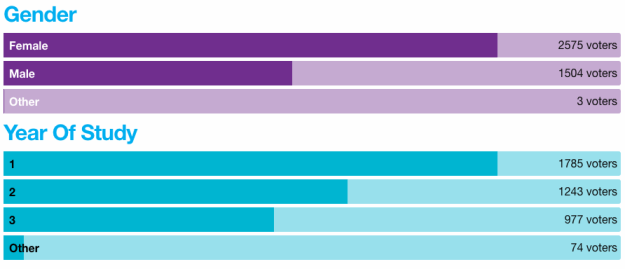
interactive chart on votes by gender and year of study

This interactive chart is generated from some data you can grab

Increasingly you might come across an interesting set of interactive charts from a public body, or an interactive map, and you want to grab the data behind it in order to ask further questions. In many cases you don’t need to do any scraping — you just need to know where to look. In this post I explain how to work out where the data is being fetched from… Continue reading

Vine is gone. Here are 5 great ways it was used for datavis

After Vine’s announcement to discontinue the mobile app in the coming months, Maria Crosas Batista pulled together 5 good stories on data visualisation (first published on her site Dinfografia).

1.Legal vs illegal weapons in the US

2. The evolution of global warming

Continue reading

Press officers to be given data to back up speeches – will journalists be able to interrogate it?

Full Fact report that the Department of Health is to give press officers data so they can field press enquiries about claims made in ministerial speeches:

“An internal ‘data document’ will provide press officers with links to sources for each factual claim made in a speech, as well as contact details for the official or analyst who provided the information.”

It’s an important move, and given that it comes in response to a body  (the UK Statistics Authority) which has also rebuked other arms of government for misusing stats, you might expect other departments to follow.

Of course, it relies on journalists being aware that this exists, being willing to ask for the data, and able to interrogate it (or its author). Another on the list for the case for data literacy.

Leveraging music to help people understand data

In a guest post for OJB, Ion Mates interviews Tom Levine and Roman Heindorff about the role of audio in data journalism.

Audiolisation (sometimes called ‘auralization‘ or ‘sonification’) is the process of turning complex data to sound.

Instead of using graphics and bar charts, one can represent the contents of a spreadsheet by assigning sounds to different kinds of data.

In the above example, the activity of newsrooms is represented by verses, phrases and different rhythms. The author is Thomas Levine.

Beginning to represent data as audio

Tom started playing with computers from an early age. His main interest was to design things towards them being easier to use.

Continue reading

Useful sources of health data – on Help Me Investigate

Last month I spoke to some health reporters from a national broadcaster about my favourite sources of health data. As part of that I wrote a post on Help Me Investigate. I’m cross-posting it here this month as I talk about sources of data on the Data Journalism MOOC:
Continue reading

Journalisme et code : 10 grands principes de programmation expliqués

Cedric Motte asked if he could translate Coding for journalists: 10 programming concepts it helps to understand into French. Here’s the result – first published on NewsResources.

Si vous envisagez de vous mettre à la programmation, il y a de fortes chances que vous butiez sur une série de termes techniques, un jargon qui peut être particulièrement rébarbatif, notamment dans les tutoriels, dont les auteurs ont tendance à oublier que vous êtes inexpérimentés en programmation.

Les sections qui suivent décrivent et indiquent dix concepts que vous êtes susceptible de – non, que vous allez – rencontrer. Continue reading