
This interactive chart is generated from some data you can grab
Increasingly you might come across an interesting set of interactive charts from a public body, or an interactive map, and you want to grab the data behind it in order to ask further questions. In many cases you don’t need to do any scraping — you just need to know where to look. In this post I explain how to work out where the data is being fetched from…
Introducing the Inspector
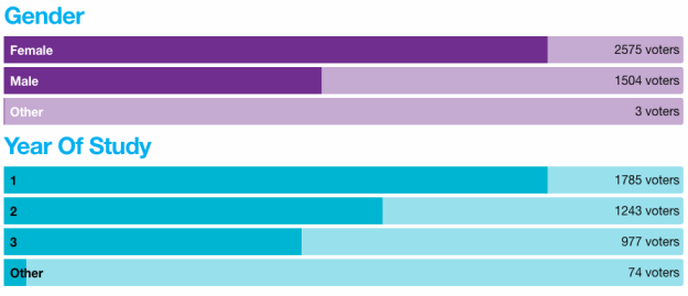
The example I’m using is from a page of charts showing the results from a student union election, broken down in a series of charts by gender, year of study, campus and other categories.
The charts look impressive, but leave some questions unanswered: why does the bar for 2575 female voters take up around 75% of the possible space? Having the original data might help.
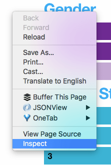
Right click on a page and select Inspect
The first step to identifying the data behind these charts is to open up the ‘inspector‘.
To do this you really need to be using a browser like Chrome, Firefox, or Opera. Once you have the page open in those browsers, the quickest way to open the inspector is to right-click somewhere on the page and select Inspect (on Chrome) or Inspect Element (Firefox and Opera).
If for any reason you cannot do that, you can also open the inspector by going to View > Developer > Developer Tools (in Chrome) or Tools > Developer > Inspector (in Firefox). In Opera you need to make the developer menu visible first by selecting View > Show Developer Menu. Then you can select Developer > Developer Tools.
Got that?
The inspector will take up part of your screen. In most cases it will open up across the bottom, but sometimes it opens up along the right hand edge, or even as a pop up window. This is what it looks like across the bottom:

Note that the inspector has a number of sections: first Elements, then Console; Sources; Network; Timeline; Profiles; Application; Security; and finally Audits. You might not see all of these: in this case a >> button after the last visible one should allow you to see the ones that have been cut off.
If there’s data being loaded into this page, a good place to look is the Network. Click on that ‘tab’ to switch to that view.

To begin with it will be empty. This is because the Network view only starts recording information while it is open.
Refresh the page and see what’s being loaded
If you refresh the page, then, you should see the Network view in the inspector start to fill up with information.
What the Network view is showing you is a list of every file that is loaded by your browser when the page is being accessed. And there will be lots.
Once upon a time a HTML page might have been only that: one HTML file, and nothing more. But most webpages you see now involve all sorts of external scripts, cookies, images, media files — and data.

When refreshed, you should see a list of all the files loaded when the webpage is accessed
This is quite a lot to pick through – but thankfully the Network tab has some extra tabs itself. Just above the results and a bunch of coloured lines (these indicate load times for each file) you should see these options:
- All
- XHR
- JS
- CSS
- Img
- Media
- Font
- Doc
- WS
- Manifest
- Other
Each of these refers to a different type of file. JS, for example, means JavaScript files that end in .js. Img refers to images, Font to fonts and so on.
A good one to check for any data sources is XHR. This actually stands for XML HTTP Request, but that doesn’t matter.

In this case there is only one file that is shown in the XHR tab.
To check that this is the data we are looking for, right-click on the name and select Open in new tab.
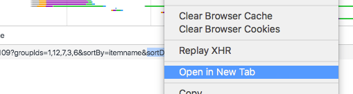
This will open the file in your browser (if you want to see it for yourself, here’s the link).
If it is using the JSON format (which is most likely), then it will probably look a bit like this:

It’s not easy to understand, but there is data in there, trust me.
To make it a bit easier to understand, install the JSONView add-on for Firefox, or for Chrome, or JsonViewer for Opera. With that installed, it will look more like this:

Now at least you can see the different types of data and the way it has been organised.
If you want to know more about how JSON is organised, read my post on Data for journalists: JSON for beginners.
Turning the JSON into something you can work with
That page is the data behind the charts. To get it into Excel or a similar tool, you’ll need to convert it. Thankfully, there are lots of converters online: just search for ‘JSON to CSV converter’ or something similar. Results include this one (you’ll need to copy and paste the JSON), this one (save the webpage with a .json extension first) and this one.
One tool I find very useful for this is Open Refine — and indeed some years back I wrote a tutorial on how to convert JSON (or XML) into a spreadsheet using Open Refine.
Once you’ve got the data, you can do what you want with it. It turns out, for example, that there’s a lot of extra data in the JSON which isn’t in the visualisations, including the percentage of total turnout and the number of non-voters in each category.
An example with data in both CSV and JSON

Here’s a fancier example (shown above) where the data is drawn from two files: one in traditional CSV format and the other in JSON.
Following the same process (opening up the inspector, switching to the Network view, refreshing the page and using the XHR filter) shows two files, which again can be right-clicked and opened/downloaded.

A note on maps
Maps are also often drawn from a dataset which includes the locations and other details for each point that needs to be placed on a map.
One good example to explore is the Sainsbury’s Store Locator. Initially the map is empty, and no JSON is loaded — but conduct a search and you will see extra files loading in the Network view of the Inspector.

In fact, there are quite a lot of files this time — so how do you work out which contain the data? Here are some clues to look for in each column:
- Method: data is typically fetched using GET, not POST
- Type: look for data formats like JSON, CSV or XML
- Size: data files are likely to be the largest ones in the list
- Domain: this gives an indication *where* the data is coming from. If the domain relates to an advertising company it’s probably to do with tracking; if it contains ‘API’ that’s a good sign: APIs are often used to fetch data
- File: sometimes this gives a clue to the information being fetched or asked for. In maps for example you might see ‘lat’ and ‘lng’ for latitude and longitude.
Note that the default settings for any search fetches data (in JSON) for those stores within 10 miles — but change the URL to 100 or 1000 or 10000 and the number of results goes up – you have the whole of the UK!
These are just some examples but if you find others please let me know!
The new edition of Scraping for Journalists includes a chapter explaining how to automatically extract JSON.

Thank you so much!!!! I’ve got csv file by this way!
Pingback: veri madenciliği – dogankent
Very useful a) I found the data I wanted – comments on a public consultation b) it turns out that the data included a whole load of personal info which shouldn’t be publicly accessible, including my own name, address and email address… time to give the people who made the map a call!
Fred
Extremely useful – very clear instructions, and most important of all, it worked. Thank you very much!
Thank you a lot!! As somebody with no special knowledge it was so simple to get the information wanted due to your perfect instruction!