Monthly Archives: March 2018

2018 has been a good year for UK local data journalism — here’s the story so far

Local data journalism in the UK has been undergoing a quiet revolution in the last 12 months, but 2018 in particular has seen a number of landmarks already in its first few months. Here’s some of the highlights in just its first 12 and a half weeks…

January: BBC Shared Data Unit publishes its first secondee-led investigation

The BBC Shared Data Unit had already been producing stories before in late 2017 it took on its first three-month secondees from the news industry. Over the next 12 weeks they received training in data journalism and work on a joint investigation. Continue reading

FAQ: Is UGC more helpful or harmful to journalism?

The latest set of questions in the semi-regular FAQ section on this blog are about UGC, and come from a student at Liverpool John Moores. Here they are…

Is UGC more helpful or harmful to journalism?

Helpful, of course! Journalism has always relied on information and media (photos, video, audio) from readers/the audience and sources. The difference is that we now have access to a much larger amount of that information. Continue reading

“I tried to deal with numbers as professionally as I could. But behind them there were people, and I couldn’t run away from it” — Ferran Morales on visualising refugee data

In a guest post for OJB Maria Crosas interviews Ferran Morales, the journalist behind The Story of Zainab, to understand how he tackled the challenge of processing and visualising data about refugees.

ferran

Ferran Morales showing infographics from Zainab’ story

Ferran Morales is a data journalist and graphic designer at El Mundo Deportivo. In February, with the team at Media Lab Prado, he published The Story of Zainab, a data-driven narrative following an 11-year-old refugee and her family, that had to leave their home in 2011 because of the war in Syria.

The project was created as part of Visualizar 2017, a workshop for prototyping data visualisation projects, and drew on data on refugees.

Continue reading

On International Women’s Day here are 7 data journalism projects about women’s issues

Photo: Pixabay

Women represent 49.5% of the world’s population, but they do not have a corresponding public, political and social influence. In recent years, more and more women have raised their voices, making society aware of their challenges — data journalists included. To commemorate International Women’s Day, Carla Pedret presents a list of data journalism projects that detail the sacrifices, injustices and prejudices that women still have to face in the 21st century.

Continue reading

3 weeks left to enter the Data Journalism Awards

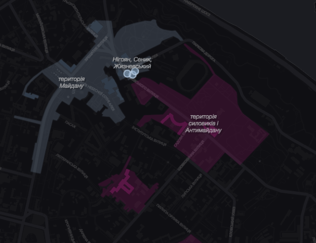
maidan revolution map

One of the projects from last year’s winning portfolio in the young data journalist category

The deadline for the Data Journalism Awards is now just 3 weeks away. One category for educators and young journalists to look out for is the ‘Student and young data journalist of the year‘ which seeks to shine a light “the outstanding work of a new talent in data journalism, for projects done while they are still studying or early in their professional careers.”

The category is open to all data journalists under the age of 27 — but not students over that age (who I’m told should apply for the Best Individual Portfolio category). Submissions can include one or as many as ten pieces of data journalism. Winners get $1801 (the year William Playfair reportedly created the pie chart) and a trophy.

Last year’s winner Yaryna Serkez won for a portfolio that included a reconstruction of the last three days of the Ukraine’s 2014 Maidan revolution, the Snow Fall-esque “Anatomy of the Carpathians“, and a network analysis of pro-Russian trolls on Facebook in Ukraine.

There are also some new categories: Innovation in data journalism, and Best data journalism team. More on the website.


Continue reading