Twitter’s new Spaces feature allows journalists to build a close connection with their audiences while expanding stories coverage. In a guest post for OJB, Catalunya Ràdio’s Carla Pedret shares her tips for using the platform.
Newsrooms face the dilemma of adapting to new platforms so often that it has its own name — the Shiny Object Syndrome. One of the latest in that long, long list of shiny new things for journalists to get to grips with is Twitter Spaces (TWS). Launched in December 2020, it’s a live audio chat streamed through the Twitter app — but should you be using it?
The first questions that anyone should ask before trying the platform are the same as with any new tool:
What kind of users has the platform? Are they an audience we want to connect with?
How is the feature going to help us get closer to our goals?
Have other media outlets used the tool? How? What were the results?
Does the tool need to be updated frequently? How does it fit into the newsroom’s workflow?
Asking those simple questions before deciding the next move is going to be a game-changer in your digital strategy.
Women represent 49.5% of the world’s population, but they do not have a corresponding public, political and social influence. In recent years, more and more women have raised their voices, making society aware of their challenges — data journalists included. To commemorate International Women’s Day, Carla Pedret presentsa list of data journalism projects that detail the sacrifices, injustices and prejudices that women still have to face in the 21st century.
Bombings in Barcelona in 1938 (Image by Italian Airforce under CC)
In a guest post for OJB, Carla Pedret looks at a new data journalism project to catalogue what happened during the Spanish Civil War.
125,000 people died, disappeared or were repressed in the Spanish Civil War (1936-1939) and during the Franco dictatorship, according to historians. Many of their families still do not know, 40 years later, what exactly happened to them.
If you are working with map data that uses the shapes of regions or countries, chances are you’ll need to work with KML. In this guest post (first published on her blog) Carla Pedret explains how you can use the data cleaning tool Open Refine to ‘read’ KML files in order to convert them into other formats (for example to grab the names of places contained in the file).
KML (Keyhole Markup Language) is the default format used by Google’s mapping tool Fusion Tables (Google bought the company which created it in 2004), but it is also used by other mapping tools like CartoDB.
The open source data cleaning tool Open Refine can help you to open, process and convert KML files into other formats in order to, for example, match two datasets (VLOOKUP) or create a new map with the information of the KML file.
What is the difference between XML and KML?
In this post, you will learn how to convert a KML file into XML and download it as aCSV file.
XML – Extensible Markup Language – is a language designed to describe data and it is used in RSS systems.
XML uses tags like HTML, but there is a big difference between both languages. XML defines the structure of the information, whereas HTML focuses on other elements too, including their meaning and arrangement (even when it is not supposed to focus on appearance), and the importing of other code and media.
KML – Keyhole Markup Language – documents are XML files specific for geographical annotations. KML files contain the parameters to add shapes to maps or three-dimensional Earth browsers like Google Earth.
The big advantage of KML files is the users can customize the maps according to their data and without knowing how to code.
Type what you are searching for and add the word geometry or KML.
Open the fusion table and check that it has shapes by looking for a ‘map’ view (normally this has its own tab).
You should be able to download the KML when looking at that map view by selecting File > Download.
Once downloaded, to convert the file, upload your KML in Open Refine (download Open Refine here) and click Next.
In the blue box under your data, select XML files.
Now in the preview you can see the XML file with the structure of the information.
If you want to create a map with your own data and the shapes in the KML file, you need to match the KML with your data.
The example I have used contains the shapes of local authorities in the UK. I want to match the shapes in one dataset (the KML file) with information in another dataset on which party runs each council.
The element both datasets have in common (and therefore the element which will be used to combine them) is the name of the councils. But you need to check that those elements are the same: in other words, are the councils named in exactly the same way in both datasets, including the use of ampersands and other characters?
Have a look at the XML preview and try to find the tags that contain the information you need: in this case, authority names. In the example the tags containing the authority name are <name></name>.
Hover over that element so that you get a dotted box like the one shown below. Click on that rectangle and wait until the process has finished.
You should then see a column or columns as the picture shows.
On the right hand side of the page, change the name of your file and click on Create a new project.
Once created, you now only need to export it. Click on Export and select the format you prefer.
What originally was a KML file is now a filtered list with data ready to check and match against your other dataset.
Do you use Open Refine? Leave a comment with your tips and techniques or send it to me at @Carlapedret..
Podcasts are a great way to listen to stories on the move, be entertained, or keep up with developments in a particular field. However, have you ever thought about using them to learn data journalism?
In this list, I have pulled together some of the best podcasts about data. Some are specifically about data journalism, whereas others approach data from another perspective. Continue reading →
Some of the drones that BBC team brought to the session (Photo: Barbara Maseda)
Drones – also called unmanned aerial systems (UASs) – can provide spectacular views for TV or online video production which would otherwise be unobtainable. When members of a BBC team specially trained to use drones explained in a special BBC Academy Fusion session what factors journalists should take into account when using drones, Online Journalism masters students Carla Pedret and Barbara Maseda (photos)went along. Here are their tips:Continue reading →
Google organised a free workshop on 14 December 2015 in Birmingham focused on how journalists can use technology to improve and complement their stories.
In this post Carla Pedret summarises some tips Google News Lab’sMatt Cooke gave during the event. You can read more about the event using the hashtag #DNRoadShow.
1. Putting ourselves in our audience’s shoes
As journalists we sometimes use words that we think are commonly used by our audience but actually are not.
In addition, one of the biggest difficulties is how to approach a story in a fresh way or a way that is attractive for our readers. Google Trends can give us some clues. Continue reading →
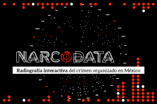
How has Mexico moved from 2 cartels in the 1970s to 9 cartels today? That is the question the Mexican website Animal Político wanted to answer when in January 2015 they started to work on NarcoData, a data journalism project that shows the evolution of 40 years of drug dealing in Mexico, home to the most violent cartels in the world. Carla Pedret reports.
The origin of the project was a document Animal Político journalist Tania Montalvo obtained in October 2014 from the country’s Attorney General’s Office, after a request under the Mexican Freedom of Information law. Continue reading →


 Google organised a free workshop on 14 December 2015 in Birmingham focused on how journalists can use technology to improve and complement their stories.