Monthly Archives: August 2020

Ergodic education: how to avoid “shovelware” when we teach online

A classroom and a zoom call

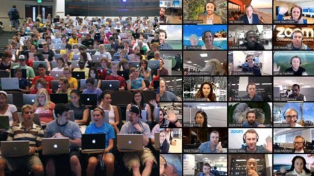
Death by Zoom: are we mistakenly trying to recreate the classroom instead of making something web-native?

A few weeks ago I was invited to talk at an online mini-fest about a ‘big idea’ for the future of online learning. I decided to talk about what I called ergodic education — how concepts from interactivity can be used to inform teaching as learners move online. In this post I talk about some of those concepts and how they can be adopted to a lockdown-era classroom.
Continue reading

3 more angles most often used to tell data stories: explorers, relationships and bad data stories

Scale: 'This is how big an issue is' Change/stasis: ‘This is going up/down/not improving’ Outliers/ranking: ‘The best/worst/where we rank’ Variation: "Postcode lotteries" and distributions Exploration: Tools, simulators, analysis — and art Relationships/debunking: ‘Things are connected’ — or not, networks and flows of power and money Problems & solutions: ‘Concerns over data’, ‘Missing data’, ‘Get the data’

Yesterday I wrote the first of a two-part series on the 7 angles that are used to tell stories about data. In this second part I finish the list with a look at the three less common angles: those stories focusing on relationships; angles that focus on the data itself — its absence, poor quality, or existence — and exploratory stories that often provide an opportunity to get to the grips with the data itself.

Data angle 5. ‘Explore’: tools, interactivity — and art

How Y’all, Youse and You Guys Talk
This New York Times interactive became one of their most-read stories of all time

Exploratory angles are largely web-native. Its selling point is often characterised by a ‘call to action’  like “explore”, “play” or “Take the quiz”. Alternatively, it might sell the comprehensiveness of the analysis in the way that it is “Mapped” or documents “Every X that ever happened”, or simply answers the question “Who/how/where”.

Continue reading

Here are the angles journalists use most often to tell the stories in data

7 common angles for data storie: scale, change, ranking, variation, explore, relationships, bad data, leads

In my data journalism teaching and training I often talk about common types of stories that can be found in datasets — so I thought I would take 100 pieces of data journalism and analyse them to see if it was possible to identify how often each of those story angles is used.

I found that there are actually broadly seven core data story angles. Many incorporate other angles as secondary dimensions in the storytelling (a change story might go on to talk about the scale of something, for example), but all the data journalism stories I looked at took one of these as its lead.

In the first of a two-part series I walk through how the four most common angles can help you identify story ideas, the variety of their execution, and the considerations to bear in mind. Continue reading