Tag Archives: network analysis

Brazilian journalists launch network analysis tool to investigate political relationships

Cruza Grafos

The Brazilian Association of Investigative Journalism (Abraji) has launched an advanced data tool to help journalists research about politicians and companies, reports Beatriz Farrugia

The platform, Cruza Grafos (“Crossing Graphs”), was created by a partnership between Brasil.io and the Google News Initiative

Cruza Grafos (registration required) is an online visual interface where journalists can research political candidates, and relate candidates to companies and entities with an official registration number in Brazil. 

The tool allows journalists to work with huge datasets without any coding.

According to Reinaldo Chaves, Abraji’s project coordinator, many journalists do not know how to code or even how to open a spreadsheet — a situation that makes some investigative projects impossible to happen. 

“We hope the Cruza Grafos makes this kind of investigation easier and democratizes access to huge datasets.”

Continue reading

3 more angles most often used to tell data stories: explorers, relationships and bad data stories

Scale: 'This is how big an issue is' Change/stasis: ‘This is going up/down/not improving’ Outliers/ranking: ‘The best/worst/where we rank’ Variation: "Postcode lotteries" and distributions Exploration: Tools, simulators, analysis — and art Relationships/debunking: ‘Things are connected’ — or not, networks and flows of power and money Problems & solutions: ‘Concerns over data’, ‘Missing data’, ‘Get the data’

Yesterday I wrote the first of a two-part series on the 7 angles that are used to tell stories about data. In this second part I finish the list with a look at the three less common angles: those stories focusing on relationships; angles that focus on the data itself — its absence, poor quality, or existence — and exploratory stories that often provide an opportunity to get to the grips with the data itself.

Data angle 5. ‘Explore’: tools, interactivity — and art

How Y’all, Youse and You Guys Talk
This New York Times interactive became one of their most-read stories of all time

Exploratory angles are largely web-native. Its selling point is often characterised by a ‘call to action’  like “explore”, “play” or “Take the quiz”. Alternatively, it might sell the comprehensiveness of the analysis in the way that it is “Mapped” or documents “Every X that ever happened”, or simply answers the question “Who/how/where”.

Continue reading

A journalist’s introduction to network analysis

David Cameron's network

Channel 4’s Who Knows Who project was an early adopter of network analysis

Network analysis offers enormous potential for journalism: able to tease out controversial connections and curious clusters, and to make visible that which we could not otherwise see, it’s also often about relationships and power.

It is both a data journalism technique and an open source intelligence (OSINT) technique — and yet it is relatively underused in both, most likely because the tools to do network analysis have only become accessible in the last few years.

Here, then, is an introduction for journalists, adapted from my lectures on the MA in Data Journalism at Birmingham City University.

How network analysis is used in journalism

Network analysis is, simply, a way of making relationships between entities visible.

It might be used in journalism to generate or check leads (by showing unusual patterns), to communicate the story itself (i.e. to show those patterns to others) or to allow readers to explore a system. Continue reading

Empathy as an investigative tool: how to map systems to come up with story ideas

Zooming out of a network map of homelessness

By starting from one person you can start to identify the different parts of the systems that affect your topic — and useful story leads and ideas

For the last couple of weeks I’ve been helping students on my MA in Multiplatform and Mobile Journalism and MA in Data Journalism come up with story ideas for specialist reporting and investigations. Part of the process involves an exercise around scoping out a particular subject or system you are interested in — for example, the housing system, or ‘dark kitchens’, the Oscars, or air pollution — and identifying the gaps in your knowledge that can lead to stories.

It’s an exercise where empathy plays a central role.

Here’s how the process works — and why empathy is so important to it. Continue reading

Is this the new swingometer? Network analysis given the broadcast journalism treatment (VIDEO)

The BBC current affairs programme Newsnight delved into network analysis this week. Network analysis generally involves generating diagrams which show clusters of relationships between people: a particularly powerful way of showing everything from power relationships to echo chambers and which people dominate or bridge particular groups of people. Continue reading

FAQ: Big data and journalism

The latest in the series of Frequently Asked Questions comes from a UK student, who has questions about big data.

How can data journalists make sense of such quantities of data and filter out what’s meaningful?

In the same way they always have. Journalists’ role has always been to make choices about which information to prioritise, what extra information they need, and what information to include in the story they communicate. Continue reading

Following the money: making networks visible with HTML5

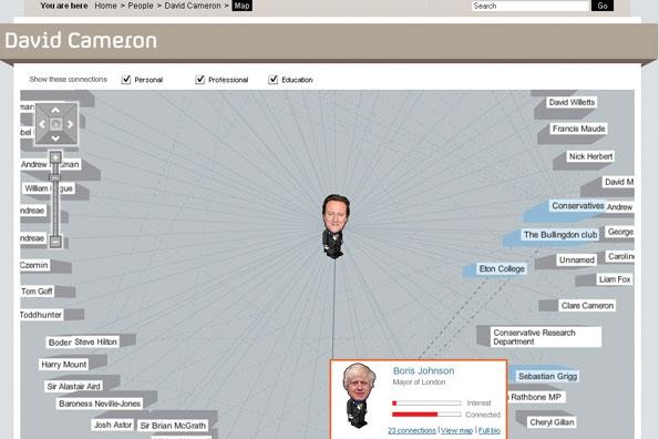
Network analysis – the ability to map connections between people and organisations – is one branch of data journalism which has enormous potential. But it is also an area which has not yet been particularly well explored, partly because of the lack of simple tools with which to do it.

One recent example – AngelsOfTheRight.net – is particularly interesting, because of the way that it is experimenting with HTML5.

The site is attempting to map “relationships among institutions due to the exchange of large quantities of money between them as reported to IRS in a decade of Form 990 tax filings.”

But it’s also attempting to “push the limits” of using HTML5 to create network maps. As this blog post explains:

“This project was built using the NodeViz project […] which wraps up a bunch of the functionality needed to squeeze network ties out of a database, through Graphviz, and into a browser with features like zooming, panning, and full DOM and JavaScript interaction with the rest of the page content. This means that we can do fun things like have a tour to mode a viewer through the map, and have list views of related data alongside the map that will open and focus on related nodes when clicked. It is also supposed to degrade gracefully to just display a clickable image on non-SVG browsers like Internet Explorer 7 and 8.”

HTML5 offers some other interesting possibilities, such as improved search engine optimisation compared to a static image or Flash interactive, although I have no idea how much this project explores that (comments invited).

Also interesting is the discussion section of AngelsOfTheRight.net, which outlines some of the holes in the data, methodological flaws, and ways that the project could be improved:

“In this sort of survey, it is always hard to tell if organizations are missing because they really didn’t make contributions, or just because nobody had time to record the data from their financial statements into the database. Several sources mention the Adolph Coors Foundation as an important funder of the conservative agenda, yet they do not appear in this database. Why not?”

via Pete Warden