During the 2015 UK general election the Trinity Mirror Data Unit created a special interactive tool which allowed readers to find out more about their own constituency. The Find My Seat tool was used across all their titles including the national Mirror newspaper as well as the Liverpool Echo, Birmingham Mail, Manchester Evening News, Newcastle Chronicle and north Wales’s Daily Post. The tool has recently been relaunched for the 2017 election. Patrick Scott (now at the Telegraph) was part of the team behind it — in an interview by Antia Geada, he explains how they did it.
Continue reading
Tag Archives: statistics
A new data journalism tool – and a new way of reporting uncertainty
On the last day of last year, web developer Ozzie Gooen launched his new project Guesstimate, a spreadsheet ‘for things that aren’t certain’.
It is an inspired idea: software plays a key role in shaping what we do, and we take spreadsheets’ certainty about numbers for granted. Why should we?
Throw in journalism’s default dislike of ambiguity and a political tendency to play to that… well, it can all make for some flawed reporting.
I was so impressed with Guesstimate and the opportunities it presents for a new style of data reporting that I sought out Gooen to find out more about the project and how he came to launch it. Continue reading
The BBC’s new statistics role has ended after 18 months. Here’s what the person in that role did
At the end of July this year the BBC ended a quiet experiment that had been going on for the last 18 months: a Head of Statistics role funded initially by the corporation’s innovation fund and then by election coverage money.
Anthony Reuben was the person occupying that role. A business reporter with almost two decades’ experience at the BBC, Reuters, Sky, the Money Channel and the FT, he was helping to design a new statistics course for the BBC College of Journalism when the need for a new role became clear.
“We got to the last slide, which was where to turn for more help. There were plenty of people outside the BBC, but nobody in it who had the time or skills to help with statistical questions. So we applied for a year’s funding from the Innovation Fund.”
What the head of statistics role involved
Once in the role Reuben would sit with the planning team and attend some of the daily news and planning meetings to anticipate big stories which might “set off alarm bells”. Continue reading
The hidden dangers of ethnic minority data in big surveys

Just because a sample is big, doesn’t mean it’s representative of the people you’re looking for. Image by Sreejith K
One of the things reporters should always be careful about when reporting on research or statistics is sample sizes: the smaller sample, the wider the margin for error when generalising to the population as a whole (more on sampling here and here).
But sometimes the sample size is less obvious than you think. Continue reading
Panini sticker albums – a great way to learn programming and statistics
When should you stop buying football stickers? I don’t mean how old should you be – but rather, at what point does the law of diminishing returns mean that it no longer makes sense to buy yet another packet of five stickers?
This was the question that struck me after seeing James Offer‘s ‘How much could it cost to fill a World Cup Sticker Album?‘ Continue reading
“I don’t do maths”: how j-schools teach statistics to journalists
Teresa Jolley reports from a conference for teaching statistics to journalism students
I am not a great ‘numbers’ person, but even I was surprised by the attitudes that journalism lecturers at the Statistics in Journalism conference reported in their students.
‘I don’t do numbers’ and ‘I hate maths’ were depressingly common expressions, perhaps unsurprisingly. People wanting to study journalism enjoy the use of language and rarely expect that numbers will be vital to the stories they are telling.
So those responsible for journalism education have a tricky task. A bit like providing a sweet covering to a nasty-tasting tablet, it was said that lecturers need to be adept at finding ingenious ways to teach a practical and relevant use of numbers without ever mentioning the M (maths) or S (statistics) words. Continue reading
The US election was a wake up call for data illiterate journalists
So Nate Silver won in 50 states; big data was the winner; and Nate Silver and data won the election. And somewhere along the lines some guy called Obama won something, too.
Elections set the pace for much of journalism’s development: predictable enough to allow for advance planning; big enough to justify the budgets to match, they are the stage on which news organisations do their growing up in public.
For most of the past decade, those elections have been about social media: the YouTube election; the Facebook election; the Twitter election. This time, it wasn’t about the campaigning (yet) so much as it was about the reporting. And how stupid some reporters ended up looking. Continue reading
The £10,000 question: who benefits most from a tax threshold change?
UPDATE [Feb 14 2012]: Full Fact picked up the challenge and dug into the data:
“The crucial difference is in methodology – while the TPA used individuals as its basis, the IFS used households as provided by the Government data.
“This led to substantially different conclusions. The IFS note that using household income as a measure demonstrates increased gains for households with two or more earners. As they state:
“”families with two taxpayers would gain more than families with one taxpayer, who tend to be worse off. Thus, overall, better-off families (although not the very richest) would tend to gain most in cash terms from this reform…””
—
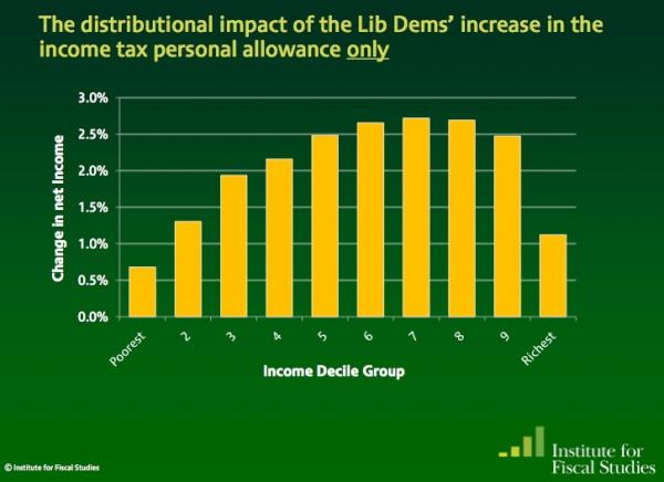
Here’s a great test for eagle-eyed journalists, tweeted by Guardian’s James Ball. It’s a tale of two charts that claim to show the impact of a change in the income tax threshold to £10,000. Here’s the first:
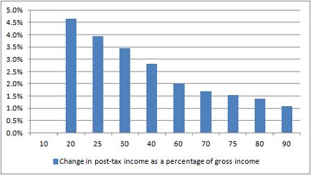
And here’s the second:
So: same change, very different stories. In one story (Institute for Fiscal Studies) it is the the wealthiest that appear to benefit the most; but in the other (Taxpayers’ Alliance via Guido Fawkes) it’s the poorest who are benefiting.
Did you spot the difference? The different y axis is a slight clue – the first chart covers a wider range of change – but it’s the legend that gives the biggest hint: one is measuring change as a percentage of gross income (before, well, taxes); the other as a change in net income (after tax).
James’s colleague Mary Hamilton put it like this: “4.5% of very little is of course much less than 1% of loads.” Or, more specifically: 4.6% of £10,853 (the second decile mentioned in Fawkes’ post) is £499.24; 1.1% of £47,000 (the 9th decile according to the same ONS figures) is £517. (Without raw data, it’s hard to judge what figures are being used – if you include earnings over that £47k marker then it changes things, for example, and there’s no link to the net earnings).
In a nutshell, like James, I’m not entirely sure why they differ so strikingly. So, further statistical analysis welcome.
UPDATE: Seems a bit of a Twitter fight erupted between Guido Fawkes and James Ball over the source of the IFS data. James links to this pre-election document containing the chart and this one on ‘Budget 2011’. Guido says the chart’s “projections were based on policy forecasts that didn’t pan out”. I’ve not had the chance to properly scrutinise the claims of either James or Guido. I’ve also yet to see a direct link to the Taxpayers’ Alliance data, so that is equally in need of unpicking.
In this post, however, my point isn’t to do with the specific issue (or who is ‘right’) but rather how it can be presented in different ways, and the importance of having access to the raw data to ‘unspin’ it.
A quick exercise for aspiring data journalists
The latest Ben Goldacre Bad Science column provides a particularly useful exercise for anyone interested in avoiding an easy mistake in data journalism: mistaking random variation for a story (in this case about some health services being worse than others for treating a particular condition):
“The Public Health Observatories provide several neat tools for analysing data, and one will draw a funnel plot for you, from exactly this kind of mortality data. The bowel cancer numbers are in the table below. You can paste them into the Observatories’ tool, click “calculate”, and experience the thrill of touching real data.
“In fact, if you’re a journalist, and you find yourself wanting to claim one region is worse than another, for any similar set of death rate figures, then do feel free to use this tool on those figures yourself. It might take five minutes.”
By the way, if you want an easy way to get that data into a spreadsheet (or any other table on a webpage), try out the =importHTML formula, as explained on my spreadsheet blog (and there’s an example for this data here).
Statistics as journalism redux: Benford’s Law used to question company accounts
A year and a day ago (which is slightly eerie) I wrote about how one Mexican blogger had used Benford’s Law to spot some unreliable data on drug-related murders being used by the UN and Mexican police.
On Sunday Jialan Wang used the same technique to look at US accounting data on over 20,000 firms – and found that over the last few decades the data has become increasingly unreliable.
“According to Benford’s law,” she wrote, “accounting statements are getting less and less representative of what’s really going on inside of companies. The major reform that was passed after Enron and other major accounting standards barely made a dent.”
She then drilled down into three industries: finance, information technology, and manufacturing, and here’s where it gets even more interesting.
“The finance industry showed a huge surge in the deviation from Benford’s from 1981-82, coincident with two major deregulatory acts that sparked the beginnings of that other big mortgage debacle, the Savings and Loan Crisis. The deviation from Benford’s in the finance industry reached a peak in 1988 and then decreased starting in 1993 at the tail end of the S&L fraud wave, not matching its 1988 level until … 2008.”
She continues:
“The time series for information technology is similarly tied to that industry’s big debacle, the dotcom bubble. Neither manufacturing nor IT showed the huge increase and decline of the deviation from Benford’s that finance experienced in the 1980s and early 1990s, further validating the measure since neither industry experienced major fraud scandals during that period. The deviation for IT streaked up between 1998-2002 exactly during the dotcom bubble, and manufacturing experienced a more muted increase during the same period.”
“Deviations from Benford’s law are [here] compellingly correlated with known financial crises, bubbles, and fraud waves. And overall, the picture looks grim. Accounting data seem to be less and less related to the natural data-generating process that governs everything from rivers to molecules to cities. Since these data form the basis of most of our research in finance, Benford’s law casts serious doubt on the reliability of our results. And it’s just one more reason for investors to beware.”
I love this sort of stuff, because it highlights how important it is for us to question data just as much as we question any other source, while showing just how that can be done.
It also highlights just how central that data often is to key decisions that we and our governments make. Indeed, you might suggest that financial journalists should be doing this sort of stuff routinely if they want to avoid being caught out by the next financial crisis. Oh, as well as environment reporters and crime correspondents.