
Documents and other collections of text can be goldmines for data journalism — if you know how to approach them as data. Here are some techniques and inspiration for your next data project.
From stories about political speech and song lyrics, to street names and social media chatter, data journalists now have a wide range of examples of text-as-data to draw inspiration and guidance from, while tools such as Pinpoint and NotebookLM are making text analysis easier than ever.
I compiled a list of over 200 pieces of data journalism where text or documents were used as sources. Quantification techniques ranged from counting the frequency of a single word and using Google’s ngram viewer, to machine learning and topic modelling.
Looking at those articles it’s clear that, once quantified, journalists tell the same stories about text as any other piece of data: using the seven most common angles.
But how those angles are used — and how often — is where it gets interesting…
Text-based data journalism most often uses an exploratory feature format
While most data stories about numerical data focused on scale or change, the data stories about text I looked at were overwhelmingly dominated by exploratory formats.
There are two obvious possible explanations for this. First, analysing text normally requires more time and skill than working with numerical data. That would be hard to justify for a simpler news article revealing scale or change.
Second, text is often rich and complex, lending itself more to exploration. The analysis itself will often require explanation too, especially if it involves classification.
The Pudding explore political speech through a series of categories. 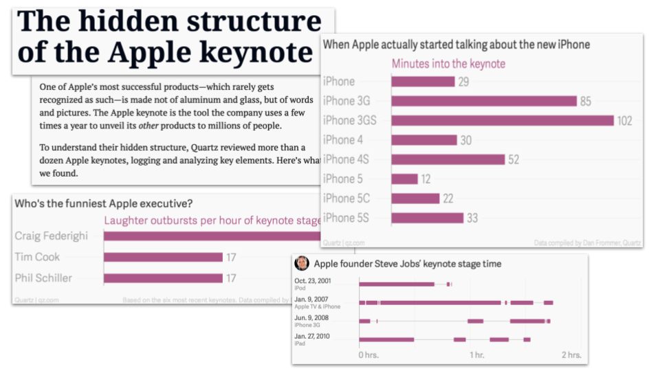
This Quartz feature on Apple keynotes quantifies text in a range of ways
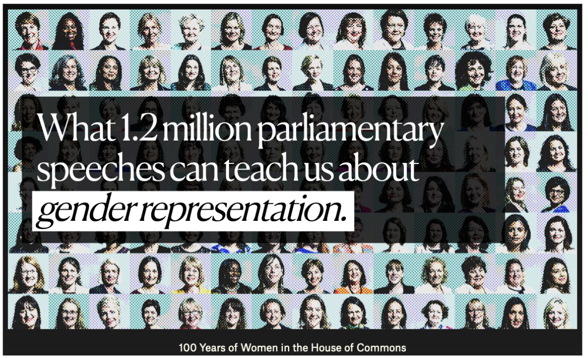
The Pudding‘s scrollytell data feature on speeches in Parliament is a good example of an exploratory approach: text from over a million speeches is classified in two ways: by the gender of the speaker, and by the topic it relates to. It is quantified in terms of the percentage of time that speakers spend on each topic (code is shared in a GitHub repo).
The story explores the data through a number of themes: the economy, welfare, education, and so on. Although the focus is largely on variation between men and women, this is secondary to the primary exploratory angle.
The same thematic approach is adopted by South African data journalism website The Outlier in #SONA2022: How does it compare to the last 5 speeches by Ramaphosa? and by Sueddeutsche Zeitung in their feature on why Russians perceive the West as a threat.
Another way to structure an exploratory feature about text is by breaking the feature up around different questions. This is the approach taken by Quartz in The hidden structure of the Apple keynote (“Who’s on stage?”, “Who’s the funniest?” and “When is the unveil?”)
Stories about changes in language
Text can act as a proxy for cultural attitudes and fashions, or political focus, so it’s not surprising that many stories based on data analysis focus on changes in society or power that language can reveal.
Text from social media and forums can be analysed to answer questions about whether the mood of populations is changing (The war in Ukraine has made Russian social-media users glum) or if people are getting ruder (Foul-mouthed mothers are causing problems for Mumsnet).
Song lyrics can be analysed to identify trends in negativity and complexity while, over a longer timescale, book context can be analysed to conclude, as Jon Burn-Murdoch one Twitter thread, that “western society is shifting away from a culture of progress, and towards one of caution, worry and risk-aversion”.
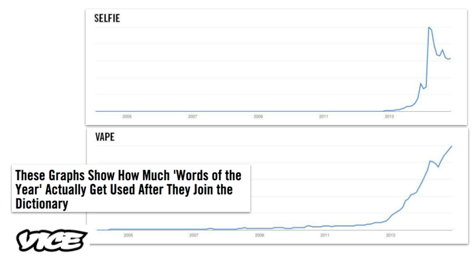
This Vice story (which no longer hosts the charts) uses trend charts to anchor text commentary 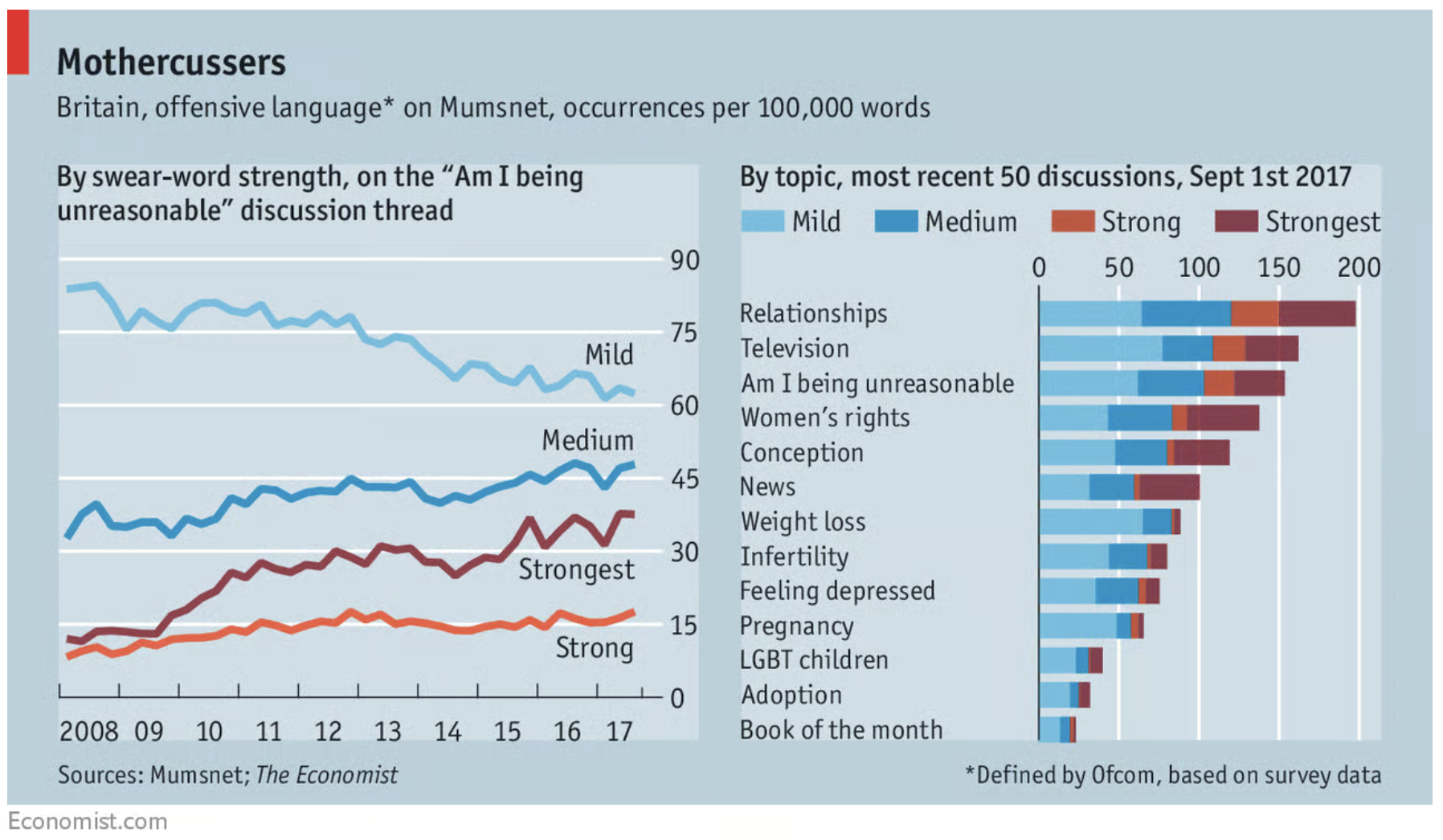
The Economist analysed language on Mumsnet 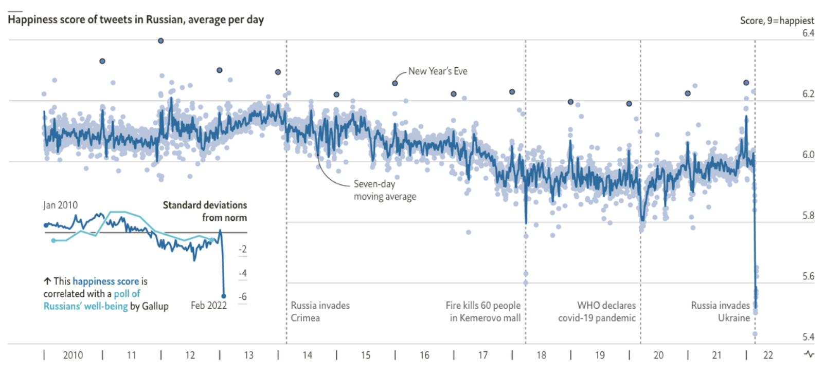
Russian sentiment on social media was a novel angle on the war in Ukraine 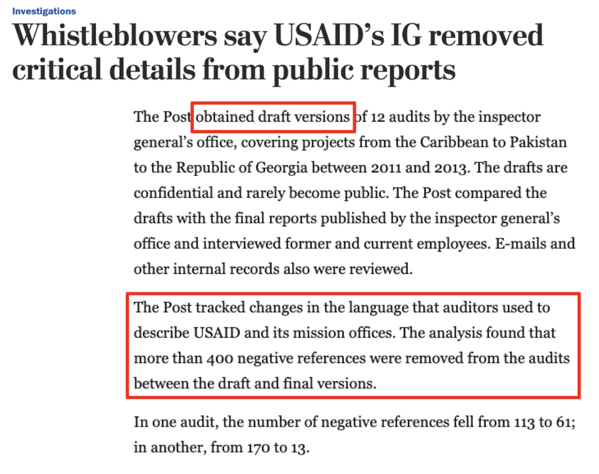
Change stories about text can focus on what has changed in a single document 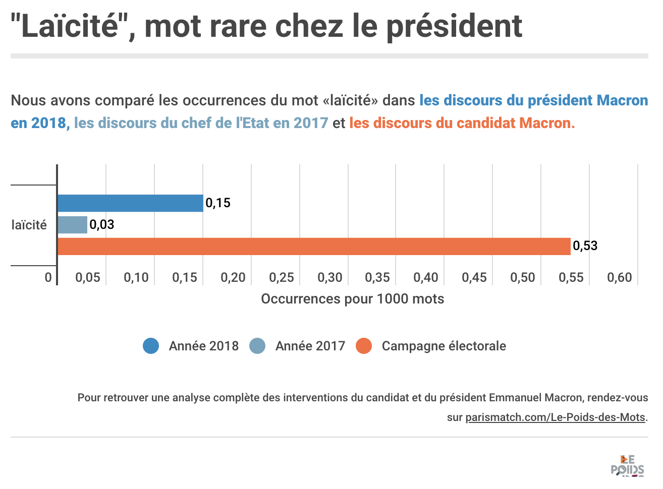
Paris Match’s data analysis identified how Emmanuel Macron’s speeches had mentioned secularism much more often as a candidate than as president. 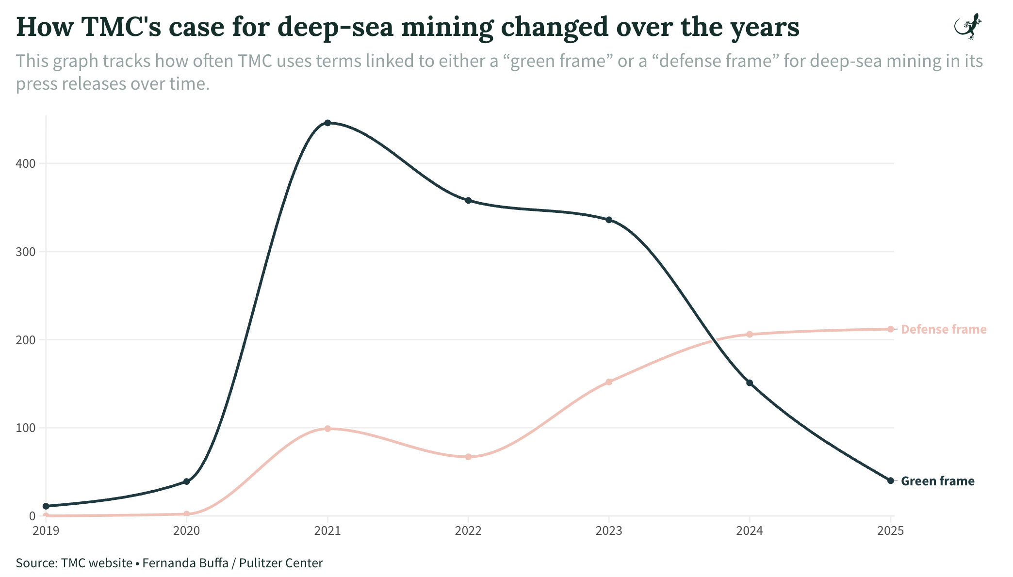
From How We Analyzed The Metals Company’s Public Messaging on Deep-Sea Mining
Changes in political speech are an important indicator not only of the priorities of those in power, but also their relationships with each other and their role in setting the tone of national conversation.
One Guardian analysis, for example, leads on How rightwing rhetoric has risen sharply in the UK parliament, while the award-winning USA Today feature Hope’ is out, ‘fight’ is in: Does tweeting divide Congress, or simply echo its division?” reports that “Language has become more divided and emotional” based on an analysis of more than 2.8 million tweets posted by members of Congress (the original article is no longer online but parts can be seen here).
More simply, the Press Association used the official record of Parliament to calculate that mentions of “Brexit” had gone From nine mentions a year to 9,000.
A more investigative use of change is provided by the Washington Post’s investigation into claims that “USAID’s IG removed critical details from public reports”. By obtaining draft versions of audits reporters were able to identify what changes were made before publication: “more than 400 negative references were removed from the audits between the draft and final versions”
Ranking the most used words and phrases
“Doncaster is the least sexist place in Britain when it comes to street names,” the Doncaster Free Press reported in 2020. The newspaper hadn’t done the analysis: a PR firm had scraped the names of over 200,000 streets and classified them along gender lines. They had also ranked the places with the biggest gap between male and female proportions, and the most common names (Victoria and John).
Ranking can be a quick way to get a story out of a corpus of text — if you can identify a pattern to extract data from. ABC News in Australia, for example, analysed over 1,000 job descriptions to reveal “some of the most common words and phrases advertisers used to attract interns”, while The size of things: an ngram experiment “used Google Books’ Ngram dataset to find the most popular size analogies in English books”.
It turns out that “size of a pea” was the most common.
The Pudding’s exploratory feature on song names includes lots of ranking. 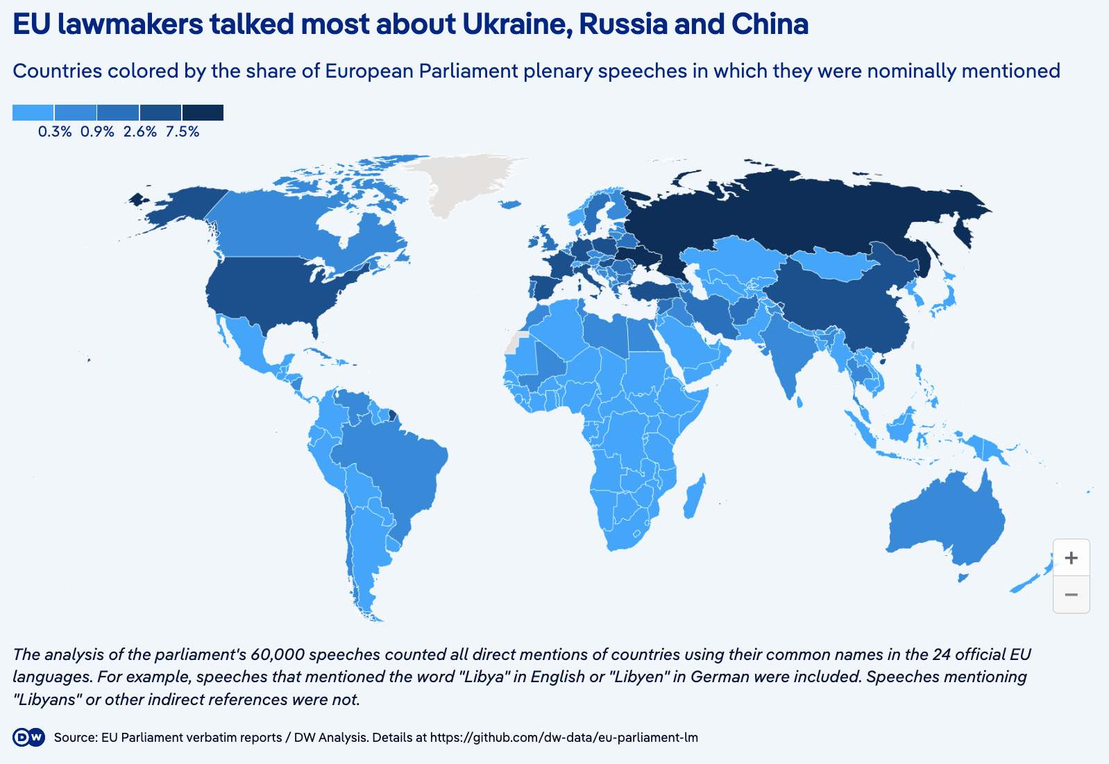
DW chose a choropleth map to compare countries by their mentions – this is probably a less effective method than a bar chart. 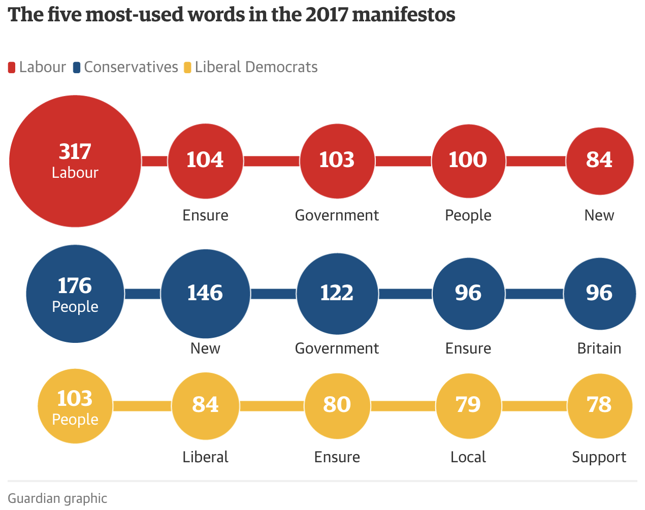
The Guardian used circles to compare the most-used terms in a story on election manifestos 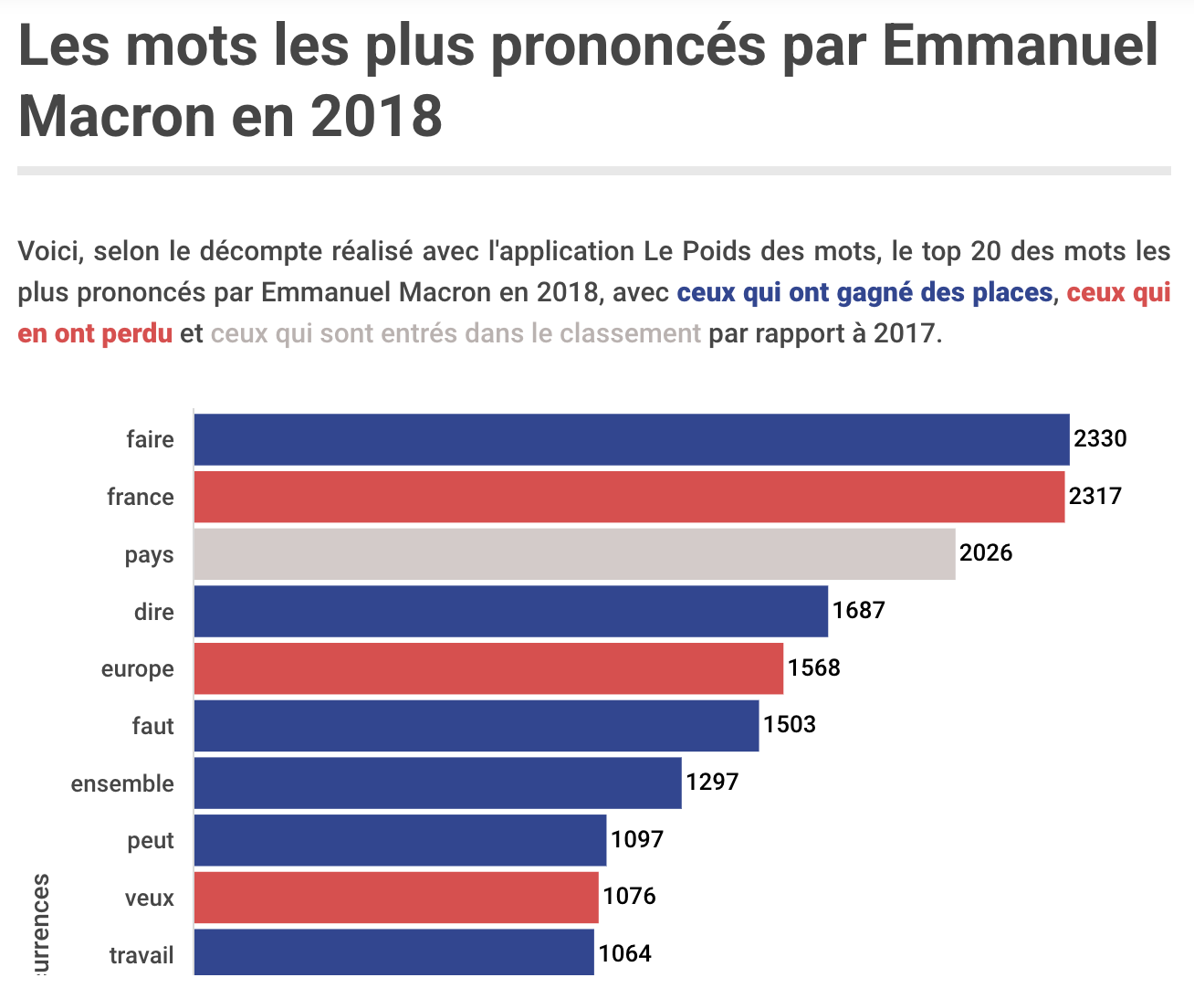
Ranking words was a key part of Paris Match’s Weight of Words project, analysing speeches by President Macron
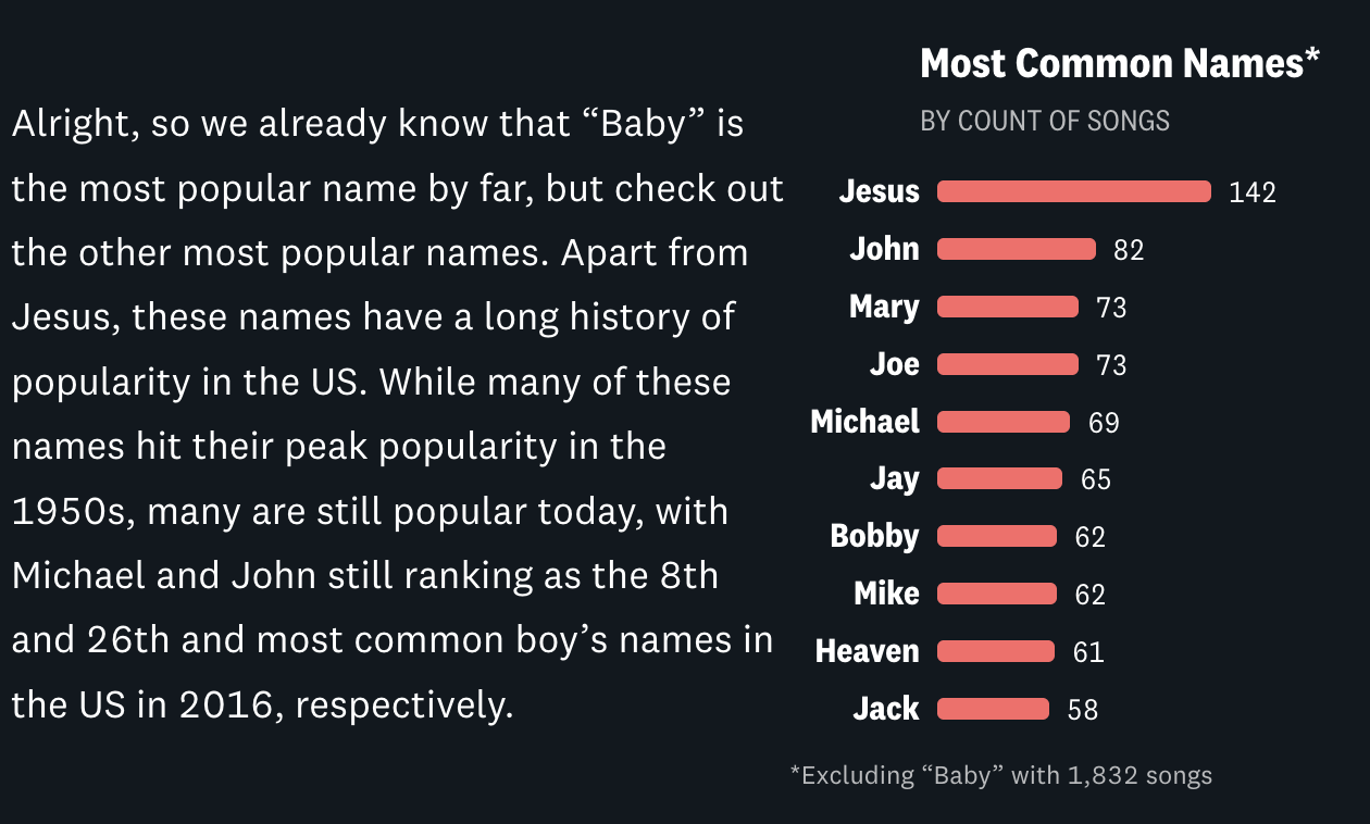
Even exploratory features can focus on exploring different rankings: the Pudding feature Sing My Name moves through sections ranking the most popular names in songs, which songs have the most repeat mentions of the same name, and what songs contain the most names, among others.
The scale of an issue — revealed in language
Text analysis can allow journalists to reveal the scale of a problem which is not visible in more traditional statistics.
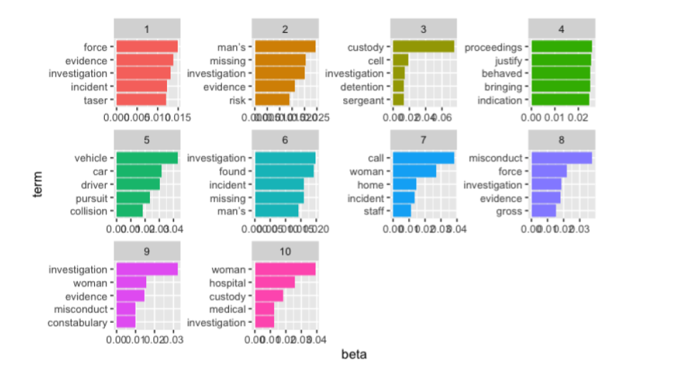
Most of the text-based stories I’ve worked on at the BBC fall into this category: there are no official statistics on the outcomes of police misconduct cases, but I was able to analyse police watchdog reports for a story that revealed “Half of police employees who committed gross misconduct were not dismissed”.
Along similar lines, classifying text in festival line-ups led to the story Music festivals: Only 13% of UK headliners in 2022 are female and declarations of interest were analysed to establish that “One in five MPs continue to employ a member of their family”.
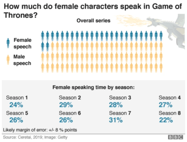
This BBC story uses a pictogram chart to communicate the scale of female dialogue. The margin of error is detailed in a footnote. 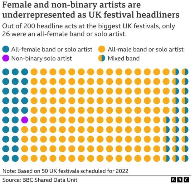
The scale of representation of female and non-binary artists is the focus of this piece of BBC data journalism 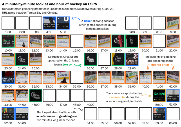
The Washington Post used AI to detect text in sports broadcasts
Social media analysis might focus on the scale of a problem on particular platforms: 3 million tweets were analysed for the story Scale of abuse of politicians on Twitter revealed and similar techniques were used by Amnesty and by the Turing Institute to establish the scale of abuse of particular groups.
Scale is a useful fallback angle if you are quantifying text, because no one else will have analysed the text before. The Guardian’s investigation into extremist Facebook groups, for example, leads on the finding that the network “exposes hundreds of thousands of Britons to racist language, conspiracy and disinformation” (my emphasis), while USA Today analysed campaign rally speech transcripts for Trump used words like invasion, killer to discuss immigrants 500 times.
It can also be a useful approach for factchecking or putting a news event into context, as in Der Spiegel’s story How much violence is in Rammstein’s lyrics? following allegations of sexual assault against the band’s singer (the investigation was later dropped)
Women versus men and other variation stories
Variation stories rely on an expectation of fairness, equality or parity. This limits the opportunities for this angle, but it can work especially well where language reveals implicit biases in society that are not quantified anywhere else.
The LA Times‘s scrollytell There are more women than ever in Star Wars. Men still do most of the talking is just one of a number of pieces of data journalism looking at gender variation using text. Others include The Gender Divide in Star Wars Scripts, Meghan gets twice as many negative headlines as positive, analysis finds, The New York Times’s The Words Men and Women Use When They Write About Love, and The Pudding’s The physical traits that define men & women in literature:
“Do authors really mention particular body parts more for men than for women? Are women’s bodies described using different adjectives than those attributed to men?”
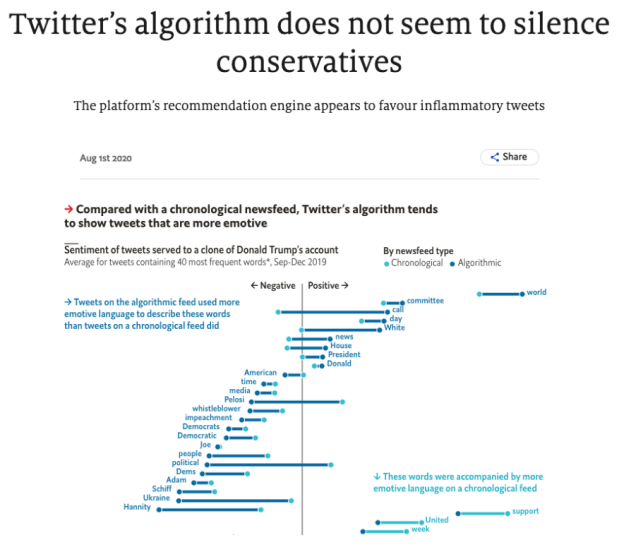
The Economist used a lollipop chart to show the variation between chronological and algorithmic newsfeeds 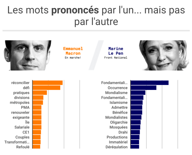
Paris Match visualised variation in word frequency between two politicians
Variation along lines of race is revealed in Football commentary racially biased, study finds and HuffPost UK’s The Met Police Are More Likely To Publish Your Mugshot If You’re Black, which classified press releases on criminal sentencing based on mentions of ethnicity, and compared the proportions to full data on sentencing by ethnicity.
Examples of political and ideological variation can be found in The Economist’s Twitter’s algorithm does not seem to silence conservatives and Paris Match’s political speech comparison Macron-Le Pen: Their silences speak volumes.
The Washington Post’s Almost all news coverage of the Barcelona attack mentioned terrorism. Very little coverage of Charlottesville did: “Even before we did our study,” the story notes, “research showed disproportionately high media coverage of terrorism committed by Muslims — even though right-wing extremist groups have committed more attacks”.
Given that databases of media coverage (such as Nexis) provide an accessible source of text data, this feels like an area ripe for more analysis.
‘Meta’ data stories are all methodologies
It is increasingly rare to find ‘meta’ data journalism angles: stories about a lack of data, poor data, or ‘Get the data‘ articles that share data for others to analyse. And the exclusive nature of text data makes it even more unlikely.
But the complexity of quantifying text for analysis means that there is sometimes a need to tell the story-behind-the-story about the methodologies that were employed: How Sky News investigated X’s algorithm for political bias, along with The Guardian’s How we measured the rise of populist rhetoric, and Reading the post-riot posts: how we traced far-right radicalisation across 51,000 Facebook messages are typical examples, while Behind the Guardian’s analysis of 100 years of MPs’ language on immigration shows another approach.
Connections, similarities, and correlations revealed by text analysis
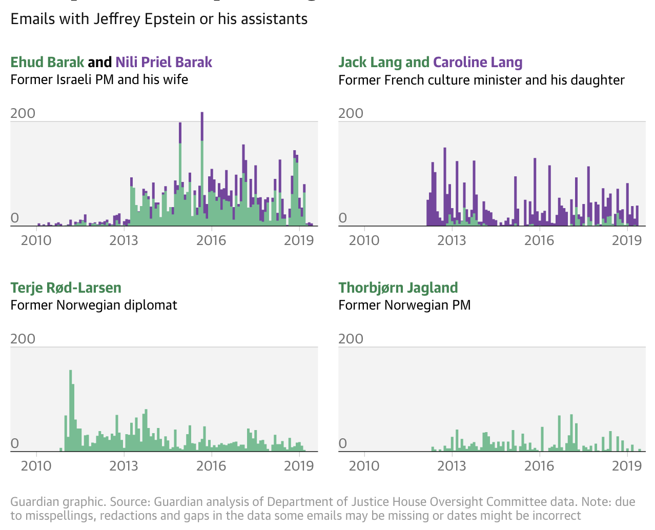
The Guardian’s story on Epstein’s relationships uses a ‘small multiple’ of histograms to compare four connections over time. 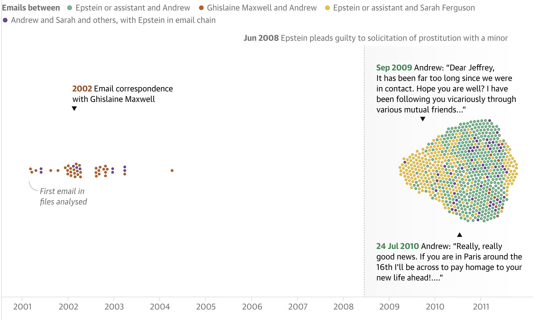
The Guardian’s story on Epstein’s relationships uses a bubble chart with one axis to visualise connections with one person over time. 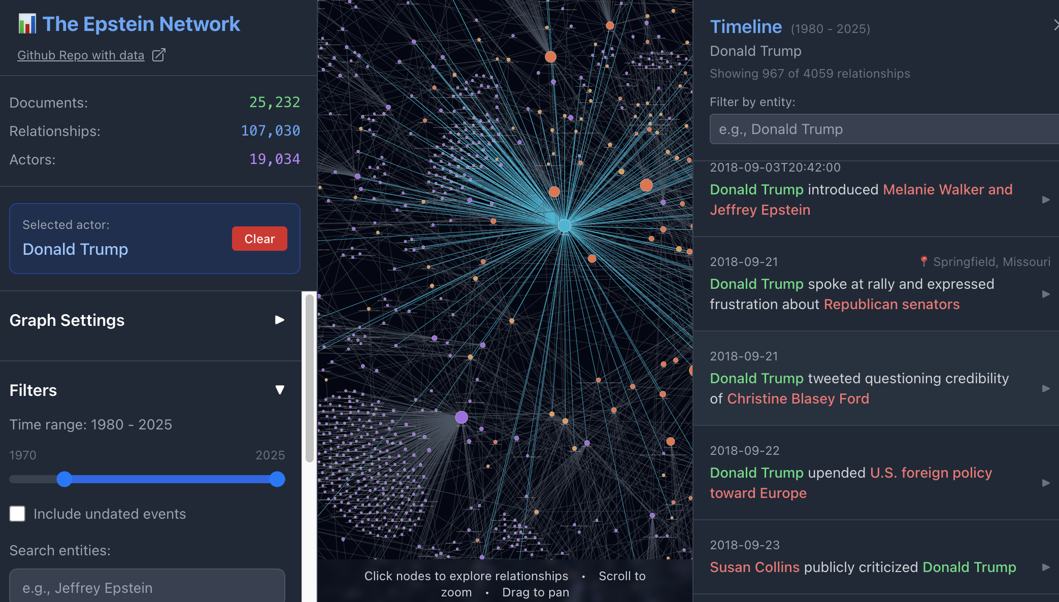
The Epstein Network shows clusters of connections and allows you to click on a node and browse through connections in the data. 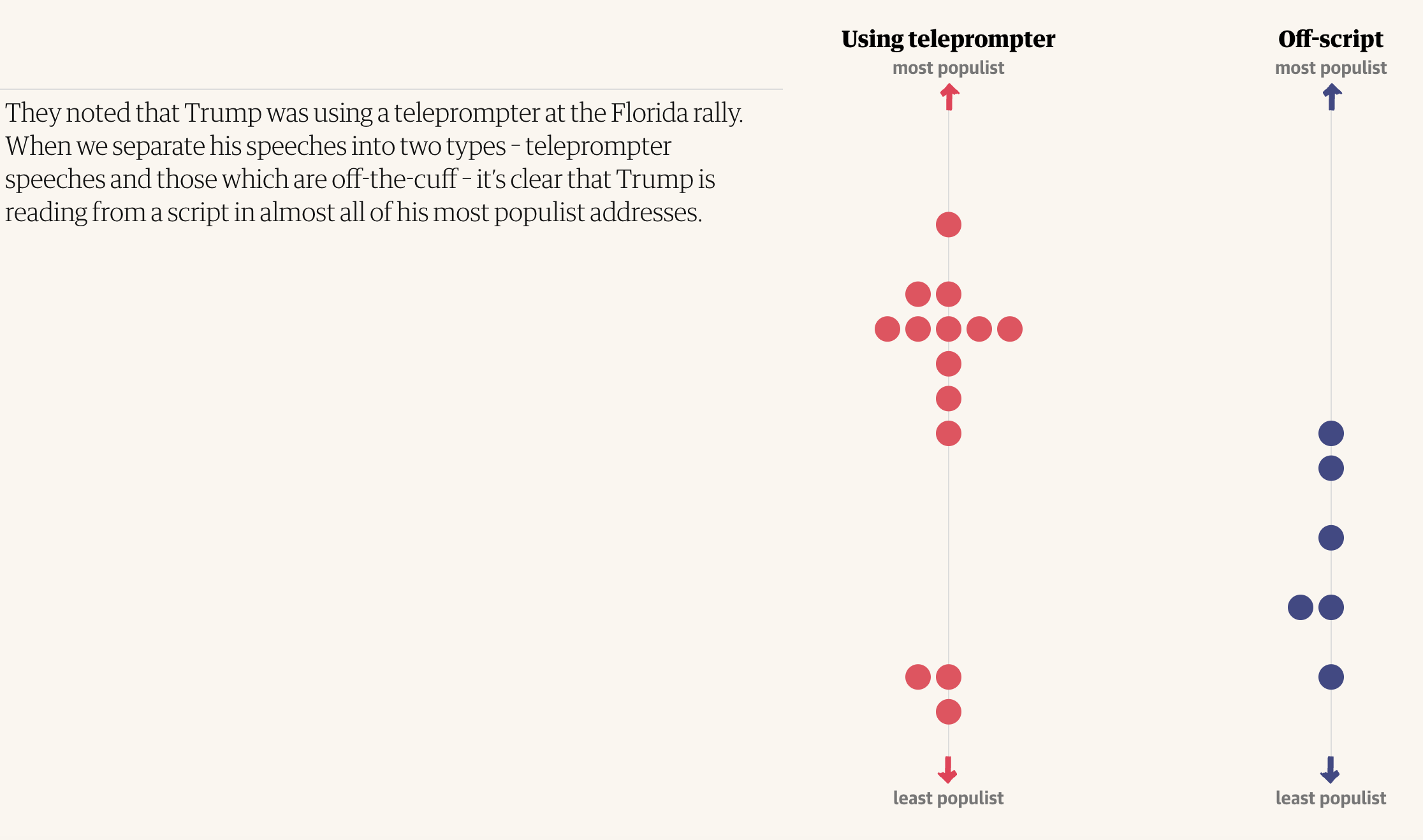
The Guardian quantified political speech to identify a relationship between scripts and populism 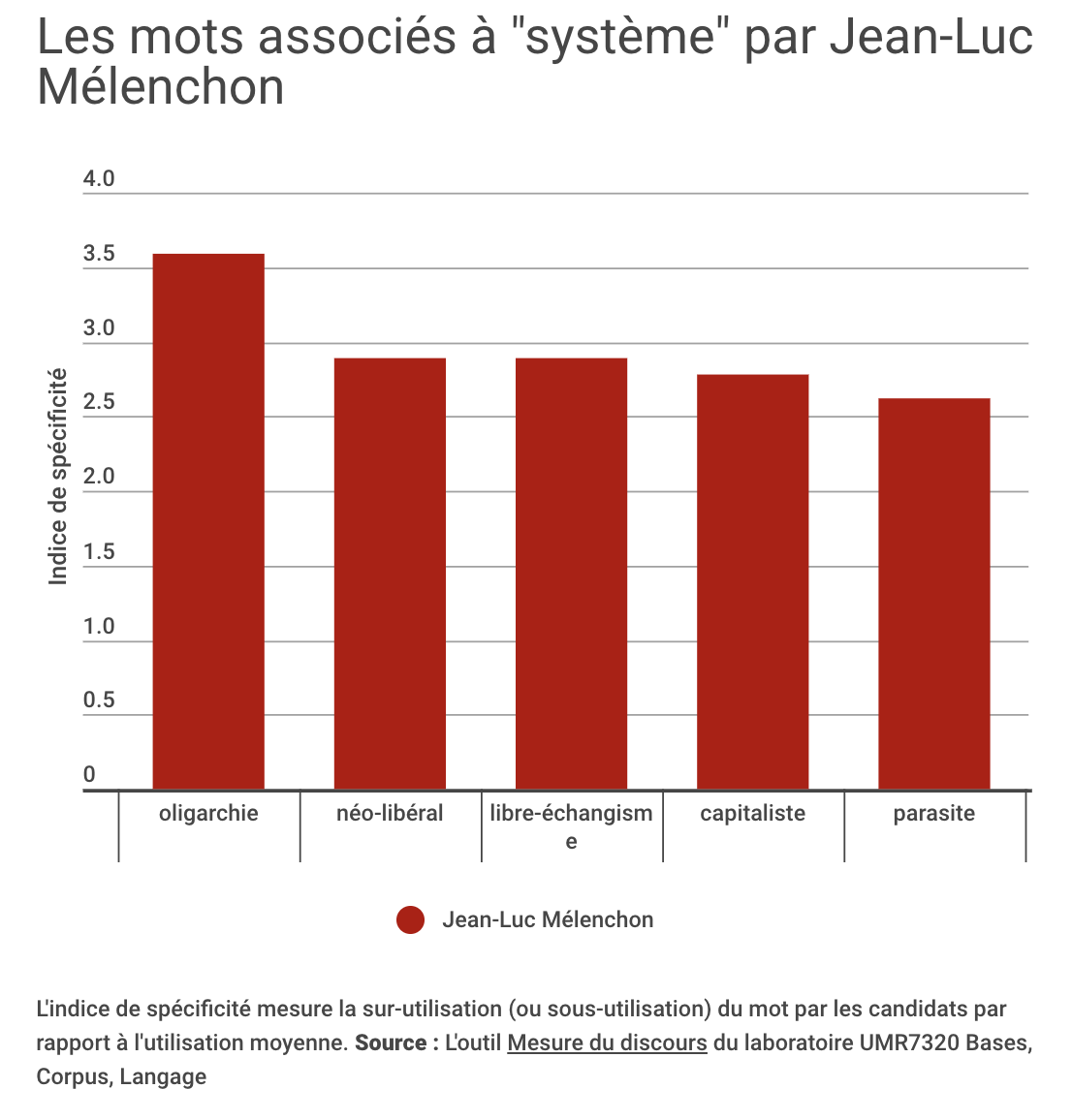
Paris Match used co-occurence analysis to quantify the words politicians most associated with ‘system’ 
From Infos zur Wahl: Warum Chatbots nicht neutral informieren
Relationship angles were the least common in the examples of text-based data journalism I found. The few stories that did adopt this focus, however, pointed to at least three possible types of relationships that could be used for stories: correlations, similarities and connections.
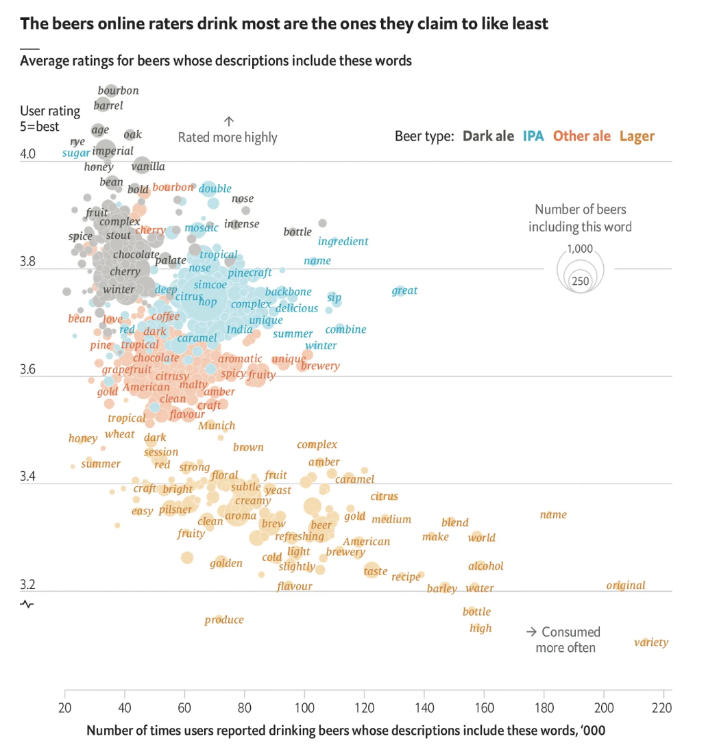
A correlation angle can be seen in The Economist’s Why beer snobs guzzle lagers they claim to dislike, which visualises the relationship between word frequencies and user ratings.
The example points to the types of sources that might provide material for similar relationship stories: where text appears alongside a numerical measure.
Reviews are just one such category of text data. Social media updates (which appear alongside numbers of likes, shares or views, and timestamps) and cultural texts such as books, songs and scripts (figures on sales, streams and views) have the same qualities.
An alternative approach is to quantify text yourself, and combine it with other data: The Guardian used this to establish a relationship between Donald Trump’s use of a teleprompter and populism, while Paris Match used it to establish a lack of relationship between search interest and candidates’ mentions of an issue.
Similarities formed the focus of the network graph-led A Map of Lexical Distances Between Europe’s Languages and Lexical Distance Among Languages of Europe 2015. The methodology points to how the ‘distance’ between words can be quantified in order to identify patterns.
Connections are the focus for Mathematicians mapped out every “Game of Thrones” relationship to find the main character, which quantifies text by classifying two characters being mentioned in the same sentence as a connection. Although this is a ranking story (the focus is on identifying the ‘main’ character), the analysis could equally have been used to tell a story about relationships, and the same method could be adapted for any text where entities (people, companies, locations) are mentioned. Paris Match, for example, used co-occurrence analysis to identify what words candidates associated with ‘system’.
Connections encoded in large language models provide another potential source: Economist data journalist, Sondre Solstad, uses this to look at the connotations of baby names.
The Epstein files provide further ideas for working with text: The Economist’s Inside Epstein’s Network, for example, also chooses a ranking angle revealing the “500 people who appear most frequently”, and while The Guardian headlined their story as “Jeffrey Epstein’s elite relationships visualised”, what is specifically visualised is the relationships between correspondence and time. What is missing from coverage generally are the clusters, cliques and bridges that can be generated by the Epstein Document Network Explorer.
Leads from analysis of text
The Epstein files also provide an example of how data-driven approaches to text can provide useful story leads. The New York Times, for example, used AI to help “identify clusters, patterns and themes,” although it may be that this is being underused. “The brunt of the work,” they admit, “is being done by a team of editors and reporters across beats and bureaus who have been preparing to dig into the files long before they were published.”
Once you have collected a corpus of text, exploratory analysis can surface potential stories you may not have considered.
When I worked on the BBC story DBS background checks mean NHS staff ‘paying to work’, for example, the angle came as a result of identifying phrases which appeared multiple times in NHS job ads (we then went on to use the data to establish the scale of this). And once I’d collected documents on police misconduct, topic modelling allowed me to see common themes across a large number of documents, any one of which could have been an avenue for further reporting.
I’d love to know of any examples where text analysis has been used to identify story leads. If you’ve been involved in a text analysis project, please let me know in the comments or on LinkedIn.
