Tag Archives: 7 angles of data journalism

Words as data: how data journalists tell stories about documents and text

Documents and other collections of text can be goldmines for data journalism — if you know how to approach them as data. Here are some techniques and inspiration for your next data project.

From stories about political speech and song lyrics, to street names and social media chatter, data journalists now have a wide range of examples of text-as-data to draw inspiration and guidance from, while tools such as Pinpoint and NotebookLM are making text analysis easier than ever.

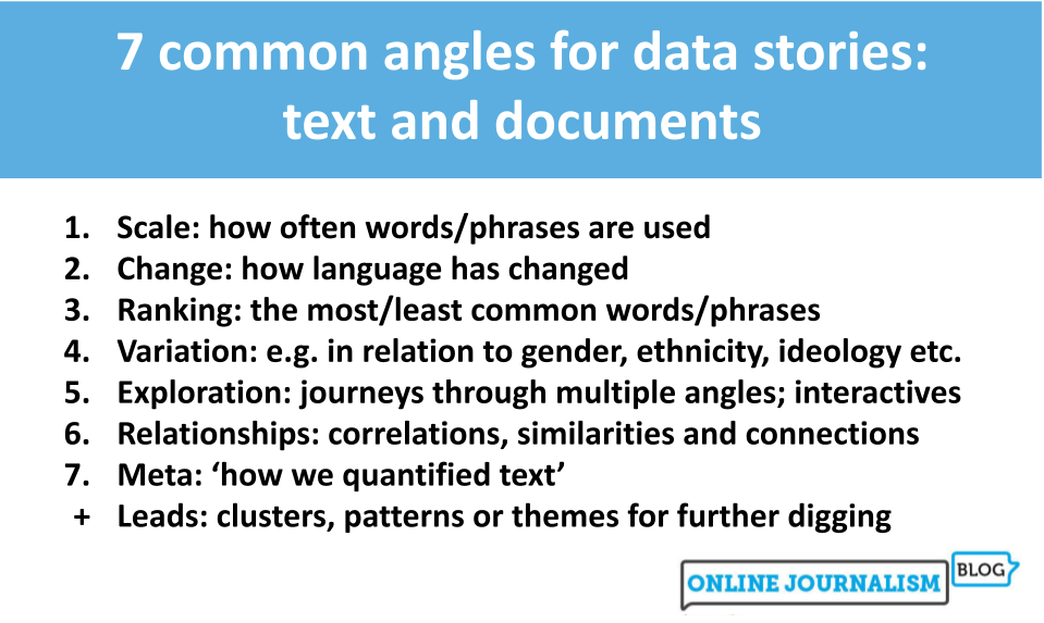
I compiled a list of over 200 pieces of data journalism where text or documents were used as sources. Quantification techniques ranged from counting the frequency of a single word and using Google’s ngram viewer, to machine learning and topic modelling.

Looking at those articles it’s clear that, once quantified, journalists tell the same stories about text as any other piece of data: using the seven most common angles.

But how those angles are used — and how often — is where it gets interesting…

7 common angles for data stories: text and documents 
Scale: how often words/phrases are used
Change: how language has changed
Ranking: the most/least common words/phrases
Variation: e.g. in relation to gender, ethnicity, ideology etc.
Exploration: journeys through multiple angles; interactives
Relationships: correlations, similarities and connections
Meta: ‘how we quantified text’
Leads: clusters, patterns or themes for further digging
Continue reading

Telling stories with data: more on the difference between ‘variation’ stories and ‘ranking’ angles

7 common angles for data storie: scale, change, ranking, variation, explore, relationships, bad data, leads
The 7 angles. Also available in Norwegian, Portuguese, Uzbek and Finnish.

One of the most common challenges I encounter when teaching people the 7 most common story angles in data journalism is confusion between variation and ranking stories. It all comes down to the difference between process and product.

That’s because both types of story involve ranking as a piece of data analysis.

We might rank the number of specialist teachers in the country’s schools, for example, in order to tell either of the following stories:

  • “There are more specialist science teachers than those in any other subject, new data reveals”
  • “New data reveals stark differences in the number of specialists teaching each subject in secondary schools

The first story reveals which subject has the most teachers — it is a ranking angle because it ranks teachers by subject.

The second story reveals the simple fact that variation exists, without focusing on any particular subject.

Continue reading

Here are the angles journalists use most often to tell the stories in data

7 common angles for data storie: scale, change, ranking, variation, explore, relationships, bad data, leads

In my data journalism teaching and training I often talk about common types of stories that can be found in datasets — so I thought I would take 100 pieces of data journalism and analyse them to see if it was possible to identify how often each of those story angles is used.

I found that there are actually broadly seven core data story angles. Many incorporate other angles as secondary dimensions in the storytelling (a change story might go on to talk about the scale of something, for example), but all the data journalism stories I looked at took one of these as its lead.

In the first of a two-part series (also in Norwegian, Uzbek, Portuguese and Finnish.) I walk through how the four most common angles can help you identify story ideas, the variety of their execution, and the considerations to bear in mind.

Continue reading