Monthly Archives: June 2026

Managing a mass FOI project? Here’s an AI-assisted methodology for that

Sending FOIs to multiple bodies across the country to get the big picture on an issue sounds like a great idea — until the responses start to trickle in. Differences between responses often make mass FOI projects extremely time-consuming as you try to get everything into a format that allows you to ask journalistic questions and compare different authorities. Can AI help?

On one recent project I decided to put together a methodology that made the process less stressful, faster and more accurate. Here’s how it works.
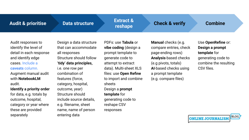
Data structure

Extract & reshape

Check & verify

Combine

Audit & prioritise

Audit responses to identify the level of detail in each response and identify edge cases. Include a caveats column.
Augment manual audit with NotebookLM audit.
Identify a priority order for data, e.g. totals by outcome, hospital, category or year where these are provided separately


Design a data structure that can accommodate all responses
Structure should follow ‘tidy’ data principles, i.e. one row per combination of features (force, category, hospital, outcome, year)
Structure should include source details, e.g. filename, sheet name, name of person entering data


PDFs: use Tabula or 
vibe coding (design a prompt template to generate code to attempt to extract data). Multi-sheet XLS files: use Open Refine to import and combine sheets
Design a prompt template for generating code to reshape CSV responses


Manual checks (e.g. compare entries, check page-ending rows)
Analysis-based checks (e.g pivots, totals)
AI-based checks using a prompt template (e.g. compare files)


Use OpenRefine or: Design a prompt template for generating code to combine the resulting CSV files.
Continue reading

Showing charts on video? Here are two essential techniques to make them effective

Using visualisation on TV and video is very different to using charts and maps online. In video, the audience has very little time to absorb the information contained in the chart — so you need to get them to that information as quickly as possible.

Every bad example of charts in videos forgets this. And every good example uses two essential techniques: keeping things simple, and adding motion.

Continue reading

“Many newsrooms are not optimised for what humans do best” (but we have an opportunity to change that)

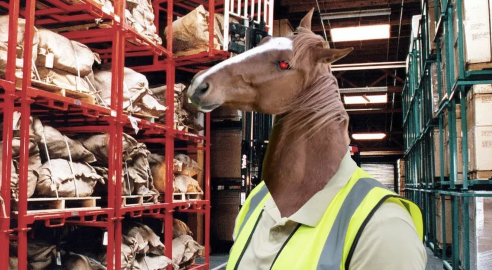
Amazon worker with horse head
Image by Cory Doctorow, from Revenge of the Chickenized Reverse-Centaurs

Some essential reading by Agnes Stenbom Swedling explores how news organisations integrate AI into their workflows and the idea of the “human in the loop“. Many newsrooms, she points out, “are not optimised for what humans do best”, and so far the introduction of AI hasn’t involved a critical consideration of whether we want to embed those features in new systems, or rethink them:

“What is being built – incrementally, often unintentionally – is a form of machine-centric hybridisation. Workflows are optimised for what machines do well: speed, scale, pattern recognition, cost efficiency. Humans are then positioned around those systems, adapting their tasks, roles, and decision-making to fit the logics of machines. 

“The consequence is a subtle but significant inversion: rather than engaging in uniquely human activities, work is reorganised to fit machine-driven processes. And once that inversion is embedded at the infrastructural level, it becomes increasingly difficult to reverse.”

Continue reading

Caught in a trap: what journalists can learn from systems thinking

One of the most powerful ways to generate original journalism is to look at the systems behind stories — particularly the points where those systems fail.

For investigative work, those points are central. Surface-level scandals often stem from deeper systemic problems. So what tools do we have for recognising those patterns?

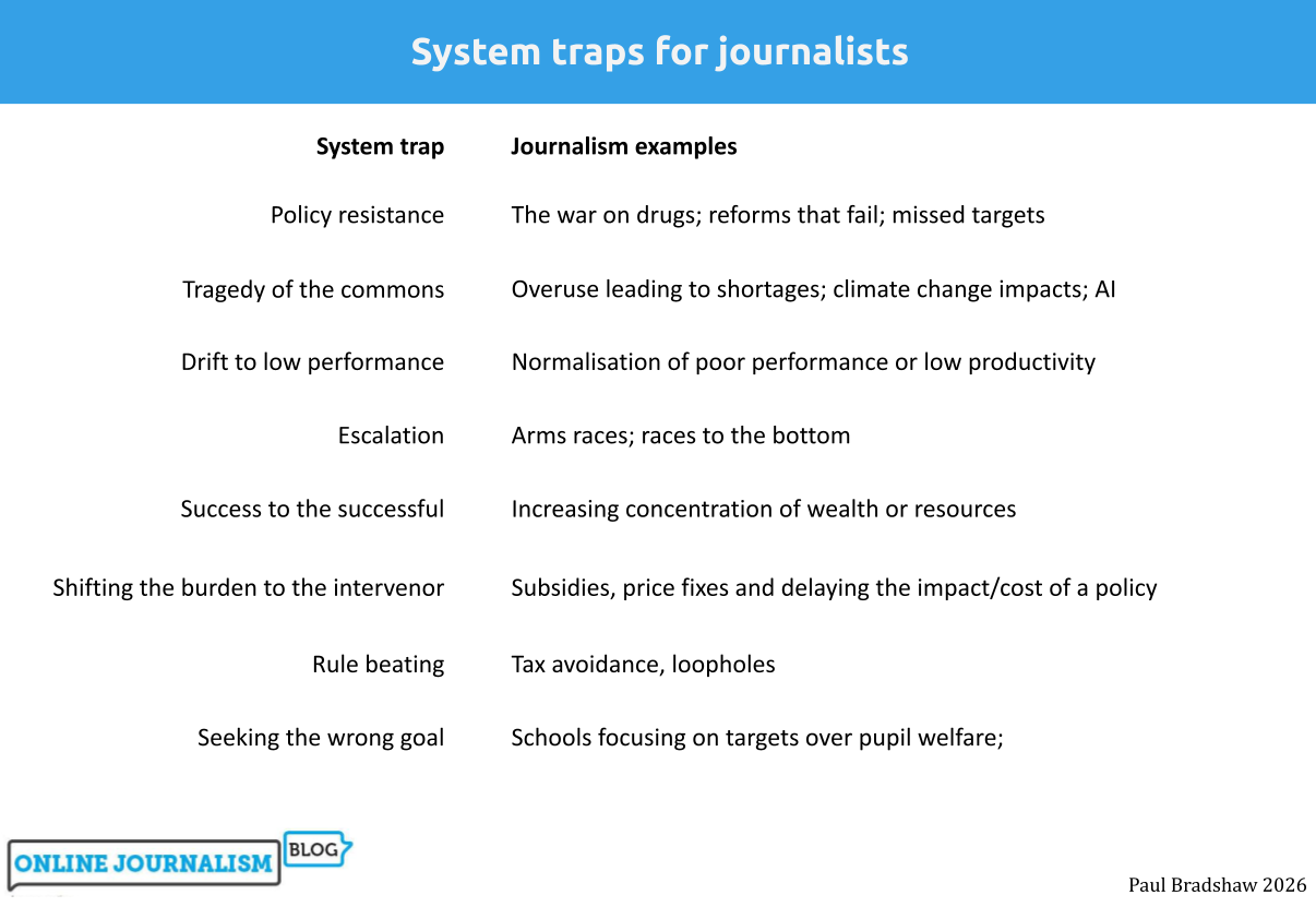
Donella Meadows’s classic book Thinking in Systems offers one: “system traps” — patterns that explain how systems get stuck, break down, or behave in ways nobody intends. They are “traps” because attempts to escape them often backfire.

System trap

Journalism examples

Policy resistance

The war on drugs; reforms that fail; missed targets

Overuse leading to shortages; climate change impacts; AI

Tragedy of the commons

Drift to low performance

Normalisation of poor performance or low productivity

Escalation

Arms races; races to the bottom

Success to the successful

Increasing concentration of wealth or resources

Shifting the burden to the intervenor

Subsidies, price fixes and delaying the impact/cost of a policy

Rule beating

Tax avoidance, loopholes

Seeking the wrong goal

Schools focusing on targets over pupil welfare;

In this post I’ll explain each trap, what it looks like in the wild, and how to use it as a lens for story ideas.

Continue reading

How to: generate hundreds of maps by combining QGIS with Python (code included!)

At this year’s Dataharvest I delivered a workshop on using Python in QGIS to automate the process of exporting maps for multiple locations. Here’s how to do it (you can find a GitHub repository with materials and links here).

Making a map for a story is cool — but what if you could make a map for every reader? Or if you’re working on a project involving teams in different regions or countries, what if you could give each one of those teams a map centred on their own patch?

Normally you would have to manually move the map to centre it on a key city, and then export an image. Then do it again and again and again for every area.

Luckily, QGIS has the ability to run code. And this is a great excuse to start using it.

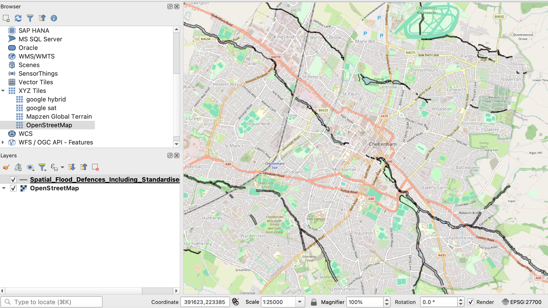
By organising the layers on the left you can put shapes such as flood defences over a base OpenStreetMap layer. You can also change the scale in the box underneath the map
Continue reading