Tag Archives: automation

“Many newsrooms are not optimised for what humans do best” (but we have an opportunity to change that)

Amazon worker with horse head
Image by Cory Doctorow, from Revenge of the Chickenized Reverse-Centaurs

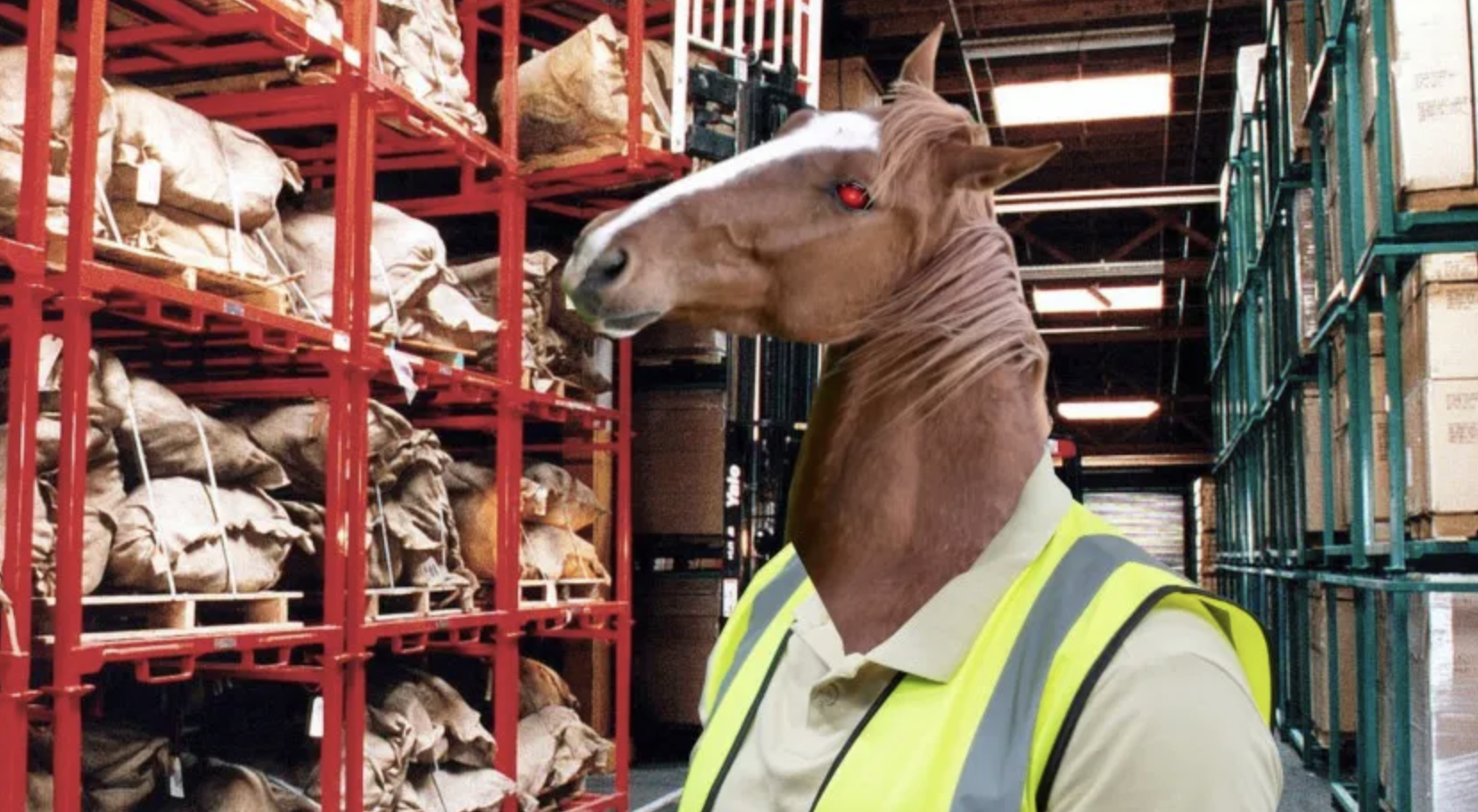
Some essential reading by Agnes Stenbom Swedling explores how news organisations integrate AI into their workflows and the idea of the “human in the loop“. Many newsrooms, she points out, “are not optimised for what humans do best”, and so far the introduction of AI hasn’t involved a critical consideration of whether we want to embed those features in new systems, or rethink them:

“What is being built – incrementally, often unintentionally – is a form of machine-centric hybridisation. Workflows are optimised for what machines do well: speed, scale, pattern recognition, cost efficiency. Humans are then positioned around those systems, adapting their tasks, roles, and decision-making to fit the logics of machines. 

“The consequence is a subtle but significant inversion: rather than engaging in uniquely human activities, work is reorganised to fit machine-driven processes. And once that inversion is embedded at the infrastructural level, it becomes increasingly difficult to reverse.”

Continue reading

How to: generate hundreds of maps by combining QGIS with Python (code included!)

At this year’s Dataharvest I delivered a workshop on using Python in QGIS to automate the process of exporting maps for multiple locations. Here’s how to do it (you can find a GitHub repository with materials and links here).

Making a map for a story is cool — but what if you could make a map for every reader? Or if you’re working on a project involving teams in different regions or countries, what if you could give each one of those teams a map centred on their own patch?

Normally you would have to manually move the map to centre it on a key city, and then export an image. Then do it again and again and again for every area.

Luckily, QGIS has the ability to run code. And this is a great excuse to start using it.

By organising the layers on the left you can put shapes such as flood defences over a base OpenStreetMap layer. You can also change the scale in the box underneath the map
Continue reading

How to stop AI making you stupid: hybrid destination-journey prompting

A local map-style illustration where a pinned "answer" destination is visible, but the route is overlaid with checkpoints labelled “confidence”, “sources”, “counter-arguments”, “verify”, “edit” (image generated by ChatGPT).

Last month I wrote about destination and journey prompts, and the strategy of designing AI prompts to avoid deskilling. In some situations a third, hybrid approach can also be useful. In this post I explain how such hybrid destination-journey prompting works in practice, and where it might be most appropriate.

Continue reading

Visualisation as an editorial process

In the second part of this extract from a book chapter in the new Routledge Companion to Visual Journalism, I look at the editorial processes involved in data visualisation, along with the ethical considerations and challenges encountered along the way.

Decisions around what data to visualise and how to visualise it involve a range of ethical considerations and challenges, and it is important to emphasise that data visualisation is an editorial process just as much as any other form of factual storytelling.

Journalists and designers employ a range of rhetorical devices to engage an audience and communicate their story, from the choice of the chart and its default views or comparisons, to the use of colour, text and font, and animations and search suggestions (Segel and Heer 2011; Hullman & Diakopoulos 2011).

Chart types are story genres

The chart that a journalist chooses to visualise data plays a key role in suggesting the type of story that is being told, and what the user might do with the data being displayed.

If a pie chart is chosen then this implies that the story is about composition (parts of a whole). In contrast, if a bar chart is used then the story is likely to be about comparison.

Line charts imply that the reader is being invited to see something changing over time, while histograms (where bars are plotted along a continuum, rather than ranked in order of size) invite us to see how something is distributed across a given scale.

Scatterplots — which plot points against two values (such as the cancer rate in each city against the same city’s air pollution) — invite us to see relationships.

Continue reading

AI and “editorial independence”: a risk — or a distraction?

Tools
When you have a hammer does everything look like a nail? Photo by Hunter Haley on Unsplash

TL;DR: By treating AI as a biased actor rather than a tool shaped by human choices, we risk ignoring more fundamental sources of bias within journalism itself. Editorial independence lies in how we manage tools, not which ones we use.

Might AI challenge editorial independence? It’s a suggestion made in some guidance on AI — and I think a flawed one.

Why? Let me count the ways. The first problem is that it contributes to a misunderstanding of how AI works. The second is that it reinforces a potentially superficial understanding of editorial independence and objectivity. But the main danger is it distracts from the broader problems of bias and independence in our own newsrooms.

Continue reading

VIDEO: How automation played a central role in data journalism — and is now playing it again

Automation was key to the work of data journalism pioneers such as Adrian Holovaty — and it’s becoming increasingly central once again. This video, made for students on the MA in Data Journalism at Birmingham City University, explores the variety of roles that automation plays in data journalism; new concepts such as robot journalism, natural language generation (NLG) and structured journalism; and how data journalists’ editorial role becomes “delegated to the future” through the creation of algorithms.

You can find the video about Poligraft, and the FT on robot journalism at those links.

This video is shared as part of a series of video posts.

This is how I’ll be teaching journalism students ChatGPT (and generative AI) next semester

Robot with books
Image by kjpargeter on Freepik

I’m speaking at the Broadcast Journalism Teaching Council‘s summer conference this week about artificial intelligence — specifically generative AI. It’s a deceptively huge area that presents journalism educators with a lot to adapt to in their teaching, so I decided to put those in order of priority.

Each of these priorities could form the basis for part of a class, or a whole module – and you may have a different ranking. But at least you know which one to do first…

Priority 1: Understand how generative AI works

The first challenge in teaching about generative AI is that most people misunderstand what it actually is — so the first priority is to tackle those misunderstandings.

Continue reading

GEN 2019 round-up: 4 videos to watch on the potential of data and AI

Krishna Bharat

This year’s Global Editor’s Network (GEN) Summit, in Athens, Greece, had a big focus on the use of verification and automation. BBC News data scientist and PGCert Data Journalism student Alison Benjamin went along to see what was being said about artificial intelligence (AI), data and technology in the news industry. Here are her highlights…
Continue reading

FAQ: Do you think that an increase in algorithms is leading to a decline in human judgement?

recipe by Phillip Stewart

This algorithm has been quality tested. Image by Phillip Stewart

The latest in my series of FAQ posts follows on from the last one, in response to a question from an MA student at City University who posed the question “Do you think that an increase in algorithmic input is leading to a decline in human judgement?”. Here’s my response.

Does an increase in computation lead to a decline in human input?

Firstly, it’s important to emphasise that the vast majority of data journalism involves no algorithms or automation at all: it’s journalists making calculations, which historically they would have done manually.

You mention the possibility that “an increase in computation leads to a decline in human input”. An analogy would be to ask whether an increase in pencils leads to a decline in human input in art. Continue reading

Here’s the thinking behind my new MA in Data Journalism

A few weeks ago I announced that I was launching a new MA in Data Journalism, and promised that I would write more about the thinking behind it. Here, then, are some of the key ideas underpinning the new course — from coding and storytelling to security and relationships with industry — and how they have informed its development. Continue reading