One of the things reporters should always be careful about when reporting on research or statistics is sample sizes: the smaller sample, the wider the margin for error when generalising to the population as a whole (more on sampling here and here).
But sometimes the sample size is less obvious than you think. Continue reading →
After decades as a business reporter and shopping correspondent John Cokley has turned his attention to the news business in the book Shopping News. In a special guest post for the Online Journalism Blog he lists ’16 models for journalistic action’ and details ways that publishers could think about range, price and labelling their products better.
In 2004 I began to develop the theory that shopping showed us three things that journalists and news publishers could really use in our business every day to prevent our businesses from going broke. If only we could work out:
“What people want”
“What they’re willing to pay money for”, and
“How much they’re willing to pay”
Surely making a living in journalism means enticing people to buy your product, or at least to invest time in it?
Perhaps it would be a good idea to find out what people were already buying and investing their time in. Continue reading →
Now yet another site – “casual sex and cheating network”Ashley Madison – has been hacked and the results leaked, so I thought I’d better deliver.
How do you come up with an ethical framework for dealing with hacked documents? Firstly, it’s useful to look at what concerns are raised when journalists use them.
Looking at previous reporting based on leaked documents these break down into three broad categories:
Firstly, that the information was ‘stolen’ (method)
Secondly, that the motivation behind obtaining the information was tainted (source)
And thirdly, that the information represents an invasion of privacy (effect)
Put another way: people are generally concerned with how the leaked information was obtained, why, and to what effect.Continue reading →
Early last week it emerged that government cybersecurity supplier Hacking Teamhad been hacked. An incredible cache of documents and emails – 400GB’s worth – was released on Sunday by the hackers, providing a fascinating – and terrifying – insight into the operations of a company dubbed one of ten “enemies of the internet” by Reporters Without Borders in 2013:
“Their products have been or are being used to commit violations of human rights and freedom of information. If these companies decided to sell to authoritarian regimes, they must have known that their products could be used to spy on journalists, dissidents and netizens.”
“[A] deal with the London cops, worth £385,000 ($591,000) to Hacking Team, was abruptly halted in in May 2014 following “internal reviews on how we wished to move this area of technology forward,” according to an email from the police, although the force left the door open for a future deal, adding: “Of course in the months/years to come this could change and if that is the case then we would welcome your organization’s participation.”
“Since then, Hacking Team has continued to try to crack the U.K. market. It tried – and apparently failed – to set up a deal with Staffordshire Police after an officer contacted the company seeking technology to “access WiFi points to check users” and infect devices to covertly collect data.”
So we have a story about a massive document leak which concerns the most powerful governments and law enforcement agencies in the world. Sound familiar?
We’ve been here before with Wikileaks, and with the Snowden revelations – two of the biggest stories of the last decade.
Hacking Team could be as big – but one week in and we’re not seeing the coverage we should. And I think that’s because of two things those stories had that Hacking Team doesn’t: a face, and a partner. Continue reading →
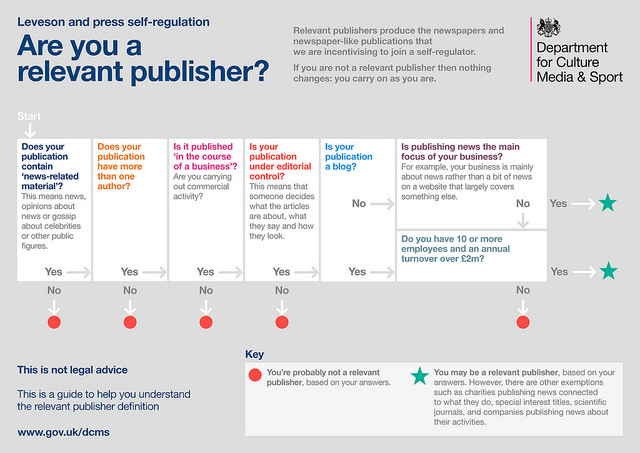
The DCMS pubished this image to clarify the definition of “a relevant published” under proposals published in early 2013.
Nick Booth left a Press Recognition Panel consultation under the impression that non profit hyperlocals were going to be exposed by the new regulation system. Then legal experts suggested he’d got it wrong. So which is it? In a special post cross-published from Podnosh, Nick tries to tease out a complex law and ask: ‘when someone sues now, who pays?’.
Last week I spent a couple of hours at a consultation in Birmingham run by the Press Recognition Panel, which is the regulator set up to oversee the creation of (a?) new press regulator(s) following the Leveson Inquiry and the Royal Charter. (I know this has already got a bit “what?”, but stick with me.)
I was there because I’m interested in what it means for hyperlocal websites (which we have helped people set up over a number of years). Especially the implications for those run for the love of their community, sites like B31voices or WV11 – not run for the money. Talk About Local has already questioned whether hyperlocals fall within Leveson and I wanted to be clear one way or the other…
So this is how my thinking has evolved…. if you find an asterix next to an assertion I’m not 100% sure this is right. Continue reading →
The proposals include the creation of a Hyperlocal Forum which will work towards a number of objectives and shared areas of interest, with initial partners including Nesta and the Carnegie Trust.
The proposals for comment are to:
introduce an external linking system, currently being rolled out to all BBC website Local Live streams across the country, to hyperlocals and bloggers, and ensuring their content is showcased and credited on the BBC website
include hyperlocal providers in training and events as part of its media partnership work
invite hyperlocal bodies to be represented on the Local Journalism Working Group and other relevant panels
ensure all local BBC teams are aware of hyperlocals operating in their area
promote an updated register of hyperlocal sites, expected to be published at the end of the year
engage with partners from across the hyperlocal community and other external media to establish a Hyperlocal Forum to meet twice a year from November.
Some of this work is already being done (particularly Local Live), but the register suggests a more comprehensive approach and linking has long been a concern.
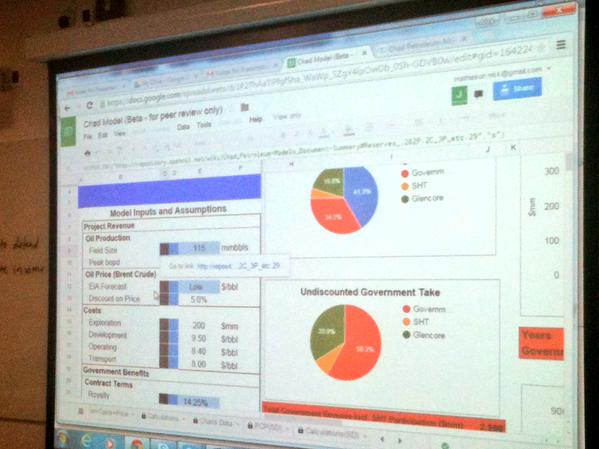
Last month I watched the founder of OpenOil, Johnny West, talk via video link about a dashboard he had designed to help people more effectively report on government announcements related to Chad’s hugely important oil industry.
The dashboard struck me in all sorts of ways: firstly in automating certain processes it lowered the barrier to more effective reporting; secondly it reduced the time needed to do so; and thirdly it turned a numerical topic into something more visual, and in the process made stories easier to spot.
More from Johnny later.
First, however, it’s worth taking stock of just how big a part dashboards play in our lives, and how little a role journalists play in their creation:
Publishers create content management systems to allow reporters and other staff to navigate between stories, media, metrics and other tools and information
Social mediaservices create dashboards as a way of navigating our networks
Analytics companies create dashboards to help users monitor the performance of their content
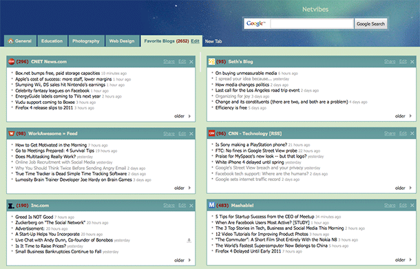
Tweetdeck and Netvibes are good examples of dashboards that save us time as journalists: specifically search time.
RSS readers like Netvibes mean that we do not need to check multiple websites or perform multiple searches to see if new information has been published or shared: instead we only need to check the Netvibes dashboard.
This Netvibes account has multiple tabs for different dashboards
In fact, we can set up more than one dashboard depending on when or where we might be using them: one for when we are covering health, for example; or another one for a specific event.
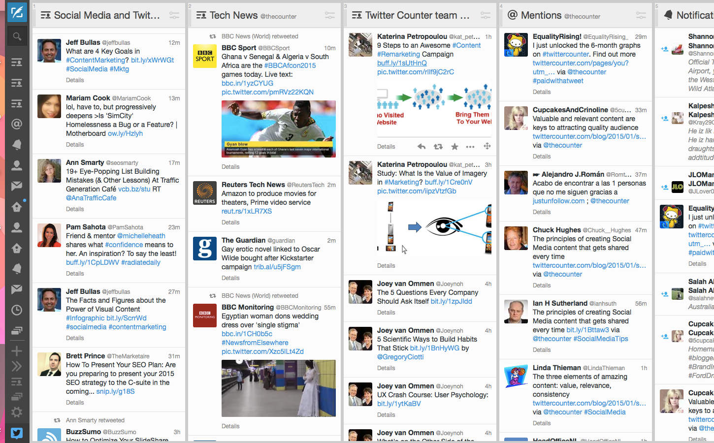
Social media management dashboards like Tweetdeck and Hootsuite perform a similar function, but more narrowly focused on social media and with the ability to publish through the dashboard too, and in some cases access analytics.
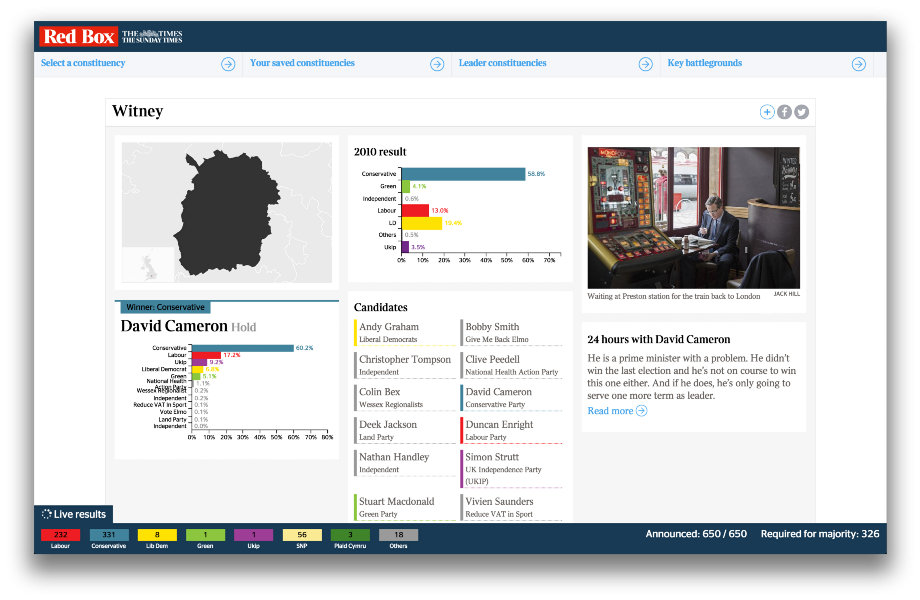
The Times’ audience-facing dashboard for the 2015 election was also useful for journalists
If you’re not using dashboards like these then you are probably wasting time unnecessarily. But these all rely on existing infrastructures, whether those are RSS feeds or social network APIs.
We can do better than that.
Dashboards that help more people hold power to account
This is where Johnny West comes in. Johnny was one of the speakers at the Centre for Investigative Journalism’s recent Illicit Finance course. Here’s that dashboard he designed to make it easier to interrogate new figures from Chad’s government and oil industry:
Chad’s public finances, he explained, are over 70% dependent on oil revenues and under “severe pressure” from falls in prices. The dashboard made it easier to frame questions:
“…Of whether a budget holds up with likely revenues etc [or compare] Chad’s annual EITI reports – which state revenues actually received – with what you would expect the government to receive.”
He argues that creating a visual interface to the information the journalist needs (in this case oil prices and contract agreements) is essential:
“You cannot achieve any real understanding of the many interlocking parts of the contract and revenue flows without a model of their relationships with each other. I would not trust any financial comment or analysis of oil economics done blind to a model.
“It is a bit of a challenge to get journalists to accept this – since many of them are not familiar with or comfortable with financial models.”
One result of financial illiteracy, he argues, is an inclination towards simple but meaningless comparisons: one royalty rate being higher than another; or how much an income tax rate was raised by.
“Nine out of ten such stories are simply not accurate enough to provide any service to the reader. What if the royalty rate is lower because the income tax rate was raised? Or this one has a higher royalty because it is the second discovery in an area (with less exploration risk to the company therefore putting government in a stronger negotiating position)? And so on…”
The dashboard supports the journalist in reporting something richer despite the pressure to deliver something on deadline. And it’s not just for journalists:
“We know there are many governments which do not have models like this one for contracts they themselves negotiated and signed. It may be a question of institutional knowledge: perhaps one individual once had one, or a consultancy or visiting IMF delegation. But these get hoarded and not passed on. The need for public domain versions of these kinds of applications is critical in helping states build their capacity, not just the media.”
At a broader level there are also dashboards designed by journalists to help make their colleagues’ work easier. The Investigative Dashboard was designed a few years ago to help journalists and civil society investigate organised crime and corruption. It has subsequently had an injection of cash and a relaunch:
Those are isolated examples, but they shouldn’t be. I once created a dashboard for journalists at a Scottish newspaper to pick stories out of some data I had scraped.
It meant that journalists with very little spreadsheet skills could call up data on any one of hundreds of measures by using a drop-down menu and be shown where to focus their follow up calls instantly.
Some great original stories and big splashes came out of that, yet all it took was a little initial effort, after which dozens of stories were easy to report.
Online spreadsheet tools like Google Sheets allow us to pull in live information, using built-in functions that fetch stock prices, or scrape web tables or feeds (which themselves might be generated by scrapers).
Once we have that live information it can be connected to historical information, and display those relationships visually.
Imagine a dashboard that pulls in the latest crime reports and tells us whether they’re going up or down – and where.
Imagine the BBC’s A&E tracker redesigned for journalists as well as readers.
Imagine sports performance shown dynamically, so you can pick up on the most improved performers and not just the top performers.
Much of this is already happening – but it’s not being done by journalists or news organisations.
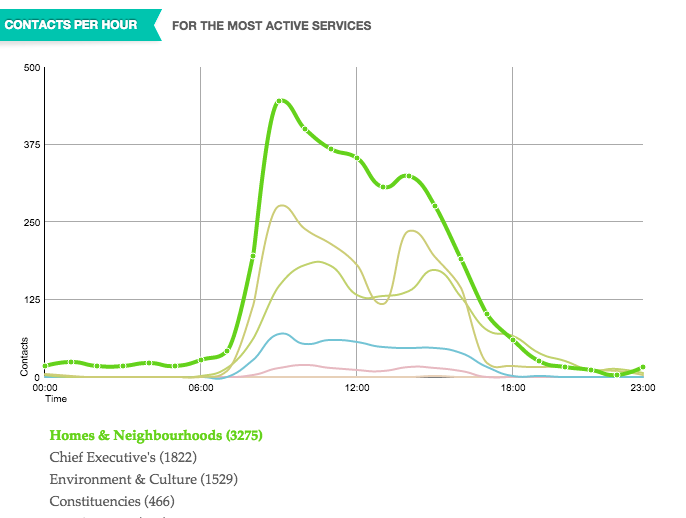
FixMyStreet has long pioneered the ability to report – and see – local problems. And Birmingham’s Civic Dashboard showed all sorts of information on things like which parts of the council were getting the most contacts and when.
The Birmingham Civic Dashboard
Expect to see more of these dashboards as the growth of ‘smart cities’ drives the connection of transport systems, policing, education, business and health.
But they’re not being done by news organisations. And that’s the point.
We need to change that.
Where data is already published we need to be setting up dashboards that bring it to the journalists. Where data is not, we need to be pushing for access to it.