

Confused? Knobs and dials image by anataman
Last month I watched the founder of OpenOil, Johnny West, talk via video link about a dashboard he had designed to help people more effectively report on government announcements related to Chad’s hugely important oil industry.
The dashboard struck me in all sorts of ways: firstly in automating certain processes it lowered the barrier to more effective reporting; secondly it reduced the time needed to do so; and thirdly it turned a numerical topic into something more visual, and in the process made stories easier to spot.
More from Johnny later.
First, however, it’s worth taking stock of just how big a part dashboards play in our lives, and how little a role journalists play in their creation:
- Publishers create content management systems to allow reporters and other staff to navigate between stories, media, metrics and other tools and information
- Social media services create dashboards as a way of navigating our networks
- Analytics companies create dashboards to help users monitor the performance of their content
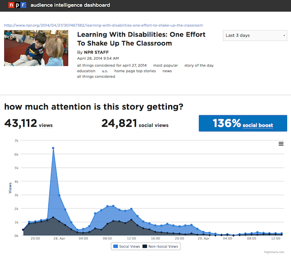
NPR’s Audience Intelligence Dashboard is part of the organisation’s attempt to build analytics into journalists’ work processes.
This dashboard uses Chartbeat to give a real time view of how reporters are performing
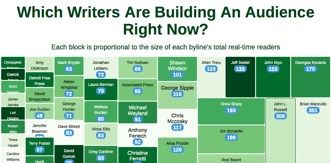
Metrics dashboards are a big part of all three, including HuffPo’s analytics and Bleacher Report’s gamification of writer performance. But what about finding stories?
Story sourcing dashboards: social and RSS
Tweetdeck and Netvibes are good examples of dashboards that save us time as journalists: specifically search time.
RSS readers like Netvibes mean that we do not need to check multiple websites or perform multiple searches to see if new information has been published or shared: instead we only need to check the Netvibes dashboard.
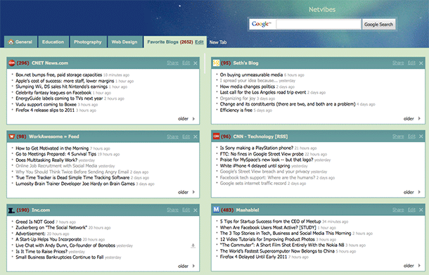
This Netvibes account has multiple tabs for different dashboards
In fact, we can set up more than one dashboard depending on when or where we might be using them: one for when we are covering health, for example; or another one for a specific event.
Social media management dashboards like Tweetdeck and Hootsuite perform a similar function, but more narrowly focused on social media and with the ability to publish through the dashboard too, and in some cases access analytics.
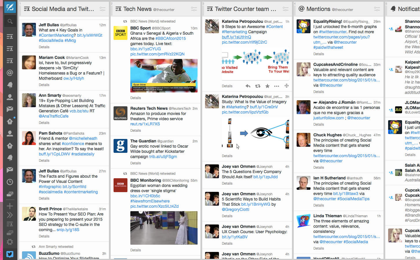
Twittercounter’s Katerina Petropolou writes about how her dashboard helps her keep in touch with the team and the sector
So we can add saving response time to the time saved performing searches across multiple social networks and monitoring multiple lists or hashtags.
And then there are trending dashboards like Spike that aim to help newsrooms spot breaking stories.
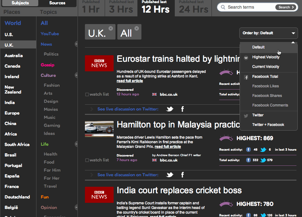
Sometimes organisations develop event-specific dashboards. Here, for example, you can read The Times team on the process behind designing their own election dashboard:
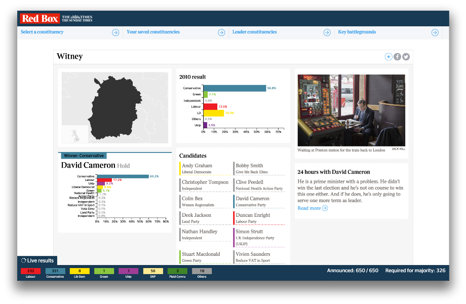
The Times’ audience-facing dashboard for the 2015 election was also useful for journalists
If you’re not using dashboards like these then you are probably wasting time unnecessarily. But these all rely on existing infrastructures, whether those are RSS feeds or social network APIs.
We can do better than that.
Dashboards that help more people hold power to account
This is where Johnny West comes in. Johnny was one of the speakers at the Centre for Investigative Journalism’s recent Illicit Finance course. Here’s that dashboard he designed to make it easier to interrogate new figures from Chad’s government and oil industry:
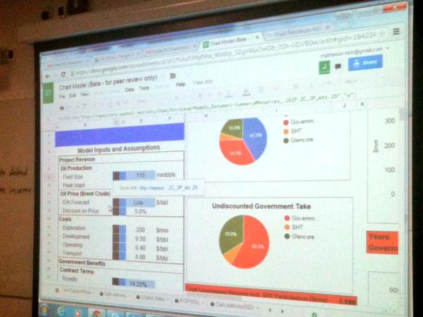
A dashboard created by Johnny West of Open Oil for Chad. Image: Joel Benjamin.
Chad’s public finances, he explained, are over 70% dependent on oil revenues and under “severe pressure” from falls in prices. The dashboard made it easier to frame questions:
“…Of whether a budget holds up with likely revenues etc [or compare] Chad’s annual EITI reports – which state revenues actually received – with what you would expect the government to receive.”
He argues that creating a visual interface to the information the journalist needs (in this case oil prices and contract agreements) is essential:
“You cannot achieve any real understanding of the many interlocking parts of the contract and revenue flows without a model of their relationships with each other. I would not trust any financial comment or analysis of oil economics done blind to a model.
“It is a bit of a challenge to get journalists to accept this – since many of them are not familiar with or comfortable with financial models.”
One result of financial illiteracy, he argues, is an inclination towards simple but meaningless comparisons: one royalty rate being higher than another; or how much an income tax rate was raised by.
“Nine out of ten such stories are simply not accurate enough to provide any service to the reader. What if the royalty rate is lower because the income tax rate was raised? Or this one has a higher royalty because it is the second discovery in an area (with less exploration risk to the company therefore putting government in a stronger negotiating position)? And so on…”
The dashboard supports the journalist in reporting something richer despite the pressure to deliver something on deadline. And it’s not just for journalists:
“We know there are many governments which do not have models like this one for contracts they themselves negotiated and signed. It may be a question of institutional knowledge: perhaps one individual once had one, or a consultancy or visiting IMF delegation. But these get hoarded and not passed on. The need for public domain versions of these kinds of applications is critical in helping states build their capacity, not just the media.”
At a broader level there are also dashboards designed by journalists to help make their colleagues’ work easier. The Investigative Dashboard was designed a few years ago to help journalists and civil society investigate organised crime and corruption. It has subsequently had an injection of cash and a relaunch:
And there are dashboards from hackdays which show how we can make better use of the data we already have:
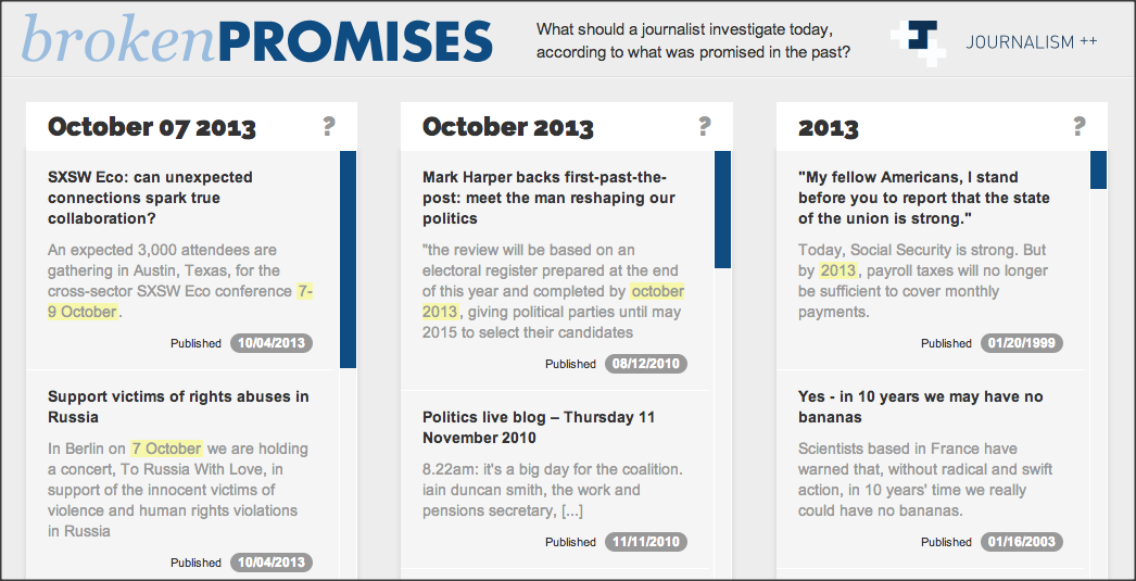
Broken Promises dashboard by Journalism++
Those are isolated examples, but they shouldn’t be. I once created a dashboard for journalists at a Scottish newspaper to pick stories out of some data I had scraped.
It meant that journalists with very little spreadsheet skills could call up data on any one of hundreds of measures by using a drop-down menu and be shown where to focus their follow up calls instantly.
Some great original stories and big splashes came out of that, yet all it took was a little initial effort, after which dozens of stories were easy to report.
Online spreadsheet tools like Google Sheets allow us to pull in live information, using built-in functions that fetch stock prices, or scrape web tables or feeds (which themselves might be generated by scrapers).
Once we have that live information it can be connected to historical information, and display those relationships visually.
Imagine a dashboard that pulls in the latest crime reports and tells us whether they’re going up or down – and where.
Imagine the BBC’s A&E tracker redesigned for journalists as well as readers.
Imagine sports performance shown dynamically, so you can pick up on the most improved performers and not just the top performers.
Much of this is already happening – but it’s not being done by journalists or news organisations.
FixMyStreet has long pioneered the ability to report – and see – local problems. And Birmingham’s Civic Dashboard showed all sorts of information on things like which parts of the council were getting the most contacts and when.
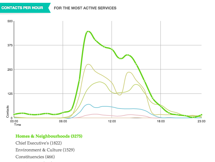
The Birmingham Civic Dashboard
Expect to see more of these dashboards as the growth of ‘smart cities’ drives the connection of transport systems, policing, education, business and health.
My #DataPowerConf paper discussed the @DublinDashboard Can click/play at dublindashboard.ie/pages/index @ProgCity http://t.co/VSHZG21GmN—
Rob Kitchin (@RobKitchin) June 23, 2015
But they’re not being done by news organisations. And that’s the point.
We need to change that.
Where data is already published we need to be setting up dashboards that bring it to the journalists. Where data is not, we need to be pushing for access to it.
It may be that news organisations can no longer “afford to be a paper of record and dutifully report everything that happened on our patch”. But we can do a better job of bringing as much as possible that happens to journalists’ desktops – and not just the stuff that is shared on social media.

Pingback: Newsletter Farol Jornalismo #53 Sobre dashboards no jornalismo, a busca por métricas mais complexas e se há férias na profissão | Farol Jornalismo
Pingback: О пользе дашбордов в журналистской работе