Monthly Archives: October 2011

Power Tools for Aspiring Data Journalists: Funnel Plots in R

Picking up on Paul Bradshaw’s post A quick exercise for aspiring data journalists which hints at how you can use Google Spreadsheets to grab – and explore – a mortality dataset highlighted by Ben Goldacre in DIY statistical analysis: experience the thrill of touching real data, I thought I’d describe a quick way of analysing the data using R, a very powerful statistical programming environment that should probably be part of your toolkit if you ever want to get round to doing some serious stats, and have a go at reproducing the analysis using a bit of judicious websearching and some cut-and-paste action…

R is an open-source, cross-platform environment that allows you to do programming like things with stats, as well as producing a wide range of graphical statistics (stats visualisations) as if by magic. (Which is to say, it can be terrifying to try to get your head round… but once you’ve grasped a few key concepts, it becomes a really powerful tool… At least, that’s what I’m hoping as I struggle to learn how to use it myself!)

I’ve been using R-Studio to work with R, a) because it’s free and works cross-platform, b) it can be run as a service and accessed via the web (though I haven’t tried that yet; the hosted option still hasn’t appeared yet, either…), and c) it offers a structured environment for managing R projects.

So, to get started. Paul describes a dataset posted as an HTML table by Ben Goldacre that is used to generate the dots on this graph:

The lines come from a probabilistic model that helps us see the likely spread of death rates given a particular population size.

If we want to do stats on the data, then we could, as Paul suggests, pull the data into a spreadsheet and then work from there… Or, we could pull it directly into R, at which point all manner of voodoo stats capabilities become available to us.

As with the =importHTML formula in Google spreadsheets, R has a way of scraping data from an HTML table anywhere on the public web:

#First, we need to load in the XML library that contains the scraper function
library(XML)
#Scrape the table
cancerdata=data.frame( readHTMLTable( 'http://www.guardian.co.uk/commentisfree/2011/oct/28/bad-science-diy-data-analysis', which=1, header=c('Area','Rate','Population','Number')))

The format is simple: readHTMLTable(url,which=TABLENUMBER) (TABLENUMBER is used to extract the N’th table in the page.) The header part labels the columns (the data pulled in from the HTML table itself contains all sorts of clutter).

We can inspect the data we’ve imported as follows:

#Look at the whole table
cancerdata
#Look at the column headers
names(cancerdata)
#Look at the first 10 rows
head(cancerdata)
#Look at the last 10 rows
tail(cancerdata)
#What sort of datatype is in the Number column?
class(cancerdata$Number)

The last line – class(cancerdata$Number) – identifies the data as type ‘factor’. In order to do stats and plot graphs, we need the Number, Rate and Population columns to contain actual numbers… (Factors organise data according to categories; when the table is loaded in, the data is loaded in as strings of characters; rather than seeing each number as a number, it’s identified as a category.)

#Convert the numerical columns to a numeric datatype
cancerdata$Rate=as.numeric(levels(cancerdata$Rate)[as.integer(cancerdata$Rate)])
cancerdata$Population=as.numeric(levels(cancerdata$Population)[as.integer(cancerdata$Population)])
cancerdata$Number=as.numeric(levels(cancerdata$Number)[as.integer(cancerdata$Number)])

#Just check it worked…
class(cancerdata$Number)
head(cancerdata)

We can now plot the data:

#Plot the Number of deaths by the Population
plot(Number ~ Population,data=cancerdata)

If we want to, we can add a title:
#Add a title to the plot
plot(Number ~ Population,data=cancerdata, main='Bowel Cancer Occurrence by Population')

We can also tweak the axis labels:

plot(Number ~ Population,data=cancerdata, main='Bowel Cancer Occurrence by Population',ylab='Number of deaths')

The plot command is great for generating quick charts. If we want a bit more control over the charts we produce, the ggplot2 library is the way to go. (ggpplot2 isn’t part of the standard R bundle, so you’ll need to install the package yourself if you haven’t already installed it. In RStudio, find the Packages tab, click Install Packages, search for ggplot2 and then install it, along with its dependencies…):

require(ggplot2)
ggplot(cancerdata)+geom_point(aes(x=Population,y=Number))+opts(title='Bowel Cancer Data')+ylab('Number of Deaths')

Doing a bit of searching for the “funnel plot” chart type used to display the ata in Goldacre’s article, I came across a post on Cross Validated, the Stack Overflow/Statck Exchange site dedicated to statistics related Q&A: How to draw funnel plot using ggplot2 in R?

The meta-analysis answer seemed to produce the similar chart type, so I had a go at cribbing the code… This is a dangerous thing to do, and I can’t guarantee that the analysis is the same type of analysis as the one Goldacre refers to… but what I’m trying to do is show (quickly) that R provides a very powerful stats analysis environment and could probably do the sort of analysis you want in the hands of someone who knows how to drive it, and also knows what stats methods can be appropriately applied for any given data set…

Anyway – here’s something resembling the Goldacre plot, using the cribbed code which has confidence limits at the 95% and 99.9% levels. Note that I needed to do a couple of things:

1) work out what values to use where! I did this by looking at the ggplot code to see what was plotted. p was on the y-axis and should be used to present the death rate. The data provides this as a rate per 100,000, so we need to divide by 100, 000 to make it a rate in the range 0..1. The x-axis is the population.

#TH: funnel plot code from:
#TH: http://stats.stackexchange.com/questions/5195/how-to-draw-funnel-plot-using-ggplot2-in-r/5210#5210
#TH: Use our cancerdata
number=cancerdata$Population
#TH: The rate is given as a 'per 100,000' value, so normalise it
p=cancerdata$Rate/100000

p.se <- sqrt((p*(1-p)) / (number))
df <- data.frame(p, number, p.se)

## common effect (fixed effect model)
p.fem <- weighted.mean(p, 1/p.se^2)

## lower and upper limits for 95% and 99.9% CI, based on FEM estimator
#TH: I'm going to alter the spacing of the samples used to generate the curves
number.seq <- seq(1000, max(number), 1000)
number.ll95 <- p.fem - 1.96 * sqrt((p.fem*(1-p.fem)) / (number.seq))
number.ul95 <- p.fem + 1.96 * sqrt((p.fem*(1-p.fem)) / (number.seq))
number.ll999 <- p.fem - 3.29 * sqrt((p.fem*(1-p.fem)) / (number.seq))
number.ul999 <- p.fem + 3.29 * sqrt((p.fem*(1-p.fem)) / (number.seq))
dfCI <- data.frame(number.ll95, number.ul95, number.ll999, number.ul999, number.seq, p.fem)

## draw plot
#TH: note that we need to tweak the limits of the y-axis
fp <- ggplot(aes(x = number, y = p), data = df) +
geom_point(shape = 1) +
geom_line(aes(x = number.seq, y = number.ll95), data = dfCI) +
geom_line(aes(x = number.seq, y = number.ul95), data = dfCI) +
geom_line(aes(x = number.seq, y = number.ll999, linetype = 2), data = dfCI) +
geom_line(aes(x = number.seq, y = number.ul999, linetype = 2), data = dfCI) +
geom_hline(aes(yintercept = p.fem), data = dfCI) +
scale_y_continuous(limits = c(0,0.0004)) +
xlab("number") + ylab("p") + theme_bw()

fp

As I said above, it can be quite dangerous just pinching other folks’ stats code if you aren’t a statistician and don’t really know whether you have actually replicated someone else’s analysis or done something completely different… (this is a situation I often find myself in!); which is why I think we need to encourage folk who release statistical reports to not only release their data, but also show their working, including the code they used to generate any summary tables or charts that appear in those reports.

In addition, it’s worth noting that cribbing other folk’s code and analyses and applying it to your own data may lead to a nonsense result because some stats analyses only work if the data has the right sort of distribution…So be aware of that, always post your own working somewhere, and if someone then points out that it’s nonsense, you’ll hopefully be able to learn from it…

Given those caveats, what I hope to have done is raise awareness of what R can be used to do (including pulling data into a stats computing environment via an HTML table screenscrape) and also produced some sort of recipe we could take to a statistician to say: is this the sort of thing Ben Goldacre was talking about? And if not, why not?

[If I’ve made any huge – or even minor – blunders in the above, please let me know… There’s always a risk in cutting and pasting things that look like they produce the sort of thing you’re interested in, but may actually be doing something completely different!]

A quick exercise for aspiring data journalists

A funnel plot of bowel cancer mortality rates in different areas of the UK

The latest Ben Goldacre Bad Science column provides a particularly useful exercise for anyone interested in avoiding an easy mistake in data journalism: mistaking random variation for a story (in this case about some health services being worse than others for treating a particular condition):

“The Public Health Observatories provide several neat tools for analysing data, and one will draw a funnel plot for you, from exactly this kind of mortality data. The bowel cancer numbers are in the table below. You can paste them into the Observatories’ tool, click “calculate”, and experience the thrill of touching real data.

“In fact, if you’re a journalist, and you find yourself wanting to claim one region is worse than another, for any similar set of death rate figures, then do feel free to use this tool on those figures yourself. It might take five minutes.”

By the way, if you want an easy way to get that data into a spreadsheet (or any other table on a webpage), try out the =importHTML formula, as explained on my spreadsheet blog (and there’s an example for this data here).

VIDEO: Sunny Hundal’s tips for bloggers

Sunny Hundal is the publisher of the UK political blog Liberal Conspiracy. Two weeks ago I hosted a 30 minute Q&A session between Hundal and students at City University, and also interviewed him briefly myself.

3 video clips of the interview (1-2 minutes each) and one of the Q&A (around 30 minutes) are embedded below. These are also published under a Creative Commons licence so you can remix them if you wish (please let me know if you do).

Hacking German foreign aid (guest post)

German foreign aid map, from http://www.maptivism.net/oda-ger/index.html

German foreign aid map, from http://www.maptivism.net/oda-ger/index.html

In a guest post for the Online Journalism Blog, Christiane Schulzki-Haddouti explains how participants at an open data event helped crack open data on German aid spending. This post was originally published in German at Hyperland.

How does the foreign aid of Germany support other countries? The Federal Ministry of Economic Cooperation and Development (BMZ) releases no details, although about 6 billion euros is made available for aid every year. Now the Open Knowledge Foundation in Germany has broken down the data – with the unintended help of the OECD.

Until now it was a mystery to the German public which countries benefit, and to what extent, from their government’s spending on foreign aid: the BMZ publishes only a list of the countries that receive aid (PDF). It was also not known which particular sectors in these countries were being supported.

For the political scientist Christian Kreutz, member of the Open Knowledge Foundation Germany, the BMZ database for development aid was just disappointing:

“The relevant information is scattered, little data is available in open formats and a breakdown of financial data such as project expenses is not yet published.”

An institutional workaround

In the course of the Open Aid Data Conference in Berlin, participants decided to tackle the situation. They noted that there has long been a public database at international level which explains the expenditures at a larger scale: the BMZ regularly reports its data as part of “Official Development Assistance” (ODA) to the Organisation for Economic Co-operation and Development, better known as the OECD.

Now the data is also available on the website Aid Data.

For two days Christian Kreutz wrangled with the data sets, then he presented his first results on a new open-data map. More than half the ODA payments come from the BMZ, the rest come from other ministries. Kreutz concludes: “Hardly any country receives nothing.”

Surprising findings

Interestingly, not only classic developing countries are supported. The lion’s share goes to BRIC countries, namely Brazil, Russia, India and China which have profited from high economic growth for years.

Russia received around 12 billion euros in the years 1995 to 2009, China and India around 6 and 4 billion euros respectively.

Current sites of conflict receive quite a lot of money: Iraq received 7 billion euros, with the majority coming from debt cancellation. A similar situation is found in Nigeria and Cameroon.

In comparison Afghanistan and Pakistan receive only about 1.2 billion euros.

Even authoritarian regimes benefit from German development aid: Syria received around 1 billion euros. A large proportion of the money is spent on debt relief as well as water and education projects.

Interestingly, however, some European states received more money: Poland got 2.8 billion, mainly going into the education sector.

EU aspirants Serbia and Turkey received 2 billion euros each.

Payment information was also combined with data from the Economist on democratic development. Here a kind of rule of thumb can be recognised: countries which are less democratic are encouraged.

Egypt, for example, not only received support for water projects and its textile industry, but also for its border police – by an unspecified federal ministry.

BMZ is opening up

The new aid data map does not break down numbers by donors yet. But it could do so, as the detailed OECD data supports it.

Christian Kreutz has filed a Freedom of Information Act request with the BMZ to get further data. But the ministry is already showing signs of movement: a spokesperson said that project funding data will be published soon on the ministry’s website.

The interesting question is how open and accessible the BMZ data will be. Recipients of ODA funds can not be inferred directly from the OECD database. Open data activists hope that the BMZ will not hide the data behind a restrictive search interface to prevent further analysis, à la Farmsubsidy.

Making it easier to join the dots of government: publicbodies.org

publicBodies.org

publicbodies.org - jargon translation: this could be very useful

If you deal with information on government departments you may want to offer your help in improving a new project that aims to make it easier to combine government data.

Publicbodies.org is attempting to do for government data what OpenCorporates does for company data: create unique resources that allow you to distinguish between similar-sounding departments, and grab extra contextual data along the way.

Created at last week’s Open Government Data Camp in Warsaw, the project currently contains basic data on German, UK and EU public bodies.

In a post introducing the project, Friedrich Lindenberg explains how the seed data for the site was compiled from freedom of information request sites such as WhatDoTheyKnow and AskTheEU.

The project still needs data on government departments in other countries, however.

This is a promising service which already includes a reconciliation service for Google Refine (in other words, if you have a spreadsheet that mentions government departments, you can relatively easily bring in extra data in just a few clicks).

And news organisations wanting to steal a march on their rivals on this front should seriously consider contributing some time to making it better.

Anyone wanting to help can comment on the blog post or find Friedrich @pudo on Twitter.

Choosing a strategy for content: 4 Ws and a H

Something interesting happened to journalism when it moved from print and broadcast to the web. Aspects of the process that we barely thought about started to be questioned: the ‘story’ itself seemed less than fundamental. Decisions that you didn’t need to make as a journalist – such as what medium you would use – were becoming part of the job.

In fact, a whole raft of new decisions now needed to be made.

For those launching a new online journalism project, these questions are now increasingly tackled with a content strategy, a phrase and approach which, it seems to me, began outside of the news industry (where the content strategy had been settled on so long ago that it became largely implicit) and has steadily been rediscovered by journalists and publishers.

‘Web first’, for example, is a content strategy; the Seattle Times’s decision to focus on creation, curation and community is a content strategy. Reed Business Information’s reshaping of its editorial structures is, in part, a content strategy:

Why does a journalist need a content strategy?

I’ve written previously about the style challenge facing journalists in a multi platform environment: where before a journalist had few decisions to make about how to treat a story (the medium was given, the formats limited, the story supreme), now it can be easy to let old habits restrict the power, quality and impact of reporting.

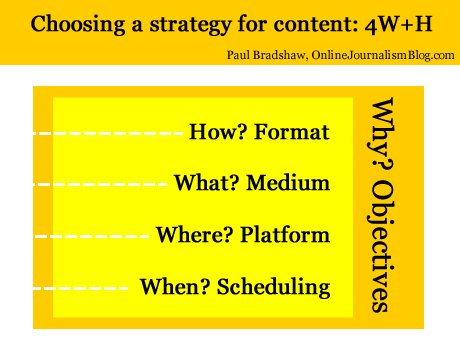
Below, I’ve tried to boil down these new decisions into 4 different types – and one overarching factor influencing them all. These are decisions that often have to be made quickly in the face of changing circumstances – I hope that fleshing them out in this way will help in making those decisions quicker and more effectively.

1. Format (“How?”)

We’re familiar with formats: the news in brief; the interview; the profile; the in-depth feature; and so on. They have their conventions and ingredients. If you’re writing a report you know that you will need a reaction quote, some context, and something to wrap it up (a quote; what happens next; etc.). If you’re doing an interview you’ll need to gather some colour about where it takes place, and how the interviewee reacts at various points.

Formats are often at their most powerful when they are subverted: a journalist who knows the format inside out can play with it, upsetting the reader’s expectations for the most impact. This is the tension between repetition and contrast that underlies not just journalism but good design, and even music.

As online journalism develops dozens of new formats have become available. Here are just a few:

  • the liveblog;
  • the audio slideshow;
  • the interactive map;
  • the app;
  • the podcast;
  • the explainer;
  • the portal;
  • the aggregator;
  • the gallery

Formats are chosen because they suit the thing being covered, its position in the publisher’s news environment, and the resources of the publisher.

Historically, for example, when a story first broke for most publishers a simple report was the only realistic option. But after that, they might commission a profile, interview, or deeper feature or package – if the interest and the resources warranted that.

The subject matter would also be a factor. A broadcaster might be more inclined to commission a package on a story if colourful characters or locations were involved and were accessible. They might also send a presenter down for a two-way.

These factors still come into play now we have access to a much wider range of formats – but a wider understanding of those formats is also needed.

  • Does the event take place over a geographical area, and users will want to see the movement or focus on a particular location? Then a map might be most appropriate.
  • Are things changing so fast that a traditional ‘story’ format is going to be inadequate? Then a liveblog may work better.
  • Is there a wealth of material out there being produced by witnesses? A gallery, portal or aggregator might all be good choices.
  • Have you secured an interview with a key character, and a set of locations or items that tell their own story? Is it an ongoing or recurring story? An audio slideshow or video interview may be the most powerful choice of format.
  • Are you on the scene and raw video of the event is going to have the most impact? Grab your phone and film – or stream.

2. Medium (“What?”)

Depending on what format has been chosen, the medium may be chosen for you too. But a podcast can be audio or video; a liveblog can involve text and multimedia; an app can be accessed on a phone, a webpage, a desktop widget, or Facebook.

This is not just about how you convey information about what’s going on (you’ll notice I avoid the use of ‘story’, as this is just one possible choice of format) but how the user accesses it and uses it.

A podcast may be accessed on the move; a Facebook app on mobile, in a social context; and so on. These are factors to consider as you produce your content.

3. Platform (“Where?”)

Likewise, the platforms where the content is to be distributed need careful consideration.

A liveblog’s reporting might be done through Twitter and aggregated on your own website. A map may be compiled in a Google spreadsheet but published through Google Maps and embedded on your blog.

An audioboo may have subscribers on iTunes or on the Audioboo app itself, and its autoposting feature may attract large numbers of listeners through Twitter.

Some call the choice of platform a choice of ‘channel’ but that does not do justice to the interactive and social nature of many of these platforms. Facebook or Twitter are not just channels for publishing live updates from a blog, but a place where people engage with you and with each other, exchanging information which can become part of your reporting (whether you want it to or not).

(Look at these tutorials for copy editors on Twitter to get some idea of how that platform alone requires its own distinct practices)

Your content strategy will need to take account of what happens on those platforms: which tweets are most retweeted or argued with; reacting to information posted in your blog or liveblog comments; and so on.

[UPDATE, March 25: This video from NowThisNews’s Ed O’Keefe explains how this aspect plays out in his organisation]

4. Scheduling (“When?”)

The choice of platform(s) will also influence your choice of timing. There will be different optimal times for publishing to Facebook, Twitter, email mailing lists, blogs, and websites.

There will also be optimal times for different formats (as the Washington Post found). A short news report may suit morning commuters; an audio slideshow or video may be best scheduled for the evening. Something humorous may play best on a Friday afternoon; something practical on a Wednesday afternoon once the user has moved past the early week slog.

Infographic: The Best Times To Post To Twitter & Facebook

This webcast on content strategy gives a particular insight into how they treat scheduling – not just across the day but across the week.

5. “Why?”

Print and broadcast rest on objectives so implicit that we barely think about them. The web, however, may have different objectives. Instead of attracting the widest numbers of readers, for example, we may want to engage users as much as possible.

That makes a big difference in any content strategy:

  • The rapid rise of liveblogs and explainers as a format can be partly explained by their stickiness when compared to traditional news articles.
  • Demand for video content has exceeded supply for some publishers because it is possible to embed advertising with content in a way which isn’t possible with text.
  • Infographics have exploded as they lend themselves so well to viral distribution.

Distribution is often one answer to ‘why?’, and introduces two elements I haven’t mentioned so far: search engine optimisation and social media optimisation. Blogs as a platform and text as a medium are generally better optimised for search engines, for example. But video and images are better optimised for social network platforms such as Facebook and Twitter.

And the timing of publishing might be informed by analytics of what people are searching for, updating Facebook about, or tweeting about right now.

The objective(s), of course, should recur as a consideration throughout all the stages above. And some stages will have different objectives: for distribution, for editorial quality, and for engagement.

Just to confuse things further, the objectives themselves are likely to change as the business models around online and multiplatform publishing evolve.

If I’m going to sum up all of the above in one line, then, it’s this: “Take nothing for granted.”

I’m looking for examples of content strategies for future editions of the book – please let me know if you’d like yours to be featured.

Choosing a strategy for content: 4 Ws and a H

Choosing a strategy for content: Format, Medium, Platform, Scheduling - and objectives

For this content I chose to write text accompanied by some images and video, published on a blog at a particular moment, for the objective of saving time and gaining feedback.

Something interesting happened to journalism when it moved from print and broadcast to the web. Aspects of the process that we barely thought about started to be questioned: the ‘story’ itself seemed less than fundamental. Decisions that you didn’t need to make as a journalist – such as what medium you would use – were becoming part of the job.

In fact, a whole raft of new decisions now needed to be made.

For those launching a new online journalism project, these questions are now increasingly tackled with a content strategy, a phrase and approach which, it seems to me, began outside of the news industry (where the content strategy had been settled on so long ago that it became largely implicit) and has steadily been rediscovered by journalists and publishers.

‘Web first’, for example, is a content strategy; the Seattle Times’s decision to focus on creation, curation and community is a content strategy. Reed Business Information’s reshaping of its editorial structures is, in part, a content strategy:

Why does a journalist need a content strategy?

I’ve written previously about the style challenge facing journalists in a multi platform environment: where before a journalist had few decisions to make about how to treat a story (the medium was given, the formats limited, the story supreme), now it can be easy to let old habits restrict the power, quality and impact of reporting.

Below, I’ve tried to boil down these new decisions into 4 different types – and one overarching factor influencing them all. These are decisions that often have to be made quickly in the face of changing circumstances – I hope that fleshing them out in this way will help in making those decisions quicker and more effectively. Continue reading

#TalkToTeens – When stories are more important than people

Here we go again.

I’ve been re-reading Kovach and Rosenstiel’s ‘Elements of Journalism’ recently and happened to be in the middle of the chapter on ‘Who journalists work for’ when this popped up in my Twitter stream.

Kovach and Rosenstiel make a simple point, and an increasingly important one: we don’t just tell stories for the sake of it; we do so because we are serving a community.

The story about Charlotte Berry, an assistant headteacher who swore in person-to-person conversations on Twitter is one example of a story which misses this point, and as a result has generated a backlash across Twitter, largely inspired by this post (currently read over 15,000 times) that makes some strong points about the public interest value of the story:

“They knew the ‘inappropriate language’ was jokey banter, between grown-ups, entirely unconnected to the school. They knew that’s what people do on Twitter, they joke and swear and let their hair down. Like this tweet from 17 August, after a football match: “Best moment from last night, the dear old lady 3 rows behind…’bowyer you dirty c@#*!” (in case you’re not sure what c@#* means, it’s ‘cunt’). That tweet wasn’t by @talktoteens, by the way. It was by @SamSmith68, the journalist on the Billericay Gazette.”

And about its target and likely effect:

“Charlotte Berry isn’t just any teacher. She’s a wellspring of energy, commitment and ideas, the sort of teacher you dream your kids will end up with. She runs a role model project for teenage girls, enabling them to meet inspiring professional women. She started a Historypin project in the school, bringing younger and older people together to share stories of their lives in the area. Even her Twitter name, @talktoteens, tells you something about her: she’s an advocate of communicating with kids, engaging them, not writing them off.”

These things, of course, didn’t matter. Because it was A Story. And sometimes – too often – we forget that A Story should have A Purpose.

This story, by a student who was helped by Charlotte Berry, is a story with a point, for example.

Credit to the head of Billericay School who responded pithily to the story as follows:

“The member of staff’s Twitter account appears to have been individually targeted, accessing conversations with friends unconnected with the school and taken completely out of context.

And credit to the newspaper for including that, albeit in the final paragraphs, and with comments now disabled. Although there are some interesting comments on the website’s forum

UPDATE: The forum has not approved any comments since Saturday evening – this post about the disconnect between print and online operations may explain why.

Comment on the story

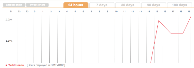
Chart showing tweets mentioning talktoteens during Friday

Chart showing tweets mentioning talktoteens during Friday

Customising your blog – some basic principles (Online Journalism Handbook)

customised car

A customised car. Like a customised blog, only bigger. Image by Steve Metz - click to see original

Although I cover blogging in some depth in my online journalism book, I thought I should write a supplementary section on what happens when you decide to start customising your blog.

Specifically, I want to address 3 key languages which you are likely to encounter, what they do, and how they work.

What’s the difference? HTML, CSS, and PHP

Most blog platforms use a combination of HTML, CSS and PHP (or similar scripting language). These perform very different functions, so it saves you a lot of time and effort if you know which one you might need to customise. Here’s what those functions are:

  • HTML is concerned with content.
  • CSS is concerned with style.
  • And PHP is concerned with functionality.

If you want to change how your blog looks, then, you will need to customise the CSS.

If you want to change what it does, you will need to customise the PHP.

And if you want to change how content is organised or classified, then you need to change the HTML.

All 3 are interrelated: PHP will generate much of the HTML, and the CSS will style the HTML. I’ll explain more about this below.

But before I do so, it’ll help if you have 3 windows open on your computer to see how this works on your own blog. They are:

  1. On your blog, right-click and select ‘View source‘ (or a similar option) so you can see the HTML for that page.
  2. Open another window, log in to your blog, and find the customisation option (you may have to Google around to find out where this option is). You should be able to see a page of code.
  3. Open a third window which you will use to search for useful resources to help you as you customise your blog. Continue reading

AUDIO: Text mining tips from Andy Lehren and Sarah Cohen

Searches made of the Sarah Palin emails

Searches made of the Sarah Palin emails - from a presentation by the New York Times's Andy Lehren

One of the highlights of last week’s Global Investigative Journalism Conference was the session on text mining, where the New York Times’s Andy Lehren talked about his experiences of working with data from Wikileaks and elsewhere, and former Washington Post database editor Sarah Cohen gave her insights into various tools and techniques in text mining.

Andy Lehren’s audio is embedded below. The story mentioned on North Korean missile deals can be found here. Other relevant links: Infomine and NICAR Net Tour.

And here’s Sarah’s talk which covers extracting information from large sets of documents. Many of the tools mentioned are bookmarked ‘textmining’ on my Delicious account.