Tag Archives: Rstats

Interest Differencing: Folk Commonly Followed by Tweeting MPs of Different Parties

Earlier this year I doodled a recipe for comparing the folk commonly followed by users of a couple of BBC programme hashtags (Social Media Interest Maps of Newsnight and BBCQT Twitterers). Prompted in part by a tweet from Michael Smethurst/@fantasticlife about generating an ESP map for UK politicians (something I’ve also doodled before – Sketching the Structure of the UK Political Media Twittersphere) I drew on the @tweetminster Twitter lists of MPs by party to generate lists of folk commonly followed by the MPs of each party.

Using the R wordcloud library commonality and comparison clouds, we can get a visual impression of folk commonly followed in significant numbers by all the MPs of the three main parties, as well as the folk the MPs of each party follow significantly and differentially to the other parties:

There’s still a fair bit to do making the methodology robust (for example, being able to cope with comparing folk commonly followed by different sets of users where the size of the set differs to a significant extent (for example, there is a large difference between the number of tweeting Conservative and LibDem MPs). I’ve also noticed that repeatedly running the comparison.cloud code turns up different clouds, so there’s some element of randomness in there. I guess this just adds to the “sketchy” nature of the visualisation; or maybe hints at a technique akin to the way a photogrpaher will take multiple shots of a subject before picking one or two to illustrate something in particular. Which is to say: the “truthiness” of the image reflects the message that you are trying to communicate. The visualisation in this case exposes a partial truth (which is to say, no absolute truth), or particular perspective about the way different groups differentially follow folk on Twitter. A couple of other quirks I’ve noticed about the comparison.cloud as currently defined: firstly, very highly represented friends are sized too large to appear in the cloud (which is why very commonly followed folk across all sets – the people that appear in the commonality cloud – tend not to appear) – there must be a better way of handling this? Secondly, if one person is represented so highly in one group that they don’t appear in the cloud for that group, they may appear elsewhere in the cloud. (So for example, I tried plotting clouds for folk commonly followed by a sample of the followers of @davegorman, as well as the people commonly followed by the friends of @davegorman – and @davegorman appeared as a small label in the friends part of the comparison.cloud (notwithstanding the fact that all the followers of @davegorman follow @davegorman, but not all his friends do… What might make more sense would be to suppress the display of a label in the colour of a particular group if that label has a higher representation in any of the other groups (and isn’t displayed because it would be too large)).

That said, as a quick sketch, I think there’s some information being revealed there (the coloured comparison.cloud seems to pull out some names that make sense as commonly followed folk peculiar to each party…). I guess way forward is to start picking apart the comparison.cloud code, another is to explore a few more comparison sets? Suggestions welcome as to what they might be…:-)

PS by the by, I notice via the Guardian datablog (Church vs beer: using Twitter to map regional differences in US culture) another Twitter based comparison project – Church or Beer? Americans on Twitter – which looked at geo-coded Tweets over a particular time period on a US state-wide basis and counted the relative occurrence of Tweets mentioning “church” or “beer”…

More Dabblings With Local Sentencing Data

In Accessing and Visualising Sentencing Data for Local Courts I posted a couple of quick ways in to playing with Ministry of Justice sentencing data for the period July 2010-June 2011 at the local court level. At the end of the post, I wondered about how to wrangle the data in R so that I could look at percentage-wise comparisons between different factors (Age, gender) and offence type and mentioned that I’d posted a related question to to the Cross Validated/Stats Exchange site (Casting multidimensional data in R into a data frame).

Courtesy of Chase, I have an answer🙂 So let’s see how it plays out…

To start, let’s just load the Isle of Wight court sentencing data into RStudio:

require(ggplot2)
require(reshape2)
iw = read.csv("http://dl.dropbox.com/u/1156404/wightCrimRecords.csv")

Now we’re going to shape the data so that we can plot the percentage of each offence type by gender (limited to Male and Female options):

iw.m = melt(iw, id.vars = "sex", measure.vars = "Offence_type")
iw.sex = ddply(iw.m, "sex", function(x) as.data.frame(prop.table(table(x$value))))
ggplot(subset(iw.sex,sex=='Female'|sex=='Male')) + geom_bar(aes(x=Var1,y=Freq)) + facet_wrap(~sex)+ opts(axis.text.x=theme_text(angle=-90)) + xlab('Offence Type')

Here’s the result:

Splitting down offences by percentage and gender

We can also process the data over a couple of variables. So for example, we can look to see how female recorded sentences break down by offence type and age range, displaying the results as a percentage of how often each offence type on its own was recorded by age:

iw.m2 = melt(iw, id.vars = c("sex","Offence_type" ), measure.vars = "AGE")
iw.off=ddply(iw.m2, c("sex","Offence_type"), function(x) as.data.frame(prop.table(table(x$value))))

ggplot(subset(iw.off,sex=='Female')) + geom_bar(aes(x=Var1,y=Freq)) + facet_wrap(~Offence_type) + opts(axis.text.x=theme_text(angle=-90)) + xlab('Age Range (Female)')

Offence type broken down by age and gender

Note that this graphic may actually be a little misleading because percentage based reports donlt play well with small numbers…: whilst there are multiple Driving Offences recorded, there are only two Burglaries, so the statistical distribution of convicted female burglars is based over a population of size two… A count would be a better way of showing this

PS I was hoping to be able to just transmute the variables and generate a raft of other charts, but I seem to be getting an error, maybe because some rows are missing? So: anyone know where I’m supposed to post R library bug reports?

Accessing and Visualising Sentencing Data for Local Courts

A recent provisional data release from the Ministry of Justice contains sentencing data from English(?) courts, at the offence level, for the period July 2010-June 2011: “Published for the first time every sentence handed down at each court in the country between July 2010 and June 2011, along with the age and ethnicity of each offender.” Criminal Justice Statistics in England and Wales [data]

In this post, I’ll describe a couple of ways of working with the data to produce some simple graphical summaries of the data using Google Fusion Tables and R…

…but first, a couple of observations:

– the web page subheading is “Quarterly update of statistics on criminal offences dealt with by the criminal justice system in England and Wales.”, but the sidebar includes the link to the 12 month set of sentencing data;
– the URL of the sentencing data is http://www.justice.gov.uk/downloads/publications/statistics-and-data/criminal-justice-stats/recordlevel.zip, which does not contain a time reference, although the data is time bound. What URL will be used if data for the period 7/11-6/12 is released in the same way next year?

The data is presented as a zipped CSV file, 5.4MB in the zipped form, and 134.1MB in the unzipped form.

The unzipped CSV file is too large to upload to a Google Spreadsheet or a Google Fusion Table, which are two of the tools I use for treating large CSV files as a database, so here are a couple of ways of getting in to the data using tools I have to hand…

Unix Command Line Tools

I’m on a Mac, so like Linux users I have ready access to a Console and several common unix commandline tools that are ideally suited to wrangling text files (on Windows, I suspect you need to install something like Cygwin; a search for windows unix utilities should turn up other alternatives too).

In Playing With Large (ish) CSV Files, and Using Them as a Database from the Command Line: EDINA OpenURL Logs and Postcards from a Text Processing Excursion I give a couple of examples of how to get started with some of the Unix utilities, which we can crib from in this case. So for example, after unzipping the recordlevel.csv document I can look at the first 10 rows by opening a console window, changing directory to the directory the file is in, and running the following command:

head recordlevel.csv

Or I can pull out rows that contain a reference to the Isle of Wight using something like this command:

grep -i wight recordlevel.csv > recordsContainingWight.csv

(The -i reads: “ignoring case”; grep is a command that identifies rows contain the search term (wight in this case). The > recordsContainingWight.csv says “send the result to the file recordsContainingWight.csv” )

Having extracted rows that contain a reference to the Isle of Wight into a new file, I can upload this smaller file to a Google Spreadsheet, or as Google Fusion Table such as this one: Isle of Wight Sentencing Fusion table.

Isle fo wight sentencing data

Once in the fusion table, we can start to explore the data. So for example, we can aggregate the data around different values in a given column and then visualise the result (aggregate and filter options are available from the View menu; visualisation types are available from the Visualize menu):

Visualising data in google fusion tables

We can also introduce filters to allow use to explore subsets of the data. For example, here are the offences committed by females aged 35+:

Data exploration in Google FUsion tables

Looking at data from a single court may be of passing local interest, but the real data journalism is more likely to be focussed around finding mismatches between sentencing behaviour across different courts. (Hmm, unless we can get data on who passed sentences at a local level, and look to see if there are differences there?) That said, at a local level we could try to look for outliers maybe? As far as making comparisons go, we do have Court and Force columns, so it would be possible to compare Force against force and within a Force area, Court with Court?

R/RStudio

If you really want to start working the data, then R may be the way to go… I use RStudio to work with R, so it’s a simple matter to just import the whole of the reportlevel.csv dataset.

Once the data is loaded in, I can use a regular expression to pull out the subset of the data corresponding once again to sentencing on the Isle of Wight (i apply the regular expression to the contents of the court column:

recordlevel <- read.csv("~/data/recordlevel.csv")
iw=subset(recordlevel,grepl("wight",court,ignore.case=TRUE))

We can then start to produce simple statistical charts based on the data. For example, a bar plot of the sentencing numbers by age group:

age=table(iw$AGE)
barplot(age, main="IW: Sentencing by Age", xlab="Age Range")

R - bar plot

We can also start to look at combinations of factors. For example, how do offence types vary with age?

ageOffence=table(iw$AGE, iw$Offence_type)
barplot(ageOffence,beside=T,las=3,cex.names=0.5,main="Isle of Wight Sentences", xlab=NULL, legend = rownames(ageOffence))

R barplot - offences on IW

If we remove the beside=T argument, we can produce a stacked bar chart:

barplot(ageOffence,las=3,cex.names=0.5,main="Isle of Wight Sentences", xlab=NULL, legend = rownames(ageOffence))

R - stacked bar chart

If we import the ggplot2 library, we have even more flexibility over the presentation of the graph, as well as what we can do with this sort of chart type. So for example, here’s a simple plot of the number of offences per offence type:

require(ggplot2)
#You may need to install ggplot2 as a library if it isn't already installed
ggplot(iw, aes(factor(Offence_type)))+ geom_bar() + opts(axis.text.x=theme_text(angle=-90))+xlab('Offence Type')

GGPlot2 in R

Alternatively, we can break down offence types by age:

ggplot(iw, aes(AGE))+ geom_bar() +facet_wrap(~Offence_type)

ggplot facet barplot

We can bring a bit of colour into a stacked plot that also displays the gender split on each offence:

ggplot(iw, aes(AGE,fill=sex))+geom_bar() +facet_wrap(~Offence_type)

ggplot with stacked factor

One thing I’m not sure how to do is rip the data apart in a ggplot context so that we can display percentage breakdowns, so we could compare the percentage breakdown by offence type on sentences awarded to males vs. females, for example? If you do know how to do that, please post a comment below 😉

PS HEre’s an easy way of getting started with ggplot… use the online hosted version at http://www.yeroon.net/ggplot2/ using this data set: wightCrimRecords.csv; download the file to your computer then upload it as shown below:

yeroon.net/ggplot2

PPS I got a little way towards identifying percentage breakdowns using a crib from here. The following command:
iwp=tapply(iw$Offence_type,iw$sex,function(x){prop.table(table(x))})
generates a (multidimensional) array for the responseVar (Offence) about the groupVar (sex). I don’t know how to generate a single data frame from this, but we can create separate ones for each sex as follows:
iwpMale=data.frame(iwp['Male'])
iwpFemale=data.frame(iwp['Female'])

We can then plot these percentages using constructions of the form:
ggplot(iwp2)+geom_bar(aes(x=Male.x,y=Male.Freq))
What I haven’t worked out how to do is elegantly map from the multidimensional array to a single data.frame? If you know how, please add a comment below…(I also posted a question on Cross Validated, the stats bit of Stack Exchange…)

Getting Started With Twitter Analysis in R

Earlier today, I saw a post vis the aggregating R-Bloggers service a post on Using Text Mining to Find Out What @RDataMining Tweets are About. The post provides a walktrhough of how to grab tweets into an R session using the twitteR library, and then do some text mining on it.

I’ve been meaning to have a look at pulling Twitter bits into R for some time, so I couldn’t but have a quick play…

Starting from @RDataMiner’s lead, here’s what I did… (Notes: I use R in an R-Studio context. If you follow through the example and a library appears to be missing, from the Packages tab search for the missing library and import it, then try to reload the library in the script. The # denotes a commented out line.)

require(twitteR)
#The original example used the twitteR library to pull in a user stream
#rdmTweets <- userTimeline("psychemedia", n=100)
#Instead, I'm going to pull in a search around a hashtag.
rdmTweets <- searchTwitter('#mozfest', n=500)
# Note that the Twitter search API only goes back 1500 tweets (I think?)

#Create a dataframe based around the results
df <- do.call("rbind", lapply(rdmTweets, as.data.frame))
#Here are the columns
names(df)
#And some example content
head(df,3)

So what can we do out of the can? One thing is look to see who was tweeting most in the sample we collected:

counts=table(df$screenName)
barplot(counts)

# Let's do something hacky:
# Limit the data set to show only folk who tweeted twice or more in the sample
cc=subset(counts,counts>1)
barplot(cc,las=2,cex.names =0.3)

Now let’s have a go at parsing some tweets, pulling out the names of folk who have been retweeted or who have had a tweet sent to them:

#Whilst tinkering, I came across some errors that seemed
# to be caused by unusual character sets
#Here's a hacky defence that seemed to work...
df$text=sapply(df$text,function(row) iconv(row,to='UTF-8'))

#A helper function to remove @ symbols from user names...
trim <- function (x) sub('@','',x)

#A couple of tweet parsing functions that add columns to the dataframe
#We'll be needing this, I think?
library(stringr)
#Pull out who a message is to
df$to=sapply(df$text,function(tweet) str_extract(tweet,"^(@[[:alnum:]_]*)"))
df$to=sapply(df$to,function(name) trim(name))

#And here's a way of grabbing who's been RT'd
df$rt=sapply(df$text,function(tweet) trim(str_match(tweet,"^RT (@[[:alnum:]_]*)")[2]))

So for example, now we can plot a chart showing how often a particular person was RT’d in our sample. Let’s use ggplot2 this time…

require(ggplot2)
ggplot()+geom_bar(aes(x=na.omit(df$rt)))+opts(axis.text.x=theme_text(angle=-90,size=6))+xlab(NULL)

Okay – enough for now… if you’re tempted to have a play yourself, please post any other avenues you explored with in a comment, or in your own post with a link in my comments;-)

Data Referenced Journalism and the Media – Still a Long Way to Go Yet?

Reading our local weekly press this evening (the Isle of Wight County Press), I noticed a page 5 headline declaring “Alarm over death rates at St Mary’s”, St Mary’s being the local general hospital. It seems a Department of Health report on hospital mortality rates came out earlier this week, and the Island’s hospital, it seems, has not performed so well…

Seeing the headline – and reading the report – I couldn’t help but think of Ben Goldacre’s Bad Science column in the Observer last week (DIY statistical analysis: experience the thrill of touching real data ), which commented on the potential for misleading reporting around bowel cancer death rates; among other things, the column described a statistical graphic known as a funnel plot which could be used to support the interpretation of death rate statistics and communicate the extent to which a particular death rate, for a given head of population, was “significantly unlikely” in statistical terms given the distribution of death rates across different population sizes.

I also put together a couple of posts describing how the funnel plot could be generated from a data set using the statistical programming language R.

Given the interest there appears to be around data journalism at the moment (amongst the digerati at least), I thought there might be a reasonable chance of finding some data inspired commentary around the hospital mortality figures. So what sort of report was produced by the Guardian (Call for inquiries at 36 NHS hospital trusts with high death rates) or the Telegraph (36 hospital trusts have higher than expected death rates), both of which have pioneering data journalists working for them, come up with? Little more than the official press release: New hospital mortality indicator to improve measurement of patient safety.

The reports were both formulaic, picking on leading with the worst performing hospital (which admittedly was not mentioned in the press release) and including some bog standard quotes from the responsible Minister lifted straight out of the press release (and presumably written by someone working for the Ministry…) Neither the Guardian nor the Telegraph story contained a link to the original data, which was linked to from the press release as part of the Notes to editors rider.

If we do a general, recency filtered, search for hospital death rates on either Google web search:

UK hosptial death rates reporting

or Google news search:

UK hospital death rate reporting

we see a wealth of stories from various local press outlets. This was a story with national reach and local colour, and local data set against a national backdrop to back it up. Rather than drawing on the Ministerial press released quotes, a quick scan of the local news reports suggests that at least the local journalists made some effort compared to the nationals’ churnalism, and got quotes from local NHS spokespeople to comment on the local figures. Most of the local reports I checked did not give a link to the original report, or dig too deeply into the data. However, This is Tamworth, (which had a Tamworth Herald byline in the Google News results), did publish the URL to the full report in its article Shock report reveals hospital has highest death rate in country, although not actually as a link… Just by the by, I also noticed the headline was flagged with a “Trusted Source” badge:

WHich is the trusted source?

Is that Tamworth Herald as the trusted source, or the Department of Health?!

Given that just a few days earlier, Ben Goldacre had provided an interesting way of looking at death rate data, it would have been nice to think that maybe it could have influenced someone out there to try something similar with the hospital mortality data. Indeed, if you check the original report, you can find a document describing How to interpret SHMI bandings and funnel plots (although, admittedly, not that clearly perhaps?). And along with the explanation, some example funnel plots.

However, the plots as provided are not that useful. They aren’t available as image files in a social or rich media press release format, nor are statistical analysis scripts that would allow the plots to be generated from the supplied data in too like R; that is to say, the executable working wasn’t shown…

So here’s what I’m thinking: firstly, we need data press officers as well as data journalists. Their job would be to put together the tools that support the data churnalist in taking the raw data and producing statistical charts and interpretation from it. Just like the ministerial quote can be reused by the journalist, so the data press pack can be used to hep the journalist get some graphs out there to help them illustrate the story. (The finishing of the graph would be up to the journalist, but the mechanics of the generation of the base plot would be provided as part of the data press pack.)

Secondly, there may be an opportunity for an enterprising individual to take the data sets and produced localised statistical graphics from the source data. In the absence of a data press officer, the enterprising individual could even fulfil this role. (To a certain extent, that’s what the Guardian Datastore does.)

(Okay, I know: the local press will have allocated only a certain amount of space to the story, and the editor would likely see any mention of stats or funnel plots as scaring folk off, but we have to start changing attitudes, expectations, willingness and ability to engage with this sort of stuff somehow. Most people have very little education in reading any charts other than pie charts, bar charts, and line charts, and even then are easily misled. We have start working on this, we have to start looking at ways of introducing more powerful plots and charts and helping people get a folk understanding of them. And funnel plots may be one of the things we should be starting to push?)

Now back to the hospital data. In How Might Data Journalists Show Their Working? Sweave, I posted a script that included the working for generating a funnel plot from an appropriate online CSV data source. Could this script be used to generate a funnel plot from the hospital data?

I had a quick play, and managed to get a scatterplot distribution that looks like the one on the funnel plot explanation guide by setting the number value to the SHMI Indicator data (csv) EXPECTED column and the p to the VALUE column. However, because the p value isn’t a probability in the range 0..1, the p.se calculation fails:
p.se <- sqrt((p*(1-p)) / (number))

Anyway, here’s the script for generating the straightforward scatter plot (I had to read the data in from a local file because there was some issue with the security certificate trying to read the data in from the online URL using the RCurl library and hospitaldata = data.frame( read.csv( textConnection( getURL( DATA_URL ) ) ) ):

hospitaldata = read.csv("~/Downloads/SHMI_10_10_2011.csv")
number = hospitaldata$EXPECTED
p = hospitaldata$VALUE
df = data.frame(p, number, Area=hospitaldata$PROVIDER.NAME)
ggplot(aes(x = number, y = p), data = df) + geom_point(shape = 1)

There’s presumably a simple fix to the original script that will take the range of the VALUE column into account and allow us to plot the funnel distribution lines appropriately? If anyone can suggest the fix, please let me know in a comment…;-)

How Might Data Journalists Show Their Working? Sweave

If part of the role of data journalism is to make transparent the justification behind claims that are, or aren’t, backed up by data, there’s good reason to suppose that the journalists should be able to back up their own data-based claims with evidence about how they made use of the data. Posting links to raw data helps to a certain extent – at least third parties can then explore the data themselves and check the claims the press are making – but you could also argue that the journalists should also make their notes available regarding how they worked the data. (The same is true in public reports, where summary statistics and charts are included in a report, along with a link to the raw data, but no transparency in how the summary reports/charts were actually produced from the data.)

In Power Tools for Aspiring Data Journalists: R, I explored how we might use the R statistical programming language to replicate a chart that appeared in one of Ben Goldacre’s Bad Science columns. I included code snippets in the post, along with the figures they generated. But is there a way of getting even closer to the source, as it were, and produce documents that essentially generate their output from some sort of “source code”?

For example, take this view of my working relating to the production of the funnel chart described in Goldacre’s column:

You can find the actual “source code” for that document here: bowel cancer funnel plot working notes If you load it into something like RStudio, you can “run” the code and generate your own PDF from it.

The “source” of the document includes both text and R code. When the Sweave document is processed, the R code contained within the document is executed and the results also included in the document. The charts shown in the report are generated directly from the code included in the document, using data pulled in to the document form a source referenced within the document. If the source data is changed, or the R code is changed, what’s contained in the output document will change as well.

This sort of workflow will be familiar to many experimental scientists, but I wonder: is it something that data journalists have considered, at least as a way of keeping working notes about data related projects they are working on?

PS as well as Sweave, see dexy.it, which generalises the Sweave approach to allow you to create self-documenting software/code. Educators, also take note…;-)

Power Tools for Aspiring Data Journalists: Funnel Plots in R

Picking up on Paul Bradshaw’s post A quick exercise for aspiring data journalists which hints at how you can use Google Spreadsheets to grab – and explore – a mortality dataset highlighted by Ben Goldacre in DIY statistical analysis: experience the thrill of touching real data, I thought I’d describe a quick way of analysing the data using R, a very powerful statistical programming environment that should probably be part of your toolkit if you ever want to get round to doing some serious stats, and have a go at reproducing the analysis using a bit of judicious websearching and some cut-and-paste action…

R is an open-source, cross-platform environment that allows you to do programming like things with stats, as well as producing a wide range of graphical statistics (stats visualisations) as if by magic. (Which is to say, it can be terrifying to try to get your head round… but once you’ve grasped a few key concepts, it becomes a really powerful tool… At least, that’s what I’m hoping as I struggle to learn how to use it myself!)

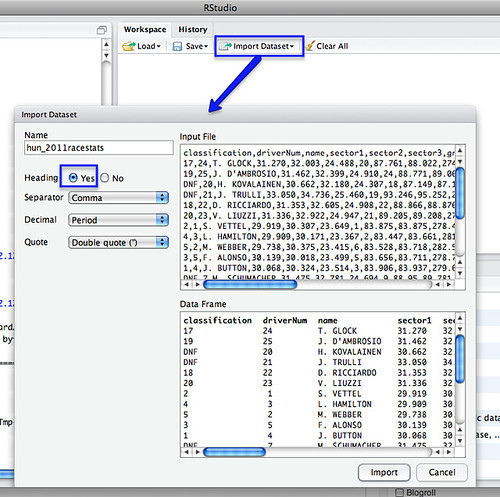
I’ve been using R-Studio to work with R, a) because it’s free and works cross-platform, b) it can be run as a service and accessed via the web (though I haven’t tried that yet; the hosted option still hasn’t appeared yet, either…), and c) it offers a structured environment for managing R projects.

So, to get started. Paul describes a dataset posted as an HTML table by Ben Goldacre that is used to generate the dots on this graph:

The lines come from a probabilistic model that helps us see the likely spread of death rates given a particular population size.

If we want to do stats on the data, then we could, as Paul suggests, pull the data into a spreadsheet and then work from there… Or, we could pull it directly into R, at which point all manner of voodoo stats capabilities become available to us.

As with the =importHTML formula in Google spreadsheets, R has a way of scraping data from an HTML table anywhere on the public web:

#First, we need to load in the XML library that contains the scraper function
library(XML)
#Scrape the table
cancerdata=data.frame( readHTMLTable( 'http://www.guardian.co.uk/commentisfree/2011/oct/28/bad-science-diy-data-analysis', which=1, header=c('Area','Rate','Population','Number')))

The format is simple: readHTMLTable(url,which=TABLENUMBER) (TABLENUMBER is used to extract the N’th table in the page.) The header part labels the columns (the data pulled in from the HTML table itself contains all sorts of clutter).

We can inspect the data we’ve imported as follows:

#Look at the whole table
cancerdata
#Look at the column headers
names(cancerdata)
#Look at the first 10 rows
head(cancerdata)
#Look at the last 10 rows
tail(cancerdata)
#What sort of datatype is in the Number column?
class(cancerdata$Number)

The last line – class(cancerdata$Number) – identifies the data as type ‘factor’. In order to do stats and plot graphs, we need the Number, Rate and Population columns to contain actual numbers… (Factors organise data according to categories; when the table is loaded in, the data is loaded in as strings of characters; rather than seeing each number as a number, it’s identified as a category.)

#Convert the numerical columns to a numeric datatype
cancerdata$Rate=as.numeric(levels(cancerdata$Rate)[as.integer(cancerdata$Rate)])
cancerdata$Population=as.numeric(levels(cancerdata$Population)[as.integer(cancerdata$Population)])
cancerdata$Number=as.numeric(levels(cancerdata$Number)[as.integer(cancerdata$Number)])

#Just check it worked…
class(cancerdata$Number)
head(cancerdata)

We can now plot the data:

#Plot the Number of deaths by the Population
plot(Number ~ Population,data=cancerdata)

If we want to, we can add a title:
#Add a title to the plot
plot(Number ~ Population,data=cancerdata, main='Bowel Cancer Occurrence by Population')

We can also tweak the axis labels:

plot(Number ~ Population,data=cancerdata, main='Bowel Cancer Occurrence by Population',ylab='Number of deaths')

The plot command is great for generating quick charts. If we want a bit more control over the charts we produce, the ggplot2 library is the way to go. (ggpplot2 isn’t part of the standard R bundle, so you’ll need to install the package yourself if you haven’t already installed it. In RStudio, find the Packages tab, click Install Packages, search for ggplot2 and then install it, along with its dependencies…):

require(ggplot2)
ggplot(cancerdata)+geom_point(aes(x=Population,y=Number))+opts(title='Bowel Cancer Data')+ylab('Number of Deaths')

Doing a bit of searching for the “funnel plot” chart type used to display the ata in Goldacre’s article, I came across a post on Cross Validated, the Stack Overflow/Statck Exchange site dedicated to statistics related Q&A: How to draw funnel plot using ggplot2 in R?

The meta-analysis answer seemed to produce the similar chart type, so I had a go at cribbing the code… This is a dangerous thing to do, and I can’t guarantee that the analysis is the same type of analysis as the one Goldacre refers to… but what I’m trying to do is show (quickly) that R provides a very powerful stats analysis environment and could probably do the sort of analysis you want in the hands of someone who knows how to drive it, and also knows what stats methods can be appropriately applied for any given data set…

Anyway – here’s something resembling the Goldacre plot, using the cribbed code which has confidence limits at the 95% and 99.9% levels. Note that I needed to do a couple of things:

1) work out what values to use where! I did this by looking at the ggplot code to see what was plotted. p was on the y-axis and should be used to present the death rate. The data provides this as a rate per 100,000, so we need to divide by 100, 000 to make it a rate in the range 0..1. The x-axis is the population.

#TH: funnel plot code from:
#TH: http://stats.stackexchange.com/questions/5195/how-to-draw-funnel-plot-using-ggplot2-in-r/5210#5210
#TH: Use our cancerdata
number=cancerdata$Population
#TH: The rate is given as a 'per 100,000' value, so normalise it
p=cancerdata$Rate/100000

p.se <- sqrt((p*(1-p)) / (number))
df <- data.frame(p, number, p.se)

## common effect (fixed effect model)
p.fem <- weighted.mean(p, 1/p.se^2)

## lower and upper limits for 95% and 99.9% CI, based on FEM estimator
#TH: I'm going to alter the spacing of the samples used to generate the curves
number.seq <- seq(1000, max(number), 1000)
number.ll95 <- p.fem - 1.96 * sqrt((p.fem*(1-p.fem)) / (number.seq))
number.ul95 <- p.fem + 1.96 * sqrt((p.fem*(1-p.fem)) / (number.seq))
number.ll999 <- p.fem - 3.29 * sqrt((p.fem*(1-p.fem)) / (number.seq))
number.ul999 <- p.fem + 3.29 * sqrt((p.fem*(1-p.fem)) / (number.seq))
dfCI <- data.frame(number.ll95, number.ul95, number.ll999, number.ul999, number.seq, p.fem)

## draw plot
#TH: note that we need to tweak the limits of the y-axis
fp <- ggplot(aes(x = number, y = p), data = df) +
geom_point(shape = 1) +
geom_line(aes(x = number.seq, y = number.ll95), data = dfCI) +
geom_line(aes(x = number.seq, y = number.ul95), data = dfCI) +
geom_line(aes(x = number.seq, y = number.ll999, linetype = 2), data = dfCI) +
geom_line(aes(x = number.seq, y = number.ul999, linetype = 2), data = dfCI) +
geom_hline(aes(yintercept = p.fem), data = dfCI) +
scale_y_continuous(limits = c(0,0.0004)) +
xlab("number") + ylab("p") + theme_bw()

fp

As I said above, it can be quite dangerous just pinching other folks’ stats code if you aren’t a statistician and don’t really know whether you have actually replicated someone else’s analysis or done something completely different… (this is a situation I often find myself in!); which is why I think we need to encourage folk who release statistical reports to not only release their data, but also show their working, including the code they used to generate any summary tables or charts that appear in those reports.

In addition, it’s worth noting that cribbing other folk’s code and analyses and applying it to your own data may lead to a nonsense result because some stats analyses only work if the data has the right sort of distribution…So be aware of that, always post your own working somewhere, and if someone then points out that it’s nonsense, you’ll hopefully be able to learn from it…

Given those caveats, what I hope to have done is raise awareness of what R can be used to do (including pulling data into a stats computing environment via an HTML table screenscrape) and also produced some sort of recipe we could take to a statistician to say: is this the sort of thing Ben Goldacre was talking about? And if not, why not?

[If I’ve made any huge – or even minor – blunders in the above, please let me know… There’s always a risk in cutting and pasting things that look like they produce the sort of thing you’re interested in, but may actually be doing something completely different!]

Using Google Spreadsheets as a Database Source for R

I couldn’t contain myself (other more pressing things to do, but…), so I just took a quick time out and a coffee to put together a quick and dirty R function that will let me run queries over Google spreadsheet data sources and essentially treat them as database tables (e.g. Using Google Spreadsheets as a Database with the Google Visualisation API Query Language).

Here’s the function:

library(RCurl)
gsqAPI = function(key,query,gid=0){ return( read.csv( paste( sep="",'http://spreadsheets.google.com/tq?', 'tqx=out:csv','&tq=', curlEscape(query), '&key=', key, '&gid=', gid) ) ) }

It requires the spreadsheet key value and a query; you can optionally provide a sheet number within the spreadsheet if the sheet you want to query is not the first one.

We can call the function as follows:

gsqAPI('tPfI0kerLllVLcQw7-P1FcQ','select * limit 3')

In that example, and by default, we run the query against the first sheet in the spreadsheet.

Alternatively, we can make a call like this, and run a query against sheet 3, for example:
tmpData=gsqAPI('0AmbQbL4Lrd61dDBfNEFqX1BGVDk0Mm1MNXFRUnBLNXc','select A,C where <= 10',3)
tmpData

My first R function

The real question is, of course, could it be useful.. (or even OUseful?!)?

Here’s another example: a way of querying the Guardian Datastore list of spreadsheets:

gsqAPI('0AonYZs4MzlZbdFdJWGRKYnhvWlB4S25OVmZhN0Y3WHc','select * where A contains "crime" and B contains "href" order by C desc limit 10')

What that call does is run a query against the Guardian Datastore spreadsheet that lists all the other Guardian Datastore spreadsheets, and pulls out references to spreadsheets relating to “crime”.

The returned data is a bit messy and requires parsing to be properly useful.. but I haven’t started looking at string manipulation in R yet…(So my question is: given a dataframe with a column containing things like <a href=”http://example.com/whatever”>Some Page</a>, how would I extract columns containing http://example.com/whatever or Some Page fields?)

[UPDATE: as well as indexing a sheet by sheet number, you can index it by sheet name, but you’ll probably need to tweak the function to look end with '&gid=', curlEscape(gid) so that things like spaces in the sheet name get handled properly I’m not sure about this now.. calling sheet by name works when accessing the “normal” Google spreadsheets application, but I’m not sure it does for the chart query language call??? ]

[If you haven’t yet discovered R, it’s an environment that was developed for doing stats… I use the RStudio environment to play with it. The more I use it (and I’ve only just started exploring what it can do), the more I think it provides a very powerful environment for working with data in quite a tangible way, not least for reshaping it and visualising it, let alone doing stats with in. (In fact, don’t use the stats bit if you don’t want to; it provides more than enough data mechanic tools to be going on with;-)]

PS By the by, I’m syndicating my Rstats tagged posts through the R-Bloggers site. If you’re at all interested in seeing what’s possible with R, I recommend you subscribe to R-Bloggers, or at least have a quick skim through some of the posts on there…

PPS The RSpatialTips post Accessing Google Spreadsheets from R has a couple of really handy tips for tidying up data pulled in from Google Spreadsheets; assuming the spreadsheetdata has been loaded into ssdata: a) tidy up column names using colnames(ssdata) <- c("my.Col.Name1","my.Col.Name2",...,"my.Col.NameN"); b) If a column returns numbers as non-numeric data (eg as a string "1,000") in cols 3 to 5, convert it to a numeric using something like: for (i in 3:5) ssdata[,i] <- as.numeric(gsub(",","",ssdata[,i])) [The last column can be identifed as ncol(ssdata) You can do a more aggessive conversion to numbers (assuming no decimal points) using gsub("[^0-9]“,”",ssdata[,i])]

PPPS via Revolutions blog, how to read the https file into R (unchecked):

require(RCurl)
myCsv = getURL(httpsCSVurl)
read.csv(textConnection(myCsv))

Merging Two Different Datasets Containing a Common Column With R and R-Studio

Another way for the database challenged (such as myself!) for merging two datasets that share at least one common column…

This recipe using the cross-platform stats analysis package, R. I use R via the R-Studio client, which provides an IDE wrapper around the R environment.

So for example, here’s how to merge a couple of files sharing elements in a common column…

First, load in your two data files – for example, I’m going to load in separate files that contain qualifying and race stats from the last Grand Prix:

R import data

We can merge the datasets using a command of the form:

m=merge(hun_2011racestats,hun_2011qualistats,by="driverNum")

The by parameter identifies which column we want to merge the tables around. (If the two datasets have different column names, you need to set by.x= and by.y= to specify the column from each dataset that is the focus for merging).

So for example, in the simple case where we are merging around two columns of the same name in different tables:

R merge
Merging datasets in R

After the merge, column names for columns from the first table have the .x suffix added, and from the second, .y.

We can then export the combined dataset as a CSV file:

write.csv(m, file = "demoMerge.csv")

fragment of csv file

[If you want to extract a subset of the columns, specify the required columns in an R command of the form: m2=m[c(“driverNum”,”name.x”,”ultimate.x”,”ultimate.y”)] See also: R: subset]

Simples;-)

PS in the above example, the merge table only contains merged rows. If there are elements in the common column of one table, but not the other, that partial data will not be included in the merged table. To include all rows, set all=TRUE. To include all rows from the first table, but not unmatched rows from the second, set all.x=TRUE; (the cells from columns in the unmatched row of the second table will be set to NA). (all.y=TRUE is also legitimate). From the R merge documentation:

In SQL database terminology, the default value of all = FALSE [the default] gives a natural join, a special case of an inner join. Specifying all.x = TRUE gives a left (outer) join, all.y = TRUE a right (outer) join, and both (all=TRUE a (full) outer join. DBMSes do not match NULL records, equivalent to incomparables = NA in R.

For other ways of combining data from two different data sets, see:
Merging Datasets with Common Columns in Google Refine
A Further Look at the Orange Data Playground – Filters and File Merging
Merging CSV data files with Google Fusion Tables

If you know of any other simple ways of joining data files about a common column, please reveal all in the comments:-)