Tag Archives: Tinkering

Data Shaping in Google Refine – Generating New Rows from Multiple Values in a Single Column

One of the things I’ve kept stumbling over in Google Refine is how to use it to reshape a data set, so I had a little play last week and worked out a couple of new (to me) recipes.

The first relates to reshaping data by creating new rows based on columns. For example, suppose we have a data set that has rows relating to Olympics events, and columns relating to Medals, with cell entries detailing the country that won each medal type:

However, suppose that you need to get the data into a different shape – maybe one line per country with an additional column specifying the medal type. Something like this, for example:

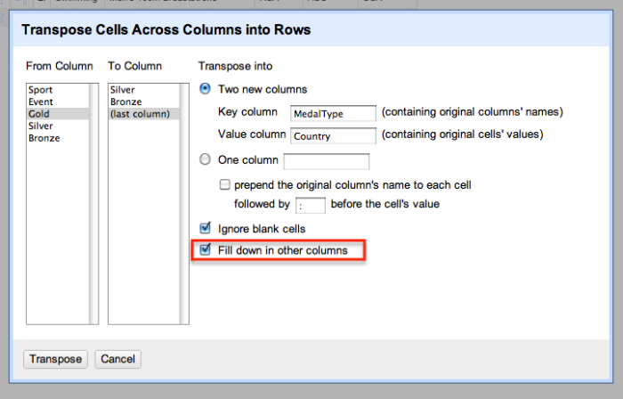
How can we generate that sort of view from the original data set? Here’s one way, that works when the columns you want to split into row values are contiguous (that is, next to each other). From the first column in the set of columns you want to be transformed, select Transpose > Transpose cells across columns into rows:

We now set the original selected column headers to be the cell value within a new column – MedalType – and the original cell values the value within a Country column:

(Note that we could also just transform the data into a single column. For example, suppose we had columns relating to courses currently taken by a particular student (Course 1, Course 2, Course 3), with a course code as cell value and one, two or three columns populated per student. If we wanted one row per student per course, we could just map the three columns onto a single column – CourseCode – and assign multiple rows to each student, then filtering out rows with a blank value in the CourseCOde column as required.)

Ticking the Fill down in other columns checkbox ensures that the appropriate Sport and Event values are copied in to the newly created rows:

Having worked out how to do that oft-required bit of data reshaping, I thought I could probably have another go at something that has been troubling me for ages – how to generate multiple rows from a single row where one of the columns contains JSON data (maybe pulled from a web service/API) that contains multiple items. This is a “mate in three” sort of problem, so here’s how I started to try to work it back. Given that I now know how to map columns onto rows, can I work out how to map different results in a JSON response onto different columns?

For example, here’s a result from the Facebook API for a search on a particular OU course code and the word open in a Facebook group name:

{“data”:[{“version”:1,”name”:”U101 (Open University) start date February 2012″,”id”:”325165900838311″},{“version”:1,”name”:”Open university, u101- design thinking, October 2011″,”id”:”250227311674865″},{“version”:1,”name”:”Feb 2011 Starters U101 Design Thinking – Open University”,”id”:”121552081246861″},{“version”:1,”name”:”Open University – U101 Design Thinking, Feburary 2011″,”id”:”167769429928476″}],”paging”:{“next”:…etc…}}

It returns a couple of results in the data element, in particular group name and group ID. Here’s one way I found of creating one row per group… Start off by creating a new column based on the JSON data column that parses the results in the data element into a list:

We can then iterate over the list items in this new column using the forEach grel command. The join command then joins the elements within each list item, specifically the group ID and name values in each result:

forEach(value.parseJson(),v,[v.id,v.name].join('||'))

You’ll notice that for multiple results, this produces a list of joined items, which we can also join together by extending the GREL expression:

forEach(value.parseJson(),v,[v.id,v.name].join('||')).join('::')

We now have a column that contains ‘||’ and ‘::’ separated items – :: separates individual group results from each other, || separates the id and name for each particular group.

Given we know how to create rows from multiple columns, we could try to split this column into separate columns using Edit column > Split into separate columns. This would create one column per result, which we could then transform into rows, as we did above. Whilst I don’t recommend this route in this particular case, here’s how we could go about doing it…

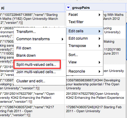
A far better approach is to use the Edit cells > split multi-valued cells option to automatically create new rows based on splitting the elements in a single column:

Note, however that this creates blanks in the other columns, so we need to Edit cells > Fill down to fill in the blanks in any other columns we want to refer to. After doing that, we end up with something like this:

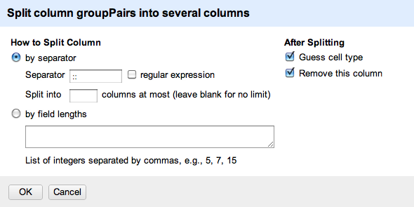
We could now split the groupPairs column using the || separator to create two columns – Group ID and group name – giving us one row per group, and separate columns identifying the course, group name and group ID.

If the above route seems a little complicated, fear not…Once you apply it, it starts to make sense!

Interest Differencing: Folk Commonly Followed by Tweeting MPs of Different Parties

Earlier this year I doodled a recipe for comparing the folk commonly followed by users of a couple of BBC programme hashtags (Social Media Interest Maps of Newsnight and BBCQT Twitterers). Prompted in part by a tweet from Michael Smethurst/@fantasticlife about generating an ESP map for UK politicians (something I’ve also doodled before – Sketching the Structure of the UK Political Media Twittersphere) I drew on the @tweetminster Twitter lists of MPs by party to generate lists of folk commonly followed by the MPs of each party.

Using the R wordcloud library commonality and comparison clouds, we can get a visual impression of folk commonly followed in significant numbers by all the MPs of the three main parties, as well as the folk the MPs of each party follow significantly and differentially to the other parties:

There’s still a fair bit to do making the methodology robust (for example, being able to cope with comparing folk commonly followed by different sets of users where the size of the set differs to a significant extent (for example, there is a large difference between the number of tweeting Conservative and LibDem MPs). I’ve also noticed that repeatedly running the comparison.cloud code turns up different clouds, so there’s some element of randomness in there. I guess this just adds to the “sketchy” nature of the visualisation; or maybe hints at a technique akin to the way a photogrpaher will take multiple shots of a subject before picking one or two to illustrate something in particular. Which is to say: the “truthiness” of the image reflects the message that you are trying to communicate. The visualisation in this case exposes a partial truth (which is to say, no absolute truth), or particular perspective about the way different groups differentially follow folk on Twitter. A couple of other quirks I’ve noticed about the comparison.cloud as currently defined: firstly, very highly represented friends are sized too large to appear in the cloud (which is why very commonly followed folk across all sets – the people that appear in the commonality cloud – tend not to appear) – there must be a better way of handling this? Secondly, if one person is represented so highly in one group that they don’t appear in the cloud for that group, they may appear elsewhere in the cloud. (So for example, I tried plotting clouds for folk commonly followed by a sample of the followers of @davegorman, as well as the people commonly followed by the friends of @davegorman – and @davegorman appeared as a small label in the friends part of the comparison.cloud (notwithstanding the fact that all the followers of @davegorman follow @davegorman, but not all his friends do… What might make more sense would be to suppress the display of a label in the colour of a particular group if that label has a higher representation in any of the other groups (and isn’t displayed because it would be too large)).

That said, as a quick sketch, I think there’s some information being revealed there (the coloured comparison.cloud seems to pull out some names that make sense as commonly followed folk peculiar to each party…). I guess way forward is to start picking apart the comparison.cloud code, another is to explore a few more comparison sets? Suggestions welcome as to what they might be…:-)

PS by the by, I notice via the Guardian datablog (Church vs beer: using Twitter to map regional differences in US culture) another Twitter based comparison project – Church or Beer? Americans on Twitter – which looked at geo-coded Tweets over a particular time period on a US state-wide basis and counted the relative occurrence of Tweets mentioning “church” or “beer”…

Tinkering With Scraperwiki – The Bottom Line, OpenCorporates Reconciliation and the Google Viz API

Having got to grips with adding a basic sortable table view to a Scraperwiki view using the Google Chart Tools (Exporting and Displaying Scraperwiki Datasets Using the Google Visualisation API), I thought I’d have a look at wiring in an interactive dashboard control.

You can see the result at BBC Bottom Line programme explorer:

The page loads in the contents of a source Scraperwiki database (so only good for smallish datasets in this version) and pops them into a table. The searchbox is bound to the Synopsis column and and allows you to search for terms or phrases within the Synopsis cells, returning rows for which there is a hit.

Here’s the function that I used to set up the table and search control, bind them together and render them:

    google.load('visualization', '1.1', {packages:['controls']});

    google.setOnLoadCallback(drawTable);

    function drawTable() {

      var json_data = new google.visualization.DataTable(%(json)s, 0.6);

    var json_table = new google.visualization.ChartWrapper({'chartType': 'Table','containerId':'table_div_json','options': {allowHtml: true}});
    //i expected this limit on the view to work?
    //json_table.setColumns([0,1,2,3,4,5,6,7])

    var formatter = new google.visualization.PatternFormat('<a href="http://www.bbc.co.uk/programmes/{0}">{0}</a>');
    formatter.format(json_data, [1]); // Apply formatter and set the formatted value of the first column.

    formatter = new google.visualization.PatternFormat('<a href="{1}">{0}</a>');
    formatter.format(json_data, [7,8]);

    var stringFilter = new google.visualization.ControlWrapper({
      'controlType': 'StringFilter',
      'containerId': 'control1',
      'options': {
        'filterColumnLabel': 'Synopsis',
        'matchType': 'any'
      }
    });

  var dashboard = new google.visualization.Dashboard(document.getElementById('dashboard')).bind(stringFilter, json_table).draw(json_data);

    }

The formatter is used to linkify the two URLs. However, I couldn’t get the table to hide the final column (the OpenCorporates URI) in the displayed table? (Doing something wrong, somewhere…) You can find the full code for the Scraperwiki view here.

Now you may (or may not) be wondering where the OpenCorporates ID came from. The data used to populate the table is scraped from the JSON version of the BBC programme pages for the OU co-produced business programme The Bottom Line (Bottom Line scraper). (I’ve been pondering for sometime whether there is enough content there to try to build something that might usefully support or help promote OUBS/OU business courses or link across to free OU business courses on OpenLearn…) Supplementary content items for each programme identify the name of each contributor and the company they represent in a conventional way. (Their role is also described in what looks to be a conventionally constructed text string, though I didn’t try to extract this explicitly – yet. (I’m guessing the Reuters OpenCalais API would also make light work of that?))

Having got access to the company name, I thought it might be interesting to try to get a corporate identifier back for each one using the OpenCorporates (Google Refine) Reconciliation API (Google Refine reconciliation service documentation).

Here’s a fragment from the scraper showing how to lookup a company name using the OpenCorporates reconciliation API and get the data back:

ocrecURL='http://opencorporates.com/reconcile?query='+urllib.quote_plus("".join(i for i in record['company'] if ord(i)<128))
    try:
        recData=simplejson.load(urllib.urlopen(ocrecURL))
    except:
        recData={'result':[]}
    print ocrecURL,[recData]
    if len(recData['result'])>0:
        if recData['result'][0]['score']>=0.7:
            record['ocData']=recData['result'][0]
            record['ocID']=recData['result'][0]['uri']
            record['ocName']=recData['result'][0]['name']

The ocrecURL is constructed from the company name, sanitised in a hack fashion. If we get any results back, we check the (relevance) score of the first one. (The results seem to be ordered in descending score order. I didn’t check to see whether this was defined or by convention.) If it seems relevant, we go with it. From a quick skim of company reconciliations, I noticed at least one false positive – Reed – but on the whole it seemed to work fairly well. (If we look up more details about the company from OpenCorporates, and get back the company URL, for example, we might be able to compare the domain with the domain given in the link on the Bottom Line page. A match would suggest quite strongly that we have got the right company…)

As @stuartbrown suggeted in a tweet, a possible next step is to link the name of each guest to a Linked Data identifier for them, for example, using DBPedia (although I wonder – is @opencorporates also minting IDs for company directors?). I also need to find some way of pulling out some proper, detailed subject tags for each episode that could be used to populate a drop down list filter control…

PS for more Google Dashboard controls, check out the Google interactive playground…

PPS see also: OpenLearn Glossary Search and OpenLearn LEarning Outcomes Search

Exporting and Displaying Scraperwiki Datasets Using the Google Visualisation API

In Visualising Networks in Gephi via a Scraperwiki Exported GEXF File I gave an example of how we can publish arbitrary serialised output file formats from Scraperwiki using the GEXF XML file format as a specific example. Of more general use, however, may be the ability to export Scraperwiki data using the Google visualisation API DataTable format. Muddling around the Google site last night, I noticed the Google Data Source Python Library that makes it easy to generate appropriately formatted JSON data that can be consumed by the (client side) Google visualisation library. (This library provides support for generating line charts, bar charts, sortable tables, etc, as well as interactive dashboards.) A tweet to @frabcus questioning whether the gviz_api Python library was available as a third party library on Scraperwiki resulted in him installing it (thanks, Francis:-), so this post is by way of thanks…

Anyway, here are a couple of examples of how to use the library. The first is a self-contained example (using code pinched from here) that transforms the data into the Google format and then drops it into an HTML page template that can consume the data, in this case displaying it as a sortable table (GViz API on scraperwiki – self-contained sortable table view [code]):

Of possibly more use in the general case is a JSONP exporter (example JSON output (code)):

Here’s the code for the JSON feed example:

import scraperwiki
import gviz_api

#Example of:
## how to use the Google gviz Python library to cast Scraperwiki data into the Gviz format and export it as JSON

#Based on the code example at:
#http://code.google.com/apis/chart/interactive/docs/dev/gviz_api_lib.html

scraperwiki.sqlite.attach( 'openlearn-units' )
q = 'parentCourseCode,name,topic,unitcode FROM "swdata" LIMIT 20'
data = scraperwiki.sqlite.select(q)

description = {"parentCourseCode": ("string", "Parent Course"),"name": ("string", "Unit name"),"unitcode": ("string", "Unit Code"),"topic":("string","Topic")}

data_table = gviz_api.DataTable(description)
data_table.LoadData(data)

json = data_table.ToJSon(columns_order=("unitcode","name", "topic","parentCourseCode" ),order_by="unitcode")

scraperwiki.utils.httpresponseheader("Content-Type", "application/json")
print 'ousefulHack('+json+')'

I hardcoded the wraparound function name (ousefulHack), which then got me wondering: is there a safe/trusted/approved way of grabbing arguments out of the URL in Scraperwiki so this could be set via a calling URL?

Anyway, what this shows (hopefully) is an easy way of getting data from Scraperwiki into the Google visualisation API data format and then consuming either via a Scraperwiki view using an HTML page template, or publishing it as a Google visualisation API JSONP feed that can be consumed by an arbitrary web page and used direclty to drive Google visualisation API chart widgets.

PS as well as noting that the gviz python library “can be used to create a google.visualization.DataTable usable by visualizations built on the Google Visualization API” (gviz_api.py sourcecode), it seems that we can also use it to generate a range of output formats: Google viz API JSON (.ToJSon), as a simple JSON Response (. ToJSonResponse), as Javascript (“JS Code”) (.ToJSCode), as CSV (.ToCsv), as TSV (.ToTsvExcel) or as an HTML table (.ToHtml). A ToResponse method (ToResponse(self, columns_order=None, order_by=(), tqx=””)) can also be used to select the output response type based on the tqx parameter value (out:json, out:csv, out:html, out:tsv-excel).

PPS looking at eg https://spreadsheets.google.com/tq?key=rYQm6lTXPH8dHA6XGhJVFsA&pub=1 which can be pulled into a javascript google.visualization.Query(), it seems we get the following returned:
google.visualization.Query.setResponse({"version":"0.6","status":"ok","sig":"1664774139","table":{ "cols":[ ... ], "rows":[ ... ] }})
I think google.visualization.Query.setResponse can be a user defined callback function name; maybe worth trying to implement this one day?

Visualising Networks in Gephi via a Scraperwiki Exported GEXF File

How do you visualise data scraped from the web using Scraperwiki as a network using a graph visualisation tool such as Gephi? One way is to import the a two-dimensional data table (i.e. a CSV file) exported from Scraperwiki into Gephi using the Data Explorer, but at times this can be a little fiddly and may require you to mess around with column names to make sure they’re the names Gephi expects. Another way is to get the data into a graph based representation using an appropriate file format such as GEXF or GraphML that can be loaded directly (and unambiguously) into Gephi or other network analysis and visualisation tools.

A quick bit of backstory first…

A couple of related key features for me of a “data management system” (eg the joint post from Francis Irving and Rufus Pollock on From CMS to DMS: C is for Content, D is for Data) are the ability to put data into shapes that play nicely with predefined analysis and visualisation routines, and the ability to export data in a variety of formats or representations that allow that data to be be readily imported into, or used by, other applications, tools, or software libraries. Which is to say, I’m into glue

So here’s some glue – a recipe for generating a GEXF formatted file that can be loaded directly into Gephi and used to visualise networks like this one of how OpenLearn units are connected by course code and top level subject area:

The inspiration for this demo comes from a couple of things: firstly, noticing that networkx is one of the third party supported libraries on ScraperWiki (as of last night, I think the igraph library is also available; thanks @frabcus ;-); secondly, having broken ground for myself on how to get Scraperwiki views to emit data feeds rather than HTML pages (eg OpenLearn Glossary Items as a JSON feed).

As a rather contrived demo, let’s look at the data from this scrape of OpenLearn units, as visualised above:

The data is available from the openlearn-units scraper in the table swdata. The columns of interest are name, parentCourseCode, topic and unitcode. What I’m going to do is generate a graph file that represents which unitcodes are associated with which parentCourseCodes, and which topics are associated with each parentCourseCode. We can then visualise a network that shows parentCourseCodes by topic, along with the child (unitcode) course units generated from each Open University parent course (parentCourseCode).

From previous dabblings with the networkx library, I knew it’d be easy enough to generate a graph representation from the data in the Scraperwiki data table. Essentially, two steps are required: 1) create and label nodes, as required; 2) tie nodes together with edges. (If a node hasn’t been defined when you use it to create an edge, netwrokx will create it for you.)

I decided to create and label some of the nodes in advance: unit nodes would carry their name and unitcode; parent course nodes would just carry their parentCourseCode; and topic nodes would carry an newly created ID and the topic name itself. (The topic name is a string of characters and would make for a messy ID for the node!)

To keep gephi happy, I’m going to explicitly add a label attribute to some of the nodes that will be used, by default, to label nodes in Gephi views of the network. (Here are some hints on generating graphs in networkx.)

Here’s how I built the graph:

import scraperwiki
import urllib
import networkx as nx

scraperwiki.sqlite.attach( 'openlearn-units' )
q = '* FROM "swdata"'
data = scraperwiki.sqlite.select(q)

G=nx.Graph()

topics=[]
for row in data:
    G.add_node(row['unitcode'],label=row['unitcode'],name=row['name'],parentCC=row['parentCourseCode'])
    topic=row['topic']
    if topic not in topics:
        topics.append(topic)
    tID=topics.index(topic)
    topicID='topic_'+str(tID)
    G.add_node(topicID,label=topic,name=topic)     
    G.add_edge(topicID,row['parentCourseCode'])
    G.add_edge(row['unitcode'],row['parentCourseCode'])

Having generated a representation of the data as a graph using networkx, we now need to export the data. networkx supports a variety of export formats, including GEXF. Looking at the documentation for the GEXF exporter, we see that it offers methods for exporting the GEXF representation to a file. But for scraperwiki, we want to just print out a representation of the file, not actually save the printed representation of the graph to a file. So how do we get hold of an XML representation of the GEXF formatted data so we can print it out? A peek into the source code for the GEXF exporter (other exporter file sources here) suggests that the functions we need can be found in the networkx.readwrite.gexf file: a constructor (GEXFWriter), and a method for loading in the graph (.add_graph()). An XML representation of the file can then be obtained and printed out using the ElementTree tostring function.

Here’s the code I hacked out as a result of that little investigation:

import networkx.readwrite.gexf as gf

writer=gf.GEXFWriter(encoding='utf-8',prettyprint=True,version='1.1draft')
writer.add_graph(G)

scraperwiki.utils.httpresponseheader("Content-Type", "text/xml")

from xml.etree.cElementTree import tostring
print tostring(writer.xml)

Note the use of the scraperwiki.utils.httpresponseheader to set the MIMEtype of the view. If we don’t do this, scraperwiki will by default publish an HTML page view, along with a Scraperwiki logo embedded in the page.

Here’s the full code for the view.

And here’s the GEXF view:

Save this file with a .gexf suffix and you can then open the file directly into Gephi.

Hopefully, what this post shows is how you can generate your own, potentially complex, output file formats within Scraperwiki that can then be imported directly into other tools.

PS see also Exporting and Displaying Scraperwiki Datasets Using the Google Visualisation API, which shows how to generate a Google Visualisation API JSON from Scraperwiki, allowing for the quick and easy generation of charts and tables using Google Visualisation API components.

Looking up Images Trademarked By Companies Using OpenCorporates and Google Refine

Listening to Chris Taggart talking about OpenCorporates at netzwerk recherche conf – data, research, stories, I figured I really should start to have a play…

Looking through the example data available from an opencorporates company ID via the API, I spotted that registered trademark data was available. So here’s a quick roundabout way of previewing trademarked images using OpenCorporates and Google Refine.

First step is to grab the data – the opencorporates API reference docs give an example URL for grabbing a company’s (i.e. a legal entity’s) data: http://api.opencorporates.com/companies/gb/00102498/data

Google Refine supports the import of JSON from a URL:

(Hmm, it seems as if we could load in data from several URLs in one go… maybe data from different BP companies?)

Having grabbed the JSON, we can say which blocks we want to import as row items:

We can preview the rows to check we’re bringing in what we expect…

We’ll take this data by clicking on Create Project, and then start to work on it. Because the plan is to grab trademark images, we need to grab data back from OpenCorporates relating to each trademark. We can generate the API call URLs from the datum – id column:

The OpenCorporates data item API calls are of the form http://api.opencorporates.com/data/2601371, which we can generate as follows:

Here’s what we get back:

If we look through the data, there are several fields that may be interesting: the “representative_name_lines (the person/group that registered the trademark), the representative_address_lines, the mark_image_type and most importantly of all, the international_registration_number. Note that some of the trademarks are not images – we’ll end up ignoring those (for the purposes of this post, at least!)

We can pull out these data items into separate columns by creating columns directly from the trademark data column:

The elements are pulled in using expressions of the following form:

Here are the expressions I used (each expression is used to create a new column from the trademark data column that was imported from automatically constructed URLs):

  • value.parseJson().datum.attributes.mark_image_type – the first part of the expression parses the data as JSON, then we navigate using dot notation to the part of the Javascript object we want…
  • value.parseJson().datum.attributes.mark_text
  • value.parseJson().datum.attributes.representative_address_lines
  • value.parseJson().datum.attributes.representative_name_lines
  • value.parseJson().datum.attributes.international_registration_number

Finding how to get images from international registration numbers was a bit of a faff. In the end, I looked up several records on the WIPO website that displayed trademarked images, then looked at the pattern of their URLs. The ones I checked seemed to have the form:
http://www.wipo.int/romarin/images/XX/YY/XXYYNN.typ
where typ is gif or jpg and XXYYNN is the international registration number. (This may or may not be a robust convention, but it worked for the examples I tried…)

The following GREL expression generates the appropriate URL from the trademark column:

if( or(value.parseJson().datum.attributes.mark_image_type==’JPG’, value.parseJson().datum.attributes.mark_image_type==’GIF’), ‘http://www.wipo.int/romarin/images/&#8217; + splitByLengths(value.parseJson().datum.attributes.international_registration_number, 2)[0] + ‘/’ + splitByLengths(value.parseJson().datum.attributes.international_registration_number, 2, 2)[1] + ‘/’ + value.parseJson().datum.attributes.international_registration_number + ‘.’ + toLowercase (value.parseJson().datum.attributes.mark_image_type), ”)

The first part checks that we have a GIF or JPG image type identified, and if it does, then we construct the URL path, and finally cast the filetype to lower case, else we return an empty string.

Now we can filter the data to only show rows that contain a trademark image URL:

Finally, we can create a template to export a simple HTML file that will let us preview the image:

Here’s a crude template I tried:

The file is exported as a .txt file, but it’s easy enough to change the suffix to .html so that we can view the fie in a browser, or I can cut and paste the html into this page…

null null
null null
“[“MURGITROYD & COMPANY”]“ “[“17 Lansdowne Road”,”Croydon, Surrey CRO 2BX”]“
“[“A.C. CHILLINGWORTH”,”GROUP TRADE MARKS”]“ “[“Britannic House,”,”1 Finsbury Circus”,”LONDON EC2M 7BA”]“
“[“BP GROUP TRADE MARKS”]“ “[“20 Canada Square,”,”Canary Wharf”,”London E14 5NJ”]“
“[“Murgitroyd & Company”]“ “[“Scotland House,”,”165-169 Scotland Street”,”Glasgow G5 8PL”]“
“[“BP GROUP TRADE MARKS”]“ “[“20 Canada Square,”,”Canary Wharf”,”London E14 5NJ”]“
“[“BP Group Trade Marks”]“ “[“20 Canada Square, Canary Wharf”,”London E14 5NJ”]“
“[“ROBERT WILLIAM BOAD”,”BP p.l.c. – GROUP TRADE MARKS”]“ “[“Britannic House,”,”1 Finsbury Circus”,”LONDON, EC2M 7BA”]“
“[“MURGITROYD & COMPANY”]“ “[“17 Lansdowne Road”,”Croydon, Surrey CRO 2BX”]“
“[“A.C. CHILLINGWORTH”,”GROUP TRADE MARKS”]“ “[“Britannic House,”,”1 Finsbury Circus”,”LONDON EC2M 7BA”]“
“[“BP Group Trade Marks”]“ “[“20 Canada Square, Canary Wharf”,”London E14 5NJ”]“
“[“ROBERT WILLIAM BOAD”,”GROUP TRADE MARKS”]“ “[“Britannic House,”,”1 Finsbury Circus”,”LONDON, EC2M 7BA”]“
“[“BP GROUP TRADE MARKS”]“ “[“20 Canada Square,”,”Canary Wharf”,”London E14 5NJ”]“

Okay – so maybe I need to tidy up the registration related columns, but as a recipe, it sort of works. (Note that it took way longer to create this blog post than it did to come up with the recipe…)

A couple of things that came to mind: having used Google Refine to sketch out this hack, we could now move code it up, maybe in something like Scraperwiki. For example, I only found trademarks registered to one legal entity associated with BP, rather than checking for trademarks held by the myriad number of legal entities associated with BP. I also wonder whether it would be possible to “compile” what Google Refine is doing (import from URL, select row items, run operations against columns, export templated data) as code so that it could be run elsewhere (so for example, could all through steps be exported as a single Javascript or Python script, maybe calling on a GREL/Google Refine library that provides some sort of abstraction layer of virtual machine for the script to make use of?)

PS What’s next…? The trademark data also identifies one or more areas in which the trademark applies; I need to find some way of pulling out each of the “en” attribute values from the items listed in the value.parseJson().datum.attributes.goods_and_services_classifications.

Mapping the New Year Honours List – Where Did the Honours Go?

When I get a chance, I’ll post a (not totally unsympathetic) response to Milo Yiannopoulos’post The pitiful cult of ‘data journalism’, but in the meantime, here’s a view over some data that was released a couple of days ago – a map of where the New Year Honours went [link]

New Year Honours map

[Hmm… so WordPress.com doesn’t seem to want to let me embed a Google Fusion Table map iframe, and Google Maps (which are embeddable) just shows an empty folder when I try to view the Fusion Table KML… (the Fusion Table export KML doesn’t seem to include lat/lng data either? Maybe I need to explore some hosting elsewhere this year…]

Note that I wouldn’t make the claim that this represents an example of data journalism. It’s a sketch map showing which parts of the country various recipients of honours this time round presumably live. Just by posting the map, I’m not reporting any particular story. Instead, I’m trying to find a way of looking at the day to see whether or not there may be any interesting stories that are suggested by viewing the data in this way.

There was a small element of work involved in generating the map view, though… Working backwards, when I used Google Fusion tables to geocode the locations of the honoured, some of the points were incorrectly located:

Google Fusion Tables - correcting fault geocoding

(It would be nice to be able to force a locale to the geocoder, maybe telling it to use maps.google.co.uk as the base, rather than (presumably) maps.google.com?)

The approach I took to tidying these was rather clunky, first going into the table view and filtering on the mispositioned locations:

Google Fusion Tables - correcting geocoding errors

Then correcting them:

Google Fusion Table, Correct Geocode errors

What would be really handy would be if Google Fusion Tables let you see a tabular view of data within a particular map view – so for example, if I could zoom in to the US map and then get a tabular view of the records displayed on that particular local map view… (If it does already support this and I just missed it, please let me know via the comments..;-)

So how did I get the data into Google Fusion Tables? The original data was posted as a PDF on the DirectGov website (New Year Honours List 2012 – in detail)…:

New Year Honours data

…so I used Scraperwiki to preview and read through the PDF and extract the honours list data (my scraper is a little clunky and doesnlt pull out 100% of the data, missing the occasional name and contribution details when it’s split over several lines; but I think it does a reasonable enough job for now, particularly as I am currently more interested in focussing on the possible high level process for extracting and manipulating the data, rather than the correctness of it…!;-)

Here’s the scraper (feel free to improve upon it….:-): Scraperwiki: New Year Honours 2012

I then did a little bit of tweaking in Google Refine, normalising some of the facets and crudely attempting to separate out each person’s role and the contribution for which the award was made.

For example, in the case of Dr Glenis Carole Basiro DAVEY, given column data of the form “The Open University, Science Faculty and Health Education and Training Programme, Africa. For services to Higher and Health Education.“, we can use the following expressions to generate new sub-columns:

value.match(/.*(For .*)/)[0] to pull out things like “For services to Higher and Health Education.”
value.match(/(.*)For .*/)[0] to pull out things like “The Open University, Science Faculty and Health Education and Training Programme, Africa.”

I also ran each person’s record through Reuters Open Calais service using Google Refine’s ability to augment data with data from a URL (“Add column by fetching URLs”), pulling the data back as JSON. Here’s the URL format I used (polling once every 500ms in order to stay with the max. 4 calls per limit threshold mandated by the API.)

"http://api.opencalais.com/enlighten/rest/?licenseID=<strong>MY_LICENSE_KEY</strong>&content=" + escape(value,'url') + "&paramsXML=%3Cc%3Aparams%20xmlns%3Ac%3D%22http%3A%2F%2Fs.opencalais.com%2F1%2Fpred%2F%22%20xmlns%3Ardf%3D%22http%3A%2F%2Fwww.w3.org%2F1999%2F02%2F22-rdf-syntax-ns%23%22%3E%20%20%3Cc%3AprocessingDirectives%20c%3AcontentType%3D%22TEXT%2FRAW%22%20c%3AoutputFormat%3D%22Application%2FJSON%22%20%20%3E%20%20%3C%2Fc%3AprocessingDirectives%3E%20%20%3Cc%3AuserDirectives%3E%20%20%3C%2Fc%3AuserDirectives%3E%20%20%3Cc%3AexternalMetadata%3E%20%20%3C%2Fc%3AexternalMetadata%3E%20%20%3C%2Fc%3Aparams%3E"

Unpicking this a little:

licenseID is set to my license key value
content is the URL escaped version of the text I wanted to process (in this case, I created a new column from the name column that also pulled in data from a second column (the contribution column). The GREL formula I used to join the columns took the form: value+', '+cells["contribution"].value)
paramsXML is the URL encoded version of the following parameters, which set the content encoding for the result to be JSON (the default is XML):

<c:params xmlns:c="http://s.opencalais.com/1/pred/" xmlns:rdf="http://www.w3.org/1999/02/22-rdf-syntax-ns#">
<c:processingDirectives c:contentType="TEXT/RAW" c:outputFormat="Application/JSON"  >
</c:processingDirectives>
<c:userDirectives>
</c:userDirectives>
<c:externalMetadata>
</c:externalMetadata>
</c:params>

So much for process – now where are the stories? That’s left, for now, as an exercise for the reader. An obvious starting point is just to see who received honours in your locale. Remember, Google Fusion Tables lets you generate all sorts of filtered views, so it’s not too hard to map where the MBEs vs OBEs are based, for example, or have a stab at where awards relating to services to Higher Education went. Some awards also have a high correspondence with a particular location, as for example in the case of Enfield…

If you do generate any interesting views from the New Year Honours 2012 Fusion Table, please post a link in the comments. And if you find a problem with/fix for the data or the scraper, please post that info in a comment too:-)

A Quick Peek at Three Content Analysis Services

A long, long time ago, I tinkered with a hack called Serendipitwitterous (long since rotted, I suspect), that would look through a Twitter stream (personal feed, or hashtagged tweets), use the Yahoo term extraction service to try to identify concepts or key words/phrases in each tweet, and then use these as a search term on Slideshare, Youtube and so on to find content that may or may not be loosely related to each tweet.

The Yahoo Term Extraction is still hanging in there – just – but I think it finally gets deprecated early next year. From my feeds today, however, it seems there may be a replacement in the form of a new content analysis service via YQL – Yahoo! Opens Content Analysis Technology to all Developers:

[The Y! COntent Analysis service will] extract key terms from the content, and, more importantly, rank them based on their overall importance to the content. The output you receive contains the keywords and their ranks along with other actionable metadata.
On top of entity extraction and ranking, developers need to know whether key terms correspond to objects with existing rich metadata. Having this entity/object connection allows for the creation of highly engaging user experiences. The Y! Content Analysis output provides related Wikipedia IDs for key terms when they can be confidently identified. This enables interoperability with linked data on the semantic Web.

What this means is that you can push a content feed through the service, and get an annotated version out that includes identifier based hooks into other domains (i.e. little-l, little-d linked data). You can find the documentation here: Content Analysis Documentation for Yahoo! Search

So how does it fare? As I’ve previously explored using the Reuters Open Calais service to annotate OU/BBC programme listings (e.g. Augmenting OU/BBC Co-Pro Programme Data With Semantic Tags), I thought I’d use a programme feed from The Bottom Line again…

To start, we need to open the YQL developer console: http://developer.yahoo.com/yql/console/

We can then pull in an example programme description from the BBC using a YQL query of the form:

select long_synopsis from xml where url='http://www.bbc.co.uk/programmes/b00vy3l1.xml'

Grabbing a BBC programme feed into YQL

For reference, the text looks like this:

The view from the top of business. Presented by Evan Davis, The Bottom Line cuts through confusion, statistics and spin to present a clearer view of the business world, through discussion with people running leading and emerging companies.
In the week that Facebook launched its own new messaging service, Evan and his panel of top business guests discuss the role of email at work, amid the many different ways of messaging and communicating.
And location, location, location. It’s a cliche that location can make or break a business, but how true is it really? And what are the advantages of being next door to the competition?
Evan is joined in the studio by Chris Grigg, chief executive of property company British Land; Andrew Horton, chief executive of insurance company Beazley; Raghav Bahl, founder of Indian television news group Network 18.
Producer: Ben Crighton
Last in the series. The Bottom Line returns in January 2011.

The content analysis query example provided looks like this:

select * from contentanalysis.analyze where text="Italian sculptors and painters of the renaissance favored the Virgin Mary for inspiration"

but we can nest queries in order to pass the long_synposis from the BBC programme feed through the service:

select * from contentanalysis.analyze where text in (select long_synopsis from xml where url='http://www.bbc.co.uk/programmes/b00vy3l1.xml')

Here’s the result:

<?xml version="1.0" encoding="UTF-8"?>
<query xmlns:yahoo="http://www.yahooapis.com/v1/base.rng"
    yahoo:count="2" yahoo:created="2011-12-22T11:03:51Z" yahoo:lang="en-US">
    <diagnostics>
        <publiclyCallable>true</publiclyCallable>
        <url execution-start-time="2" execution-stop-time="370"
            execution-time="368" proxy="DEFAULT"><![CDATA[http://www.bbc.co.uk/programmes/b00vy3l1.xml]]></url>
        <user-time>572</user-time>
        <service-time>565</service-time>
        <build-version>24402</build-version>
    </diagnostics> 
    <results>
        <categories xmlns="urn:yahoo:cap">
            <yct_categories>
                <yct_category score="0.536">Business &amp; Economy</yct_category>
                <yct_category score="0.421652">Finance</yct_category>
                <yct_category score="0.418182">Finance/Investment &amp; Company Information</yct_category>
            </yct_categories>
        </categories>
        <entities xmlns="urn:yahoo:cap">
            <entity score="0.979564">
                <text end="57" endchar="57" start="48" startchar="48">Evan Davis</text>
                <wiki_url>http://en.wikipedia.com/wiki/Evan_Davis</wiki_url>
                <types>
                    <type region="us">/person</type>
                    <type region="us">/place/place_of_interest</type>
                    <type region="us">/place/us/town</type>
                </types>
                <related_entities>
                    <wikipedia>
                        <wiki_url>http://en.wikipedia.com/wiki/Don%27t_Tell_Mama</wiki_url>
                        <wiki_url>http://en.wikipedia.com/wiki/Lenny_Dykstra</wiki_url>
                        <wiki_url>http://en.wikipedia.com/wiki/Los_Angeles_Police_Department</wiki_url>
                        <wiki_url>http://en.wikipedia.com/wiki/Today_%28BBC_Radio_4%29</wiki_url>
                        <wiki_url>http://en.wikipedia.com/wiki/Chrisman,_Illinois</wiki_url>
                    </wikipedia>
                </related_entities>
            </entity>
            <entity score="0.734099">
                <text end="265" endchar="265" start="258" startchar="258">Facebook</text>
                <wiki_url>http://en.wikipedia.com/wiki/Facebook</wiki_url>
                <types>
                    <type region="us">/organization</type>
                    <type region="us">/organization/domain</type>
                </types>
                <related_entities>
                    <wikipedia>
                        <wiki_url>http://en.wikipedia.com/wiki/Mark_Zuckerberg</wiki_url>
                        <wiki_url>http://en.wikipedia.com/wiki/Social_network_service</wiki_url>
                        <wiki_url>http://en.wikipedia.com/wiki/Twitter</wiki_url>
                        <wiki_url>http://en.wikipedia.com/wiki/Social_network</wiki_url>
                        <wiki_url>http://en.wikipedia.com/wiki/Digital_Sky_Technologies</wiki_url>
                    </wikipedia>
                </related_entities>
            </entity>
            <entity score="0.674621">
                <text end="477" endchar="477" start="450" startchar="450">location, location, location</text>
            </entity>
            <entity score="0.651227">
                <text end="79" endchar="79" start="60" startchar="60">The Bottom Line cuts</text>
                <types>
                    <type region="us">/other/movie/movie_name</type>
                </types>
            </entity>
            <entity score="0.646818">
                <text end="799" endchar="799" start="789" startchar="789">Raghav Bahl</text>
                <wiki_url>http://en.wikipedia.com/wiki/Raghav_Bahl</wiki_url>
                <types>
                    <type region="us">/person</type>
                </types>
                <related_entities>
                    <wikipedia>
                        <wiki_url>http://en.wikipedia.com/wiki/Network_18</wiki_url>
                        <wiki_url>http://en.wikipedia.com/wiki/Superpower</wiki_url>
                        <wiki_url>http://en.wikipedia.com/wiki/Deng_Xiaoping</wiki_url>
                        <wiki_url>http://en.wikipedia.com/wiki/The_Amazing_Race</wiki_url>
                        <wiki_url>http://en.wikipedia.com/wiki/Hare</wiki_url>
                    </wikipedia>
                </related_entities>
            </entity>
            <entity score="0.644349">
                <text end="144" endchar="144" start="133" startchar="133">clearer view</text>
            </entity>
            <entity score="0.54609">
                <text end="675" endchar="675" start="665" startchar="665">Chris Grigg</text>
                <types>
                    <type region="us">/person</type>
                </types>
            </entity>
        </entities>
    </results>
</query>

So, some success in pulling out person names, and limited success on company names. The subject categories look reasonably appropriate too.

[UPDATE: I should have run the desc contentanalysis.analyze query before publishing this post to pull up the docs/examples… As well as the where text= argument, there is a where url= argument that will pul back semantic information about a URL. Running the query over the OU homepage, for example, using select * from contentanalysis.analyze where url=”http://www.open.ac.uk” identifies the OU as an organisation, with links out to Wikipedia, as well as geo-information and a Yahoo woe_id.]

Another related service in this area that I haven’t really explored yet is TSO’s Data Enrichment Service (API).

Here’s how it copes with the same programme synposis:

TSO Data Enrichment Service

Pretty good… and links in to dbpedia (better for machine readability) compared to the Wikipedia links that the Yahoo service offers.

For completeness, here’s what the Reuters Open Calais service comes up with:

OPen Calais - content analysis

The best of the bunch on this sample of one, I think, albeit admittedly in the domain the Reuters focus on?

But so what…? What are these services good for? Automatic metadata generation/extraction is one thing, as I’ve demonstrated in Visualising OU Academic Participation with the BBC’s “In Our Time”, where I generated a quick visualisation that showed the sorts of topics that OU academics had talked about as guests on Melvyn Bragg’s In Our Time, along with the topics that other universities had been engaged with on that programme.

Finding Common Terms around a Twitter Hashtag

@aendrew sent me a link to a StackExchange question he’s just raised, in a tweet asking: “Anyone know how to find what terms surround a Twitter trend/hashtag?”

I’ve dabbled in this area before, though not addressing this question exactly, using Yahoo Pipes to find what hashtags are being used around a particular search term (Searching for Twitter Hashtags and Finding Hashtag Communities) or by members of a particular list (What’s Happening Now: Hashtags on Twitter Lists; that post also links to a pipe that identifies names of people tweeting around a particular search term.).

So what would we need a pipe to do that finds terms surrounding a twitter hashtag?

Firstly, we need to search on the tag to pull back a list of tweets containing that tag. Then we need to split the tweets into atomic elements (i.e. separate words). At this point, it might be useful to count how many times each one occurs, and display the most popular. We might also need to generate a “stop list” containing common words we aren’t really interested in (for example, the or and.

So here’s a quick hack at a pipe that does just that (Popular words round a hashtag).

For a start, I’m going to construct a string tokeniser that just searches for 100 tweets containing a particular search term, and then splits each tweet up in separate words, where words are things that are separated by white space. The pipe output is just a list of all the words from all the tweets that the search returned:

Twitter string tokeniser

You might notice the pipe also allows us to choose which page of results we want…

We can now use the helper pipe in another pipe. Firstly, let’s grab the words from a search that returns 200 tweets on the same search term. The helper pipe is called twice, once for the first page of results, once for the second page of results. The wordlists from each search query are then merged by the union block. The Rename block relabels the .content attribute as the .title attribute of each feed item.

Grab 200 tweets and check we have set the title element

The next thing we’re going to do is identify and count the unique words in the combined wordlist using the Unique block, and then sort the list accord to the number of times each word occurs.

Preliminary parsing of a wordlist

The above pipe fragment also filters the wordlist so that only words containing alphabetic characters are allowed through, as well as words with four or more characters. (The regular expression .{4,} reads: allow any string of four or more ({4,}) characters of any type (.). An expression .{5,7} would say – allow words through with length 5 to 7 characters.)

I’ve also added a short routine that implements a stop list. The regular expression pattern (?i)b(word1|word2|word3)b says: ignoring case ((?i)),try to match any of the words word1, word2, word3. (b denotes word boundary.) Note that in the filter below, some of the words in my stop list are redundant (the ones with three or fewer characters. Remember, we have already filtered the word list to show only words of length four or more characters.)

Stop list

I also added a user input that allows additional stop terms to be added (they should be pipe (|) separated, with no spaces between them). You can find the pipe here.

Getting Started With Twitter Analysis in R

Earlier today, I saw a post vis the aggregating R-Bloggers service a post on Using Text Mining to Find Out What @RDataMining Tweets are About. The post provides a walktrhough of how to grab tweets into an R session using the twitteR library, and then do some text mining on it.

I’ve been meaning to have a look at pulling Twitter bits into R for some time, so I couldn’t but have a quick play…

Starting from @RDataMiner’s lead, here’s what I did… (Notes: I use R in an R-Studio context. If you follow through the example and a library appears to be missing, from the Packages tab search for the missing library and import it, then try to reload the library in the script. The # denotes a commented out line.)

require(twitteR)
#The original example used the twitteR library to pull in a user stream
#rdmTweets <- userTimeline("psychemedia", n=100)
#Instead, I'm going to pull in a search around a hashtag.
rdmTweets <- searchTwitter('#mozfest', n=500)
# Note that the Twitter search API only goes back 1500 tweets (I think?)

#Create a dataframe based around the results
df <- do.call("rbind", lapply(rdmTweets, as.data.frame))
#Here are the columns
names(df)
#And some example content
head(df,3)

So what can we do out of the can? One thing is look to see who was tweeting most in the sample we collected:

counts=table(df$screenName)
barplot(counts)

# Let's do something hacky:
# Limit the data set to show only folk who tweeted twice or more in the sample
cc=subset(counts,counts>1)
barplot(cc,las=2,cex.names =0.3)

Now let’s have a go at parsing some tweets, pulling out the names of folk who have been retweeted or who have had a tweet sent to them:

#Whilst tinkering, I came across some errors that seemed
# to be caused by unusual character sets
#Here's a hacky defence that seemed to work...
df$text=sapply(df$text,function(row) iconv(row,to='UTF-8'))

#A helper function to remove @ symbols from user names...
trim <- function (x) sub('@','',x)

#A couple of tweet parsing functions that add columns to the dataframe
#We'll be needing this, I think?
library(stringr)
#Pull out who a message is to
df$to=sapply(df$text,function(tweet) str_extract(tweet,"^(@[[:alnum:]_]*)"))
df$to=sapply(df$to,function(name) trim(name))

#And here's a way of grabbing who's been RT'd
df$rt=sapply(df$text,function(tweet) trim(str_match(tweet,"^RT (@[[:alnum:]_]*)")[2]))

So for example, now we can plot a chart showing how often a particular person was RT’d in our sample. Let’s use ggplot2 this time…

require(ggplot2)
ggplot()+geom_bar(aes(x=na.omit(df$rt)))+opts(axis.text.x=theme_text(angle=-90,size=6))+xlab(NULL)

Okay – enough for now… if you’re tempted to have a play yourself, please post any other avenues you explored with in a comment, or in your own post with a link in my comments;-)