Tag Archives: tony hirst

Is there a ‘canon’ of data journalism? Comment call!

Looking across the comments in the first discussion of the EJC’s data journalism MOOC it struck me that some pieces of work in the field come up again and again. I thought I’d pull those together quickly here and ask: is this the beginnings of a ‘canon’ in data journalism? And what should such a canon include? Stick with me past the first obvious examples…

Early data vis

These examples of early data visualisation are so well-known now that one book proposal I recently saw specified that it would not talk about them. I’m talking of course about… Continue reading

When data goes bad

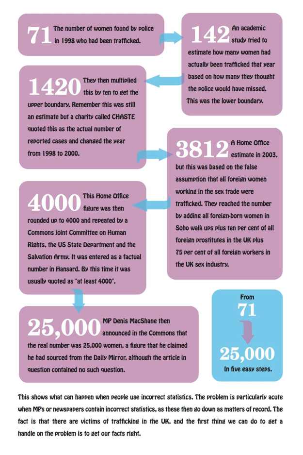
Bad data on sex trafficking: flow chart

Image by Lauren York on the Data Journalism Blog

Data is so central to the decision-making that shapes our countries, jobs and even personal lives that an increasing amount of data journalism involves scrutinising the problems with the very data itself. Here’s an illustrative list of when bad data becomes the story – and the lessons they can teach data journalists:

Deaths in police custody unrecorded

This investigation by the Bureau of Investigative Journalism demonstrates an important question to ask about data: who decides what gets recorded?

In this case, the BIJ identified “a number of cases not included in the official tally of 16 ‘restraint-related’ deaths in the decade to 2009 … Some cases were not included because the person has not been officially arrested or detained.” Continue reading

When data goes bad

Incorrect-statistics

Image by Lauren York

Data is so central to the decision-making that shapes our countries, jobs and even personal lives that an increasing amount of data journalism involves scrutinising the problems with the very data itself. Here’s an illustrative list of when bad data becomes the story – and the lessons they can teach data journalists:

Deaths in police custody unrecorded

This investigation by the Bureau of Investigative Journalism demonstrates an important question to ask about data: who decides what gets recorded?

In this case, the BIJ identified “a number of cases not included in the official tally of 16 ‘restraint-related’ deaths in the decade to 2009 … Some cases were not included because the person has not been officially arrested or detained.”

As they explain:

“It turns out the IPCC has a very tight definition of ‘in custody’ –  defined only as when someone has been formally arrested or detained under the mental health act. This does not include people who have died after being in contact with the police.

“There are in fact two lists. The one which includes the widely quoted list of sixteen deaths in custody only records the cases where the person has been arrested or detained under the mental health act. So, an individual who comes into contact with the police – is never arrested or detained – but nonetheless dies after being restrained, is not included in the figures.

“… But even using the IPCC’s tightly drawn definition, the Bureau has identified cases that are still missing.”

Cross-checking the official statistics against wider reports was key technique. As was using the Freedom of Information Act to request the details behind them and the details of those “ who died in circumstances where restraint was used but was not necessarily a direct cause of death”.

Cooking the books on drug-related murders

Drug related murders in Mexico
Cross-checking statistics against reports was also used in this investigation by Diego Valle-Jones into Mexican drug deaths:

“The Acteal massacre committed by paramilitary units with government backing against 45 Tzotzil Indians is missing from the vital statistics database. According to the INEGI there were only 2 deaths during December 1997 in the municipality of Chenalho, where the massacre occurred. What a silly way to avoid recording homicides! Now it is just a question of which data is less corrupt.”

Diego also used the Benford’s Law technique to identify potentially fraudulent data, which was also used to highlight relationships between dodgy company data and real world events such as the dotcom bubble and deregulation.

Poor records mean no checks

Detective Inspector Philip Shakesheff exposed a “gap between [local authority] records and police data”, reported The Sunday Times in a story headlined ‘Care home loses child 130 times‘:

“The true scale of the problem was revealed after a check of records on police computers. For every child officially recorded by local authorities as missing in 2010, another seven were unaccounted for without their absence being noted.”

Why is it important?

“The number who go missing is one of the indicators on which Ofsted judges how well children’s homes are performing and the homes have a legal duty to keep accurate records.

“However, there is evidence some homes are failing to do so. In one case, Ofsted gave a good report to a private children’s home in Worcestershire when police records showed 1,630 missing person reports in five years. Police stationed an officer at the home and pressed Ofsted to look closer. The home was downgraded to inadequate and it later closed.

“The risks of being missing from care are demonstrated by Zoe Thomsett, 17, who was Westminster council’s responsibility. It sent her to a care home in Herefordshire, where she went missing several times, the final time for three days. She had earlier been found at an address in Hereford, but because no record was kept, nobody checked the address. She died there of a drugs overdose.

“The troubled life of Dane Edgar, 14, ended with a drugs overdose at a friend’s house after he repeatedly went missing from a children’s home in Northumberland. Another 14-year-old, James Jordan, was killed when he absconded from care and was the passenger in a stolen car.”

Interests not registered

When there are no formal checks on declarations of interest, how can we rely on it? In Chile, the Ciudadano Inteligente Fundaciondecided to check the Chilean MPs’ register of assets and interests by building a database:

“No-one was analysing this data, so it was incomplete,” explained Felipe Heusser, executive president of the Fundacion. “We used technology to build a database, using a wide range of open data and mapped all the MPs’ interests. From that, we found that nearly 40% of MPs were not disclosing their assets fully.”

The organisation has now launched a database that “enables members of the public to find potential conflicts of interest by analysing the data disclosed through the members’ register of assets.”

Data laundering

Tony Hirst’s post about how dodgy data was “laundered” by Facebook in a consultants report is a good illustration of the need to ‘follow the data’.

We have some dodgy evidence, about which we’re biased, so we give it to an “independent” consultant who re-reports it, albeit with caveats, that we can then report, minus the caveats. Lovely, clean evidence. Our lobbyists can then go to a lazy policy researcher and take this scrubbed evidence, referencing it as finding in the Deloitte report, so that it can make its way into a policy briefing.”

“Things just don’t add up”

In the video below Ellen Miller of the Sunlight Foundation takes the US government to task over the inconsistencies in its transparency agenda, and the flawed data published on its USAspending.gov – so flawed that they launched the Clearspending website to automate and highlight the discrepancy between two sources of the same data:

Key budget decisions made on useless data

Sometimes data might appear to tell an astonishing story, but this turns out to be a mistake – and that mistake itself leads you to something much more newsworthy, as Channel 4′s FactCheck foundwhen it started trying to find out if councils had been cutting spending on Sure Start children’s centres:

“That ought to be fairly straightforward, as all councils by law have to fill in something called a Section 251 workbook detailing how much they are spending on various services for young people.

“… Brent Council in north London appeared to have slashed its funding by nearly 90 per cent, something that seemed strange, as we hadn’t heard an outcry from local parents.

“The council swiftly admitted making an accounting error – to the tune of a staggering £6m.”

And they weren’t the only ones. In fact, the Department for Education  admitted the numbers were “not very accurate”:

“So to recap, these spending figures don’t actually reflect the real amount of money spent; figures from different councils are not comparable with each other; spending in one year can’t be compared usefully with other years; and the government doesn’t propose to audit the figures or correct them when they’re wrong.”

This was particularly important because the S251 form “is the document the government uses to reallocate funding from council-run schools to its flagship academies.”:

“The Local Government Association (LGA) says less than £250m should be swiped from council budgets and given to academies, while the government wants to cut more than £1bn, prompting accusations that it is overfunding its favoured schools to the detriment of thousands of other children.

“Many councils’ complaints, made plain in responses to an ongoing government consultation, hinge on DfE’s use of S251, a document it has variously described as “unaudited”, “flawed” and”not fit for purpose”.

No data is still a story

Sticking with education, the TES reports on the outcome of an FOI request on the experience of Ofsted inspectors:

“[Stephen] Ball submitted a Freedom of Information request, asking how many HMIs had experience of being a secondary head, and how many of those had led an outstanding school. The answer? Ofsted “does not hold the details”.

““Secondary heads and academy principals need to be reassured that their work is judged by people who understand its complexity,” Mr Ball said. “Training as a good head of department or a primary school leader on the framework is no longer adequate. Secondary heads don’t fear judgement, but they expect to be judged by people who have experience as well as a theoretical training. After all, a working knowledge of the highway code doesn’t qualify you to become a driving examiner.”

“… Sir Michael Wilshaw, Ofsted’s new chief inspector, has already argued publicly that raw data are a key factor in assessing a school’s performance. By not providing the facts to back up its boasts about the expertise of its inspectors, many heads will remain sceptical of the watchdog’s claims.”

Men aren’t as tall as they say they are

To round off, here’s a quirky piece of data journalism by dating site OkCupid, which looked at the height of its members and found an interesting pattern:

Male height distribution on OKCupid

“The male heights on OkCupid very nearly follow the expected normal distribution—except the whole thing is shifted to the right of where it should be.

“Almost universally guys like to add a couple inches. You can also see a more subtle vanity at work: starting at roughly 5′ 8″, the top of the dotted curve tilts even further rightward. This means that guys as they get closer to six feet round up a bit more than usual, stretching for that coveted psychological benchmark.”

Do you know of any other examples of bad data forming the basis of a story? Please post a comment – I’m collecting examples.

UPDATE (April 20 2012): A useful addition from Simon Rogers: Named and shamed: the worst government annual reports explains why government department spending reports fail to support the Government’s claimed desire for an “army of armchair auditors”, with a list of the worst offenders at the end.

Also:
“Data laundering”

Wonderful post by Tony Hirst in which he sort-of-coins* a lovely neologism in explaining how data can be “laundered”:

“The Deloitte report was used as evidence by Facebook to demonstrate a particular economic benefit made possible by Facebook’s activities. The consultancy firm’s caveats were ignored, (including the fact that the data may in part at least have come from Facebook itself), in reporting this claim.

“So: this is data laundering, right? We have some dodgy evidence, about which we’re biased, so we give it to an “independent” consultant who re-reports it, albeit with caveats, that we can then report, minus the caveats. Lovely, clean evidence. Our lobbyists can then go to a lazy policy researcher and take this scrubbed evidence, referencing it as finding in the Deloitte report, so that it can make its way into a policy briefing.”

So, perhaps we can now say “Follow the data” in the same way that we “Follow the money”?

*Although a search for “money laundering” generates thousands of results on Google, most of them seemingly influenced by serial neologist William Gibson‘s use of the term to refer to using illegally acquired data, I can’t find an example of it being used in the way that Tony means it.

Time for UK media organisations to use some lobbying muscle

There are two Cabinet Office consultations taking place at the moment around open data: one around data policy for the new Public Data Corporation (PDC), and another around the government’s policy around transparency and open data strategy.

This should be of enormous interest to any media organisation – a key opportunity to influence the availability of information of public interest.

For example, among the issues under consideration are (summed up by Tony Hirst): charging for PDC information, licensing and regulation.

These will all be vital elements in the future of journalism – news organisations and journalists should be vocal in shaping them.

The deadline for both consultations is October 27.

When information is power, these are the questions we should be asking

Various commentators over the past year have made the observation that “Data is the new oil“. If that’s the case, journalists should be following the money. But they’re not.

Instead it’s falling to the likes of Tony Hirst (an Open University academic), Dan Herbert (an Oxford Brookes academic) and Chris Taggart (a developer who used to be a magazine publisher) to fill the scrutiny gap. Recently all three have shone a light into the move towards transparency and open data which anyone with an interest in information would be advised to read.

Hirst wrote a particularly detailed post breaking down the results of a consultation about higher education data.

Herbert wrote about the publication of the first Whole of Government Accounts for the UK.

And Taggart made one of the best presentations I’ve seen on the relationship between information and democracy.

What all three highlight is how control of information still represents the exercise of power, and how shifts in that control as a result of the transparency/open data/linked data agenda are open to abuse, gaming, or spin. Continue reading

Merging Datasets with Common Columns in Google Refine

It’s an often encountered situation, but one that can be a pain to address – merging data from two sources around a common column. Here’s a way of doing it in Google Refine…

Here are a couple of example datasets to import into separate Google Refine projects if you want to play along, both courtesy of the Guardian data blog (pulled through the Google Spreadsheets to Yahoo pipes proxy mentioned here):

University fees data (CSV via pipes proxy)

University HESA stats, 2010 (CSV via pipes proxy)

We can now merge data from the two projects by creating a new column from values an existing column within one project that are used to index into a similar column in the other project. Looking at the two datasets, both HESA Code and institution/University look like candidates for merging the data. Which should we go with? I’d go with the unique identifier (i.e. HESA code in the case) every time…

First, create a new column:

Now do the merge, using the cell.cross GREL (Google Refine Expression Language) command. Trivially, and pinching wholesale from the documentation example, we might use the following command to bring in Average Teaching Score data from the second project into the first:

cell.cross("Merge Test B", "HESA code").cells["Average Teaching Score"].value[0]

Note that there is a null entry and an error entry. It’s possible to add a bit of logic to tidy things up a little:

if (value!='null',cell.cross("Merge Test B", "HESA code").cells["Average Teaching Score"].value[0],'')

Here’s the result:

Coping with not quite matching key columns

Another situation that often arises is that you have two columns that almost but don’t quite match. For example, this dataset has a different name representation that the above datasets (Merge Test C):

There are several text processing tools that we can use to try to help us match columns that differ in well-structured ways:

In the above case, where am I creating a new column based on the contents of the Institution column in Merge Test C, I’m using a couple of string processing tricks… The GREL expression may look complicated, but if you build it up in a stepwise fashion it makes more sense.

For example, the command replace(value,"this", "that") will replace occurrences of “this” in the string defined by value with “that”. If we replace “this” with an empty string (” (two single quotes next to each other) or “” (two double quotes next to each other)), we delete it from value: replace(value,"this", "")

The result of this operation can be embedded in another replace statement: replace(replace(value,"this", "that"),"that","the other"). In this case, the first replace will replace occurrences of “this” with “that”; the result of this operation is passed to the second (outer) replace function, which replaces “that” with “the other”). Try building up the expression in realtime, and see what happens. First use:
toLowercase(value)
(what happens?); then:
replace(toLowercase(value),'the','')
and then:
replace(replace(toLowercase(value),'the',''),'of','')

The fingerprint() function then separates out the individual words that are left, orders them, and returns the result (more detail). Can you see how this might be used to transform a column that originally contains “The University of Aberdeen” to “aberdeen university”, which might be a key in another project dataset?

When trying to reconcile data across two different datasets, you may find you need to try to minimise the distance between almost common key columns by creating new columns in each dataset using the above sorts of technique.

Be careful not to create false positive matches though; and also be mindful that not everything will necessarily match up (you may get empty cells when using cell.cross; (to mitigate this, filter rows using a crossed column to find ones where there was no match and see if you can correct them by hand). Even if you don’t completely successful cross data from one project to another, you might manage to automate the crossing of most of the rows, minimising the amount of hand crafted copying you might have to do to tidy up the real odds and ends…

So for example, here’s what I ended up using to create a “Pure key” column in Merge Test C:
fingerprint(replace(replace(replace(toLowercase(value),'the',''),'of',''),'university',''))

And in Merge Test A I create a “Complementary Key” column from the University column using fingerprint(value)

From the Complementary Key column in Merge Test A we call out to Merge Test C: cell.cross("Merge Test C", "Pure key").cells["UCAS ID"].value[0]

Obviously, this approach is far from ideal (and there may be more “correct” and/or efficient ways of doing this!) and the process described above is admittedly rather clunky, but it does start to reveal some of what’s involved in trying to bring data across to one Google Refine project from another using columns that don’t quite match in the original dataset, although they do (nominally) refer to the same thing, and does provide a useful introductory exercise to some of the really quite powerful text processing commands in Google Refine …

First Play With R and R-Studio – F1 Lap Time Box Plots

Last summer, at the European Centre for Journalism round table on data driven journalism, I remember saying something along the lines of “your eyes can often do the stats for you”, the implication being that our perceptual apparatus is good at pattern detection, and can often see things in the data that most of us would miss using the very limited range of statistical tools that we are either aware of, or are comfortable using.

I don’t know how good a statistician you need to be to distinguish between Anscombe’s quartet, but the differences are obvious to the eye:

Anscombe's quartet /via Wikipedia

Another shamistician (h/t @daveyp) heuristic (or maybe it’s a crapistician rule of thumb?!) might go something along the lines of: “if you use the right visualisations, you don’t necessarily need to do any statistics yourself”. In this case, the implication is that if you choose a viualisation technique that embodies or implements a statistical process in some way, the maths is done for you, and you get to see what the statistical tool has uncovered.

Now I know that as someone working in education, I’m probably supposed to uphold the “should learn it properly” principle… But needing to know statistics in order to benefit from the use of statistical tools seems to me to be a massive barrier to entry in the use of this technology (statistics is a technology…) You just need to know how to use the technology appropriately, or at least, not use it “dangerously”…

So to this end (“democratising access to technology”), I thought it was about time I started to play with R, the statistical programming language (and rival to SPSS?) that appears to have a certain amount of traction at the moment given the number of books about to come out around it… R is a command line language, but the recently released R-Studio seems to offer an easier way in, so I thought I’d go with that…

Flicking through A First Course in Statistical Programming with R, a book I bought a few weeks ago in the hope that the osmotic reading effect would give me some idea as to what it’s possible to do with R, I found a command line example showing how to create a simple box plot (box and whiskers plot) that I could understand enough to feel confident I could change…

Having an F1 data set/CSV file to hand (laptimes and fuel adjusted laptimes) from the China 2001 grand prix, I thought I’d see how easy it was to just dive in… And it was 2 minutes easy… (If you want to play along, here’s the data file).

Here’s the command I used:
boxplot(Lap.Time ~ Driver, data=lapTimeFuel)

Remembering a comment in a Making up the Numbers blogpost (Driver Consistency – Bahrain 2010) about the effect on laptime distributions from removing opening, in and out lap times, a quick Google turned up a way of quickly stripping out slow times. (This isn’t as clean as removing the actual opening, in and out lap times – it also removes mistake laps, for example, but I’m just exploring, right? Right?!;-)

lapTime2 <- subset(lapTimeFuel, Lap.Time < 110.1)

I could then plot the distribution in the reduced lapTime2 dataset by changing the original boxplot command to use (data=lapTime2). (Note that as with many interactive editors, using your keyboard’s up arrow displays previously entered commands in the current command line; so you can re-enter a previously entered command by hitting the up arrow a few times, then entering return. You can also edit the current command line, using the left and right arrow keys to move the cursor, and the delete key to delete text.)

Prior programming experience suggests this should also work…

boxplot(Lap.Time ~ Driver, data=subset(lapTimeFuel, Lap.Time < 110))

Something else I tried was to look at the distribution of fuel weight adjusted laptimes (where the time penalty from the weight of the fuel in the car is removed):

boxplot(Fuel.Adjusted.Laptime ~ Driver, data=lapTimeFuel)

Looking at the release notes for the latest version of R-Studio suggests that you can build interactive controls into your plots (a bit like Mathematica supports?). The example provided shows how to change the x-range on a plot:
manipulate(
plot(cars, xlim=c(0,x.max)),
x.max=slider(15,25))

Hmm… can we set the filter value dynamically I wonder?

manipulate(
boxplot(Lap.Time ~ Driver, data=subset(lapTimeFuel, Lap.Time < maxval)),
maxval=slider(100,140))

Seems like it…?:-) We can also combine interactive controls:

manipulate(boxplot(Lap.Time ~ Driver, data=subset(lapTimeFuel, Lap.Time < maxval),outline=outline),maxval=slider(100,140),outline = checkbox(FALSE, "Show outliers"))

Okay – that’s enough for now… I reckon that with a handful of commands on a crib sheet, you can probably get quite a lot of chart plot visualisations done, as well as statistical visualisations, in the R-Studio environment; it also seems easy enough to build in interactive controls that let you play with the data in a visually interactive way…

The trick comes from choosing visual statistics approaches to analyse your data that don’t break any of the assumptions about the data that the particular statistical approach relies on in order for it to be applied in any sensible or meaningful way.

[This blog post is written, in part, as a way for me to try to come up with something to say at the OU Statistics Group’s one day conference on Visualisation and Presentation in Statistics. One idea I wanted to explore was: visualisations are powerful; visualisation techniques may incorporate statistical methods or let you “see” statistical patterns; most people know very little statistics; that shouldnlt stop them being able to use statistics as a technology; so what are we going to do about it? Feedback welcome… Err….?!]