Tag Archives: visualisation

I’ve updated the Inverted Pyramid of Data Journalism — and brought together resources for every stage

Inverted pyramid of data journalism: conceive, compile, clean, context, combine (with 'question' throughout). Communicate: vis, narrate, humanise, personalise, socialise, utilise

It’s over a decade since I published the Inverted Pyramid of Data Journalism. The model has been translated into multiple languages, taught all over the world, and included in a number of books and research papers. But in that time the model has also developed and changed through discussion and teaching, so here’s a round up of everything I’ve written or recommended on the different stages — along with a revised model in English (shown above; versions have been published before in German, Russian and Ukrainian!).

The most basic change to the Inverted Pyramid of Data Journalism is the recognition of a stage that precedes all others — idea generation — labelled ‘Conceive’ in the diagram above.

This is often a major stumbling block to people starting out with data journalism, and I’ve written a lot about it in recent years (see below for a full list).

The second major change is to make questioning more explicit as a process that (should) take place through all stages — not just in data analysis but in the way we question our sources, our ideas, and the reliability of the data itself.

Alongside the updated pyramid I’ve been using for the past few years I also wanted to round up links to a number of resources that relate to each stage. Here they are…

Continue reading

The visual challenges of big data: how The Economist turned Spotify data into a story about language

Early Visualisation from Off the Charts

In an interview with Kirstin Bunce for OJB, interactive journalist Olivia Vane explains the production process behind ‘Singing in tongues. What Spotify data show about the decline of English.

Earlier this year The Economist team published an interactive analysis delving into 5 years of Spotify’s data in 70 countries. It was a large data project that started with a scraper — by data journalist Dolly Setton, who was interested in the role of language on the platform — but getting the data was just the beginning.

“I thought it was an interesting experience at the beginning, exploring and figuring out together what was the heart of the piece,” says Olivia. “We didn’t realise what the story was going to be until sort of midway through.”

Continue reading

Striking the balance between graphic design and data journalism: “Design is a conversation”

Beirut blast scrollytell

Reuters’ Graphics Team is renowned for creating a myriad of innovative news stories under tight deadlines, from Covid-19 coverage to mapping the movement of shifting smoke from California wildfires. In a guest post for OJB, Hanna Duggal speaks to the team’s Simon Scarr and Marco Hernandez about pushing the boundaries of visual storytelling in the newsroom and the relationship between data and design. 

In a world that has become increasingly data-prolific and hardwired towards visual content, visualisation provides the newsroom with both a way to communicate complex data effectively and to engage audiences.

Data graphics have become more immersive, compelling and revealing, — and for Reuters, an integral part of how stories are told.

“I’m incredibly proud of our breaking news work,” says Simon Scarr, Reuters’ Deputy Head of Graphics. Continue reading

Coronavirus: 3 ways journalists need to get to grips with uncertainty during the pandemic

R number ranges in different UK regions

R number ranges shown by the FT

Journalism doesn’t like uncertainty: editors are trained to cut out vagueness and journalists taught to be as concrete as possible in their reporting. In most cases it compels reporters to ensure they have a firm grip on the details and are confident in the story they are reporting.

But with coronavirus, this discipline becomes a systemic blind spot.

From prevalence to testing, and from deaths to infection rates, the story of this pandemic is full of uncertainty. Here, then, are 3 ways that journalists need to understand — and better communicate — the things that we don’t know, and won’t know, about it. Continue reading

Data storytelling done right: 8 easy tips to avoid bad visualisation

tesselationIn a guest post for OJB, Steve Carufel interviews Dutch data journalist Thomas de Beus about visualisation, storytelling — and useful new tools for data journalists.

Data journalism is, among other things, the art of resisting the temptation to show spectacular visualisations that fail to highlight the data behind a story.

Insights and relevant statistics can get lost in visual translation, so Thomas de BeusColourful Facts is a great place to start thinking more about clarity and your audience — and less about spectacular graphic design (although you do not want to forego attractiveness entirely). Continue reading

How to: create a treemap in Tableau

tableau treemap buzzfeed

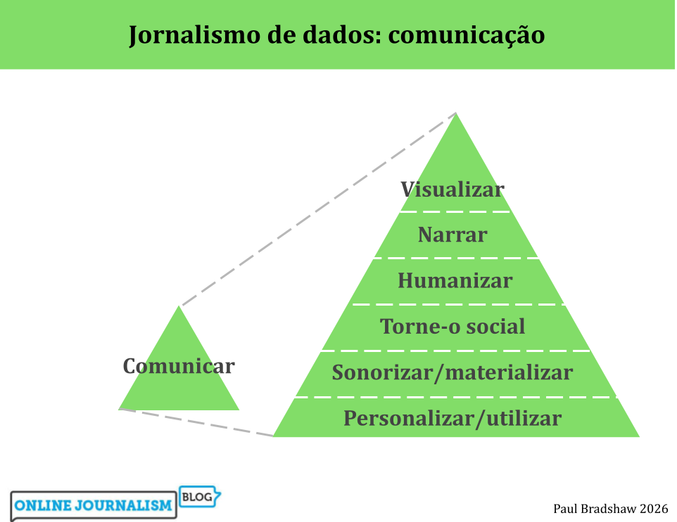
Treemaps are a great alternative to pie charts when you want to tell a story about the composition of something: whereas pie charts can be limiting, treemaps allow users to drill down into ‘parts of parts’, and group elements within particular categories.

In this post I’m going to show you how to create a treemap in the free visualisation software Tableau Public to show how the majority of BuzzFeed’s content views in 2015 took place away from its website.

This data suits a treemap particularly well: although the traffic is broadly split between ‘website’, ‘Facebook’, ‘Snapchat’, ‘YouTube’ and ‘other’, there are also subdivisions within some of those platforms – for example, Facebook traffic is split between video and images, and website traffic is split between direct visits, those via Google, and those via Facebook. A treemap allows users to explore those subtleties in a way that pie charts do not.

Step 1: Get the data in the right format

To create a treemap it is vital that you get the data in the correct format to begin with. In particular, you will need to make sure that as well as a primary ‘category’ column, you also have a second ‘sub category’ column. They don’t have to have these names, but that general concept is important. A third column should contain the values to be visualised.

treemap data format

The key feature to look for in this data structure is that you should expect to see categories in your main ‘category’ column appear more than once. In our BuzzFeed data, for example, the platform category ‘website’ appears 3 times – once for each ‘Source’ sub category of ‘Direct traffic’, ‘Traffic from Google’ and ‘Traffic from Facebook’.

Also, make sure that your values only use numbers – don’t add percentage symbols, commas or other characters that might lead to it being interpreted as text and mean you have to reclassify the data later.

If you need a dataset to work with, I’ve uploaded the Buzzfeed figures here (you’ll need to save it to your computer).

Begin creating your chart

In Tableau Public, connect to the data you’ve just created, and go to your empty worksheet. On the left you should see your category (in this case, ‘Platform’) and sub category (in this case ‘Source’) columns in the Dimensions area; and underneath that in the Measures area, your values (in this case, ‘Traffic %’).

Click and drag your main category dimension (‘Platform’) into the Rows area at the top. Then do the same with your measure (‘Traffic %’) so that it looks like this:

Platform and traffic % in rows

Tableau will automatically draw a chart for you – but ignore that. Instead, look to the right hand side where the ‘Show me’ menu should now be showing which chart types you can use with this combination of data. If it doesn’t show, click ‘Show me’ in the upper right corner.

One of the options available should be the treemap – it’s normally the first option four rows down. Click on this to change the chart to a treemap.

Show me menu

Now we have a treemap – but it’s only showing the top-level category (in this case, ‘Platform’). We need to customise it a bit to get a treemap which allows users to see the sub-categories too.

Customising the colours and slices

To the left of the chart itself you should see a box titled Marks containing buttons for Color, Size, Label, Detail and Tooltip. And underneath those buttons, icons indicating three settings:

  • The ‘Size’ icon is set by ‘SUM(Traffic %)’
  • The ‘Color’ icon is also set by ‘SUM(Traffic %)’
  • The ‘Label’ icon is set by ‘Platform’

Treemap

First we need to change it so that the ‘Color’ is determined by the main category (‘Platform’). To do that, click and drag the ‘Platform’ dimension onto the Color button.

Now, instead of one colour in different shades representing an amount, you should have five colours – one for each category:

Treemap coloured by category

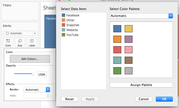
We can customise the colour further by clicking on the ‘Color’ button and clicking Edit colors…. This will open up a new window with a list of categories on the left, and a palette on the right. In our case it makes sense to assign relevant colours to each platform: yellow for Snapchat, red for YouTube, and blue for Facebook. I’ve also chosen grey for ‘Other’. If you prefer other shades you can access other palettes using the dropdown menu in the upper right corner. Click ‘Apply’ to see the results, and ‘OK’ to apply and leave this window.

Edit colors menu

Next, we need to bring in that sub-category (‘Category’) in. A good place to do this is on the ‘Label’: because we are already using colour to indicate the platform, we need the label to add that extra information about the source of traffic to that platform.

To do this, click and drag the ‘Category’ dimension onto the Label button.

Now the area of colour for each platform should now split into further parts based on this new category. In addition, the text labels should reflect that information too.

Treemap

Other customisation

The chart is now pretty much ready. That just leaves the title to customise: at the moment it is automatically taking the name of the sheet, so you can change the title by double-clicking on the sheet tab at the bottom and renaming it. Alternatively you can double-click on the sheet title and replacing it in the window that opens.

You can also customise the Tooltip – for example a % sign needs adding after the percentage figure on each slice.

What I learned at Jan Willem Tulp’s workshop at Tutki! 2016/NODA16

Jan Willem Tulp

Jan Willem Tulp’s workshop

In a guest post first published on her blog, Maria Crosas Batista sums up the key takeaways from a session at the Nordic investigative journalism conference Tutki! 2016 by Jan Willem Tulp, the data experience designer behind Tulp Interactive.

Continue reading

Just add JavaScript: use these 3 tools to get instant interactivity

Maria Crosas Batista highlights ways to get started with adding interactivity to your journalism.

This post is for beginners that are learning HTML, CSS and JavaScript. Below are 3 useful websites to embed maps, charts and timelines in your HTML without going crazy. Continue reading

Visualising 40 years of organised crime in Mexico: NarcoData

Narco Data
How has Mexico moved from 2 cartels in the 1970s to 9 cartels today? That is the question the Mexican website Animal Político wanted to answer when in January 2015 they started to work on NarcoData, a data journalism project that shows the evolution of 40 years of drug dealing in Mexico, home to the most violent cartels in the world. Carla Pedret reports.

The origin of the project was a document Animal Político journalist Tania Montalvo obtained in October 2014 from the country’s Attorney General’s Office, after a request under the Mexican Freedom of Information lawContinue reading

“It’s black and white to colour”: Ben Fry on data visualisation’s past and future

Ben-Fry-visualization

Ben Fry published his book Visualizing Data in 2007, before the term ‘data journalism’ had entered the professional vocabulary. Since then, Fry has been developing Processing, an open source “language for learning how to code within the context of the visual arts”, and he is a principal at Fathom, a Boston design and software consultancy which has created visualisation projects for National Geographic; Bill, Hillary & Chelsea Clinton Foundation and Bill & Melinda Gates Foundation

Catalina George asked him a few questions about his current work and his advice to aspiring data journalists.

Visualisation, a reinvented tool

World-eats-visualization-Fathom

For a better view of the world calories consumption, the user can see how much this differs from China to the UK @Fathom

One of your Fathom projects was a data visualisation for National Geographic’s What the World Eats”. The graphic part can play a great role to enrich our perception and understanding of reality. But what does the development of visualisation mean for journalism?

I think what’s called “visualisation” has been around a long time for journalism. Otto Neurath was doing this in the 1920s. I think it’s been receiving more attention in recent years because we have the means to more easily distribute interactive works, which is a boon for more sophisticated takes on data. Continue reading