

Jan Willem Tulp’s workshop
In a guest post first published on her blog, Maria Crosas Batista sums up the key takeaways from a session at the Nordic investigative journalism conference Tutki! 2016 by Jan Willem Tulp, the data experience designer behind Tulp Interactive.
Lacking data visualisation design skills can lead to distorted data and prioritising aesthetics before information. For this reason, Jan Willem Tulp organised a data visualisation design workshop at NODA and Tutki! 2016, a joint conference held last weekend in Helsinki.
Tulp’s workshop focused on improving visual literacy in order to critically evaluate our own and other people’s work.
Below are five takeaways to keep in mind when designing a data visualisation:
1. Being an expert in a tool is the starting point
Even though tools are important to create visualisations, using them perfectly does not guarantee the “correctness, quality and aesthetics of your design.”
It’s important to know why we want to represent the data in a particular manner that will attract the audience.
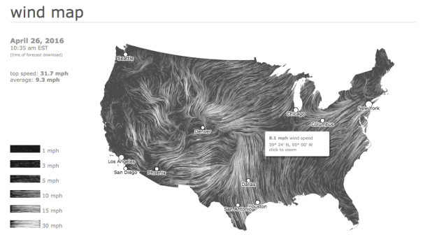
The following maps show the same information – wind patterns in the US – through different tools.
However, the design of the first map makes more difficult to explore the data and seems less likely to invite the reader to explore it:
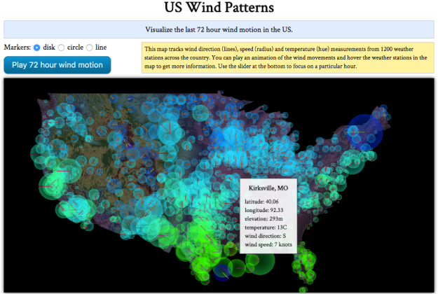
This US Wind Patterns map is hard for users to explore
2. Put the data in context
From Tulp’s point of view, there are 3 elements that create a good data visualisation:
- The data (what do we want to tell);
- The concept (why are we using a visualisation); and
- The design (how the data will make sense)
Data can help to tell some stories, but journalists have to understand it before turning it into some representation.
In the following picture, numbers or text are pointless if we don’t know their meaning:
3. Graphs, sound and taste
Andrew Vande Moere and Helen Purchase investigate the requirement of attractiveness in visualisation in On the role of design in information visualization. They conclude that visualisation design is not an ‘add-on’:
“Design reasoning is not an activity that can be added ‘later’ after most other decisions have been made; visualisation developers need to be conscious of the role of design at the outset.”
However, this is not just graphs: other media such as music or taste can be used too.
Below are some examples:
Fractions of a Second: An Olympic Musical by The New York Times:

The Data Cuisine, an interesting project on expressing  as a means of
  expression:

4. Create alternative designs
Learn by doing.
A good exercise to practise data visualisation design skills is to find graphics that have already been published and redesign them.
This will help you see what does or what does not work, and how the visualisation can be improved.
WTF Visualisations is a useful resource for this: a website that highlights and collectsgraphics that make no sense.
The following pie charts were suggested as bad data visualisations, and Jan Willem challenged the audience to redesign the second graph around money and football:


5. No definition of ‘interesting’
What makes a data visualisation interesting? People differ on this concept and opinions have changed over the years.
To explain that, Jan Willem showed 2 interactive visualisations and asked the audience to pick one.
Both representations gather plenty of data and present it as a story. Which one would you choose?
U.S. Gun deaths created by Periscopic:

Drone strikes victims in Pakistan, created by Pitch Interactive

One audience can engage with design very differently: more than half the class chose the second interactive (I didn’t. I felt that the first one created by Periscopic was easier to follow and extract the story, without looking for extra information).
Even though there are plenty approaches to define what is interesting, Jan Willem said that any data representation needs novelty and comprehensibility to catch the eye:
You can follow Jan on Pinterest, where he shares useful datavis sources and visualisations.
