Author Archives: Maria Crosas

How Periodista de Datos aggregated over 300 journalists in Spain and Latin America to help data journalism collaboration

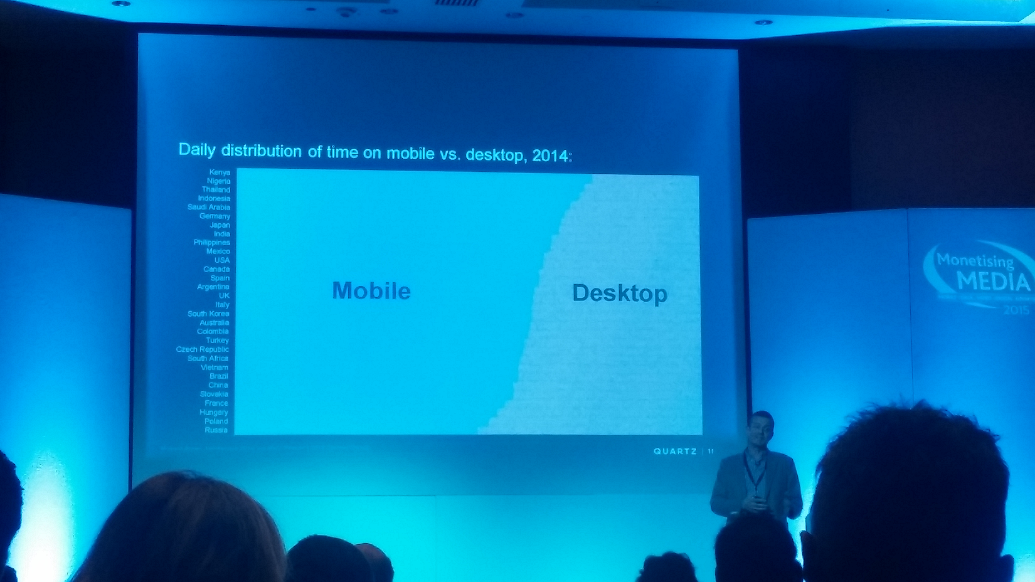
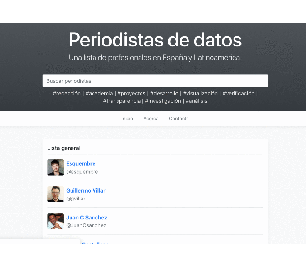
In July an aggregator of data journalists from Spain and Latin America was launched under the name Periodista de Datos. Four months later, Maria Crosas Batista interviewed Félix Arias, project lead with Miguel Carvajal, to find out more about how the project came about — and where they plan to take it next.

Periodistas de datos gif

Satisfying a need for up-to-date information in one place

This project came as the result of a specific need of journalists (and professors) driving the Innovation in Journalism MA (MIP) at the Miguel Hernández University (Elche, Spain).

Félix and Miguel were looking for a tool to use in their lessons that could show the potential of data journalism, as well as outstanding projects, to their students. Continue reading

This is what I learned after teaching chatbots to journalists: 3 takeaways for newsrooms

In a guest post for OJB Maria Crosas points out three main takeaways that newsrooms should consider when aiming for a complete chatbot experience. 

Over the past year I’ve been frequently invited to share ideas around how bots can help newsrooms to deliver news, and advice on how to build an engaging chatbot experiences. And throughout these classes, I’ve also had challenging questions on how these technologies are pushing the boundaries of ethics, artificial intelligence and storytelling.

I’ve boiled down these experiences into 3 takeaways for newsrooms that want to begin the chatbot journey. Here they are…

Continue reading

“I tried to deal with numbers as professionally as I could. But behind them there were people, and I couldn’t run away from it” — Ferran Morales on visualising refugee data

In a guest post for OJB Maria Crosas interviews Ferran Morales, the journalist behind The Story of Zainab, to understand how he tackled the challenge of processing and visualising data about refugees.

ferran

Ferran Morales showing infographics from Zainab’ story

Ferran Morales is a data journalist and graphic designer at El Mundo Deportivo. In February, with the team at Media Lab Prado, he published The Story of Zainab, a data-driven narrative following an 11-year-old refugee and her family, that had to leave their home in 2011 because of the war in Syria.

The project was created as part of Visualizar 2017, a workshop for prototyping data visualisation projects, and drew on data on refugees.

Continue reading

When chatbots talk about politics: 3 effective approaches

Since the trend is to use Whatsapp or Facebook Messenger rather than downloading new apps, the media is investing in chatbots to engage with the audience. They keep users awake and speak the same language.

There have been several examples of chatbots for cooking, shopping or travelling. However, politics chatbots are quite new. In a post first published on her blog, Maria Crosas Batista shares three effective approaches when it comes to cover elections or represent politicians:

1. GloBot · Canada

output_zsa6gg

Canadian newspaper The Globe and Mail has built a Facebook Messenger chatbot for the American elections that shares text, audio, and video from their website. Continue reading

Vine is gone. Here are 5 great ways it was used for datavis

After Vine’s announcement to discontinue the mobile app in the coming months, Maria Crosas Batista pulled together 5 good stories on data visualisation (first published on her site Dinfografia).

1.Legal vs illegal weapons in the US

2. The evolution of global warming

Continue reading

How one Mexican data team uncovered the story of 4,000 missing women

4534

by Maria Crosas Batista

Mexican newspaper El Universal has put a face to the 4,534 women who have gone missing in Mexico City and the State of Mexico over the last decade: Ausencias Ignoradas (Ignored Absences) aims to put pressure on the government and eradicate this situation.

Daniela Guazo, from the data journalism team, explains how they gathered the data and presented the information not as numbers but as close people: Continue reading

What I learned at Jan Willem Tulp’s workshop at Tutki! 2016/NODA16

Jan Willem Tulp

Jan Willem Tulp’s workshop

In a guest post first published on her blog, Maria Crosas Batista sums up the key takeaways from a session at the Nordic investigative journalism conference Tutki! 2016 by Jan Willem Tulp, the data experience designer behind Tulp Interactive.

Continue reading

5 great data visualisation pieces from outside the newsroom

Some of the most interesting examples of journalistic data visualisation come not from newsrooms, but from creative agencies or companies. In a post first published on her datavis blog Dinfografia, Maria Crosas Batista outlines 5 of the best examples:

1. The Refugee Project

The Refugee Project GIF

Interactive map designed by Hyperakt & Ekene Ijeoma about refugees’ migrations since 1975. It includes historical explanations of some large movements and events to contextualise them. Continue reading

17 takeaways on mobile publishing from Monetising Media 2015

mobile desktop timeHow do you reach an audience which is consuming more content on mobile than desktop – and at different schedules to the traditional print model? At Monetising Media last week industry leaders shared their concerns and strategies for succeeding on mobile without losing quality and content. Maria Crosas Batista sums up some of the key takeaways:

Product rather than platform: Lee Wilkinson, Hearst Magazines International

Lee Wilkinson bets on product rather than platform:

“If your audience is the core of a product strategy you are more likely to engage and reach them when your content is out there.”

Continue reading