
In a guest post for OJB Maria Crosas interviews Ferran Morales, the journalist behind The Story of Zainab, to understand how he tackled the challenge of processing and visualising data about refugees.

Ferran Morales showing infographics from Zainab’ story
Ferran Morales is a data journalist and graphic designer at El Mundo Deportivo. In February, with the team at Media Lab Prado, he published The Story of Zainab, a data-driven narrative following an 11-year-old refugee and her family, that had to leave their home in 2011 because of the war in Syria.
The project was created as part of Visualizar 2017, a workshop for prototyping data visualisation projects, and drew on data on refugees.
A cross-platform project: print and digital
When designing the story, the team decided to extend the platforms to include both print and digital. In both cases, the data was the backbone of the narrative, illustrated by seven comics on one side and data visualisations on the other.
While the print version was a pulldown story composed of seven chapters and visualisations (Aleppo; Exodus to Turkey; Road to Izmir; The Sea; Moria; A year in Nea Kavala; and Migration Office) the responsive website was able to extend the length of text and add some interactive infographics.
-
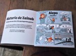
- Some of the pages from the comic version of the story
Zainab: A fictional character based on true stories
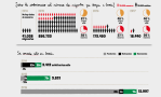
Real data and stories lie behind Zainab’s trip and challenges. A CSV file compiled by PorCausa, an organisation that aims to ensure accurate information on migration, showcased the number of people in Greek refugee camps as one starting point.
From this CSV data Morales and his team put themselves in Zainab’s shoes to work on the skeleton of her past. They travelled from Syria to Greece, imagining its upsides and downsides.
Once they gathered enough data, some questions continued to recur: What should we ask of the data? What is this data telling us? And what is actually not telling?
“An emphasis on qualitative and quantitative data runs across the whole project.”
Several times throughout the process the team reflected on what the data was showing, and the importance of having qualitative data. There were questions about how to deal with topics where data is estimated, such as deaths or missing people, when there were no bodies to count. “How should we report the absence?” asks Morales.
At the end, the team merged several stories into one. The story from Zainab is real, but the team also wanted to raise a hypothetical case about what would happen to children that were under-age when leaving their country, but approaching adulthood in Greece or Germany. What happens with the family regrouping in this case?
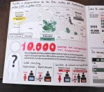
11 million stories on an Excel spreadsheet
Since the war started in Syria in 2011, around 11 million of people have left their homes for a better life. Morales, backed by other members of the team, confessed:
“When I was building Zainab’s story through infographics, I tried to deal with numbers as professionally as I could. But this led to cold drafts and approaches. Behind this data, there were people, and I couldn’t run away from it.”
Morales struggled to build a story without being affected by numbers, since every one had a face, name and story.
“These numbers are real people,” says Morales, a point illustrated by the photography of fellow Visualizar’17 participant Samuel Nacar, who had visited some of the refugee camps.
Challenge: Comic and data to create storytelling

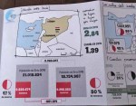
Chaper 5: Moria
Morales says that he likes one particular graphic more than any other. From Chapter 5, Moria, it illustrates the aggregation of refugees in Greece in 2015 at the top, and how many of those were still waiting to be accepted by the Greek Government at the bottom.
The challenge was to combine and integrate the comic strip with the visualisations and the web layout; to find a graphic style for the infographics that took account of the cross-platform approach.
“What took us longer was to bring the story to the website. We definitely achieved that through arrows that enabled the user to jump through the eight chapters and still maintain the essence of the print version. We achieved a graphic style that could explain this conflict, its deaths and the context to a teenager without building complex graphs.”
An earlier version of this article was first posted on Maria’s blog Dinfografia.

Reblogged this on Matthews' Blog.