
In an interview with Kirstin Bunce for OJB, interactive journalist Olivia Vane explains the production process behind ‘Singing in tongues. What Spotify data show about the decline of English.’
Earlier this year The Economist team published an interactive analysis delving into 5 years of Spotify’s data in 70 countries. It was a large data project that started with a scraper — by data journalist Dolly Setton, who was interested in the role of language on the platform — but getting the data was just the beginning.
“I thought it was an interesting experience at the beginning, exploring and figuring out together what was the heart of the piece,” says Olivia. “We didn’t realise what the story was going to be until sort of midway through.”
The team started by exploring the data that Dolly had scraped, thinking about the different ways they could visually represent that — and what was the interesting story they wanted to tell about the data.
“It was quite organic how the angle developed,” says Olivia, “because the clustering — and certainly identifying the Spanish cluster — was something that we came across later.
“I had been looking at what were the most popular album releases around the world and which countries shared the same favourite album release year on year.
“And we were seeing that often for the Spanish countries, it was the same artist, the same album.
“We were seeing some of these high level patterns of countries that were sharing music and then Dolly was working on this clustering analysis and found these patterns that I’d also seen. So looking at the data this different way, made sense together.
“I’d say definitely it was a bit of an organic process.”
From there the team started thinking about what would be the best way of explaining this clustering pattern — but also letting people play and explore the songs themselves.
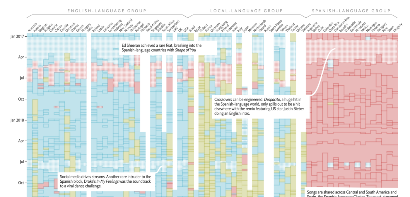
They settled on showing the clustering in relation to language and pop music that they divided into three groups: English, Spanish and local-language.
Dolly then identified that English was dropping across all three groups — and this change became the the main angle for the story.
The biggest challenge to overcome

With the angle identified, the next challenge the team faced was how to communicate the large amounts of information inside the data — a process that Olivia talks about in an edition of The Economist’s data journalism newsletter, Off The Charts.
She says the final desktop version of the story “took some thinking and trying out.
“If you look on desktop it’s a really large interactive with the audio player and a tooltip that comes up with song information. Then we have all sorts of various stories that we pulled out about patterns you can see in the interactive at the bottom.
“Initially we tried having the annotations on top of the interactive with arrows explaining some of the patterns you can see.
“It just became too complicated with having the interactions working on mobile as well, so we had to rethink it. But I think in the end I was very happy with how we got it working as a responsive design.”
That responsive design involved an interactive matrix created through the JavaScript library D3.
Olivia’s colleague, Ros Pearce, also worked on the graphics that would go into the print piece. And while the story was worked on largely by the trio, editors, illustrators and designers from outside the team all had an input into the piece.
“We actually worked with research to do data checking, so there was lots of input from various different teams.”
“My Spotify recommendations have been completely mucked up”
In the end, working on the project affected Olivia’s own listening, too.
“I ended up listening to a lot of music that I would not have come across otherwise,” she says, “and my own Spotify recommendations have been completely mucked up by working on this piece — so now I get recommended a lot of European music that I wouldn’t have come across before.”
But she says it has been very interesting to learn more about the different kinds of music that are popular in other countries.
“I hadn’t appreciated the extent to which countries like Poland have a big homegrown rap scene — so it’s been really interesting to just get a sense of the really popular kinds of music in other places that I’ve not listened to before.”
Advice on getting into data visualisation
When asked for her advice on getting into the field, Olivia recommends working on projects that you personally find really interesting. “There are datasets on all kinds of different topics.”
But most importantly: “make and make and make — and build up a portfolio.
“Just start making, get making, share your work and work on building up a portfolio, that’s definitely the most important thing.”
