
R number ranges shown by the FT
Journalism doesn’t like uncertainty: editors are trained to cut out vagueness and journalists taught to be as concrete as possible in their reporting. In most cases it compels reporters to ensure they have a firm grip on the details and are confident in the story they are reporting.
But with coronavirus, this discipline becomes a systemic blind spot.
From prevalence to testing, and from deaths to infection rates, the story of this pandemic is full of uncertainty. Here, then, are 3 ways that journalists need to understand — and better communicate — the things that we don’t know, and won’t know, about it.
1. False negatives, false positives and testing

This image by Jessica Watson/Penny Whiting demonstrates how false negatives and positives compare to the real situation
Tests have been a recurring theme of the last 8 weeks — and yet very little of that reporting has acknowledged that testing is not perfect; that people testing positive is not the same as all those people having or not having coronavirus.
Any test will produce both false negatives (people being given the all-clear when they actually have the disease) and/or false positives (people being told they have the disease when they didn’t).
Back in March the virologist Professor Lawrence Young told HuffPost UK that the UK test was, “at best” 75% accurate — in other words, that 25% of the negative results would be false.
The rate was similar to those being found in research on the tests being done in China — estimated to be around 30%.
That rate may have gone up, or gone down — in April, for example, concerns were expressed that “supply chain issues that hampered the UK’s ability to ramp up the numbers of tests performed may also have negatively affected the quality of testing, because labs have had to rely on substandard chemicals and reagents.”
But the fact that journalists don’t know is itself an issue to be tackled.
False positive rates are harder to come by, but reports of people catching coronavirus twice appear to be down to tests returning a false positive, while there have also been reports of recovered patients retesting positive “because the test falsely identified dead viral matter as active Covid-19 infection”.
Testing normally involves a trade-off between either more false negatives or more false positives. As Kaiser Fung puts it: “Low false-positives usually mean higher false-negative results.”
We can expect false positives to become more important as antibody testing is ramped up.
For example, Roche’s antibody tests have been widely described as “100% accurate” — but read the small print: the Centre for Evidence-Based Medicine points out that the 100% figure only relates to one part of testing accuracy (false negatives): “2 in 1000 people (0.2%) tested positive with the antibody test, even though they should have tested negative.” (false positives)
Quartz are just one news organisation to have created an interactive to explain this tension in antibody tests — it’s well worth exploring.
It’s not just in health and science that reporters need to know about false positives and false negatives: Kaiser Fung‘s excellent book Numbers Rule Your World has a chapter dedicated to the topic which takes in sport (doping tests), policing (anti-terrorism measures) and justice (polygraph tests), among other fields.
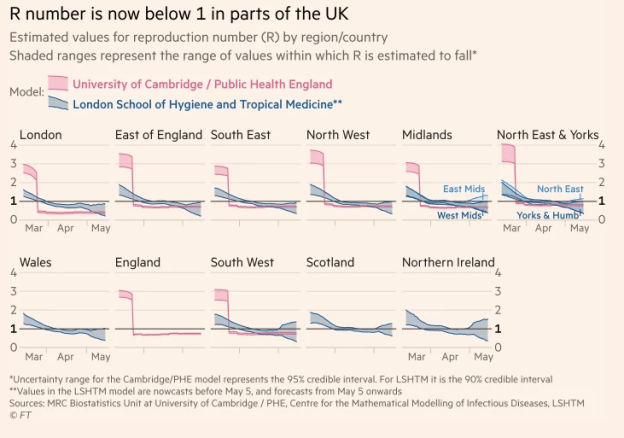
2. The R number: it’s not a number
The reproduction number — R number, R0 or “R-naught” — describes how many people, on average, are infected by each infected person.
A disease has both a basic reproduction number (how much it can spread) and an effective reproduction number (how much it is spreading at a particular point).
The effective reproduction number is now playing an important role in guiding government decisions on lifting — or imposing — lockdowns.
As I write this, the R number range for the UK is 0.7-1.0, meaning that, on average, for every 10 people in this country with coronavirus, between 7 and 10 more people are being infected.
When a journalist at one recent daily UK coronavirus briefing tried to pin the Government down to a single R number, it suggested that the reporter hadn’t done his research: there isn’t a single number — it’s a range.
As one FT article explains of the need to avoid using single R numbers:
“There is roughly a 50 per cent risk that the R level is higher than [any specific point] estimate,” [Roger Halliday, the Scottish government’s chief statistician] said. “If we take decisions on that specific estimate it could have quite significant consequences, such as the NHS becoming quickly overwhelmed.”

One visualisation of R0 ranges in US states indicates the range within which they are 90% certain and 50% certain
And what’s more, it’s a range that refers to a past situation, not now. As the page for the UK’s R number explains:
“Data such as contacts, hospital admissions, ICU admissions and deaths generally takes 2 to 3 weeks for changes in R to be reflected in these data sources, due to the time between infection and needing hospital care.”
In other words, the R number is an estimate, based on plugging in a combination of numbers and trying to calculate what reproduction rate contributed to them.
Because cause and effect is complex, and many other variables will be involved, even small differences in weighting can have a big impact in the resulting R number. And there are a number of different models being used to calculate a number of different R number ranges (the UK range is arrived at based on a combination of models’ outputs).
Reporting on models and modeling
Modeling more broadly is also a challenge for reporters: Journalists’ Resource has a good guide to the considerations to bear in mind when reporting on models. They include:
- “Make it clear in your coverage that models are only as good as the data used to build them, and that researchers currently lack high-quality data about this pandemic.
- “Explain to your audience that researchers also make assumptions when creating models.
- “Keep in mind that researchers use a variety of models to study infectious diseases. They are designed to answer different questions.
- “Emphasize that the prediction is a ballpark estimate represented by a range of possible numbers.
- “Tell your audience what the study adds to what we know about that particular topic and which big questions remain.
- “Give additional scrutiny to models created by researchers who have not demonstrated expertise in model building.”
It also recommends asking seven questions when interviewing researchers about epidemiological models:
- “What type of model was used and what are its strengths and weaknesses?
- “What assumptions went into creating the model?
- “What was this model designed to do?
- “Where did the data used for the model come from and how did using this specific data affect results?
- “What factors or data were intentionally left out of this study and why?
- “Does this study focus on a best-case or worst-case scenario?
- “What caveats must be included in an explanation of this study’s findings?”
Kaiser Fung’s post last month about issues with coronavirus tracking app data is a good example of working through many of these questions.
3. Making comparisons, estimates and projections
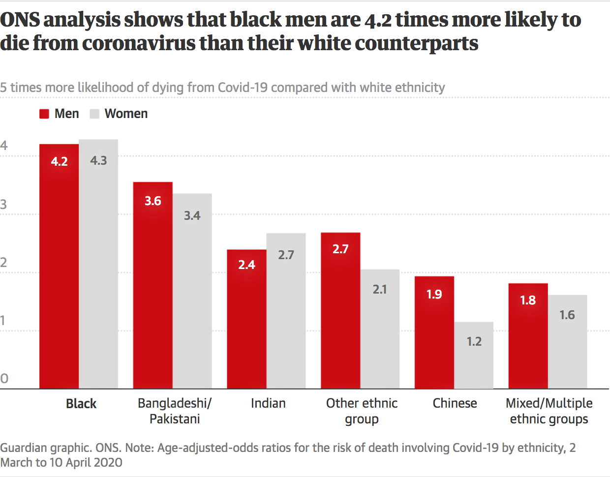
A number of stories have focused on the increased likelihood of dying from coronavirus when someone is of a particular ethnicity, or from a particular age group or occupation.
The Office for National Statistics’ Henry Lau put together a particularly good article on how they decided to present that information to communicate the uncertainty around the figures, and what they are being compared to.
He picks up on some of the mistakes made by news teams when presenting the information: the BBC, for example, “[didn’t] plot the bars [showing comparative likelihood of dying] relative to the comparison group”, i.e. those of white ethnicity.
And while the BBC, FT and The Guardian all chose to use a baseline of zero for their bar chart, “An odds ratio of 0 means that the event is impossible,” points out Lau.
Visualising uncertainty

Image from research paper: “Effect of displaying uncertainty in Line and Bar charts” (PDF)
Starting bar charts from a baseline of zero is something of a tenet of data visualisation, so this is understandable, but it can be that the desire to use a widely understood chart type has meant the information is poorly communicated. As Lau puts it:
“With all the bar charts, I feel plotting from zero is somewhat misleading as you might think since the bars have length at 1 this would represent an increase in likelihood but are in fact equal likelihood to the comparison group.”
Instead, he argues, the bars should have been plotted from 1 out (so a rating of 0.8 would have been shown by a bar moving leftwards, negatively, from a baseline of 1)
There are a number of chart types specifically designed to communicate uncertainty, from error bars and ranges to gauges and simulations: FIveThirtyEight, for example, use interactivity to illustrate the various ways that models of predictions work, and so have the Washington Post.
What standard bar charts also omit is the confidence intervals that are an important part of the figures. Confidence intervals are the upper and lower limits of the range being shown: for example “Bangladeshi and Pakistani men are 1.4 to 2 times as likely to die from COVID-19 as white men”. They relate to the margin of error in the data, that is: the amount (plus and minus) from the midpoint that researchers are 95% confident the ‘real’ figure exists.
The confidence intervals in fact are, to some extent, the figures: because, again, we are talking about a range — not a single figure.
When those ranges overlap this becomes crucial, as it means that there is no statistically meaningful difference.
So, for example, when The Guardian shows black men’s relative odds of dying as a bar that is higher than the relative odds of Bangladeshi/Pakistani men, this is misleading: both groups’s ranges overlap; and Indian, Chinese and “Other” groups’ comparative odds also overlap significantly.
A standard bar chart misrepresents ranges as single (midpoint) figures. Overlapping ranges will not be statistically different
Where next?
The Royal Society has written a guide to communicating uncertainty; and the Reuters Institute has a review of the literature on how the media report uncertainty. Visualising Data has a page devoted to resources on this topic.
The biggest challenge here, of course, is audiences’ unfamiliarity with uncertainty: the New York Times’s election gauge provoked strong reactions — but it also helped the organisation learn about communicating uncertainty, and its approach has evolved and improved as a result.
And journalism itself contributes to the visual literacy of audiences around how uncertainty is communicated: knowing just how much to stretch your audience is an editorial skill that will be vital in the months to come.
