
The BBC’s chart mentions a margin of error
There’s a story out this week on the BBC website about dialogue and gender in Game of Thrones. It uses data generated by artificial intelligence (AI) — specifically, machine learning — and it’s a good example of some of the challenges that journalists are increasingly going to face as they come to deal with more and more algorithmically-generated data.
Information and decisions generated by AI are qualitatively different from the sort of data you might find in an official report, but journalists may fall back on treating data as inherently factual.
Here, then, are some of the ways the article dealt with that — and what else we can do as journalists to adapt.
Margins of error: journalism doesn’t like vagueness
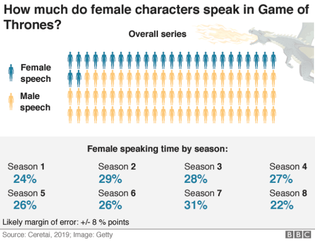
The story draws on data from an external organisation, Ceretai, which “uses machine learning to analyse diversity in popular culture.” The organisation claims to have created an algorithm which “has learned to identify the difference between male and female voices in video and provides the speaking time lengths in seconds and percentages per gender.”
Crucially, the piece notes that:
“Like most automatic systems, it doesn’t make the right decision every time. The accuracy of this algorithm is about 85%, so figures could be slightly higher or lower than reported.”
And this is the first problem.
Machine learning is about teaching an algorithm to ‘learn’ relationships between things (causes and effects, actions and reactions, etc).
In this case (a branch called ‘supervised learning‘) it is learning the characteristics that tell us that a voice belongs to a male or female person.
To do this, it will first be given a training set of data which has already been classified. So for example a set of audio recordings which have already been tagged ‘male’ or ‘female’.
It will then be tested against a test set of data which has also been classified but which the algorithm has not been trained on, to see how well it has learned.
This process might be repeated a number of times as the algorithm improves. By the end, it still gets the gender correct 85% of the time in this test, but wrong 15% of the time.
85% is quite good in machine learning terms — but journalistically, it’s problematic. We have moved from dealing with facts, to dealing with estimates.
“Slightly” higher or lower?
There are a number of ways to deal with uncertainty, and the BBC article uses at least two.
- First, a caption has been added to the bottom of one of the infographics: “Likely margin of error: +/- 8 % points“.
- Second, there is that textual disclaimer about the possibility of the real figure being “slightly” higher or lower.
Notably, it doesn’t specify just how slightly that is: nowhere in the text does it say the real figure could be 8 percentage points higher or lower.
This is important: if the figure in the chart is 27%, for example, that means that the real figure could be anywhere between 19% and 35%.
So when the article says that:
“Researchers were expecting to see about 30% of the speaking time to be the voices of female characters. This is the average given to women on screen, according to research by the USC Annenberg on inequality in 900 popular films.”
That 30% is well within the margin of error, so the researchers actually did find what they expected, more or less — they just either didn’t realise it, or the journalists didn’t.
There is a third technique which the BBC could have used, and didn’t: using visual techniques to communicate uncertainty.
This is an area which has been a hot topic in the visualisation field for some years now: on Visualising Data you can find a page from 2015 collecting a range of references and resources for visualising uncertainty.
Reporting the facts that you can establish
Crucially, the story uses a lot of qualifying words whenever referring to figures: female characters “speak about three times less” or “about a quarter” (my emphases), “male speech amounts to about 75%”.
Whether these qualifying words — like “slightly” — are an appropriate representation of the accuracy of the figures, is a debate that needs to be had within the editorial team. But it is worth drawing attention to.
Attribution is also used to qualify one figure (and by implication those in the next paragraphs): “[female speech accounts for] just one in five times the overall speaking time, according to the algorithm used for the analysis.”
The headline, likewise, only raises a question rather than claiming to answer one (a wise SEO play too).
After introducing the caveat about accuracy, the article’s strongest factual assertion is that “the data suggests that speaking times for men and women in the programme are far from being equal.” This is fair. At the upper end of the margin of error, women are still only speaking 35% of the time. But if that upper end was 50% or above, you could not make that claim.
Seeking other sources
The article may lead with the new (and therefore most newsworthy) machine learning-generated data — but crucially, it draws on other sources too, including the USC Annenberg research mentioned above, data journalism by Hanah Anderson, analysis by the BBC itself, and Game of Thrones-specific analysis by US software firm Looker.
All of that data, as far as I can tell, was manually encoded rather than AI-generated.
Like any journalism, checking the story’s central premise with multiple sources makes for a more rigorous story. Even if the machine learning data isn’t accurate enough, the general thrust is well-supported: there is a problem with gender equality when it comes to dialogue in TV and film.
Algorithmic accountability: holding the source to account

What isn’t clear is to what extent, if at all, the journalists questioned the way that the algorithm was designed and trained and tested. Some questions a journalist should ask in this sitution include:
- How big was the training data set?
- How big was the test set?
- What was the training data?
- How did they settle on the 85% accuracy?
- What issues have they identified in the data — for example the sorts of false positives or negatives that it tends towards?
Some of these questions are analagous to those any journalist should ask of a survey: how big was the sample? How was it chosen? What questions were asked? (And what’s the vested interest of those conducting it.)
Other questions are specific to the realm of algorithmic accountability and an understanding of the issues that face machine learning techniques, such as bias in machine learning and the techniques used to address it.
Either way, some sort of methodology section is important to explain what ingredients were used to create the model and any attempts to address bias.
Why we need guidelines for uncertainty

Those techniques aside, what this demonstrates is that more and more journalists can expect to be dealing with this sort of uncertainty as the role of machine learning algorithms continues to grow (how much more mainstream can you get than Game of Thrones?).
First and foremost, journalists need to understand that data generated by AI technologies will almost invariably involve some sort of uncertainty: it will never be ‘data’ in the sense that most journalists understand it.
(And yes, data has always involved sampling and margins of error — and yes, journalists often failed to understand that too).
Second, we will need a more systematic way of dealing with that, some consideration of the issue in editorial guidelines.
These might draw on the resources listed on Visualising Data, but also Teresa Ashe’s 2017 report How the Media Report Scientific Risk and Uncertainty and The Royal Society’s Communicating uncertainty about facts, numbers and science. It might also draw on literature on uncertainty in machine learning specifically.
If you’ve any relevant experiences of examples, I’d love to hear them.
Update: an example from NiemanLab of just how complicated this can get
On the same day as this post was published, NiemanLab published an article on another set of machine learning-generated data, from a study by the Pew Research Center. This time the article did not mention anything about the accuracy of the algorithm, although it did attribute all factual claims to the study.
The study itself does a poor job of communicating the margin of error involved in its analysis. Although the word “estimate” or “estimating” was used, claims of numerical certainty are regularly made without any caveats — sometimes even within the same paragraph (emphasis added):
“Of those individuals, 35,367 were estimated to be men and 17,700 were estimated to be women. In other words, 33% of all people shown in news images on Facebook were women and 67% were men.”
That claim is misleading. The report should have said “Approximately 33%/67%”.
Charts in the report also include no mention of the fact that figures are estimates.
How accurate was that estimation? In the main report it is explained that the model “achieved 95% accuracy when tested on a subset of the data it was trained with, and 87% accuracy when tested on a random sample of 998 individuals from the Facebook news images, using human judgments as a ground truth.”
The figure is further complicated when you realise that machine learning was also used to identify the faces before the gender algorithm was used. In the Methodology section they explain that that algorithm “achieves 99.4% accuracy on the popular Labeled Faces in the Wild dataset.”
Not complicated enough? How about the fact that another algorithm was used to classify the topics of the stories the faces were included in.
The methodology is worth reading in full, as it explains in depth the algorithm that they built on top of (which has a 90% accuracy), and how they tried to address bias related to ethnicity and other factors.

Pingback: What we read this week (24 May) – BMJ Labs
Pingback: journalismAI.com | If we are using AI in journalism we need better guidelines on reporting uncertainty | ONLINE JOURNALISM BLOG
Pingback: Coronavirus: 3 ways journalists need to get to grips with uncertainty during the pandemic | Online Journalism Blog