Tag Archives: kaiser fung

Coronavirus: 3 ways journalists need to get to grips with uncertainty during the pandemic

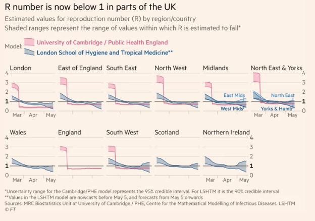
R number ranges in different UK regions

R number ranges shown by the FT

Journalism doesn’t like uncertainty: editors are trained to cut out vagueness and journalists taught to be as concrete as possible in their reporting. In most cases it compels reporters to ensure they have a firm grip on the details and are confident in the story they are reporting.

But with coronavirus, this discipline becomes a systemic blind spot.

From prevalence to testing, and from deaths to infection rates, the story of this pandemic is full of uncertainty. Here, then, are 3 ways that journalists need to understand — and better communicate — the things that we don’t know, and won’t know, about it. Continue reading

Statistics and data journalism: seasonal adjustment for journalists

seasonal adjustment image from Junk Charts

When you start to base journalism around data it’s easy to overlook basic weaknesses in that data – from the type of average that is being used, to distribution, sample size and statistical significance. Last week I wrote about inflation and average wages. A similar factor to consider when looking at any figures is seasonal adjustment.

Kaiser Fung recently wrote a wonderful post on the subject:

“What you see [in the image above] is that almost every line is an inverted U. This means that no matter what year, and what region, housing starts peak during the summer and ebb during the winter.

“So if you compare the June starts with the October starts, it is a given that the October number will be lower than June. So reporting a drop from June to October is meaningless. What is meaningful is whether this year’s drop is unusually large or unusually small; to assess that, we have to know the average historical drop between October and June.

“Statisticians are looking for explanations for why housing starts vary from month to month. Some of the change is due to the persistent seasonal pattern. Some of the change is due to economic factors or other factors. The reason for seasonal adjustments is to get rid of the persistent seasonal pattern, or put differently, to focus attention on other factors deemed more interesting.

“The bottom row of charts above contains the seasonally adjusted data (I have used the monthly rather than annual rates to make it directly comparable to the unadjusted numbers.)  Notice that the inverted U shape has pretty much disappeared everywhere.”

The first point is not to think you’ve got a story because house sales are falling this winter – they might fall every winter. In fact, for all you know they may be falling less dramatically than in previous years.

The second point is to be aware of whether the figures you are looking at have been seasonally adjusted or not.

The final – and hardest – point is to know how to seasonally adjust data if you need to.

For that last point you’ll need to go elsewhere on the web. This page on analysing time series takes you through the steps in Excel nicely. And Catherine Hood’s tipsheet on doing seasonal adjustment on a short time series in Excel (PDF) covers a number of different types of seasonal variation. For more on how and where seasonal adjustment is used in UK government figures check out the results of this search (adapt for your own county’s government domain).
Something I wrote for the Guardian Datablog (and caveats)

I’ve written a piece on ‘How to be a data journalist’ for The Guardian’s Datablog. It seems to have proven very popular, but I thought I should blog briefly about it if you haven’t seen one of those tweets.

The post is necessarily superficial – it was difficult enough to cover the subject area for a 12,000-word book chapter, so summarising further into a 1,000 word article was almost impossible.

In the process I had to leave a huge amount out, compensating slightly by linking to webpages which expanded further.

Visualising and mashing, as the more advanced parts of data journalism, suffered most, because it seemed to me that locating and understanding data necessarily took precedence.

Heather Billings, for example, blogged about my “very British footnote [which was the] only nod to visual presentation”. If you do want to know more about visualisation tips, I wrote 1,000 words on that alone here. There’s also this great post by Kaiser Fung – and the diagram below, of which Fung says: “All outstanding charts have all three elements in harmony. Typically, a problematic chart gets only two of the three pieces right.”:

Trifecta checkup

On Monday I blogged the advice on where aspiring data journalists should start in full. There’s also the selection of passages from the book chapter linked above. And my Delicious bookmarks on data journalism, visualisation and mashups. Each has an RSS feed.

I hope that helps. If you do some data journalism as a result, it would be great if you could let me know about it – and what else you picked up.

Data journalism pt2: Interrogating data

This is a draft from a book chapter on data journalism (the first, on gathering data, is here). I’d really appreciate any additions or comments you can make – particularly around ways of spotting stories in data, and mistakes to avoid.

UPDATE: It has now been published in The Online Journalism Handbook.

“One of the most important (and least technical) skills in understanding data is asking good questions. An appropriate question shares an interest you have in the data, tries to convey it to others, and is curiosity-oriented rather than math-oriented. Visualizing data is just like any other type of communication: success is defined by your audience’s ability to pick up on, and be excited about, your insight.” (Fry, 2008, p4)

Once you have the data you need to see if there is a story buried within it. The great advantage of computer processing is that it makes it easier to sort, filter, compare and search information in different ways to get to the heart of what – if anything – it reveals. Continue reading