Tag Archives: tutorial

How to: get started with SQL in Carto and create filtered maps

map carto

Today I will be introducing my MA Data Journalism students to SQL (Structured Query Language), a language used widely in data journalism to query databases, datasets and APIs.

I’ll be partly using the mapping tool Carto as a way to get started with SQL, and thought I would share my tutorial here (especially as since its recent redesign the SQL tool is no longer easy to find).

So, here’s how you can get started using SQL in Carto — and where to find that pesky SQL option. Continue reading

How to: use the AtF Spark font to create charts with just text

atfspark examples

AtF Spark is “a typeface for creating sparklines in text”. In other words, the fonts will convert numbers into something that looks like a chart. It looks pretty cool, and is a neat way to add a little spark (ahem) to your text.

But while the GitHub repo gives some basic instruction on using the fonts, it also assumes quite a bit of prior knowledge, so here’s a tutorial to explain how to use it if you’re not already familiar with web fonts and other technicalities of web design. Continue reading

How to: create a treemap in Tableau

tableau treemap buzzfeed

Treemaps are a great alternative to pie charts when you want to tell a story about the composition of something: whereas pie charts can be limiting, treemaps allow users to drill down into ‘parts of parts’, and group elements within particular categories.

In this post I’m going to show you how to create a treemap in the free visualisation software Tableau Public to show how the majority of BuzzFeed’s content views in 2015 took place away from its website.

This data suits a treemap particularly well: although the traffic is broadly split between ‘website’, ‘Facebook’, ‘Snapchat’, ‘YouTube’ and ‘other’, there are also subdivisions within some of those platforms – for example, Facebook traffic is split between video and images, and website traffic is split between direct visits, those via Google, and those via Facebook. A treemap allows users to explore those subtleties in a way that pie charts do not.

Step 1: Get the data in the right format

To create a treemap it is vital that you get the data in the correct format to begin with. In particular, you will need to make sure that as well as a primary ‘category’ column, you also have a second ‘sub category’ column. They don’t have to have these names, but that general concept is important. A third column should contain the values to be visualised.

treemap data format

The key feature to look for in this data structure is that you should expect to see categories in your main ‘category’ column appear more than once. In our BuzzFeed data, for example, the platform category ‘website’ appears 3 times – once for each ‘Source’ sub category of ‘Direct traffic’, ‘Traffic from Google’ and ‘Traffic from Facebook’.

Also, make sure that your values only use numbers – don’t add percentage symbols, commas or other characters that might lead to it being interpreted as text and mean you have to reclassify the data later.

If you need a dataset to work with, I’ve uploaded the Buzzfeed figures here (you’ll need to save it to your computer).

Begin creating your chart

In Tableau Public, connect to the data you’ve just created, and go to your empty worksheet. On the left you should see your category (in this case, ‘Platform’) and sub category (in this case ‘Source’) columns in the Dimensions area; and underneath that in the Measures area, your values (in this case, ‘Traffic %’).

Click and drag your main category dimension (‘Platform’) into the Rows area at the top. Then do the same with your measure (‘Traffic %’) so that it looks like this:

Platform and traffic % in rows

Tableau will automatically draw a chart for you – but ignore that. Instead, look to the right hand side where the ‘Show me’ menu should now be showing which chart types you can use with this combination of data. If it doesn’t show, click ‘Show me’ in the upper right corner.

One of the options available should be the treemap – it’s normally the first option four rows down. Click on this to change the chart to a treemap.

Show me menu

Now we have a treemap – but it’s only showing the top-level category (in this case, ‘Platform’). We need to customise it a bit to get a treemap which allows users to see the sub-categories too.

Customising the colours and slices

To the left of the chart itself you should see a box titled Marks containing buttons for Color, Size, Label, Detail and Tooltip. And underneath those buttons, icons indicating three settings:

  • The ‘Size’ icon is set by ‘SUM(Traffic %)’
  • The ‘Color’ icon is also set by ‘SUM(Traffic %)’
  • The ‘Label’ icon is set by ‘Platform’

Treemap

First we need to change it so that the ‘Color’ is determined by the main category (‘Platform’). To do that, click and drag the ‘Platform’ dimension onto the Color button.

Now, instead of one colour in different shades representing an amount, you should have five colours – one for each category:

Treemap coloured by category

We can customise the colour further by clicking on the ‘Color’ button and clicking Edit colors…. This will open up a new window with a list of categories on the left, and a palette on the right. In our case it makes sense to assign relevant colours to each platform: yellow for Snapchat, red for YouTube, and blue for Facebook. I’ve also chosen grey for ‘Other’. If you prefer other shades you can access other palettes using the dropdown menu in the upper right corner. Click ‘Apply’ to see the results, and ‘OK’ to apply and leave this window.

Edit colors menu

Next, we need to bring in that sub-category (‘Category’) in. A good place to do this is on the ‘Label’: because we are already using colour to indicate the platform, we need the label to add that extra information about the source of traffic to that platform.

To do this, click and drag the ‘Category’ dimension onto the Label button.

Now the area of colour for each platform should now split into further parts based on this new category. In addition, the text labels should reflect that information too.

Treemap

Other customisation

The chart is now pretty much ready. That just leaves the title to customise: at the moment it is automatically taking the name of the sheet, so you can change the title by double-clicking on the sheet tab at the bottom and renaming it. Alternatively you can double-click on the sheet title and replacing it in the window that opens.

You can also customise the Tooltip – for example a % sign needs adding after the percentage figure on each slice.

How and why to save politicians’ (and your own) tweets before they are deleted

Headline: Twitter Shuts Down Services That Tracked Politicians’ Deleted Tweets In 30 Countries

In August 2015 Twitter shut down a number of ‘deleted tweets’ archives. Image: TechCrunch

If you rely on Twitter or other social media services to act as a record of history, a series of incidents over the past six months should make you think again – and take control. Continue reading

How to: convert XML or JSON into spreadsheets using Open Refine

curly brackets

Curly brackets pattern by Dan McCullough

One of the most useful applications of the data cleaning tool Open Refine (formerly Google Refine) is converting XML and JSON files into spreadsheets that you can interrogate in Excel.

Surprisingly, I’ve never blogged about it. Until now. Continue reading

How-to: learn about APIs while making tweetable quotes

This is the second in a series of tutorials introducing HTML, CSS and APIs. You should probably start with the first one, here.

You can also get all four tutorials in a small ebook.

Sharelines

In the previous post I outlined how to create a ‘Tweet this’ link using HTML to open a new Twitter window containing any text you liked. In this post I’ll outline how to add links, hashtags and @names to that tweet – and along the way find out a bit about APIs. Continue reading

How-to: learn HTML and CSS by making tweetable quotes

Sharelines

In the first of a series of tutorials I’m going to introduce you to some basic HTML by showing you a particularly useful application of simple coding skills: making something in your article ‘tweetable’.

I’ll do this in three stages: this first and longest post will introduce HTML basics by showing how to create the ‘tweetable quote’; the second post will add more details on tweeting links, hashtags and @names.

The third post will cover how to make a ‘tweetable image’; and finally, the third post will add a little design flair with CSS.

You can also get all four tutorials in a small ebook.

You will need an article already written in order to do this – ideally one with at least one image, and some good quotes.

Stage 1: The tweetable quote

If you know how to create a link then you already know how to create a tweetable quote.

Let me explain. A link has two parts:

  1. The raw text or image which is linked, and
  2. The HTML code which makes it into a link. HTML code is always in triangular brackets, sometimes called chevrons.

Here, for example, is a link with both elements:

<a href="http://onlinejournalismblog.com">PUT LINK TEXT HERE</a>

The text (in capitals in the example above) will go to the link in quotation marks in the HTML, whatever that text is.

Now let me show you the HTML for a link which creates a very simple ‘tweet this’ box with the tweet already filled with the text ‘hello’. The structure is the same:

<a href="https://twitter.com/intent/tweet?text=hello">PUT LINK TEXT HERE</a>

Starting with HTML: opening and closing tags

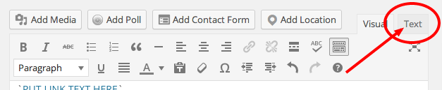
In WordPress, switch from the normal ‘Visual’ view to the ‘Text’ view, which allows you to see the post text including most of the HTML as well.

wordpress text editor

For example, if you have any formatting such as bold or italic text, subheadings, bullet or numbered lists and links, then you should be able to see the HTML doing that work. Here are some examples:

  • <strong> – this makes text bold
  • <em> – this makes text italic
  • </em></strong>
    <h2>
    – this makes a Heading 2 subheading. Similar tags will create headings at levels 3 down to 6
  • </h2>
    <ul>
    <ul>
    – this makes a bullet list…


    * `

  • ` – …and then the first item in that list
    * `

    1. ` – this makes a numbered list, and then the first item in that list
      * `

      ` – this makes an indented quote
      * `` – this makes an image
      * `` – this makes a link. More on this later.

You should also notice that (almost) every tag has a similar, tag, with a backslash before it.

This ‘turns off’ the tag. For instance:

  • “ – this turns off bold text
  • “ – this turns off italic text
  • `

- this ends the Heading 2 subheading.
*

- this marks the end of a bullet list...
*

- ...and this marks the end of the first item in that list
*

- this ends the last item in a numbered list, and then the numbered list as a whole
*

` – this ends an indented quote
* “ – this marks the end of linked text.

You’ll notice one tag that is only in one of those two lists: <img alt="" />. This is because the img tag is one of a very few tags that don’t have a closing tag.

All this is a long way of saying: if you want to create a link, you need to make sure that you close it with the “ tag.

You may have noticed that the <a> in the link code example given earlier also includes other words like href= – why don’t we close those? Well, because those are not tags – they are something else, as I’ll explain next.

As a first exercise, before that, try this:

  1. Make sure you are in the HTML view for your post (click the Text tab if you are in WordPress).
  2. Find a quote (try CTRL+F to find it quickly)
  3. Put <a> immediately before it (on the same line) and </a> immediately after it (also on the same line).
  4. Preview the post after this change. The quote should now be styled like a link, like this. But when you hover over it, you cannot click – why?

Attributes and values

Some HTML tags, like <a> and <img alt="" /> need attributes and values to work properly. You can create some HTML which looks like this: </a><a>A LINK</a><a> and it will look like a link – but it won’t go anywhere. Why? Because we haven’t specified where we want the link to go.

The source of the link is just one attribute that an <a> tag can have. That attribute is href (hyperlink reference).

Other common attributes of tags include src (source), width, height, color and border. And when you start to think about those the idea of an attribute makes more sense: if you want to draw a box then of course you need to know its attributes in terms of width and height.

And of course each attribute needs a value: what is the width? What is the height, or the colour? What is the URL of the href of this link, or src of this image?

The value is specified by adding an equals operator after the attribute, and then the value in straight quotation marks.

A typical <a> tag in full, then, with an attribute and its value, looks something like this: </a><a href="http://onlinejournalismblog.com">

The href attribute has (=) the value "http://onlinejournalismblog.com"

A single tag can have multiple attributes. An image can have a src attribute, a width and height, a border thickness, alignment, title and alternative description, to name just a few.

But you only close the tag. You do not close the attributes.

To apply these principles to your link, change the HTML so that the <a> tag has an href attribute like so:

<a>

Make sure there is still an “ after the text, to end the link.

Now when you preview to see the effect of the change, your text should not only be styled like a link, but it should be clickable too, like this.

But when you click on the link, it will not go anywhere.

That is because you now have a tag and an attribute, but no value (the URL of the link it should be going to).

So let’s add one. The URL which will create your tweet:

https://twitter.com/intent/tweet?text=hello

If you add this as your href attribute’s value your full link HTML should look like this:

<a href="https://twitter.com/intent/tweet?text=hello">Your link text here</a>

Change your HTML for the link so it uses the same URL. Then preview and test the link (you need to be logged into Twitter by the way, or you’ll be taken to a login page).

The link should open a Twitter box with the word ‘hello’ already entered.

Now ideally we want it to open in a separate window. And there’s an attribute for that: target.

The target attribute specifies whether you want this link to open in the same window, or a new one (among other now largely unused options).

If you don’t use it, the link will by default open in the same window. But if you want to open in a new window, then you need to give the target attribute the value ="_blank". Here’s an example of adding that to the link shown above:

<a href="https://twitter.com/intent/tweet?text=hello" target="_blank">PUT LINK TEXT HERE</a>

Now preview and test the link.

Regular testing is key when playing with any code: it allows you to identify any problems quickly and specifically.

For example, if you make ten changes and then test, the cause of any problem could be any of those ten changes. If for each of those ten changes you test each time, you will only get that problem for the one change that causes it.

Customising the tweeted text – hackable URLs

When you click on that text you’ll notice that the resulting window contains the impressive but ultimately unhelpful text: ‘hello’.

Now we want to change that text to the same text as our quote.

If you look at the URL you should be able to guess how to do that.

At the end of the URL are the words text=hello. This is very similar to the attributes and values that we talked about: text always stays the same (it means the contents of the tweet) but the value can be changed. At the moment that value is 'hello' but… what if we change it?

Well, we can try and see what happens. It’s not going to break the internet.

So, change the value to something else to test our suspicions: is this the part of the URL which populates the text of the tweet?

In your browser address bar, then, copy and edit that URL to this:

https://twitter.com/intent/tweet?text=goodbye

And yes indeed when we go to that URL the text changes to ‘goodbye’.

This is called a ‘hackable URL‘. In other words, we can change (‘hack’) the URL to generate different results.

How about a longer phrase? When we try something like this…

https://twitter.com/intent/tweet?text=your quote here

…it works, but look at the final URL: it’s slightly different:

https://twitter.com/intent/tweet?text=your%20quote%20here

The spaces have been replaced by %20 – because URLs cannot have spaces in them (in Firefox it may look like spaces, but if you copy and paste the URL into a text editor you will see %20 instead).

This is called ‘escaping’ special characters which might otherwise cause problems, and your browser automatically does it.

Try it now, then, with the quote you actually want to appear in the tweet. Ideally you should copy the resulting URL with %20 instead of spaces – although if you didn’t the link would probably still work (‘resolve’) anyway.

Now use that in your HTML link instead of the simpler ‘hello’ version so you have something like this:

<a href="https://twitter.com/intent/tweet?text=How%20to%20create%20a%20tweetable%20quote%20by%20Paul%20Bradshaw" target="_blank">How to create a tweetable quote by Paul Bradshaw</a>

By the way, speech marks are another special character which needs to be ‘escaped’. In this case, it will be replaced by %22.

When someone clicks on that link it should open a new window containing the text specified.

Have a play with the techniques covered so far until you’re confident. In particular, see if you can add a short link back to the original post.

In the next post I will outline how to add that link, plus other elements such as @names and hashtags.

Before then, let’s cover a bit more on HTML: specifically nested tags.

Changing your linked text to a ‘call to action’

So far we’ve been linking the quote itself, but will the user know what will happen when they click on it? Chances are the user will assume that link takes them to the source of the quote – not to a Twitter box allowing them to share it.

So we need to change that.

First, we need to create the ‘Call to Action’ (CTA) that tells the user to ‘Tweet this!’. Type that after the quote, perhaps in square brackets, like so:

[Tweet this!]

Now we need to link that text instead of the quote itself. You could, for example, cut and paste both parts of the <a> tag (opening and closing) from where they were, to before and after [Tweet this!].

If you want that text to be a bit less obtrusive, you can make it ‘superscript’ (small text hovering slightly above normal text) with the <sup> tag like so: [Tweet this!]

<a href="https://twitter.com/intent/tweet?text=hello" target="_blank"><sup>[Tweet this!]</sup></a>

Which tag comes first?

At this point you are dealing with a piece of HTML which uses two tags: <a> and <sup>.

This is a good opportunity to introduce the LIFO rule in HTML: when you are combining more than one tag, they should be closed in the reverse order.

In other words: Last In First Out (LIFO).

If you want text to be bold and italic, for example, you could apply that formatting by combining the tags:

<strong><em>

…then close in the reverse order:

It does not generally matter which one comes first; it only matters that you reverse the order when closing. So conversely, if you started with

<em><strong>

…then you would close with

In some cases, however, you don’t have that option.

For example in a bullet or numbered list you have to open a tag for the list as a whole and for each item within that list. You cannot open a list item before you open the list in which it is supposed to sit.

So, you only use <ul> (unordered list) and </ul> once (because there is only one list) but within those you might use <ul>
<li>
(list item) and `


` as many times as you want bulleted items.

If you get any problems with tags it is worth checking:

  1. Whether you closed them in the reverse order, and
  2. If you change the order, does it help?

For example, if you have problems with <sup><a>, try </a><a><sup> – but always remember the LIFO rule: whichever tag you open first – <sup> or </sup></sup></a><a> – should be the one you close last. [Tweet this!]

Adding a Twitter icon

The same principle applies if you want to use a little Twitter bird icon after your quote.

There are a number of these on Twitter’s image resources page including this one:

In this case your HTML looks like so:

<a href="https://twitter.com/intent/tweet?text=hello" target="_blank"><img src="https://g.twimg.com/dev/documentation/image/Twitter_logo_blue_16.png" alt="Tweet this" /></a>

This time the <img alt="" /> tag is nested within the <a> and </a> tags. We can’t reverse this order because <img alt="" /> does not have a closing tag. We link the image by surrounding it with the opening and closing <a> tags.

The <img alt="" /> tag also has some attributes: src="" tells us where the image is being loaded from: in this case https://g.twimg.com/dev/documentation/image/Twitter_logo_blue_16.png

And the alt="" attribute tells us an alternative description for the image, in case the user is using screen reading software (because they are partially sighted or blind), or if the image does not load, and also to help search engines understand what the image is. Tweet this

For more styling options see the final part of this series on using CSS.

Have a play around with making your own ‘tweet this’ links and different URLs. In the next post I’ll cover how to add other elements to the tweet itself.

HOW TO: Find out the ages of people using Excel

excel for journalists ebook

This post is taken from the ebook Finding Stories With Spreadsheets

“How do I calculate an age in Excel?” Marion Urban, a French journalist and student on the MA in Online Journalism in Birmingham, was preparing data for the forthcoming UK General Election.

In order to do this Marion had downloaded details on the candidates who had stood successfully in the previous election.

“It was a very young intake. But it wasn’t easy to calculate their ages.”

Indeed. You would think that calculating ages in Excel would be easy. But there is no off-the-shelf function to help you do so. Or at least, no easy-to-find function.

Instead there are a range of different approaches: some of them particularly, and unnecessarily complicated.

In this extract from Finding Stories in Spreadsheets I will outline one approach to calculating ages, which also illustrates a useful technique in using spreadsheets in stories: the ability to break down a problem into different parts. Continue reading

Create a council ward map with Scraperwiki

Mapping council wards

With local elections looming this is a great 20-30 minute project for any journalist wanting to create an interactive Google map of council ward boundaries.

For this you will need:

Social Interest Positioning – Visualising Facebook Friends’ Likes With Data Grabbed Using Google Refine

What do my Facebook friends have in common in terms of the things they have Liked, or in terms of their music or movie preferences? (And does this say anything about me?!) Here’s a recipe for visualising that data…

After discovering via Martin Hawksey that the recent (December, 2011) 2.5 release of Google Refine allows you to import JSON and XML feeds to bootstrap a new project, I wondered whether it would be able to pull in data from the Facebook API if I was logged in to Facebook (Google Refine does run in the browser after all…)

Looking through the Facebook API documentation whilst logged in to Facebook, it’s easy enough to find exemplar links to things like your friends list (https://graph.facebook.com/me/friends?access_token=A_LONG_JUMBLE_OF_LETTERS) or the list of likes someone has made (https://graph.facebook.com/me/likes?access_token=A_LONG_JUMBLE_OF_LETTERS); replacing me with the Facebook ID of one of your friends should pull down a list of their friends, or likes, etc.

(Note that validity of the access token is time limited, so you can’t grab a copy of the access token and hope to use the same one day after day.)

Grabbing the link to your friends on Facebook is simply a case of opening a new project, choosing to get the data from a Web Address, and then pasting in the friends list URL:

Google Refine - import Facebook friends list

Click on next, and Google Refine will download the data, which you can then parse as a JSON file, and from which you can identify individual record types:

Google Refine - import Facebook friends

If you click the highlighted selection, you should see the data that will be used to create your project:

Google Refine - click to view the data

You can now click on Create Project to start working on the data – the first thing I do is tidy up the column names:

Google Refine - rename columns

We can now work some magic – such as pulling in the Likes our friends have made. To do this, we need to create the URL for each friend’s Likes using their Facebook ID, and then pull the data down. We can use Google Refine to harvest this data for us by creating a new column containing the data pulled in from a URL built around the value of each cell in another column:

Google Refine - new column from URL

The Likes URL has the form https://graph.facebook.com/me/likes?access_token=A_LONG_JUMBLE_OF_LETTERS which we’ll tinker with as follows:

Google Refine - crafting URLs for new column creation

The throttle control tells Refine how often to make each call. I set this to 500ms (that is, half a second), so it takes a few minutes to pull in my couple of hundred or so friends (I don’t use Facebook a lot;-). I’m not sure what limit the Facebook API is happy with (if you hit it too fast (i.e. set the throttle time too low), you may find the Facebook API stops returning data to you for a cooling down period…)?

Having imported the data, you should find a new column:

Google Refine - new data imported

At this point, it is possible to generate a new column from each of the records/Likes in the imported data… in theory (or maybe not..). I found this caused Refine to hang though, so instead I exprted the data using the default Templating… export format, which produces some sort of JSON output…

I then used this Python script to generate a two column data file where each row contained a (new) unique identifier for each friend and the name of one of their likes:

import simplejson,csv

writer=csv.writer(open('fbliketest.csv','wb+'),quoting=csv.QUOTE_ALL)

fn='my-fb-friends-likes.txt'

data = simplejson.load(open(fn,'r'))
id=0
for d in data['rows']:
	id=id+1
	#'interests' is the column name containing the Likes data
	interests=simplejson.loads(d['interests'])
	for i in interests['data']:
		print str(id),i['name'],i['category']
		writer.writerow([str(id),i['name'].encode('ascii','ignore')])

[I think this R script, in answer to a related @mhawksey Stack Overflow question, also does the trick: R: Building a list from matching values in a data.frame]

I could then import this data into Gephi and use it to generate a network diagram of what they commonly liked:

Sketching common likes amongst my facebook friends

Rather than returning Likes, I could equally have pulled back lists of the movies, music or books they like, their own friends lists (permissions settings allowing), etc etc, and then generated friends’ interest maps on that basis.

[See also: Getting Started With The Gephi Network Visualisation App – My Facebook Network, Part I and how to visualise Google+ networks]

PS dropping out of Google Refine and into a Python script is a bit clunky, I have to admit. What would be nice would be to be able to do something like a “create new rows with new column from column” pattern that would let you set up an iterator through the contents of each of the cells in the column you want to generate the new column from, and for each pass of the iterator: 1) duplicate the original data row to create a new row; 2) add a new column; 3) populate the cell with the contents of the current iteration state. Or something like that…

PPS Related to the PS request, there is a sort of related feature in the 2.5 release of Google Refine that lets you merge data from across rows with a common key into a newly shaped data set: Key/value Columnize. Seeing this, it got me wondering what a fusion of Google Refine and RStudio might be like (or even just R support within Google Refine?)

PPPS this could be interesting – looks like you can test to see if a friendship exists given two Facebook user IDs.