
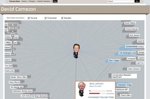
Channel 4’s Who Knows Who project was an early adopter of network analysis
Network analysis offers enormous potential for journalism: able to tease out controversial connections and curious clusters, and to make visible that which we could not otherwise see, it’s also often about relationships and power.
It is both a data journalism technique and an open source intelligence (OSINT) technique — and yet it is relatively underused in both, most likely because the tools to do network analysis have only become accessible in the last few years.
Here, then, is an introduction for journalists, adapted from my lectures on the MA in Data Journalism at Birmingham City University.
How network analysis is used in journalism
Network analysis is, simply, a way of making relationships between entities visible.
It might be used in journalism to generate or check leads (by showing unusual patterns), to communicate the story itself (i.e. to show those patterns to others) or to allow readers to explore a system.
A common application of network analysis is in showing interactions between people, especially in situations where those people aren’t physically visible — such as in the BBC Newsnight example in the video above, and stories on online disinformation campaigns, (Marc Smith describes it as a way of taking a picture of crowds online).
But network analysis can be used for a wide range of journalistic purposes, including exploring:
- Connections between people based on their education, employment history (for example attending the same school or working for the same organisation), or other characteristics
- Company relationships, e.g. which companies do business with each other, or which companies are connected to other companies through ownership
- Director-company relationships, e.g. connections between directors and companies
- Influencers, cliques, power brokers and outliers: a network graph (more on this later) can show the density of relationships, who plays significant roles, who acts as a bridge between different groups, and who is on the margins
- Change: adding a time dimensions allows you to see or show how any of the above features have changed over a particular period
In fact, research in 2017 of news articles using network analysis identified five different ways it was being used by journalists:
- To explore associations around individual actors (such as networks of personal power)
- To detect ‘key players’ (those who hold power less visibly)
- To map alliances and oppositions
- To explore the evolution of associations over time (for example how political parties became less cooperative); and
- To reveal hidden ties
How do we do this? Well, firstly, you need to be able to identify what sorts of relationships you want to investigate, who or what those are between, and where and how that might be measured.
Who and how: nodes and connections

The Wall Street Journal used network analysis to visualise the business interests of Donald Trump and his children
At the core of network analysis are two concepts:
- Nodes (sometimes called vertices or elements): the entities you are interested in. They might be individuals, organisations, locations, documents or anything else you can measure
- Connections (called ‘edges‘): typically the relationships between nodes.
Relationships can be literal (parent, child, colleague, employee, follower) or related to interactions or commonalities (payments between, appearance together, attendance at, speaking about, correspondence between, etc.)
Relationships can also be directed: for example, one thing follows/pays/owns another but not vice versa.
And they can be weighted, too: an ownership might be 100% or 50%; payment could be $1m or $500,000, and so on.
But you need to be able to see those relationships as an avenue for exploration before you start measuring them.
How to measure connections

This network analysis was compiled by treating two characters being mentioned in the same sentence as a relationship
Some relationships may be easier to spot and measure than others: on social media, for example, one person follows another; one person @-mentions another in a tweet or retweets another user.
Some relationships may be codified for us: Facebook and LinkedIn, for example, encode worked-for and works-for relationships. Most social platforms encode information about where people say they reside, while Facebook adds data on where someone used to live and where they were born, as well as who they are married to and a range of other details.
Company registers such as Companies House might encode other information, such as a person holding a directorship in a company, or a company having significant control in another company.
But other data might need to be compiled manually or semi-automatically: one network analysis of Game of Thrones (PDF), for example, classed the mention of two characters within 15 words of each other as a relationship, and used text analysis of one book to compile data on those occurrences.
How to ‘read’ a network graph
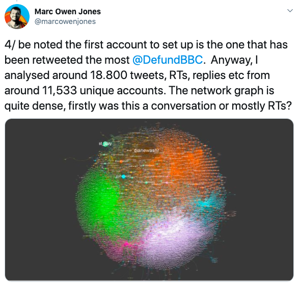
This network graph of #defundthebbc tweets is quite dense, indicating a single group rather than separate ones
Once you’ve compiled data for network analysis it’s likely that you will generate a network graph that visualises the network in order to make it easier to see the strength of connections and the connectivity of each note.
Network graphs can actually show a number of things, each of which might warrant a different hypothesis and avenue of inquiry. For example, you can use a network graph to look for angles including:
- Who/what is most connected (degree centrality): conventionally this is illustrated in a network graph by the size of the node — the more connections a node has, the bigger it is.
- Who/what has the most ‘influence‘ (Eigenvalue centrality): similar to degree centrality, but this factors in how connected a node is to highly connected others.
- Who/what is most ‘central’ (closeness centrality): this is more about a person’s location within the network and how many steps it takes for them to get to all other nodes in that network.
- Who/what acts as a ‘bridge’ between groups in the network (betweenness centrality): networks often separate into different clusters, so you might be interested in who connects those clusters. In the Game of Thrones example above, for example, Stannis appears to perform a bridging role.
- Other measures of centrality are listed in Wikipedia’s entry on the concept.
Sometimes these measures can be averaged for members of different groups, as in John Mowbray’s analysis of the ‘bridge’-ness of members of different political camps in the 1980s.

These diagrams on the Kumu blog illustrate different stages in a network’s development, but also different types of network ‘shape’
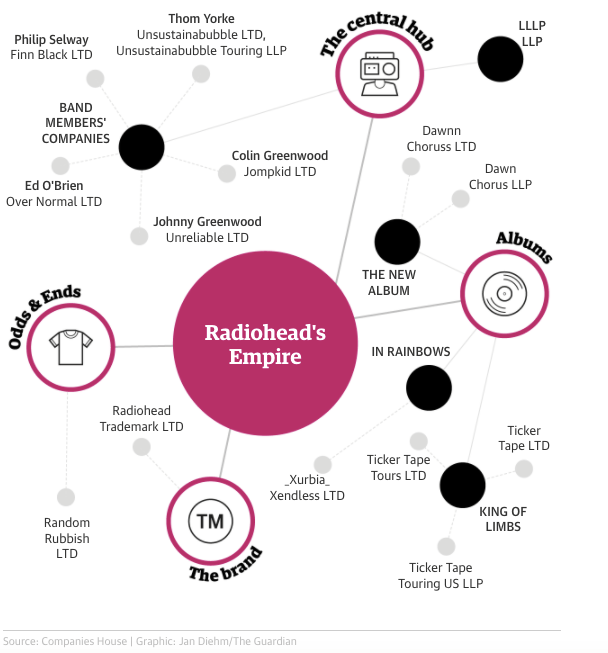
A network graph can also be used to tell a story about the type of network you are dealing with. A ‘hub and spoke’ network centralises power or influence around a small number of nodes, for example, whereas a ‘multi-hub’ network is more decentralised.
From looking at a network we can identify what clusters (“cliques”) exist and how they relate to each other: the Newsnight video above, for example, first shows how clusters have formed based on politics but also how close they are to — or far from — each other.
Crowds in network analysis can take all sorts of shape: research in the field can provide a useful guide.
Bear in mind that the sample for the network analysis can have a big influence on its shape: if you started from one person then it should be no surprise that they are very central in the network graph that is produced.
Tools for doing network analysis

Example of a network drawn using Kumu, from my post on using empathy as an investigative tool
There are a growing number of network analysis tools to get started with this. At the simpler end, Kumu allows you to manually draw a network and its connections, and the tool will store the data created along the way (which can be used in other network analysis tools). It’s useful for mapping systems — as detailed in this post — but lacks some of the functionality of other tools.
Flourish includes network graphs in its data visualisation options and is also worth starting with in order to get to grips with the dynamics and shape of the data involved. It even has a VR network visualisation template.
Gephi is one of the oldest and most powerful tools in the field — but also one of the more complex to use, and less visually attractive in its results. Peter Aldous’s NICAR workshop can help you get started.
NodeXL is a package for Excel that allows it to do network analysis (Peter’s NICAR workshop (PDF) on that is here). It’s not as pretty as Flourish, but more powerful.
Neo4j is another very powerful tool that has been used by the International Consortium of Investigative Journalists (ICIJ) in the Panama Papers and Swiss Leaks stories. It takes some setting up but is especially useful when dealing with large datasets. You can read a tutorial aimed at journalists here.
If you are comfortable with coding then it might also be worth exploring network analysis libraries/packages: Python has NetworkX; R has qgraph and networkD3; JavaScript has Sigma and D3.
Showing the results

This Bloomberg story visualises the strength of relationships between different professions without using a network graph
The visual output of the tools above varies — but in most cases you can export the data from the network analysis stage (typically as two sheets: one for nodes and one for connections) and import it into a separate tool to visualise.
Flourish and Kumu, for example, will present better-looking graphs, offer additional customisation, and interactivity for users.
A well edited or narrated chart can also emphasise the story angle you want to focus on, as this Guardian example shows:
But network graphs are also only one way of visualising the data. Chord diagrams can also be used to show connections and relationships.

This chord diagram shows connections between different companies in a sector (view original article to see interactive version)
Sankey diagrams are another option, typically used to show a flow: for example money or people from one organisation or place to another.
Obviously none of these visualisations are as intuitive as a simple bar chart or pie chart for the typical reader, and for that reason they tend to be more exploratory, with the story inviting users to explore the visualisation rather than using the visualisation to embellish the story.
And sometimes — like Reuters’s Connected China, or Channel 4’s 2009 project Who Knows Who — the output is a whole editorial product in itself.

Pingback: Online Journalism Blog: A journalist’s introduction to network analysis | ResearchBuzz: Firehose
Pingback: Blackbandcamp, Google, Facebook, More: Monday Afternoon ResearchBuzz, June 22, 2020 – ResearchBuzz
Pingback: Blackbandcamp, Google, Facebook, More: Monday Afternoon ResearchBuzz, June 22, 2020 | Business Marketing Journal
Pingback: 3 more angles most often used to tell data stories: explorers, relationships and bad data stories | Online Journalism Blog