Tag Archives: variation

Words as data: how data journalists tell stories about documents and text

Documents and other collections of text can be goldmines for data journalism — if you know how to approach them as data. Here are some techniques and inspiration for your next data project.

From stories about political speech and song lyrics, to street names and social media chatter, data journalists now have a wide range of examples of text-as-data to draw inspiration and guidance from, while tools such as Pinpoint and NotebookLM are making text analysis easier than ever.

I compiled a list of over 200 pieces of data journalism where text or documents were used as sources. Quantification techniques ranged from counting the frequency of a single word and using Google’s ngram viewer, to machine learning and topic modelling.

Looking at those articles it’s clear that, once quantified, journalists tell the same stories about text as any other piece of data: using the seven most common angles.

But how those angles are used — and how often — is where it gets interesting…
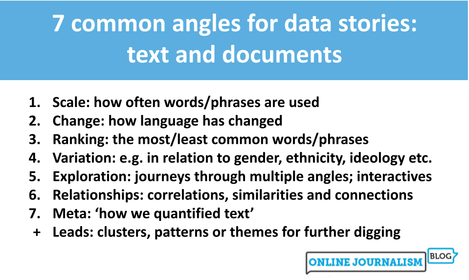
7 common angles for data stories: text and documents 
Scale: how often words/phrases are used
Change: how language has changed
Ranking: the most/least common words/phrases
Variation: e.g. in relation to gender, ethnicity, ideology etc.
Exploration: journeys through multiple angles; interactives
Relationships: correlations, similarities and connections
Meta: ‘how we quantified text’
Leads: clusters, patterns or themes for further digging
Continue reading

Telling stories with data: more on the difference between ‘variation’ stories and ‘ranking’ angles

7 common angles for data storie: scale, change, ranking, variation, explore, relationships, bad data, leads
The 7 angles. Also available in Norwegian, Portuguese, Uzbek and Finnish.

One of the most common challenges I encounter when teaching people the 7 most common story angles in data journalism is confusion between variation and ranking stories. It all comes down to the difference between process and product.

That’s because both types of story involve ranking as a piece of data analysis.

We might rank the number of specialist teachers in the country’s schools, for example, in order to tell either of the following stories:

  • “There are more specialist science teachers than those in any other subject, new data reveals”
  • “New data reveals stark differences in the number of specialists teaching each subject in secondary schools

The first story reveals which subject has the most teachers — it is a ranking angle because it ranks teachers by subject.

The second story reveals the simple fact that variation exists, without focusing on any particular subject.

Continue reading

A quick exercise for aspiring data journalists

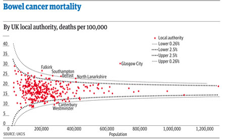
A funnel plot of bowel cancer mortality rates in different areas of the UK

The latest Ben Goldacre Bad Science column provides a particularly useful exercise for anyone interested in avoiding an easy mistake in data journalism: mistaking random variation for a story (in this case about some health services being worse than others for treating a particular condition):

“The Public Health Observatories provide several neat tools for analysing data, and one will draw a funnel plot for you, from exactly this kind of mortality data. The bowel cancer numbers are in the table below. You can paste them into the Observatories’ tool, click “calculate”, and experience the thrill of touching real data.

“In fact, if you’re a journalist, and you find yourself wanting to claim one region is worse than another, for any similar set of death rate figures, then do feel free to use this tool on those figures yourself. It might take five minutes.”

By the way, if you want an easy way to get that data into a spreadsheet (or any other table on a webpage), try out the =importHTML formula, as explained on my spreadsheet blog (and there’s an example for this data here).