
Cogs image by Stuart Madeley

Cogs image by Stuart Madeley
I’ve been using The Guardian’s clever Second Screen webpage-slash-app during much of the Olympics. It is, frankly, a little too clever for its own good, requiring a certain learning curve to understand its full functionality.
But one particular element has really caught my eye: the Twitter activity histogram.
In the diagram below – presented to users before they use Second Screen – this histogram is highlighted in the upper left corner.
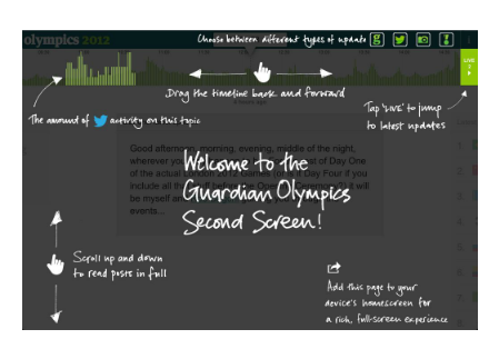
What the histogram provides is an instant visual cue to help in hunting down key events.

As an industry, online publishing has gone through a series of obsessions. From ‘Content is King’ to information architecture (IA), SEO (search engine optimisation) to SMO (social media optimisation).
Most people’s view of online publishing is skewed towards one of these areas. For journalists, it’s likely to be SEO; for designers or developers, it’s probably user experience (UX). As a result, we’re highly influenced by fashion when things aren’t going smoothly, and we tend to ignore potential solutions outside of our area.
Content agency Contentini are blogging about the way they use analytics to look at websites and identify which of the various elements above might be worth focusing on. It’s a useful distillation of problems around sites and equally useful as a prompt for jolting yourself out of falling into the wrong ways to solve them.
The post is worth reading in full, and probably pinning to a wall. But here are the bullet points:
Solutions in the post itself. Anything you’d add to them?
What if a newspaper was designed using principles of web user experience design*? That’s the question that design agency Information Architects asked themselves when they put together a pitch for Swiss newspaper Tages-Anzeiger. They lost the pitch, but the blog post about their ideas is fascinating reading for anyone interested in usability and reinventing the print package for a multiplatform world.

Their innovations included making the text scannable with blue text for key words (see above), high contrast, and being limited to two fonts. They cleaned up the logo (optimising it, essentially), and printed comments next to the articles they commented on. The blog post contains lots more images. In addition, they’ve put the original PDFs of their pitch online too – linked below:
Garcia Media has more context including why Garcia felt they failed.
H/t: Adrian Short. *I should have said user experience design not web design, which was the original headline.
