
I’ve been using The Guardian’s clever Second Screen webpage-slash-app during much of the Olympics. It is, frankly, a little too clever for its own good, requiring a certain learning curve to understand its full functionality.
But one particular element has really caught my eye: the Twitter activity histogram.
In the diagram below – presented to users before they use Second Screen – this histogram is highlighted in the upper left corner.
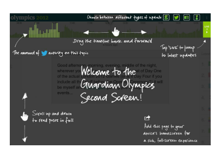
What the histogram provides is an instant visual cue to help in hunting down key events.
If you missed Jessica Ennis’s gold, it’s a pretty safe bet you’ll find it where the big Twitter spike is. (See image below – supplied after this post was first published)

Indeed, if you missed something interesting – whether you know it happened or not – you should be able to find it by hitting the peaks in that Twitter histogram.
That’s useful whether you’re looking at the Olympics or any other ongoing event which would normally see news websites reaching for a liveblog. What’s more, it requires no human intervention or editorial decision making.
Of course, in this form it relies on people using Twitter – but you can adapt the principle to other sources of activity data: traffic volume to your site, for instance (compared to typical traffic for that time of day, if you want to avoid it being skewed by lunchtime rushes).
Indeed, that’s what the Guardian Zeitgeist does across the site as a whole.
Horizontal navigation, adopted by Second Screen as a whole, is a further innovation which bears closer scrutiny. The histogram lends itself to it, so how do you adapt from a vertically-navigated scrolling liveblog? Would you run the histogram up the side, kept static while the page scrolls? Or would you run the liveblog horizontally?
Either way, it’s a creative solution to a common liveblogging problem that’s worth noting.
UPDATE: Jonathan Richards has now written about the development of the Second Screen app.

Users adjusting as old taboos being broken about content below the fold and out view. More intelligent and advanced navigation becoming accepted as people adjust to smartphone and tablet interfaces.
The histogram idea is one solution to picking highlights out of the never-ending the stream of social content, but not ideal, the on/off selection options top right are useful.
Pingback: #london2012 day 15: social media gubbins » Danegeld
Pingback: Daylife as a tool for media professionals | Tools for 21C Media