This is a duplicate post. You can find the original here, or a version in Spanish here.
6 ways of communicating data journalism (The inverted pyramid of data journalism part 2)
Leave a reply

This is a duplicate post. You can find the original here, or a version in Spanish here.
UPDATE: A new version of the inverted pyramid, with new stages and resources for each, is now available.
Last week I published an inverted pyramid of data journalism which attempted to map processes from initial compilation of data through cleaning, contextualising, and combining that. The final stage – communication – needed a post of its own, so here it is.
UPDATE: Now in Spanish too.
Below is a diagram illustrating 6 different types of communication in data journalism. (I may have overlooked others, so please let me know if that’s the case.)
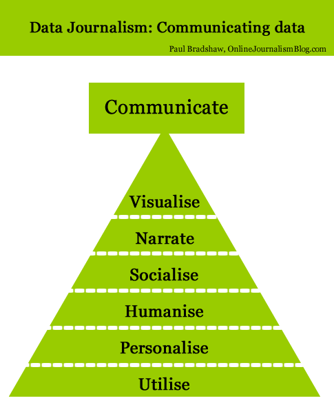
Modern data journalism has grown up alongside an enormous growth in visualisation, and this can sometimes lead us to overlook different ways of telling stories involving big numbers. The intention of the following is to act as a primer for ensuring all options are considered.
Continue reading
