
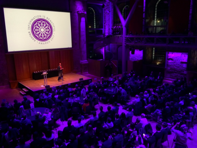
David McCandless, founder of the IiB awards, hosted the ceremony
MA Data Journalism students Carmen Aguilar Garcia and Victoria Oliveres attended the Information is Beautiful awards this week and spoke to some of the nominees and winners. In a guest post for OJB they give a rundown of the highlights, plus insights from data visualisation pioneers Nadieh Bremer, Duncan Clark and Alessandro Zotta.
Nadieh Bremer was one of the major winners at this year’s Information is Beautiful Awards 2017 — winning in both the Science & Technology and Unusual categories for Why Are so Many Babies Born around 8:00 A.M.? (with Zan Armstrong and Jennifer Christiansen) and Data Sketches in Twelve Installments (with Shirley Wu).
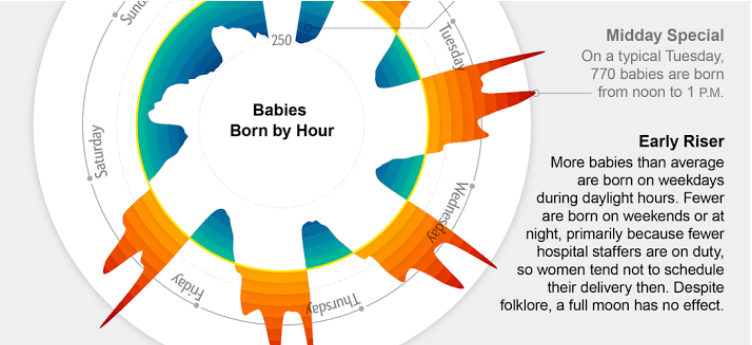
Silver, Science & technology category – Why Are so Many Babies Born around 8:00 A.M.? by Nadieh Bremer, Zan Armstrong & Jennifer Christiansen. The prize was shared with Zan Armstrong, Scientific American.

Gold, Unusual category: Data Sketches in Twelve Installments by Nadieh Bremer, Shirley Wu
Bremer graduated as an Astronomer in 2011, but a couple of years working as an Analytic Consultant were enough for her to understand that her passion was data visualisation. For the past year she has been exploring this world by herself.
“If you don’t have some interesting insight of the story to share,” she said, “your dataviz is just going to disappear into the world of ‘just google for bad infographics’”.
Beside her short freelance career, she has already been recognized with the Outstanding Individual award this year.
“Dataviz itself is built on the fundamental of the story. They both need each other, but the visualisation without the story is nothing,” says Nadieh.
“The person in the room I envy the most”: Best individual is @NadiehBremer (2nd prize!) pic.twitter.com/Dfmsbw55NL
— Victòria Oliveres (@VictriaVic) 28 de noviembre de 2017
And she wasn’t the only one in saying that. The importance of storytelling was a recurring theme throughout the night.
Eric Salama, CEO of Kantar, opened the night highlighting the “big difference” that data visualisation is making in explaining stories. But he warned that “It’s not the technique, it’s about the story to help you to understand what is happening”.
Kantar #iibawards is turning from just #dataviz to longform #storytelling pic.twitter.com/5LZcY53L4j
— Victòria Oliveres (@VictriaVic) 28 de noviembre de 2017
New categories, same qualities
There were novelties in this sixth edition of the event. Categories changed from formats to topics, to mark “The increasing importance of data visualization and infographics across all media”.
But what judges look for remains the same: a balance between information and visual form, as David McCandless, founder of the awards and host of the ceremony, visually shows:

Revamped categories had space for multiple topics as well as for those projects which didn’t fit any box.
The Unusual category offered a diverse range of projects: while Nadieh Bremer won Gold in that category with Shirley Wu, Silver went to How To Fix a Toilet (And Other Things We Couldn’t Do Without Search) by Google News Lab and Xaquín González Veira:

Bronze went to Data Viz Project by Ferdio:

And there was an honourable mention for Forma Fluens by Mauro Martino:

Previous winner Duncan Clark was also nominee to this category for his new project Flourish, which “isn’t typical for the Information is Beautiful Awards, because it’s a toolkit rather than a graphic”.
The toolkit offers “infinite flexibility and a storytelling layer, which already supports ‘stepper’-style stories but over time will support audio, scrolling and more”, said Clark.
More ‘scrollitelling’
Nadieh Bremer has noticed an evolution in the shortlist this year. “We are moving towards more ‘scrollitelling’”, she says. “The dataviz itself is becoming more complex. The more complex (data visualisations) are actually winning and they are getting more comfortable [with non-standard projects].”
Not only is there diversity among winning projects, she feels, but also in the winners. Students from Density Design, for example, were awarded Studio of the Year and also took home two awards and an honourable mention: Gold in the Current Affairs & Politics category, Silver in Humanitarian/Global, and the honourable mention in the Rising Star category for Giacomo Flaim‘s works including Are you sure you want to smoke?

Gold, Current Affairs & Politics category: On Their Way: the Journey of Foreign Fighters

Silver, Humanitarian/Global: The Point Of No Return – How the world is adapting to climate change
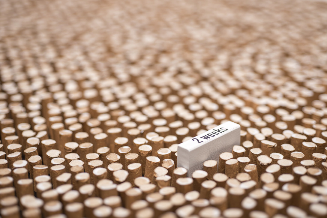
An honourable mention in the Rising Star category went to Giacomo Flaim for works including Are you sure you want to smoke?
In this Research Lab – rather than a usual studio – the students start from their “own curiosity to learn about a topic”, says winner Alessandro Zotta.
For him, “dataviz is not the objective of the course but the tool that you use to understand phenomenon and controversy.”
All these projects were designed during their course in Communication Design in the Politecnico di Milano, an achievement that sets the bar high for future data visualizers and shows the strength of talent among new arrivals in the field.
You can see a full list of the winners of Kantar Information is Beautiful Awards 2017 here.

Pingback: FYI December 02, 2017 – Instagatrix
Pingback: FYI December 04, 2017 – Instagatrix
Pingback: Information is Beautiful Awards 2017: “Visualisation without story is nothing” | Periodisme Lapislàtzuli - Victòria Oliveres