
One of the simplest ways to get started with data journalism techniques is a ‘Get the data’ article.
Start by looking at examples of other ‘Get the data’ articles. A good search for this is:
intitle:"get the data" -getthedata
This searches for the exact phrase “get the data” in the title of the page but also excludes the site getthedata.org (which otherwise dominates results) by using the minus operator.
You can obviously add further terms, such as ‘news’ or ‘finance’, to narrow further.
Here are some examples:
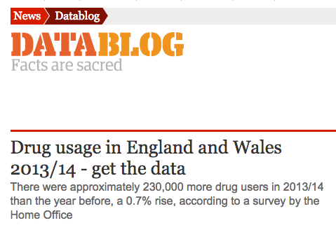
- The Guardian: Drug usage in England and Wales 2013/14 – get the data
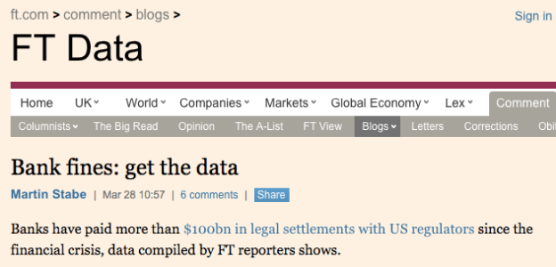
- The Financial Times: Bank fines: get the data
- The Bureau of Investigative Journalism: Get the data: The Bureau’s financial lobby database
- The Guardian: 2013 global corruption barometer – get the data
Those three examples show two different types of datablog. The Guardian, for example, take public data which has just been released and make it more accessible to a broader audience.
In this example the Guardian actually link to two sources of data elsewhere, on Government sites
The Bureau of Investigative Journalism and FT, on the other hand, are making data available which they themselves have compiled.

In this example the Bureau of Investigative Journalism have compiled their own data – and made it public so others can dig through it and help
Compiling data doesn’t have to be onerous. It can be as simple as combining the data for six different months, or four different years.
Choosing an intro
To share your data you’ll need an introduction. Often this will be a ‘top line’ on the data in question. For example:
“More than half of people believe the level of corruption in their countries has increased over the past two years, according to Transparency International” (Guardian)
“Banks have paid more than $100bn in legal settlements with US regulators since the financial crisis, data compiled by FT reporters shows.” (FT)
“The size and scale of Britain’s financial lobby has never been quantified – until now.” (BIJ)
“There were approximately 230,000 more drug users in 2013/14 than the year before, a 0.7% rise, according to a survey by the Home Office” (Guardian)
Often that top line is simply a grand total (how much money, how many people), a proportion, a change (how much something has gone up or down), or who is top or bottom.
Sometimes it actually comes from the organisation releasing the data.
Adding the background
Once you’ve given that ‘top line’, you should explain where the information comes from, and how the data was collected (i.e. how representative it might be), e.g.:
“The 2013 global corruption barometer, released on Tuesday by NGO Transparency International, surveyed 114,270 people in 107 countries.”
What else?
You don’t have to write anything else: you can simply move on to the ‘get the data’ part (explained below). But you do have all sorts of choices to elaborate further. Here are just some:
- Visualise it, or part(s) of it: this is another version of the ‘top line’, and may go at the top of the piece. A line chart (to show change); a bar chart (to compare things); a pie chart (to show composition of a whole) are all simple ways to show either the top line or another newsworthy detail.
- Add background: link to previous articles on your own site or others; link to related reports and research
- Add facts: either from the data or from other sources – again, link to them
- Add colour: human case studies, quotes, interviews will all help bring this to life – but be careful you’re not trying to do too much*. If you have a good case study that should lead the piece, or at least be a standalone piece you can link to. Don’t bury it in a ‘get the data’ piece – it’s much more interesting!
The ‘get the data’ part
After those first two pars – or at the end of a few more – you can then introduce the data itself. This can be:
- Embedded in the article itself as a table and/or
- Linked to in a separate spreadsheet
The Guardian Datablog simply add a new subheading at the end of their articles saying ‘Download the full spreadsheet’ followed by a link to ‘Download the full data’ or (when it is not hosted by themselves): ‘SOURCE:’ followed by a link or links to the authorities hosting it, e.g. “SOURCE: The Home Office and the Health and Social Care Information Centre (HSCIC)”
The Bureau add a more instructive ‘call to action’:
Click here to see the Financial Lobby dataset in alphabetical order.
And the FT include it in the body of the article, but again at the end:
“You can now download the full bank fines data as a CSV file that can be imported into any spreadsheet or statistical software package. This link will always provide the most up-to-date version of the data compiled by the FT.”
Indeed, this is a good way to end any article based on a data source.
Embedding tables in a post
There are a number of tools for quickly generating tables you can embed in an article. Tableizer and Datawrapper are two particularly quick ones: all you have to do is copy the data from your original spreadsheet and paste it into a box on the website.
They will then generate some HTML code which you can copy and paste into your post (HTML view in WordPress)
Linking to the data
If you want to link to the data there are also a number of options:
- You can link to the original data itself wherever it came from (this is what the Guardian post on drug use does)
- You can link to the (cleaned/simplified) data file on your own site (this is what the FT do in their post)
- You can link to a public spreadsheet hosted on Google Drive or similar service (as The Guardian do in their post on corruption index data)
Which option you choose depends on the data.
If it is possible to link to the original data, and it is easy to see and understand (i.e. it’s not on one of many sheets) and you assume it will always be there, then that’s OK – but it’s probably not the best option long term.
More likely, you’ll need to at least host it yourself. In this case, choose just the one sheet that’s relevant, and export in a simple format like CSV rather than the spreadsheet software’s preferred format.
WordPress does allow you to upload CSV files in the same way you upload images (using the Upload Media option) – just make a note of the URL that links to that file (in your media library).
Perhaps the most accessible way (in terms of the wider public, not in terms of developers who would prefer CSV) is to upload it to Google Drive. Once uploaded (and converted, ideally), just follow the instructions for publishing a Google Drive file. This will give you a URL that you can link to in your article.
Although this means the spreadsheet can be viewed in the browser, it also makes it slightly harder to use. So it’s worth including a line of instruction, as the Bureau do:
“To download an editable version, select File > Download As.”
Just the start?
*Think of ‘get the data’ as one part of a wider set of articles – so you may have a more traditional news piece which links to this ‘get the data’ one at the end; just as your ‘get the data’ post may link to that news piece in its intro.
The case study might be a third article (leading on a key quote); a fourth piece may be a broader ‘explainer’.
Then you have follow-ups on reaction, denials, further revelations and so on. One story can yield many articles – don’t try to do them all at once.
Of course on the other hand, ‘get the data’ may be all you want to do on this story. But the point is that you’re getting it out there and increasing the chance that someone, somewhere, may find you through it – and tip you off to something you hadn’t thought to look at.

Pingback: Data Viz News [76] | Visualoop
Pingback: What to Expect From the Next Generation of Web Content Management | makemybusinessboomblog