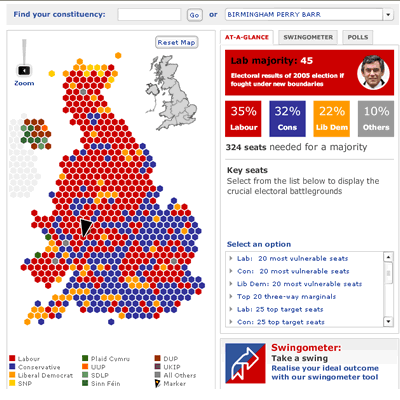
The Telegraph is starting to make a habit of combining Flash and databases to impressive effect. Their latest project brings in mapping too, to produce a political map of the UK which has real depth behind its Flashy appearance.
It’s done this with some nifty database connectivity. A click on a particular constituency brings up info about the last election results. So far so-so. But a tab to the right (see detail below: surely this should be the default?) offers a ‘Public services profile’ of how health, education and crime have changed, along with (currently empty) spaces for related articles and links. If and when this works it promises the sort of connectivity that has been lacking from so much online journalism. But will they be brave enough to link to reports on other sites?
Other features include the Swingometer (see how different swings affect the results), previous results, and lists of vulnerable seats – all of which are now expected, having been done before by the BBC among others (as I reported in the mists of 2005) – while the links to the latest polls add something extra.
Meanwhile, usability is smooth with postcode search, drop-down, and zoom feature, plus the ability to ‘mark’ an area.
Telegraph.co.uk’s Editor Marcus Warren says the tool was prepared for last autumn’s “General Election that wasn’t. It would have been ready for the closing weeks of the campaign but in the end the Prime Minister thought better of going to the country so we pursued the project at a slightly less breakneck speed and launched in the political “new year”.
“It’s also part of a more general drive, both by us and elsewhere, to drill down to the local level and exploit data relevant to our audience’s lives. We also wanted to the tool to be “fun”. (Originally, for example, the images of the party leaders were caricatures.)”
While acknowledging the influence of the likes of “Start Swinging” with Peter Snow, Warren says there has been no one model “that made us exclaim: “we want one of them too”. Like everyone else, we’ve been keeping an eye on the digital election campaigns in Australia and the US, both Google’s approach and that of others. World Archipelago have done a great job in building the thing, as have the people here who worked on it.”
The most frustrating thing at the moment about the map is simply the fact that there is no election on yet, which gives the Telegraph team plenty of time to respond to feedback, iron out problems, try new ideas, find out about others through the blogosphere (Warren admits to not being aware of Electoral Calculus until Simon Dickson’s post) and be all mysterious about their plans. As Warren says:
“There are lots of clues in there which hint at what else we plan to do with it. And we have other surprises up our sleeve as well.”
For my part I’d like to see some individual RSS feeds/mobile alerts for constituencies and some tapping into the power of tagging – perhaps automated grabs of delicious bookmarks with clusters of key words in them (or indeed which key words become popular), or getting Telegraph journalists to tag their sources with a particular phrase that is picked up by the engine. But I’m being fussy. What do you think?


I wish something like that could be made here for the upcoming elections in Spain!
Pingback: Ten ways journalism has changed in the last ten years (Blogger’s Cut) | Online Journalism Blog